
Overview
Guided experiences empower users to effectively use your product. By delivering clear, timely guidance, you help them build confidence and unlock the full capabilities of your tool. Applied strategically, guided support generates powerful ripple effects across the entire user experience:
- Faster adoption: Users quickly grasp core functionalities and begin deriving value, leading to quicker integration of your product into their workflows.
- Reduced support costs: A well-designed guided experience proactively addresses user questions, significantly reducing inbound support inquiries and operational costs.
- Enhanced engagement & loyalty: Eliminating friction and confusion fosters a positive, even enjoyable, initial experience. This builds excitement, driving deeper engagement and long-term user loyalty.
There are two categories of guided experiences:

Onboarding new users
Onboarding is about more than just welcoming new users; it's about helping them confidently navigate your product and quickly understand its value. A well-crafted onboarding experience is an investment in user success, laying the groundwork for a productive relationship with your platform.
Choosing between an onboarding modal or a guided tour ultimately depends on what you want to convey and the desired level of user interaction:
| Type | Primary use case | Content & Interaction Model | Learning curve |
|---|---|---|---|
| Onboarding modal | Focused info; mmediate attention | Concise; interrupts workflow for acknowledgment | Low → moderate |
| Guided tour | Introduce features; enhance understanding | Step-by-step, in-product guidance | Moderate → high |
No matter the approach, always prioritize the user experience. Keep it concise, intuitive, and non-intrusive, and consistently gather feedback through testing to refine your onboarding journey.
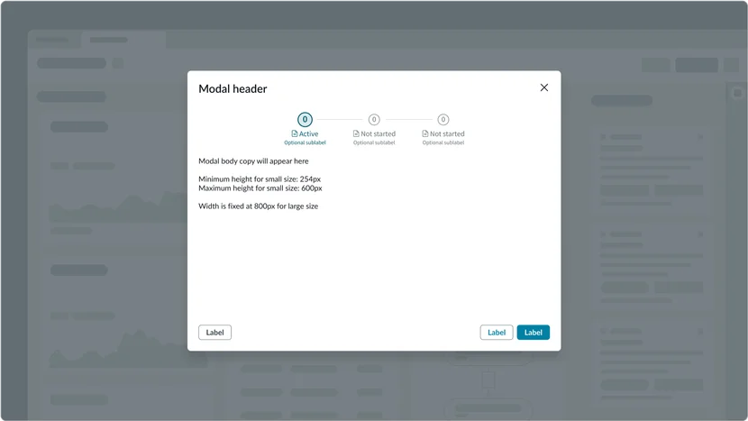
Onboarding modal
When using an onboarding modal, the modal will typically contain a brief message, a visual element (which can include embedded video), and a clear call to action for the user to acknowledge the modal and/or learn more. Display these modals the first time a user interacts with your product or service. This helps to effectively orient them and provides a concise overview of the platform's capabilities or new features.
There are two types of onboarding modals:
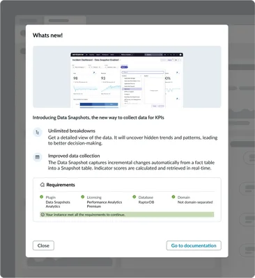
- Single-step: This simple, effective format delivers a concise message and a clear call to action. It's ideal for brief introductions, important announcements, or quick tips, and can optionally feature a single introductory video. In the example below, the messaging is paired with an image to provide context as well as some instructions.
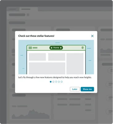
- Multi-step carousel: An interactive format that allows you to showcase multiple features or benefits in a visually appealing and sequential way. In the example below, each slide highlights a specific aspect of the product, guiding users through key information, while incorporating engaging video content on individual slides.
Each one provides a slightly different experience to help educate the user about what they are about to experience.
Single-step modal
Multi-step modal
Guided tour
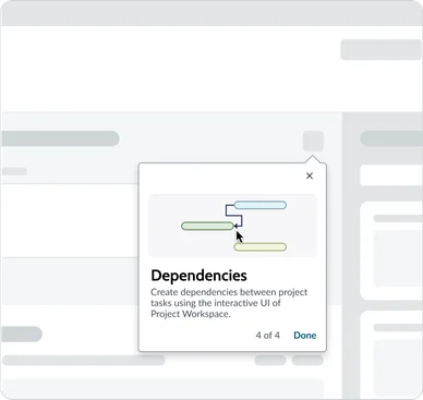
A guided tour takes a user on a step-by-step journey through the product's key features. Use a guided tour when you want to introduce them to new features or higher level concepts while providing contextual information within the product interface. Guided tours often use a combination of tooltips, popovers, and interactive elements to engage users and provide a hands-on learning experience. They are particularly useful for complex products with multiple features and workflows.

Popover default
Popover with image
Combined onboarding approach
For complex onboarding situations where a foundational overview is needed before hands-on exploration, you can combine the onboarding modal with a subsequent guided tour. This approach starts by presenting the user with a concise onboarding modal to deliver critical initial information or set the stage.
Once the user acknowledges and closes the modal, a guided tour seamlessly begins, leading them through specific features and workflows within the product interface. This powerful combination ensures users receive essential context upfront and then immediately get the in-product guidance they need to confidently navigate and understand the platform's value.
Guiding users through complex tasks
Even the most intuitive interfaces can't always eliminate complexity. Whether due to legacy systems, technological constraints, or inherently intricate processes, some tasks present significant hurdles. When users face these challenges, it often leads to frustration and abandonment.
That's where guided support patterns become indispensable. By breaking down complex workflows into smaller, manageable steps, we empower users to confidently navigate daunting tasks. Think guided setups, wizards, checklists, and clear next steps – all designed to reduce cognitive load and provide a sense of accomplishment. These interfaces don't just streamline user journeys; they ensure users achieve their desired outcomes, fostering confidence and enhancing satisfaction along the way.
Choosing the right pattern
There are multiple patterns to choose from to help guide users through complex tasks:
| Type | Primary use case | Experiences | Task complexity |
|---|---|---|---|
| Guided setups | Configuration, development | Admin, builder | Simple → complex |
| Playbooks | Customer workflows | Workspace, portals | Moderate → complex |
| Wizards | Configuration, development | Admin, builder | Simple |
| Checklists | Configuration, development | Admin | Moderate → complex |
Guided setups
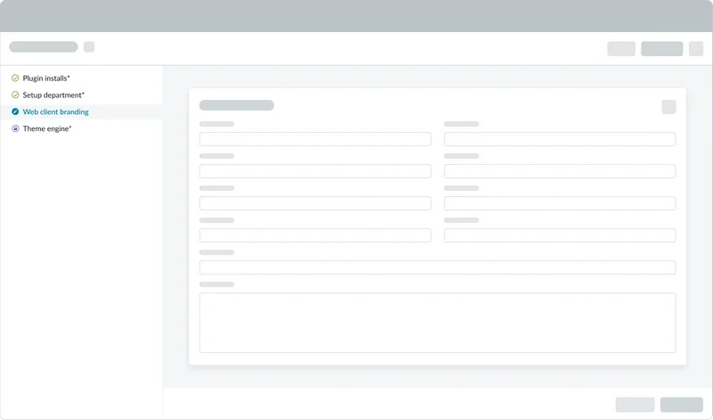
Guided setups guide users through complex configurations and setup tasks. These are often one-time processes, such as the initial platform setup, activation of new applications, or modules. Accessed directly through the platform, Guided setups make intricate configurations manageable by breaking them into smaller, clear steps.
This approach significantly enhances the user experience by providing clear, contextual guidance and a crucial sense of progress, enabling users to understand not just what to do, but why. Visually, steps are presented vertically with ample detail, while critical navigation and action buttons float at the bottom of the viewport, ensuring constant visibility and a smooth, guided completion of tasks. They also keep track of your progress, allowing you to stop and resume where you left off.
- When to use: Initial platform setup; activating new applications or modules; one-time, comprehensive administrative configurations.
- Benefits: Simplified complex deployments; ensured correct and compliant setup; reduced admin onboarding time; clear progress tracking.
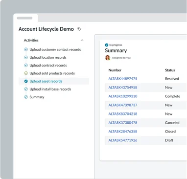
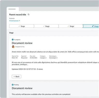
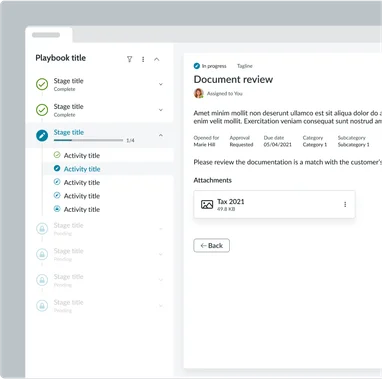
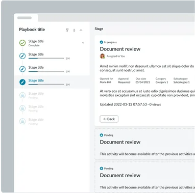
Playbooks
Playbooks provide a structured approach to guiding users through complex tasks or workflows. Like a playbook in sports, it outlines a series of steps for achieving a specific goal. Playbooks provide a clear roadmap for users, breaking down complex processes into manageable chunks. By following the playbook's instructions as well as leveraging the provided guidance, users can confidently achieve their goal by navigating challenging tasks in a prescribed order.
Playbooks are incredibly powerful orchestrators and conductors, designed to manage processes that range from very simple to highly complex, potentially spanning multi-month durations and involving various administrators and users. A key feature is their support for branching logic, allowing the workflow to adapt and proceed in different ways based on user selections or specific conditions. This pattern is particularly useful for tasks that require multiple steps, involve decision-making, necessitate specific configurations, and often incorporate significant automation to streamline operations.
- When to use: Standardizing operational procedures; workflows requiring consistent execution across users; orchestrating complex, multi-team processes.
- Benefits: Ensured process consistency and compliance; accelerated task resolution; reduced errors and rework; improved agent productivity.
There are four available layouts:
Horizontal
Horizontal — Focused
Horizontal — Stacked
Vertical — Focused
Vertical — Stacked

Learn more about this component
Learn more about this component
Learn more about this component
Learn more about this component
Learn more about this component
Wizards
Although wizards are not technically a component. Wizards are a design pattern, and you can create a wizard like experience by combining a stepper and modal component.
Wizards visually break down complex tasks into a series of smaller, more manageable steps. Wizards uses a stepper which provides a clear visual affordance that creates a reassuring path for users. Each step in the wizard is typically represented by a distinct visual cue, such as a numbered circle, that indicates the user's current position within the overall process. This visual feedback helps users understand their progress, maintain focus, and feel a sense of accomplishment as they complete each step.
- When to use: Collecting specific data across several distinct steps; multi-screen form submissions; simplifying complex data input; sequential decision-making processes.
- Benefits: Simplified complex data entry; reduced cognitive load; ensured complete and accurate data submission; improved user experience for sequential tasks.
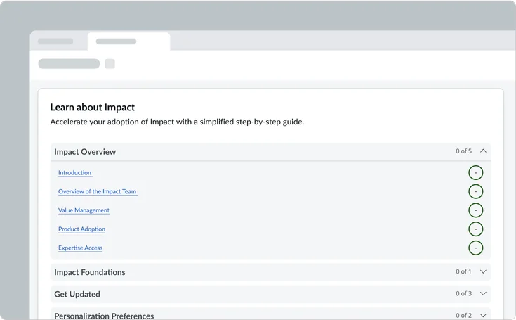
Checklists
Checklists provide users with a clear, step-by-step path to complete tasks or configure settings. They offer a tangible form of guided support by visually breaking down complex processes into manageable items. Each step is presented as a distinct checklist item, ensuring users always know what to do next.
As users complete each step, the checklist updates, fostering a strong sense of accomplishment and reducing anxiety by clearly showing what's done and what remains. This pattern fundamentally enhances user confidence and ensures thoroughness. Checklists are particularly effective in scenarios like onboarding, complex configurations, or multi-step forms where precise tracking is essential, empowering users to navigate intricate processes efficiently, minimizing oversight, and streamlining their journey towards successful completion.
- When to use: Tracking discrete task completion; verifying all necessary steps in a process; simple task management or verification; guiding users through a set of independent actions.
- Benefits: Clear progress tracking; ensured completeness and thoroughness; simplified task management; reduced oversight and missed steps.
Conclusion
At its heart, guided support is the compass and trusted companion every user needs and deserves on their digital journey. Whether illuminating the first steps of onboarding, charting a course through intricate processes, or revealing the hidden gems of new features, these patterns transform uncertainty into capability. They act as lighthouses in a complex landscape, breaking down daunting tasks into manageable strides and empowering users to move forward with clarity and confidence.
Ultimately, this thoughtful guidance is more than just functionality; it's the bedrock of a truly intuitive experience. It's the assurance that no user is left adrift, but rather guided gently to their goals, fostering a deeper connection with your platform. By investing in clear, contextual support, we don't just build products; we cultivate success stories, ensuring every interaction blossoms into a productive and rewarding partnership.