

Anatomy
Learn about the individual parts of Playbook modals.
Cancel playbook modal
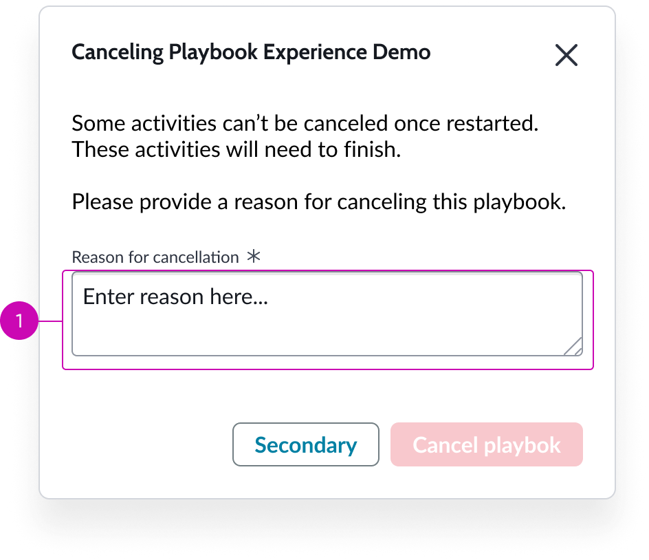
- Reason for cancellation box: Required entry field for user to type reason for cancelling a playbook; user must confirm the cancelation
Add optional activity modal
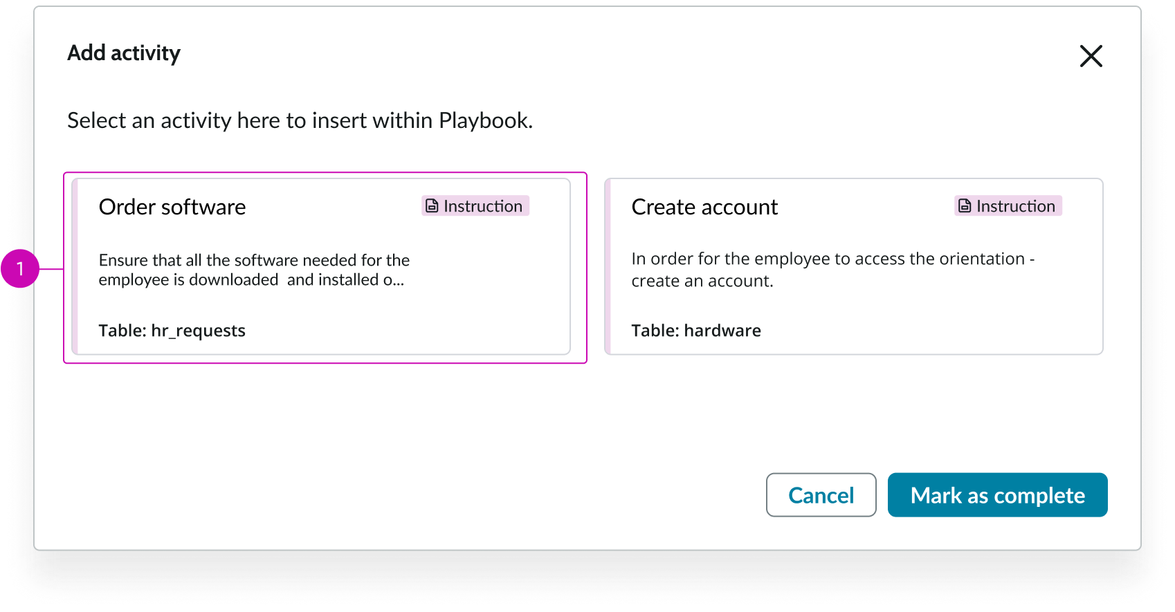
- Optional activity: Optional activities that are available for the user to select and add to a playbook appear here
Usage
Playbook modals support features in playbook that need to be surfaced to the user in a modal without requiring you to set up multiple, different modals to accomplish your goals.
Configurations
Learn how to customize playbook modals by configuring the available properties.
Presets and controllers
This component has a preset configuration that sets properties and event handlers, making it ready for use. You can override preset values with a custom configuration if needed. Preset values won’t upgrade with updates. To avoid using presets, configure manually. One preset can apply to a single component instance. See presets for more info.
A preset is linked to a controller, which serves as a data resource. Controllers provide configuration data and event bindings for the component. Selecting a preset adds the required controller to the page, allowing new components to use its preset. For more on controllers, see controllers. For default presets, see view properties and events in the controller API.
Note: If the playbook controller is present on the page, it applies right away. However, if there’s no controller, you’ll be asked if you want to add the playbook controller. You should add it. If you don’t, the configuration data and event binding the component needs to function will be missing from your page.
Optional activities
To enable the user to add an activity to a running process, you can configure optional activities that show up in the optional activities modal.
Cancel activities
You can specify which running playbook the cancel modal cancels for the user.
Playbook ID
You can specify the ID of the playbook experience you want to load.
Design recommendations
Learn how to apply playbook modals in your design.
Alignment and positioning
The playbook modals component has to be in the the body section of a UI Builder page. Placing it at the top is recommended.
Usability
Playbook modals complies with all internationalization and accessibility requirements - with the current exception of re-flow.
Internationalization
When this component is used in a platform configured for a right-to-left (RTL) language, it flips in its orientation.
Playbook modals doesn't change for right-to-left (RTL) languages.
Accessibility
Learn how to access the actionable elements of playbook modals through keyboard interactions and screen readers.
Playbook modals doesn’t have any specific accessibility interactions.
Cancel playbook modal tab order
Add optional activity modal tab order
Keyboard interactions
You can access the actionable elements of playbook modals with these keyboard keys:
- Tab: Shifts focus to the button starting with the most important UI action; tab order continues in order of importance
- Space or Enter: Launches the action in focus
Screen readers
When you apply ARIA labels to a component, screen readers announce the controls and content of playbook modals in the prescribed tab order.