App shells and page layout
Each workspace experience is built on three basic layers: the unified navigation, the app shell, and the page layout.

Overview of the basic layers of a workspace
Next Experience Unified Navigation: This global navigation runs across the top of every page and includes controls that help users navigate across experiences, search their instance, and receive notifications. This navigation is shared by all ServiceNow experiences.
App shell: The workspace app shell provides a basic wrapper for the experience. It contains the application navigation and page navigation for your workspace.
Page layout: This is the experience your user interacts with, made up of pages, patterns and components.
Navigation
In addition to the global unified navigation, workspaces have two additional levels of navigation: application navigation and page navigation.

Workspace navigation
- Page navigation: tabs or breadcrumbs that allow users to navigate between records
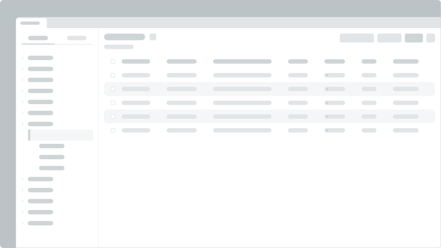
- Application navigation: left-side navigation bar that enables users to switch between pages, like landing pages and lists
Page layouts
Page layouts are the way you tailor the experience and fill the body of your workspace. You can choose from various out-of-the-box layouts or create and customize pages with UI Builder.
The common page layouts in workspaces include:
- Landing pages
- List pages
- Record pages
Landing pages
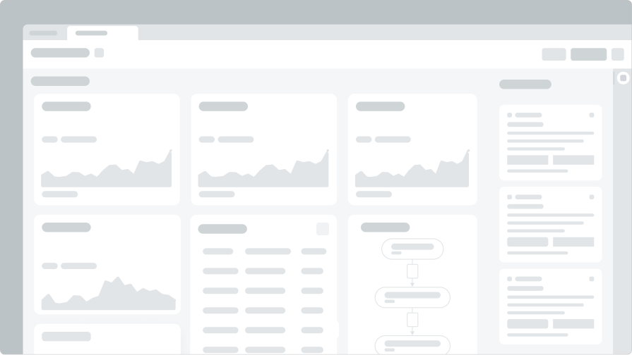
Landing pages provide actionable data to help the user orient their day to the activities and issues that require the most attention.

Workspace landing page
List pages
List pages display lists of records relevant to a user role. Lists can be filtered, sorted, and saved as personal favorites.

Workspace list page
Record pages
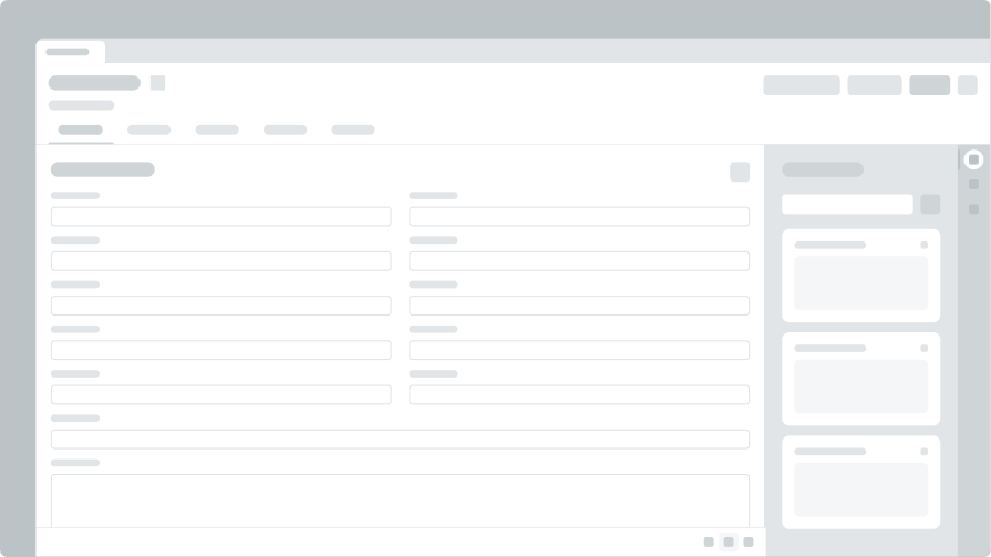
Record pages provide a detailed view of a record, like an incident or case, configured with the right information and actions for a specific user role.

Workspace record page
Components and patterns
Components are the basic building blocks of the workspace interface. They provide the info and functionality that allow users to get work done.
They include things like buttons, form fields, and tables. Patterns are the combination and configuration of components we recommend to solve common user needs, like messaging.
