Cards typically consist of a combination of text, images, and/or other elements arranged within a defined boundary. They serve to organize information in a visually appealing and easily navigable manner, enhancing the user experience. Cards can be interactive, allowing users to engage with the content by clicking, or tapping for further interaction or exploration.
| Card Type | Component to use | Description |
|---|---|---|
| Card with content | Template card | Showcases a summarized record |
| EVAM card | Provides brief summary of a complex item | |
| Record card | Used within Kanban board | |
| Dashboard card | Showcases details regarding dashboards | |
| Search result card | Allows users to click for detailed view | |
| Card with image and video | Card container slot | Fundamental structural component to organize content within a card layout |
| EVAM card | Provides brief summary of a complex item | |
| Record card | Used within Kanban board | |
| Card with score | Card container slot | Combines container with single score / KPI |
| Card with visualization | Card container slot | Combines container with visualization |
Base components
Base components, like card headers and footers, provide essential structural elements for organizing and presenting information within cards, facilitating clear communication and intuitive user interaction. They acts as a foundational structure, ensuring consistency and cohesion in card layouts while accommodating diverse content types and design variations. These base components can be used to create custom cards.
Card container
A card container is a fundamental structural element used to encapsulate and organize content within a card layout. It provides a defined space for arranging various components such as headers, footers, etc.
To replace the slot component with a custom one, first, design a local component featuring your custom layers. Then, choose the slot component, and from the slot drop-down menu in the customization panel on the right, select the local component with which you wish to substitute.
Sidebar and shadow can be toggled on/off as required.
See usage guidance for card container
| Card Container | Example |
|---|---|
| Size: sm, md, lg |  |
| Sidebar |  |
| Shadow |  |
Card header
A card subcomponent that supports multiple headings and action buttons or menus. Taglines, identifiers, and other sub-components within the card header can be toggled on or off as needed.
Highlighted values communicate the value of an item by promoting visibility and readability. Use highlighted values when you want to convey the status in a card. A highlighted value may be combined with a status icon.

| Card Header | Description | Example |
|---|---|---|
| Icon | An Icon identifier is a visual element that supplements the heading label. It also creates a visual distinction between cards. When adding an icon identifier, make sure it uses a complementary size. | |
| Image | An Image identifier is paired with the heading label to enrich card content, ensuring alignment in style and size for seamless integration and aesthetic appeal. It also creates a visual distinction between cards. When adding an image identifier, make sure it uses a complementary size. | |
| Avatar | An Avatar represents a user by their initials, a profile image, or an anonymous icon. Avatar is paired with the heading label to enrich card content. It also creates a visual distinction between cards. When adding an avatar identifier, make sure it uses a complementary size. |
Card footer
A card subcomponent for the footer. The action variant may feature 1, 2, or 3 icons. If more than 3 actions are necessary and they should be accessible in the overflow menu using the ellipse icon.
Highlighted values communicate the value of an item by promoting visibility and readability. Use highlighted values when you want to convey the status in a card. A highlighted value may be combined with a status icon.
See usage guidance for card footer
| Card footer | Example |
|---|---|
| Action variant |  |
| Text link variant | |
| Avatar variant | |
| Metadata variant | |
| Highlighted value variant |
Card divider
It is used within card components to separate and distinguish distinct sections or content within the card's layout.

Card actions
Card actions are placed within card components, allowing users to perform specific actions or operations related to the displayed content. A single button fills the width of the card action container.
When adding additional buttons, equally distribute the button width and span to fill the card action container. A maximum of 3 buttons can be added to the card actions.
See usage guidance for card base actions
| Card Actions | Example |
|---|---|
| Small variant (1 button) |  |
| Small variant (2 buttons) |  |
| Small variant (3 buttons) |  |
| Medium variant |  |
Card container slot options
Image and Video

- Card slot: Space for card subcomponents, other subcomponents, and custom content.
- Card container: The container of which subcomponents are assembled in order to create a card type.

Card slot - video variant
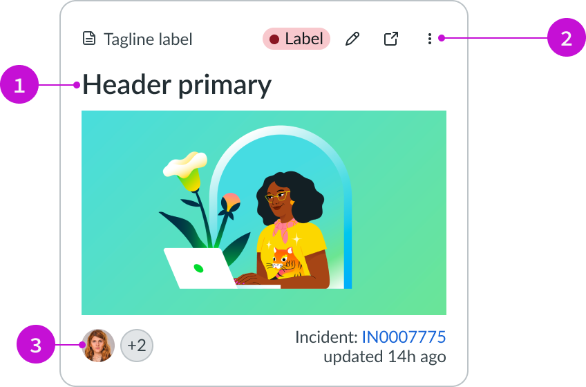
- Header label: Text that explains the card.
- Actions: Dropdown menu that contains the record actions.
- Card footer: Container for a label-value pair (inline) component.
Single score
This card displays essential metrics or performance indicators to provide quick insights and facilitate decision-making within a dashboard or analytics interface. A single score component includes essential elements such as an icon for visual identification, a numerical score representing performance, a change indicator to denote fluctuations, a target value for comparison, gap information indicating the deviation from the target, a sparkline visualization illustrating the trend over time, and the score date indicating when the measurement assessment occurred.
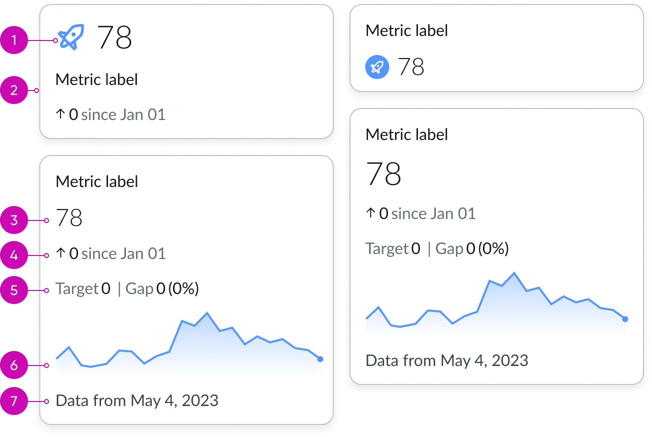
- Icon: Visually represent and provide context to key performance indicators.
- Data & viz. container: Container for various charts and KPI that visualize and compare system data.
- Single score: Displays a single measurement as a number. Sparkline and supporting information can be added below.
- Change: Specifies any change or movement in the primary metric, measured from the specified date.
- Target & gap: Target refers to the desired objective, while gap indicates the disparity between current performance and the target.
- Sparkline: A compact, axis-free representation depicting the overall temporal trend of a measurement. Score date: Specific date when a performance metric is assessed or measured.
- Score date: Specific date when a performance metric is assessed or measured.
Visualization
A card incorporating graphical representations or visualizations of data, allowing users to interpret complex information more intuitively and enable effective data-driven decision-making.
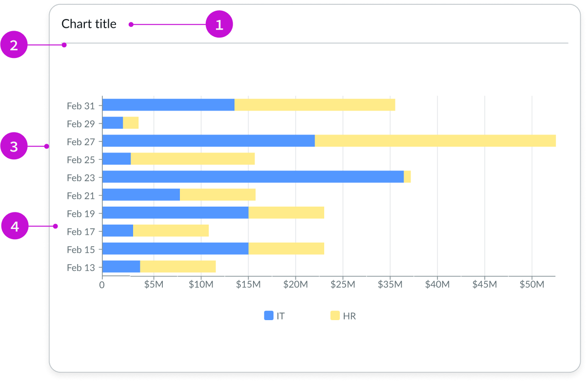
- Chart title: Text that explains the visualization.
- Divider: Horizontal line that separates content or card subcomponents.
- Data viz. container: Container for various charts and KPI that visualize and compare system data.
- Container slot: Container for showing visualizations.
Template card variants
Cards generally comprise a mix of text, images, and/or other components arranged within a specified area, aiding in information organization with visual appeal and ease of navigation, thereby improving user experience. They may be interactive, enabling users to interact further by clicking or tapping for exploration or interaction.
Template card
A template card is aimed at displaying a summary of an assist record. It’s commonly used in the contextual side panel of a record view and the card footer can contain metadata.
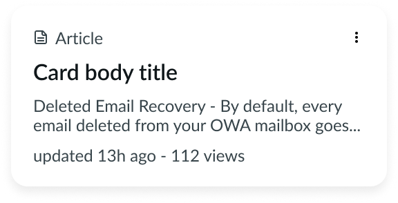
Template card - agent assist variant
Template card omnichannel
Omnichannel template cards provide a method for revealing content that enables a user's interaction. A template card is commonly used in the contextual side panel of a record view and the card footer can contain action buttons.
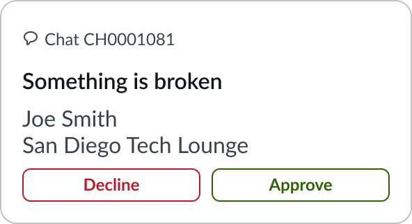
Template card omnichannel
Template card attachment
Attachment template cards are best used to show a file has been or will be added to a record. The attachment card can feature either an image or an icon as its identifier.
See usage guidance for template card attachment
| Template Card Attachment | Example |
|---|---|
| Icon | |
| Image |  |
| Virus scanning |  |
| Virus scanning failed |  |
Dashboard card
These cards are generally used on dashboard displaying information about the available in the instance and can redirect to them. It can contain meta data and/or highlighted value. They can be clicked to navigate to another screen.

Dashboard card - meta data and highlighted value variant
Contact card
A presentational component to show a card which can be used for contacts, accounts, or other informational needs. This card can support an avatar, primary text, secondary field label/values, and badges.

Contact card
EVAM cards
Now EVAM card record
The Now-card-evam-record serves as a concise overview of a detailed object, prompting user interaction or exploration for further details. This component is exclusively found within data-set and content-set components, with the option to selectively hide or display its elements.
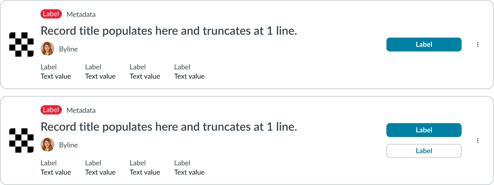
Now EVAM card record - list view
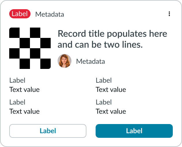
Now EVAM card record
Now EVAM card content
The Now-card-evam-content serves as a concise overview of a detailed object, prompting user interaction or exploration for further details. This component is exclusively found within data-set and content-set components, with the option to selectively hide or display its elements.
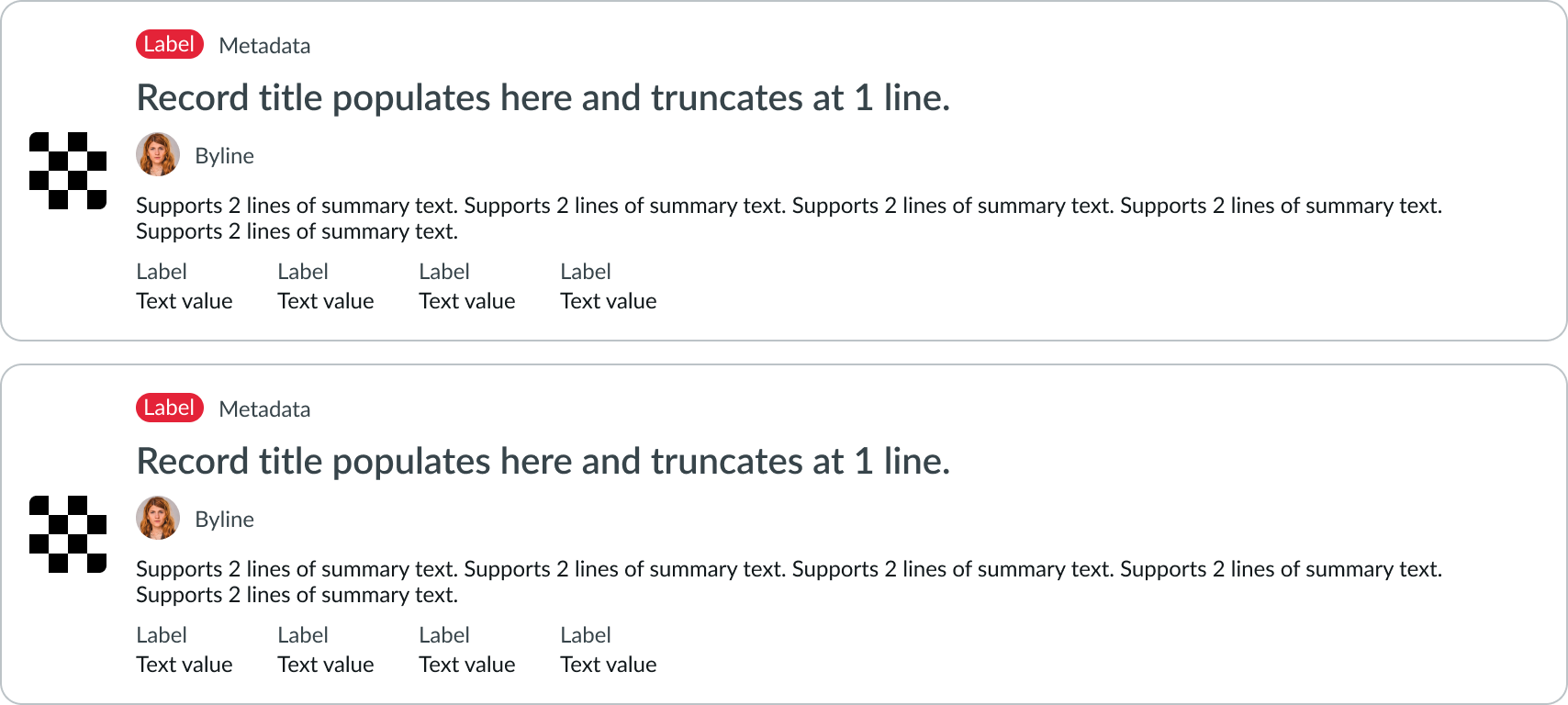
Now EVAM card content- list view
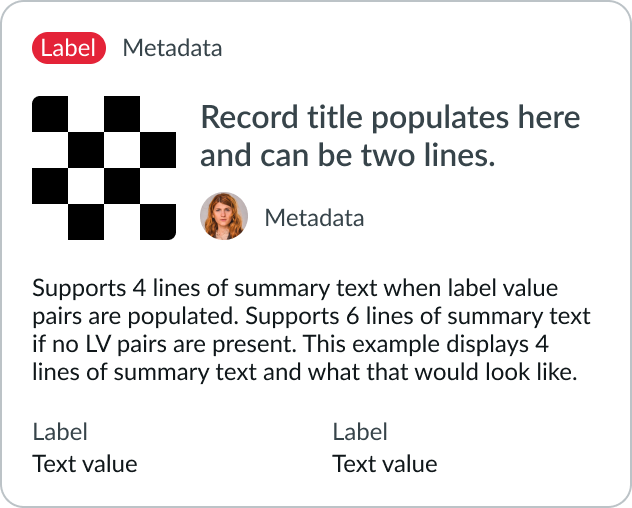
Now EVAM card content
Record card
They are placed within a kanban board that enables users to view and work with multiple records at the same time, with capabilities for organizing, tracking, and managing work.
| Variant | Example |
|---|---|
| Dashboard |  |
| Archive |  |
| Compact |  |
| Standard |  |
Search result card
These cards are used to represent a scrollable list view of search results that may be filtered in place and clicked for detailed views of search result card content. Different identifier representations such as icons, images, or avatars are available in various variants.
| Search Result Card | Example |
|---|---|
| No result |  |
| Article |  |
| Article with attachment |  |
| Catalog item |  |
| Person |  |
Data set card
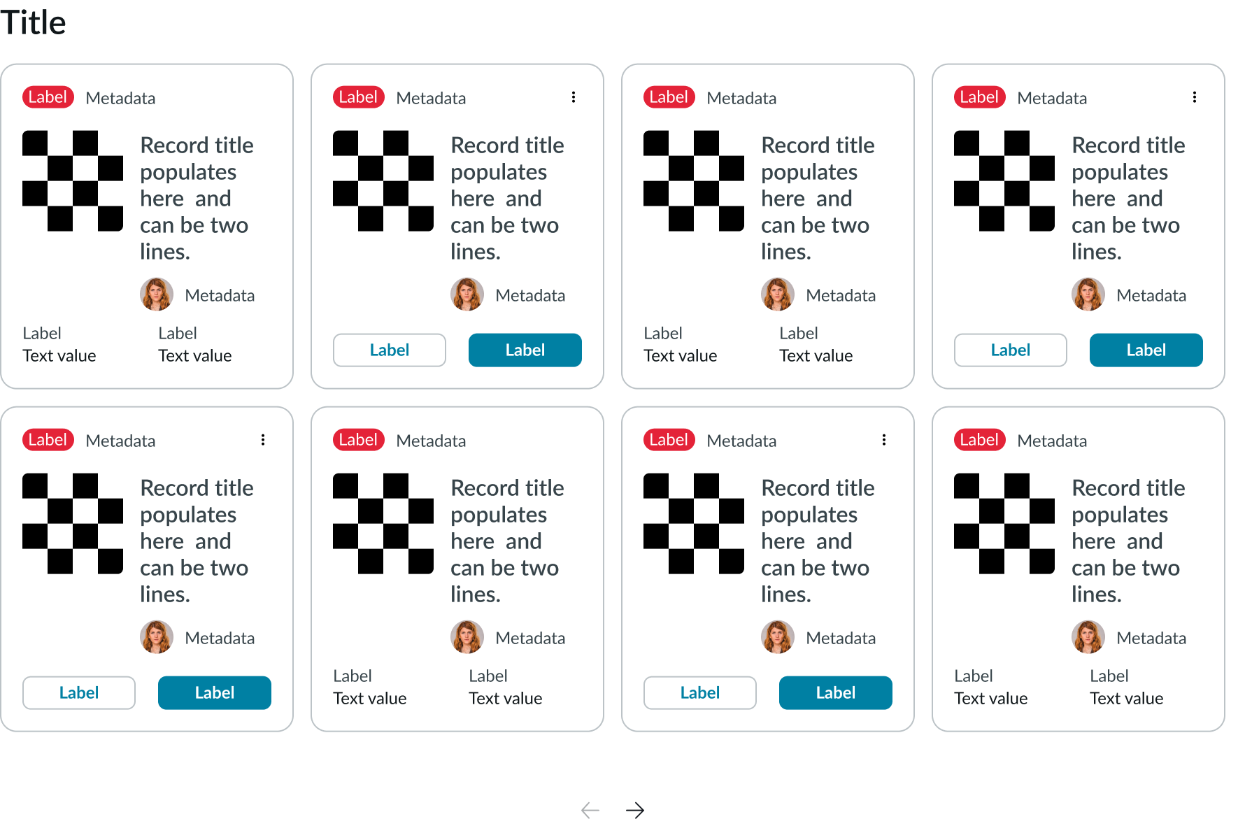
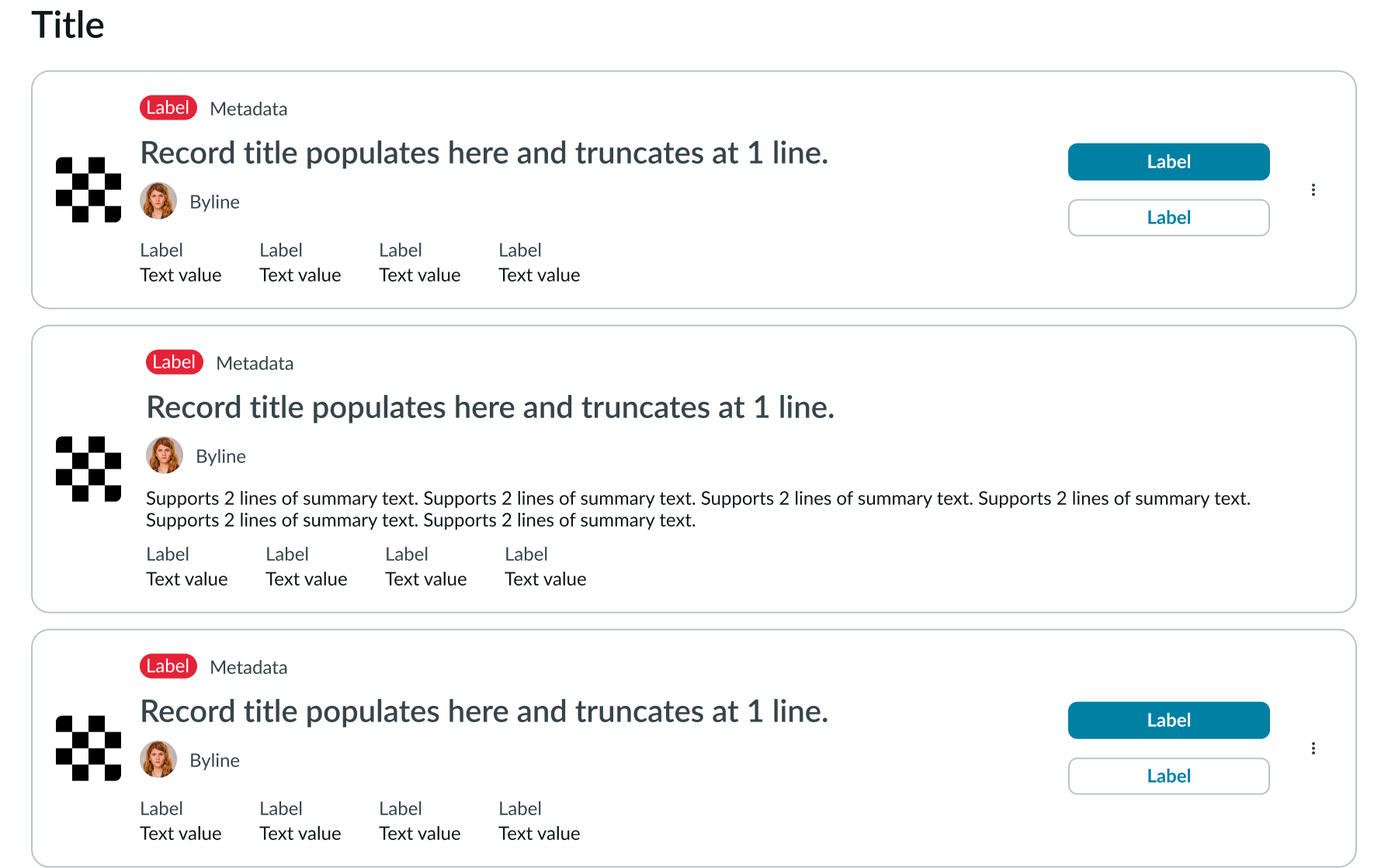
These components are utilized to showcase multiple cards within clearly defined layouts, including grid, horizontal, and vertical arrangements, and can also be employed within carousels.
Data set card view
A set of record cards that offer users configurable view types and filter options can be placed in form of a grid.
Data set list view
A set of record cards that offer users configurable view types and filter options can be placed in form of a list one below each other.
Data row
Data row is a single, scrollable row of cards containing actions that provide access to either a larger data set or to individual records. Now data row can be displayed in a horizontal or vertical orientation.


