

Anatomy
- Container: Area within the card that contains the card footer
- Content slot: Space for card text, an avatar, text link, tag, or iconic button
Usage
Use card footer for any low-priority actions or meta data associated with a card.
Configurations
You can add a maximum of two elements to card footer.
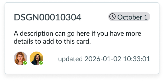
Avatar
Use an avatar to associate a user with a card.
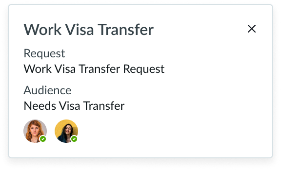
Avatars can provide a visual indication of the users associated with a task that the card displays.
An avatar appears at the bottom of a card to avoid distracting users from the card's content. You can display multiple avatars if you have enough space in the container.
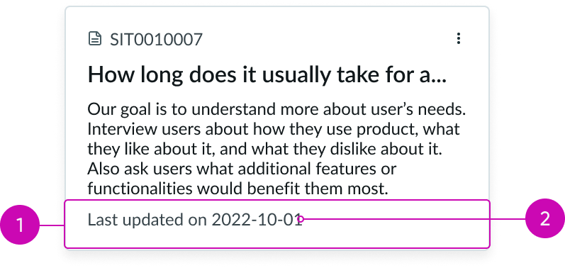
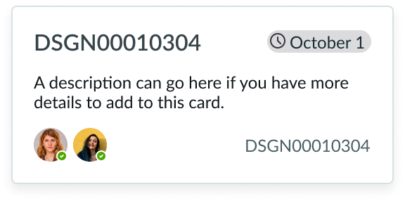
Metadata text
Use metadata text to display additional information.
The metadata in the card footer surfaces secondary information that may be useful to users.
Button bare
Use a bare button to surface secondary actions on a card.
In this example, the text link is an action that takes the user to a view with more information.
See usage guidance for text link
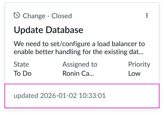
Highlighted value
Use a highlighted value to categorize a card.
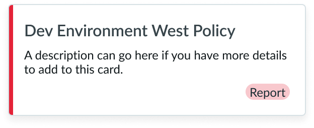
In this example, the highlighted value indicates a category for the card.
You can also use a highlighted value as a visual cue for priority or urgency. Position highlighted value on the right side of the card footer.
Button iconic
Use an button iconic to provide additional actions on a card.
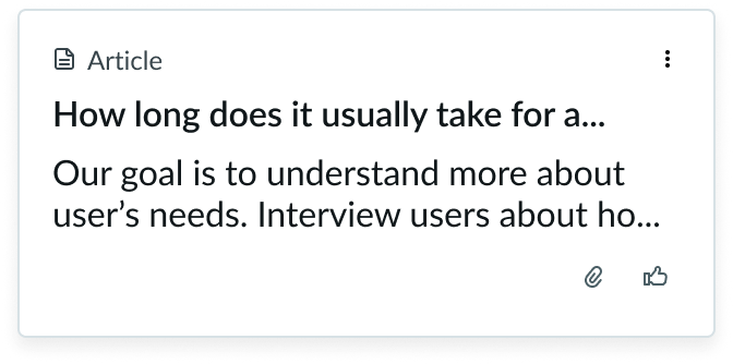
In this example, the iconic buttons offer additional actions to attach a file or to mark the card as helpful.
Position iconic buttons on the right side of the card footer.
See usage guidance for iconic button
Design Recommendations
Only include supplemental information in card footer.
Don't place redundant information or elements in card footer.
Alignment and positioning
The card footer will always be positioned at the bottom of the card. However, you can adjust how the content area(s) within card footer appear.
There are three different alignments: no split, equal, and unequal.
| Layout | Description | Example |
|---|---|---|
| No split | One content area fills the entire width of the footer. | 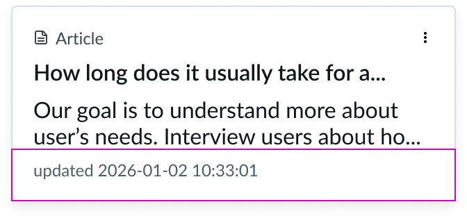 |
| Equal | Two content areas equally split the width of the footer. | 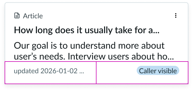 |
| Unequal | Two content areas that splits the width of the footer between two areas in 25% and 75%. | 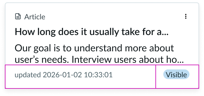 |
Behavior
Card footer behavior is dependent on the elements you use.
Usability
Internationalization
When the display translates to a right-to-left (RTL) language, the content flips and aligns from the right.
Accessibility
Note: An option in the user Preferences menu on the OS sets a tab stop on non-interactive text that truncates in this component, such as a title or label, and makes that text a tooltip trigger. The user presses Enter or the spacebar to open the tooltip and view the entire content. To enable this feature, set the Enable keyboard focus on truncated text option to true in the Accessibility panel of the Preferences menu.
Keyboard interactions
- Tab: Shifts focus to the first action if actions are part of the card footer configuration
- Enter or Space: Launches the action in focus