
Anatomy
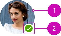
- Identifier: Distinguishes users from each other
- Presence icon (optional): Shows the online presence of the user
Subcomponents
See the usage guidelines for icon.
Usage
Learn how to use avatar for a card, global header, chat, or profile. Avatar can represent a user or show something the user is assigned to (like a task).
Cards
You can use a small avatar to identify users associated with a card.
In this example, three users are assigned to an activity in the card.
An avatar in a card can also provide visual information about a user.
In this example, an image avatar adds context to the user's profile information.
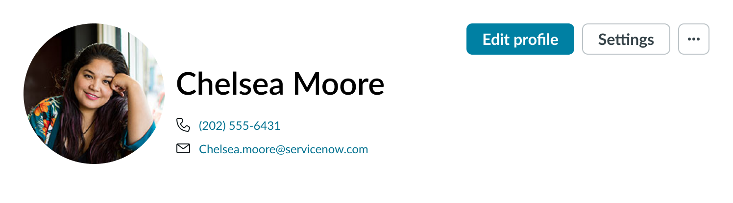
Global header
You can use a small avatar in a global header to indicate that a user is signed in.
In this example, the image avatar is a visual reminder that the user is signed in.
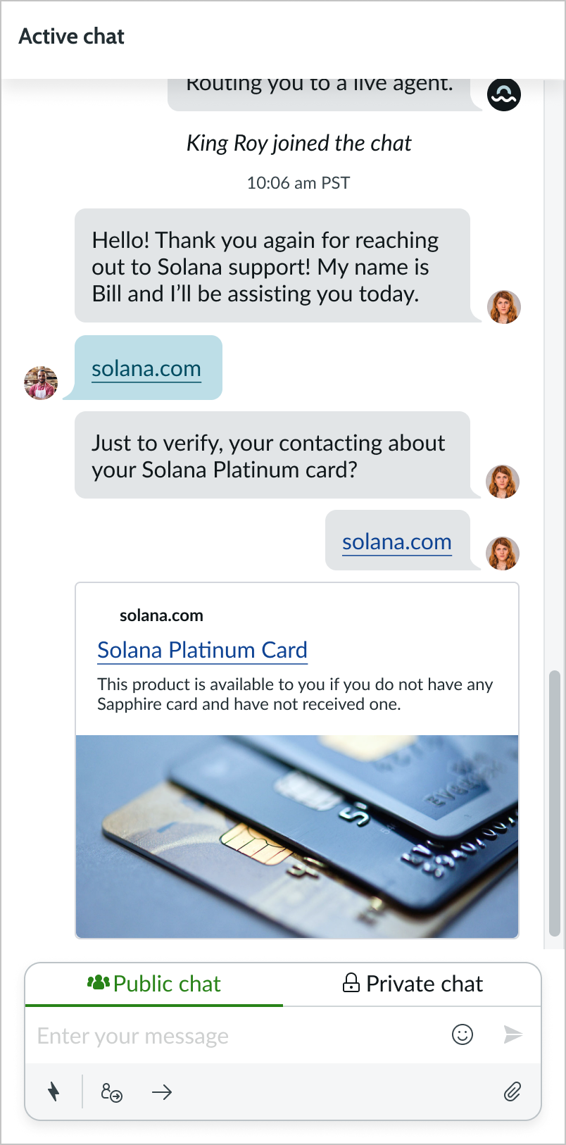
Chat
You can use a medium avatar to identify users in a chat.
In this example, the image avatar adds context to the user's profile information.
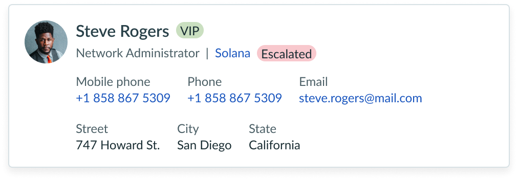
Profile
Use a large or extra-large image avatar in the user's profile to help distinguish users from one another. A user can also change their image by editing their profile.
In this example, the image avatar highlights the user's personal information.
Variants
Learn about avatar and find out how to use it in your design.
Types
The user avatar has the following types. If more than one is set, image is the highest priority moving down the list to the lowest priority anonymous icon.
| Type | Usage | Example |
|---|---|---|
| Image | You can display this avatar if a user has uploaded an image file. |  |
| Icon image | You can display any existing icon as an avatar icon – including icon component custom images. |  |
| Initials | You can display this avatar if a user has provided their first and last names. |  |
| Anonymous icon | You can display this as the default avatar or show it when a user's image or initials aren't available. |  |
Sizes
Avatar has the following sizes: extra-small (xs), small (sm), medium (md), large (lg), and extra-large (xl). The size you choose depends on your use case.
Extra small
Use the extra-small avatar with a small pill.
Small
Use a small avatar for a page header or banner to show the relevant user, such as someone signed into their account.
Medium
Use the medium size when you're identifying a user within a list or other component (like a card). Medium is the default size for the component.
Large
Use the large size when you're displaying a profile view page.
Extra-large
Use the extra-large size to distinguish a user on a profile edit page.
Configurations
Learn how to customize avatar by configuring the available properties.
Interactive property
The Interaction property controls how an avatar responds to user interactions. By default, this property is set to “None,” but you can change its value to determine how the avatar behaves when a user selects it.
None
In this example, the interaction property is set to “None.” The cursor remains the default arrow, indicating that the avatar does not respond to user interactions.
Button
In this example, the interaction property is set to “Button.” The cursor changes to a pointer cursor, indicating that the avatar can be selected like a button.
Link
In this example, the interaction property is set to “Link.” The cursor also changes to a pointer cursor, indicating that the avatar can be selected to follow a link.
Presence icon
You can configure the optional presence icon with the avatar in any of the following states to show the online status of a user. The presence icon always appears in the lower right of the avatar.
| Status | Example |
|---|---|
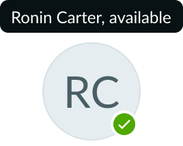
| Available |  |
| Busy |  |
| Away |  |
| Offline |  |
Tooltip for username
The default tooltip shows text with a full username and a status to help identify an avatar with initials only. The tooltip can be disabled if it's a distraction or not needed.
By default, the entire name is displayed in a tooltip. For a compound name, the avatar only shows the initials of the first and last names (for example, Nicholas-Allen Moon).
Design recommendations
Learn how to apply avatar in your design.
Use consistent avatar sizes when displayed together.
Avoid using a mix of avatar sizes that display together. This creates design imbalance.
Consider small or medium avatar sizes to complement the visual balance of surrounding elements.
Avoid using a large or extra-large avatar if it disrupts the visual balance of surrounding elements.
UI text guidelines
If you include a tooltip on hover, consider what information would be most useful for the person to know (like name or title).
Behavior
Learn how avatar behaves when the display changes or a user interacts with the component.
States
Avatar doesn't have any states. However, the subcomponents within avatar have their own states. If you include a presence icon with the avatar, it displays the user's online status. A tooltip will also appear in the hover state that displays the user's online status and full name.
Interactions
Learn how avatar responds when a user interacts with it.
Selection
Depending on the interaction property setting, users can select the avatar to trigger an associated action or open a link.
If the interaction property is set to “Button” or “Link,” users can select the avatar, indicated by the pointer cursor.
Tooltip
When hovering over an avatar, the tooltip automatically appears.
Hovering over the avatar triggers a tooltip that displays the username.
Usability
Avatar complies with all internationalization and accessibility requirements.
Internationalization
The avatar's appearance doesn't change when the display translates to a right-to-left (RTL) language. However, if you're using a presence icon with an avatar, the presence icon flips its position to the left side of the avatar.
Accessibility
Learn how to access the actionable elements of avatar through keyboard interactions.
If an avatar is an image by itself and not actionable (no links, tooltips, or buttons) the minimum requirement is an alt description identifying the user and their presence status (for example, "Jane Jones is online").
- If an avatar icon is actionable, the icon should be part of the tab order on the page and have keyboard actions.
Keyboard interactions
You can access the actionable elements of avatar with these keyboard keys:
- Tab: Moves focus to an avatar if that avatar has any associated actions
- Space or Enter: Selects the avatar and opens any applicable actions; for example, when the avatar is a dropdown for profile information