
Understanding page navigation and app shells
Your page navigation is determined by the app shell you select. Workspace generally offers two options for page navigation: breadcrumbs and tabs.
Workspace navigation can't be easily changed once you start implementation.
Consider the following navigation options carefully.
Tabs
Tabbed navigation is provided by the workspace app shell. Tabs allow users to open each record in a separate tab, group related records, and quickly switch contexts between incidents, cases, and other info.
Use tabs when…
- Your users are managing multiple concurrent record sessions.
- Your users are trying to resolve as many tasks as possible as quickly as possible.
- They need or want access to multiple records at a time.
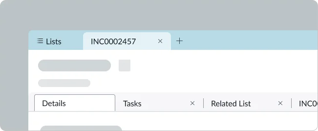
Workspace tabbed navigation with sub-tabs
Breadcrumbs
Breadcrumb navigation is provided by the breadcrumb app shell. Breadcrumbs simplify the nav experience, limiting users to a single view at a time. This allows space to create more focused, web-app-like views of a single task. Breadcrumbs also display in a hierarchical structure at the top of the workspace as the user navigates through their flow, so they can easily see where they’ve been and how information is connected.
Use breadcrumbs when…
- Your users are generally focusing on one task at a time.
- They’re working on “long-tailed tasks” that may take days or longer to resolve.
- They need an understanding of underlying data, hierarchy, and organization.
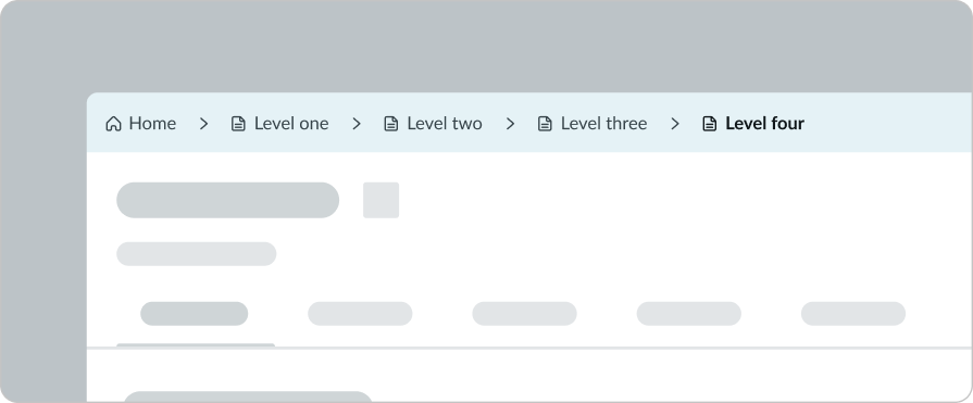
Workspace breadcrumb navigation
Blank
Blank navigation is provided by the header app shell. This is an advanced option that would require substantial design and engineering effort.
Use blank navigation when…
- You need to build a custom experience, but want to keep some of the core functionality provided with a workspace.
Understanding pages
Pages are containers you use to structure the content in your workspace layout. Workspaces have three basic page types: landing pages, lists, and record pages.
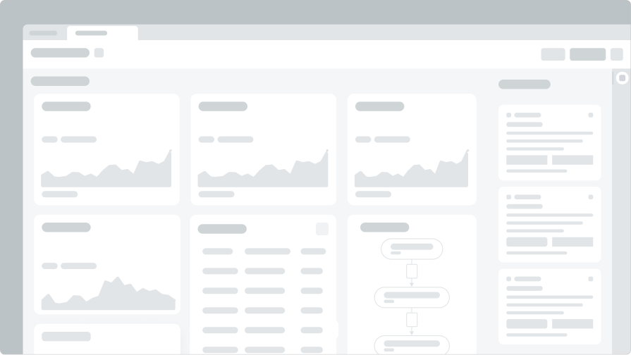
Landing page
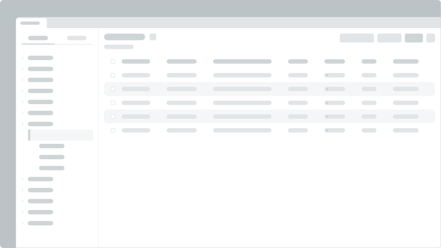
List page
Record page
Landing pages
Landing pages quickly orient users to a workspace, help them understand status, and identify the work that needs to be done. They should be used to drive a user to act and focus on the next best thing to do during their workday.
Is a landing page the same thing as a dashboard?
While landing pages may look like dashboards, it’s worth keeping in mind that they serve different purposes and are built using different technical frameworks. Landing pages support the work that needs to be done now, while dashboards support analytical tasks like tracking progress or understand patterns.
Lists
Lists are used to group records related to user workflows and make them easily accessible. You can configure default lists and show or hide relevant information based on your understanding of what different user roles will need access to. Users can also modify their view of the default lists and define their own custom lists.
The list menu can be launched from the side navigation and enables users to see all records of a specific type, or curated views of the data available to them.
Record pages
A record is an instance of data from a table on the platform, like an incident or a case. A record page is used to display the details of a specific record. You can tailor record pages to show the relevant details and actions a user might need to complete their task. Workspace users are often working with multiple records at a time to get their work done.
As you create your workspace, you can decide how to use the following elements on each record page to optimize the efficiency and efficacy of your teams.
Record page anatomy
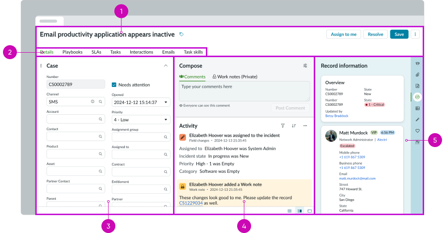
Workspace record page anatomy
How are "related tabs" different from the tabs provided by the primary record nav?
Related tabs are the tabs that appear below the record tabs in a workspace. They provide users easy access to related records while keeping everything organized under a single record tab. They aren't part of the record's app shell.
Record header
The record header provides context for the specific record, and includes the record title, name-value pairs, tags, and actions.
Keep in mind: Header height
Limit the header and content vertical height to avoid pushing the page content lower on the page. This will ensure the core tasks are visible above the page fold.
Label-value pairs (optional): Use the label-value pairs to give users insight into the record by pulling contextual values from the record form.
Record tags (optional): Use record tags to allow users to tag records at three distinct scopes: Me, Groups and Users, and Everyone. When users add a tag to a record it allows the creation of custom lists within the List module filtered on the defined attributes.
Actions: The record header provides users with core actions pertaining to the intended workflow. The default action for records is the save action. However, actions are configurable, and the header can contain any number of actions required.

Record header with actions
Keep in mind: Actions
- Limit the number of actions you provide to 3. If you include more than that, it becomes harder to choose the right one and can decrease user productivity.
- Minimize the word count on an action button. Keeping the label short improves the users ability to scan.
- Group related actions into a split button, and prioritize the actions by order of importance. Grouping will keep the related content together and minimize the button real estate impact within the header.
- Only include one primary action button. Multiple primary action buttons creates competing focus and makes it harder for users to make a choice. If everything is visually important, then nothing is visually important.
Related tabs
You can add related tabs to allow users to see additional information tied to a specific record. The content in related tabs should be relevant content that's commonly needed for a user to complete their workflow.
If your record has a lot of related lists, you can show them as a single related tab containing a list selector and list pane.
Keep in mind: Tabs
Too many tabs clutter the layout and make it harder for users to find information. To minimize the number of tabs on the page, consider placing related info in a lookup and verify component, which provides a subset of fields directly on the record.
Record form
Use a record form to enable users to edit and update record data.
Learn more about how to build a form layout with Form Builder.
Activity stream
By default, record pages include the activity stream. The activity stream is a list of entries in records and conversations, such as journal fields, comments, and work notes that display chronologically.
Use the activity stream to allow users to track changes, comments and system actions that have occurred across the record.
Contextual side panels
The contextual side panel is a persistent panel that provides related information, templates, knowledge base, tasks, recommended actions, and any custom components. The component persists across a record session tab — and enables users to easily reference information or leverage tools for their workflow. Think of this component as a multi-purpose tool.
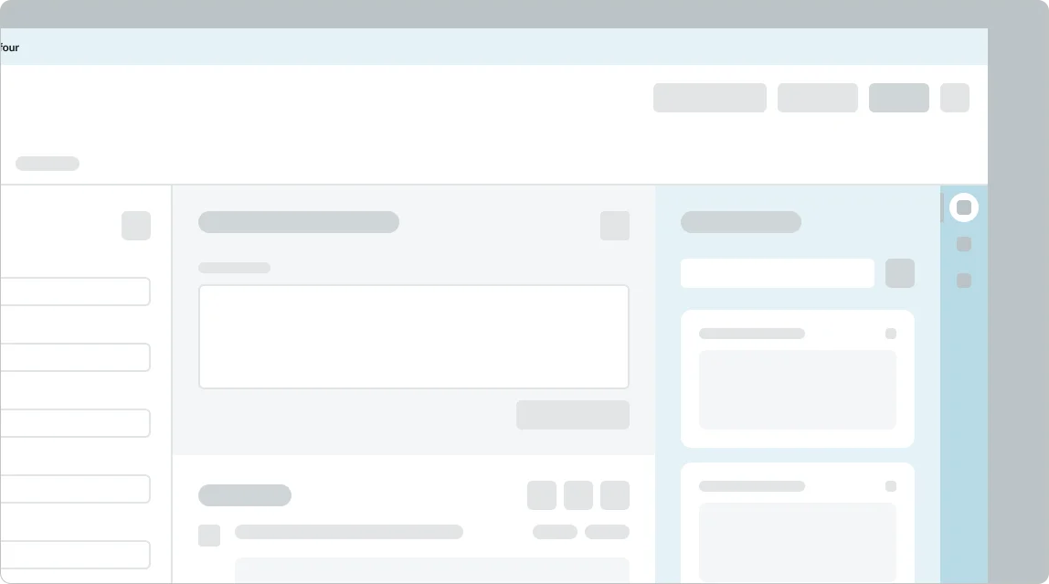
Contextual side panel
Keep in mind: Contextual side panel
- To default to a collapsed state, you need to disable Show the sidebar setting in Workspace preferences.
- Limit contextual side panels to ones your user will actually need to use. Providing too many options can overwhelm and make the experience less usable and useful.
- Prioritize panel options to reflect the user workflow from beginning to end.
For more info, view the contextual side panel pattern.
Playbooks
Use playbooks to help agents visualize workflows in a simplified, task-oriented view, reducing the time needed to understand and resolve cases.
Forms
Form fields are the basic elements for managing a record. Careful planning of a form will impact a users ability to complete a workflow with efficiency.
Keep in mind: Forms
- Minimize the number of fields to reduce clutter in a form. Saving vertical space limits the users need to scroll and search for fields. Consider removing fields that are rarely used.
- Group related fields into sections to make things easy to find. Logical groupings create break points for users and make things more scannable.
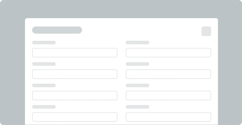
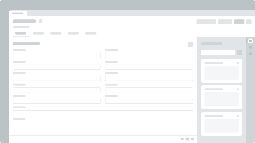
Form component
Modals
Modals are intended to draw focus to a singular task, and prevent users from accessing content from the information behind. Leverage modals for alerts or tasks that does not depend on information from the associated record. If the task requires copy and paste from the record, then a modal will prevent user access.
Keep in mind: Modals
As an alternatives to modals, consider placing the content in a modeless dialog or contextual side bar. Both options allow users to input info while maintaining access to the content in the record.
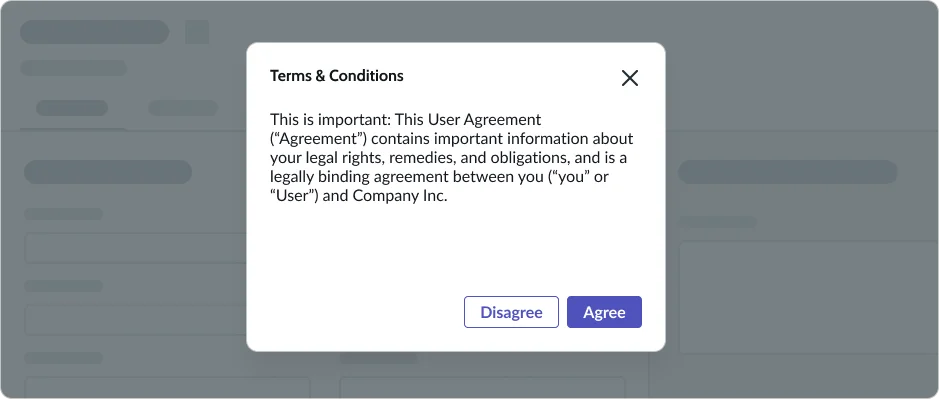
Modal
Configuring pages
Modular components make it easy for you to tailor your workspace to meet the needs and expectations of your target audience. UI Builder is the application you'll use to work with those components on the Workspace app framework.
UI Builder helps you manage and organize components on your workspace pages.
The application also allows you to create multiple variants of each page with different components and data for each role or persona you're building for.
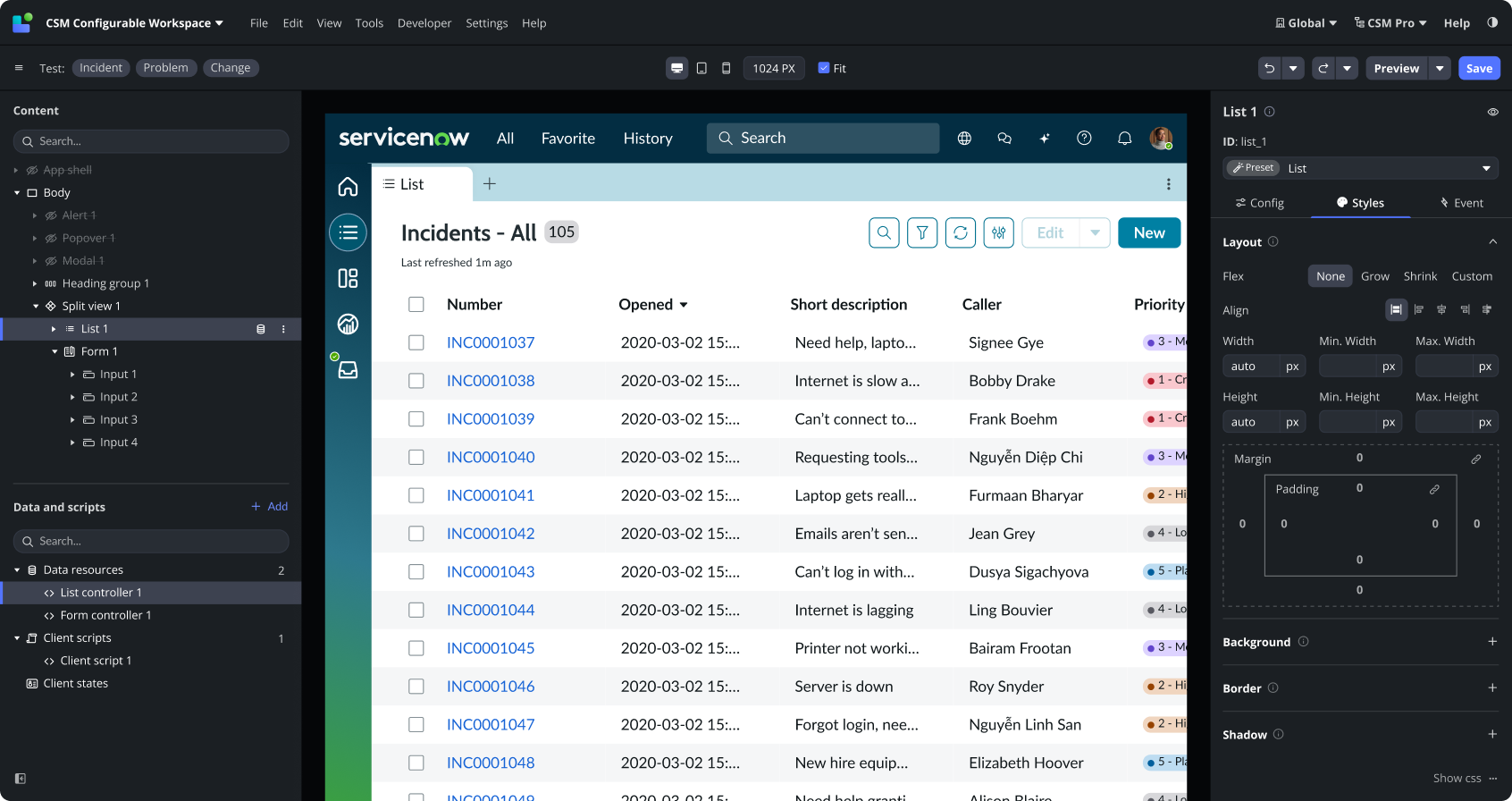
Screenshot of UI Builder editing a list component in a container.
Building custom components
If you need a component that isn't currently available in our component library, you can use the component building UI in UIB to create custom components.
Theming
Use Theme Builder to apply theming across your instance with a series of simple configurations.
Configure the following elements with Theme Builder:
- Logo: company or brand logo
- Color palettes: interface colors that represent your brand
- Font family: change the globally applied fonts
- Corner shape: define shapes of on-screen components
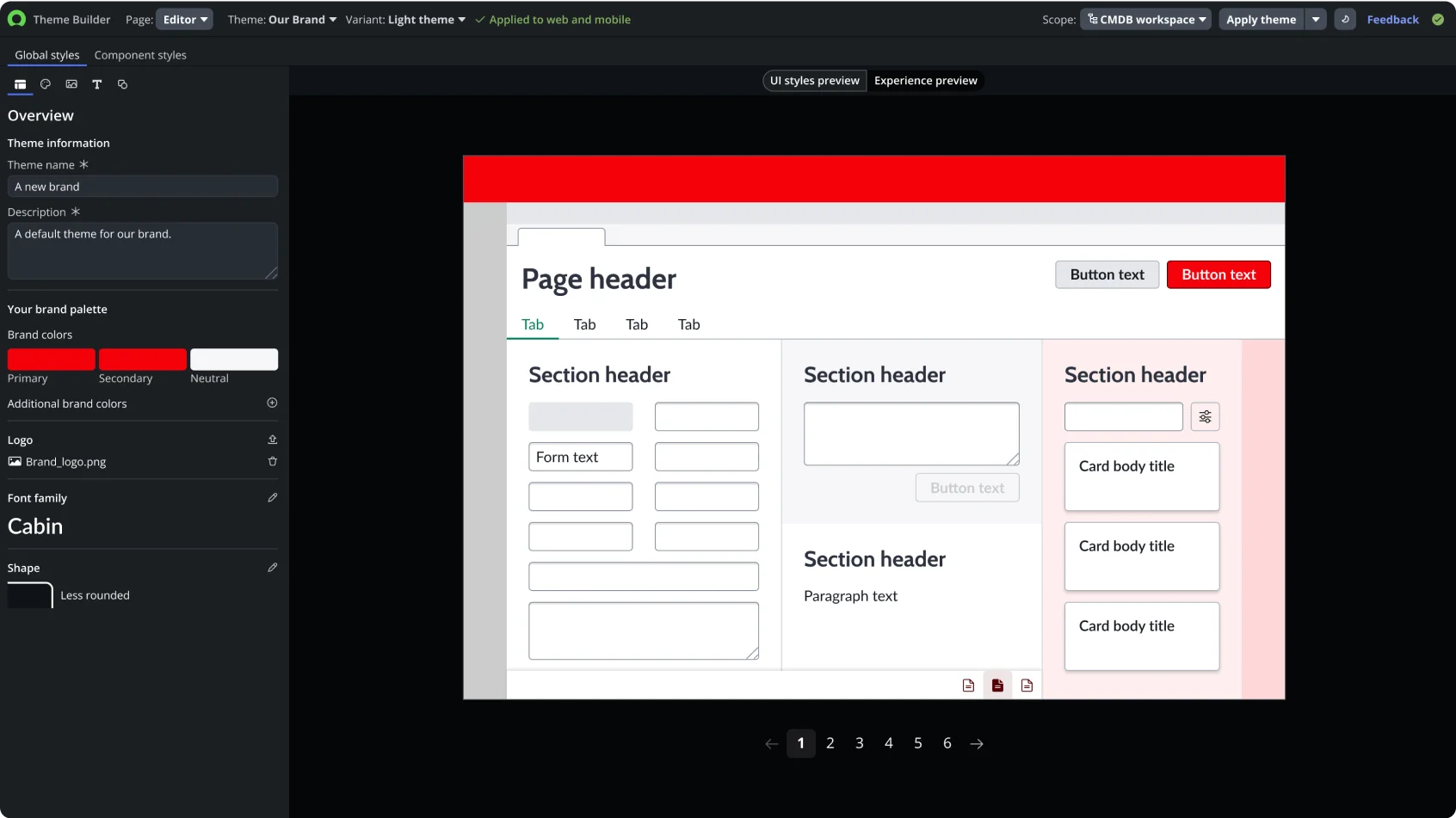
Screenshot of Theme Builder with a custom theme already configured in the left panel.