

Anatomy
Learn about the individual parts of Lookup.
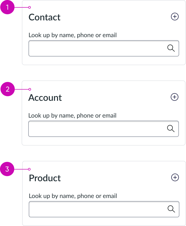
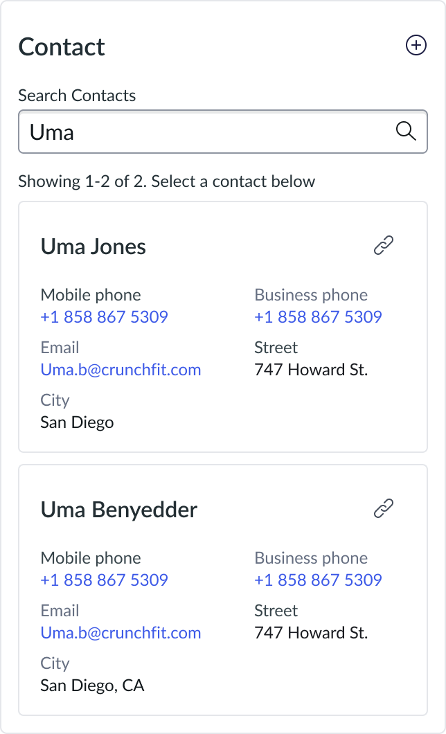
Search card anatomy
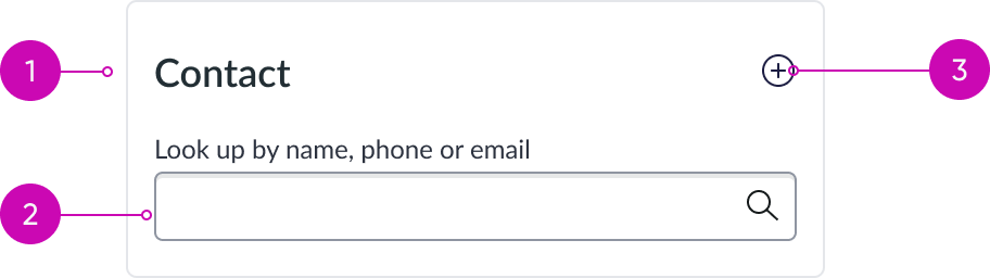
- Reference type: Heading, with link disabled
- Search input: Enables users to easily find any tables
- Create button: Adds new contacts, accounts, or assets
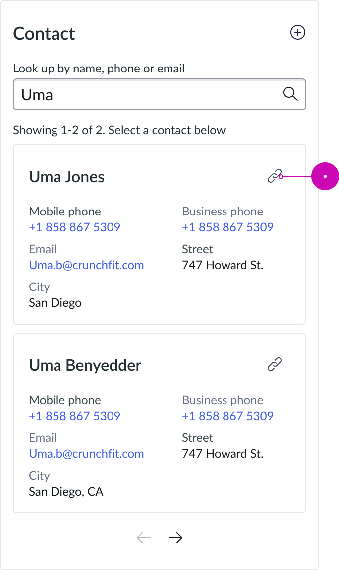
Search results anatomy
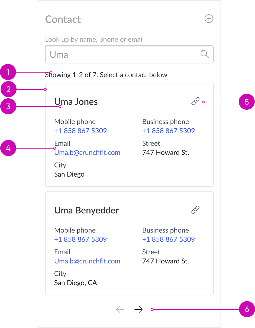
- Number of records: The total number of records available and how many are displayed
- Results card: Card with card header and body with contextual action enabled
- Record name: Header leverages heading sub-component with link enabled
- Record information: Stacked label value component provides information from the assigned record; configured by the admin in UI Builder
- Link button: Enables agents to quickly connect accounts, assets, or contacts to a specific case. Admins can configure the link button to display or not; default is to display.
- Results pagination: Leverages pagination control sub-component, displays navigation arrows; helps navigate between search pages
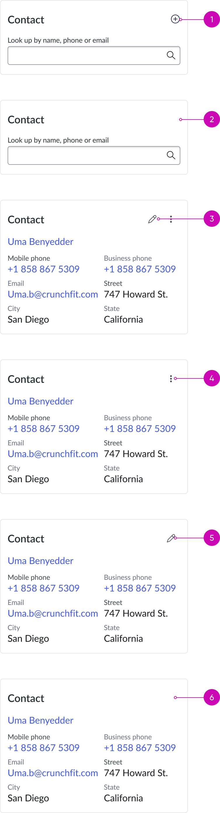
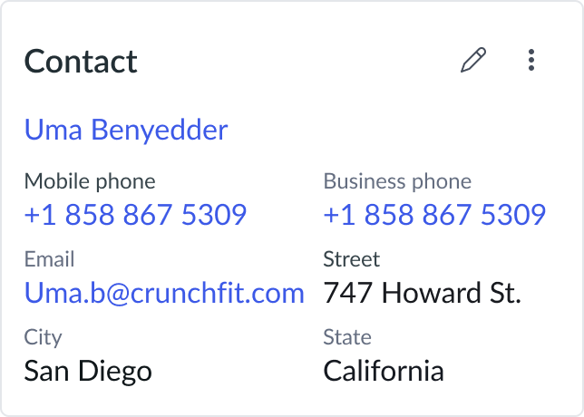
Search results card anatomy

- Edit action: Header leverages heading sub-component, with link enabled; refer to heading component for specifics
- Ellipsis action: Opens a dropdown menu with user actions, edit and unlink
- Record information: The stacked label value component provides information from the assigned record, configured by the admin in UI Builder
- Unlink action: Leverages dropdown sub-component; this action reverts the component back into a ‘search’ state to find another record to link to the record you are viewing
Search results card anatomy with one action
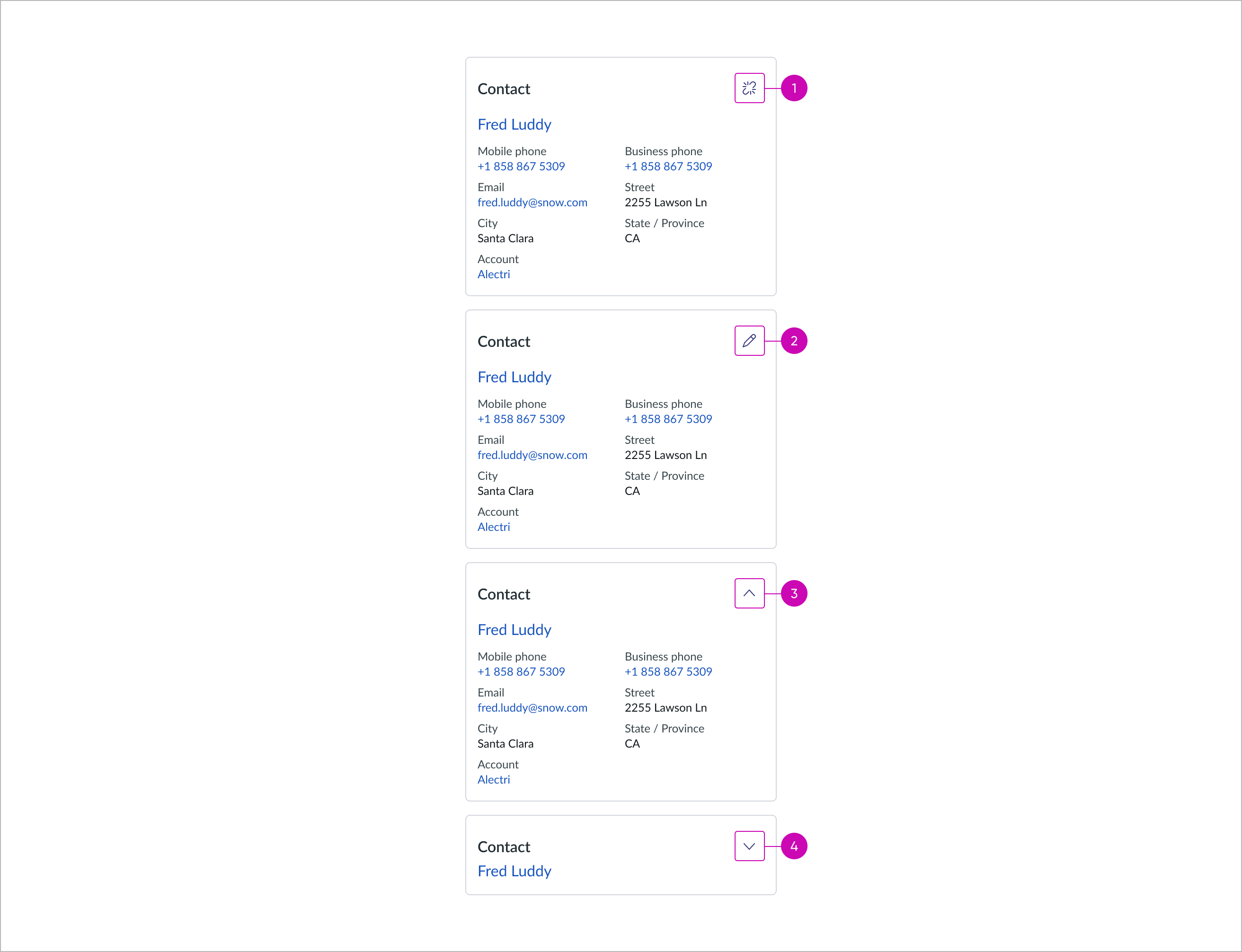
- Unlink action: Unlinks the lookup card, returning it to its default state
- Edit action: Allows user to modify the content of the lookup card
- Collapse option: Hides the content of the lookup card
- Expand option: Displays the content of the lookup card
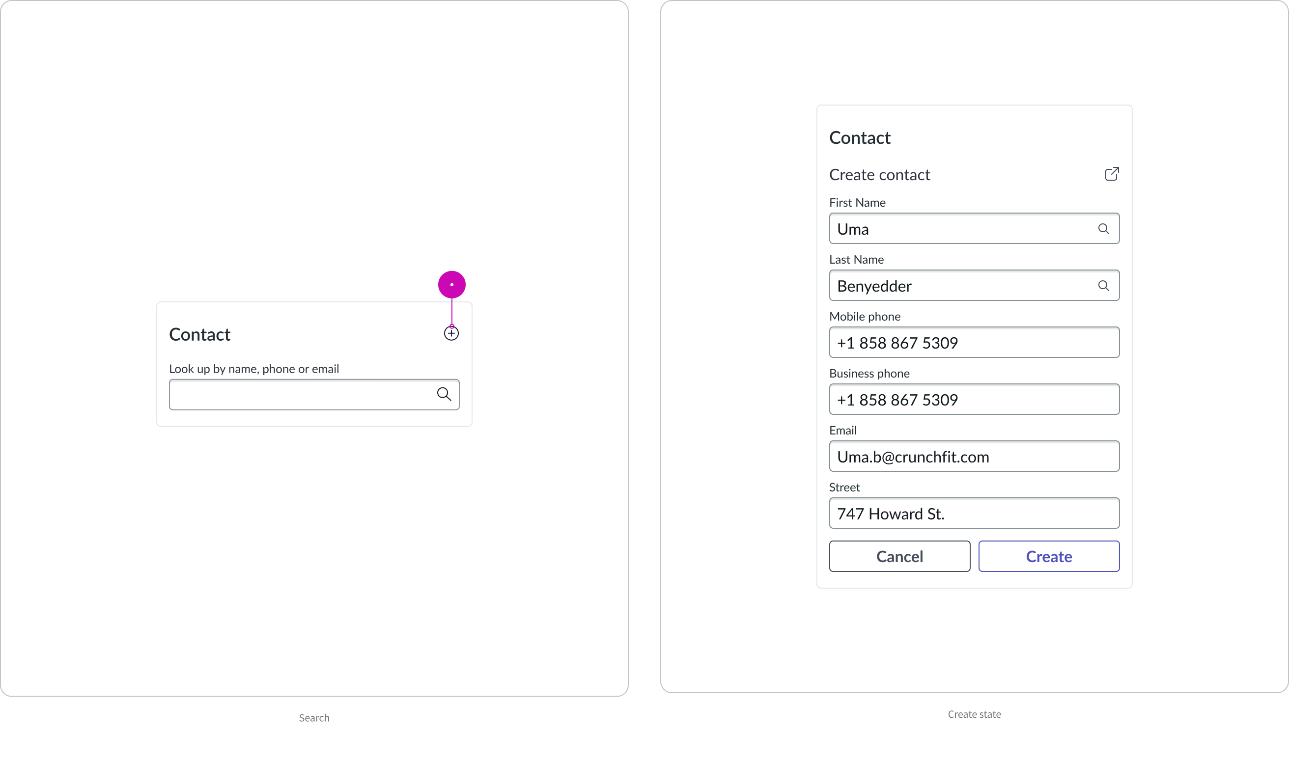
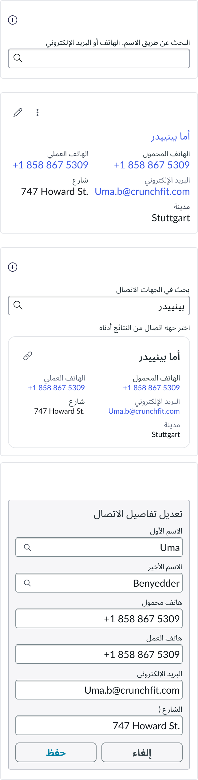
Create and edit card anatomy
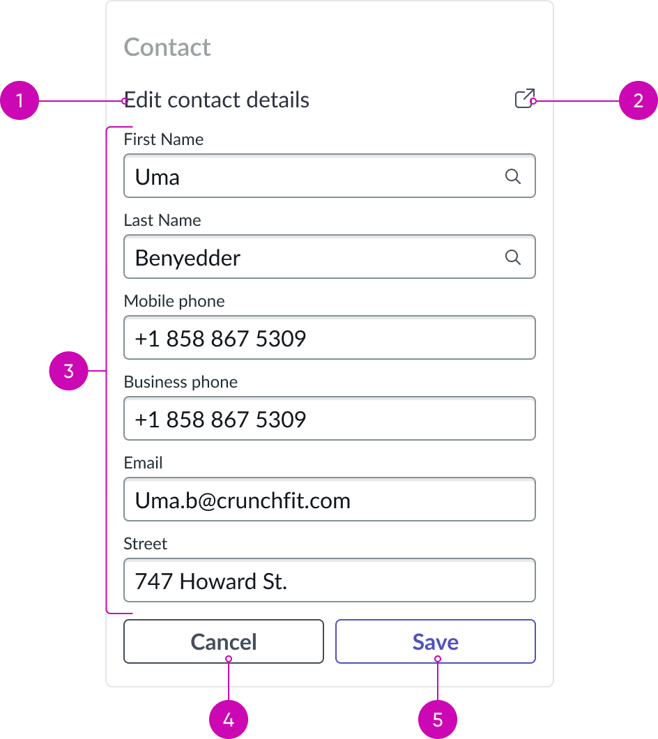
- Subtitle: Leverages heading sub-component; this heading provides context of this view that displays upon editing a contact contextually in the lookup component
- Open in child tab action: Leverages button bare variant; this action opens the contact record in a child tab to provide more room to edit the contact details
- Form: Leverages form sub-component; displays a form view of record fields from the record you’re editing
- Cancel action: Leverages button sub-component; reverts any form changes and component directs back to the ‘linked’ view of record
- Save action: Leverages button sub-component; updates the associated record with the changes made. Component directs back to ‘linked’ view of the record, reflecting the new changes made in the edit contact details.
Usage
Learn about how to use record lookup to satisfy different use cases.
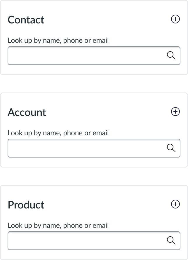
Variants
You can configure these variants for different tables in the instance. The table and the defined data is configurable.
- Contact: Displays information about a specific ‘account’ record type
- Account: Displays information about a specific ‘consumer’ user type
- Product: Displays information about a specific ‘asset’ user type
Configurations
Learn how to customize Record lookup by configuring the available properties.
Presets and controllers
This component has a preset configuration that sets properties and event handlers, making it ready for use. You can override preset values with a custom configuration if needed. Preset values won’t upgrade with updates. To avoid using presets, configure manually. One preset can apply to a single component instance. See presets for more info.
A preset is linked to a controller, which serves as a data resource. Controllers provide configuration data and event bindings for the component. Selecting a preset adds the required controller to the page, allowing new components to use its preset. For more on controllers, see controllers. For default presets, see view properties and events in the controller API.
Configurable header
Admins can configure the options available in the header of the lookup component to meet different use cases.
- Creation option (on): Enables the 'Create New' button that allows users to add a new contact, account, or asset.
- Creation option (off): Disables the 'Create New' button to indicate users are unable to add new contacts, accounts, or assets.
- All options (on): Enables the 'Edit' and 'Unlink' actions so users can modify details or disconnect contacts, accounts, or assets from a case.
- Modify option (off): In certain scenarios, the 'Modify' function may be unavailable, limiting the ability to modify details of contacts, accounts, or assets.
- Unlink option (off): In certain scenarios, the ‘Unlink’ function may be unavailable, limiting the ability to unlink the record.
- All options (off): In certain scenarios, both the 'Modify' and ‘Unlink’ function may be unavailable, limiting the ability to modify details of contacts, accounts, or assets.
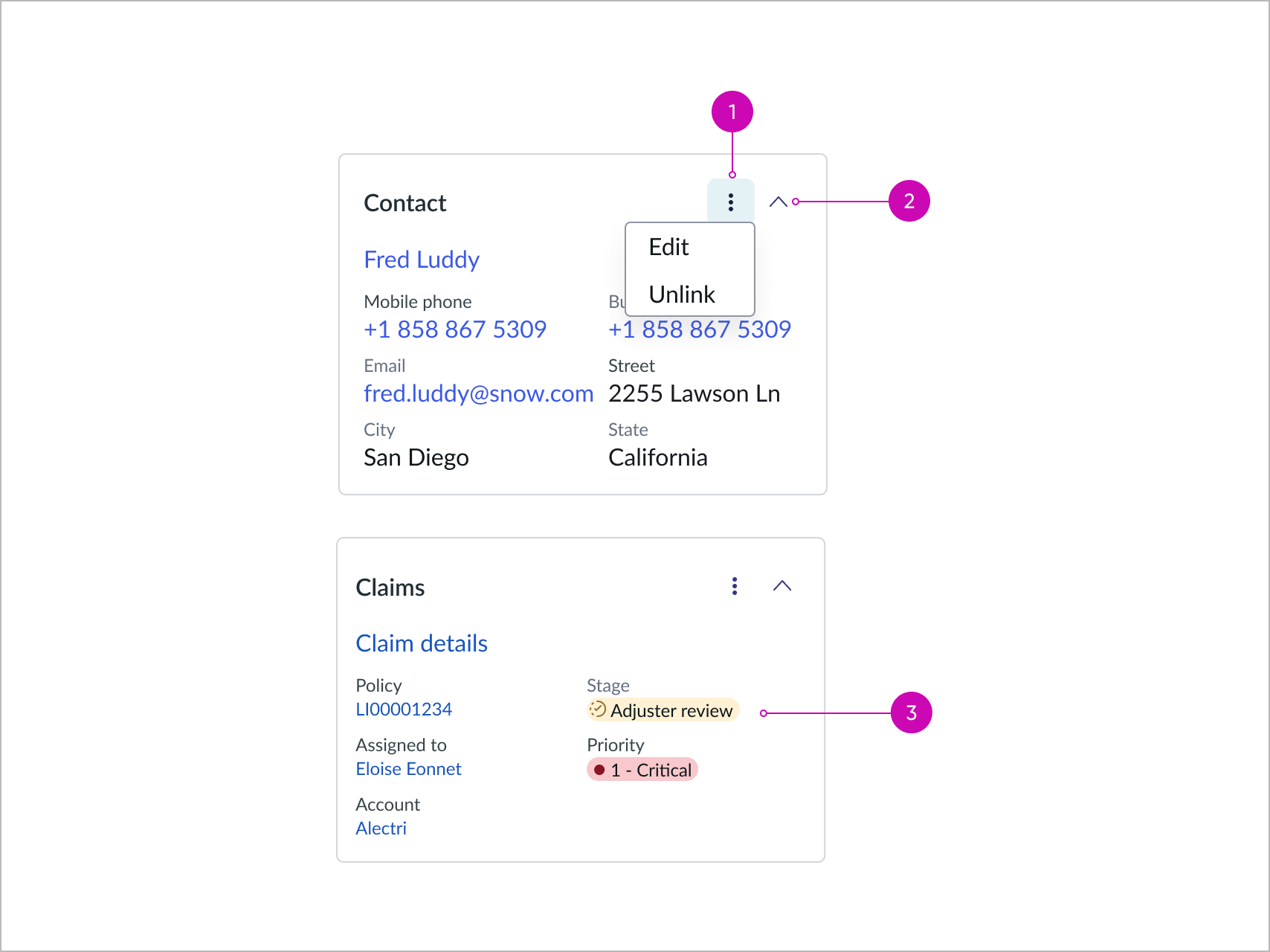
- Ellipsis action: Opens a dropdown menu with user actions, edit and unlink.
- Collapse and Expand option: Toggles the visibility of the linked card content fields; select this option on the Linked card configuration panel to enable; this option is disabled by default.
- Highlighted value: Fields with highlighted value display in linked card.
Type of reference
You can configure lookup to use different tables and data according to your use cases. The following are examples of the reference types.
Behavior
Learn how record lookup behaves when the display changes or a user interacts with the component.
States
Lookup has the following empty states: Unconfigured, No search results, and Error.
| State | Example |
|---|---|
| Unconfigured | 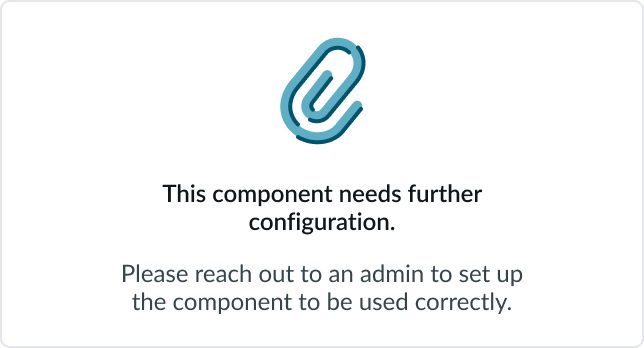 |
| No search results | 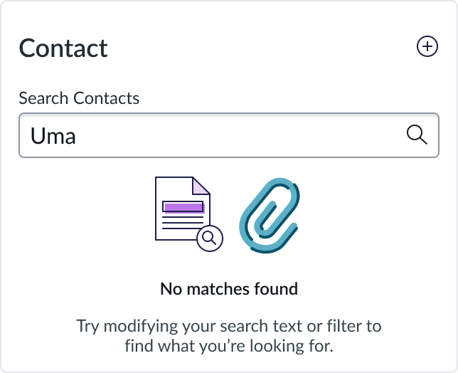 |
| Error |  |
Responsive behaviors
Learn how record lookup responds to changes in a container or display.
Resizing
The component resizes based on its container. The component is responsive in nature, so it adapts well with 200% zoom changes. Label value pairs stack into a single column at high zoom levels.
Interactions
Learn how record lookup responds when a user interacts with it.
Create button
When the user selects the create button, a creation form appears.
Link button
When linking a record from the results screen, the user is taken to a record view that shows information about the linked record.
Edit button
When viewing a linked record in the lookup component, there is an option to edit the record contextually. Select the button to see a form view of the options.

Unlink button
When viewing a linked record in the lookup component, there’s an option to unlink the record. Select this button to return to the search state. The unlink action displays directly as an icon on a lookup card when it's the only available action, allowing agents to remove links without opening an overflow menu.

Text hinting
When starting to type, shows a preview from the type ahead indicating how many characters you need to type in order to see results.

Collapse and Expand button
Select the caret to hide content and only display the card title and its actions. When the Show record link setting is enabled, the collapsed state displays the record link.
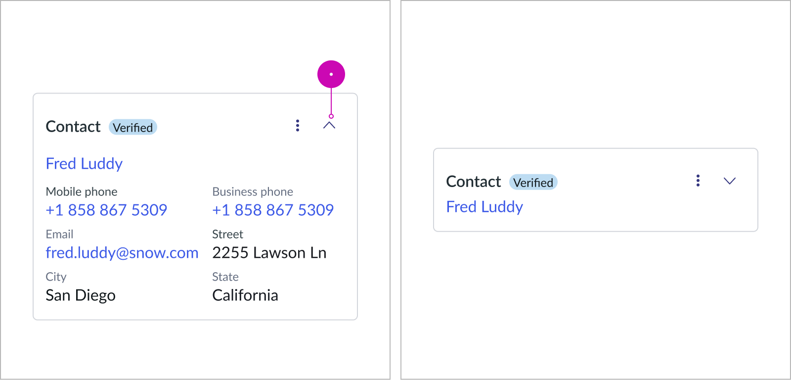
Expanded and collapsed state while the Show record link property is enabled
When the Show record link setting is disabled, the record link is always hidden, whether the card is expanded or collapsed.
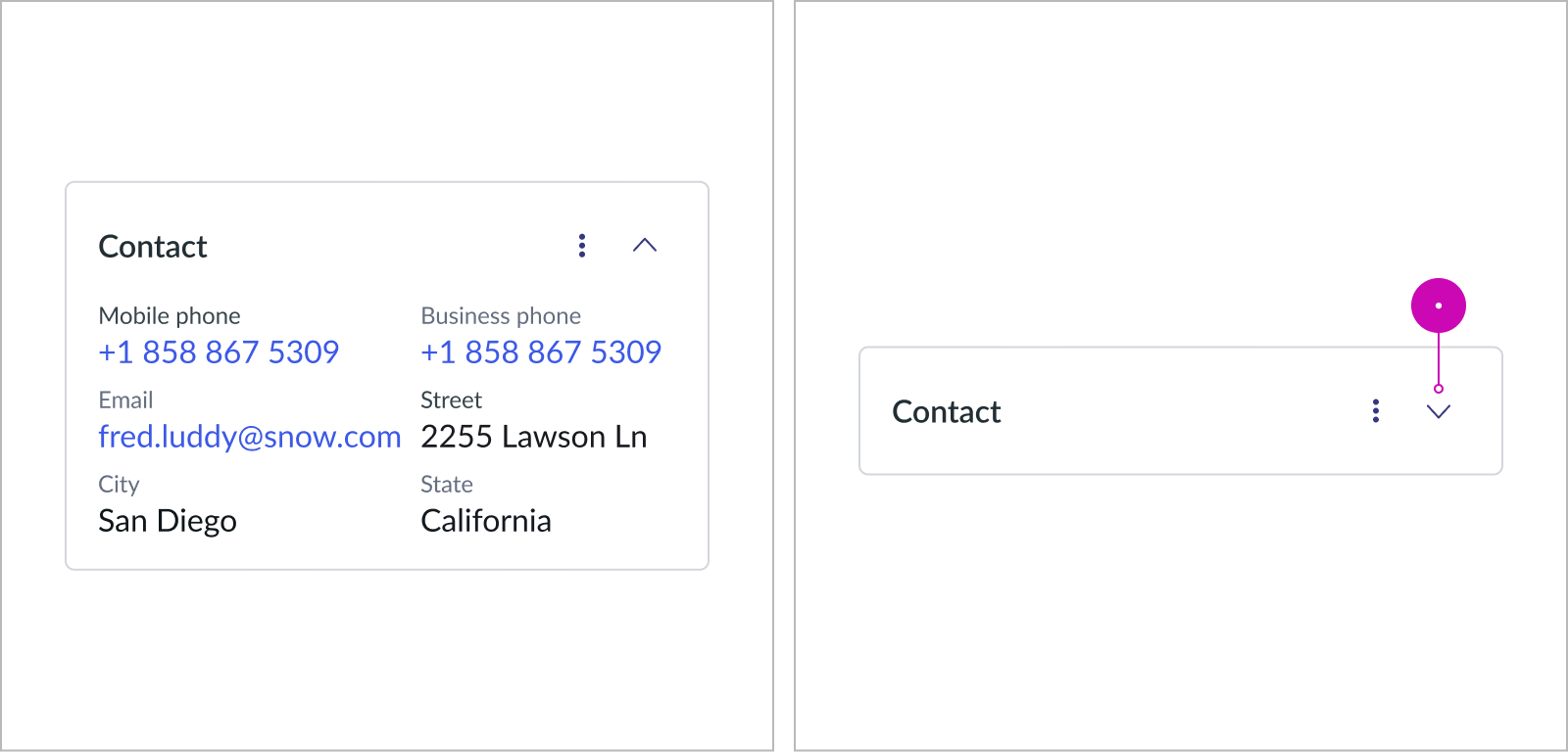
Expanded and collapsed state while the Show record link property is disabled
Usability
Learn how record lookup responds when a user interacts with it.
Internationalization
Record lookup complies with all internationalization and accessibility requirements.When this component is used in a platform configured for a right-to-left (RTL) language, the text rearranges accordingly.
Accessibility
Learn how to access the actionable elements of record lookup through keyboard interactions and screen readers.
Record lookup tab order
This is the tab order for record lookup.

Keyboard interactions
The entire component is a tab group. Select enter on the keyboard to enter the tab group and navigate the set of links within the component.
Screen readers
When you apply ARIA labels to a component, screen readers announce the controls and content of Record lookup in the prescribed tab order.
Polite-level aria-live messages are announced for the following user interactions:
- The user links a record
- Message: “The information has been linked.”
- The user verifies a linked record
- Message: “The information has been verified.”
- The user saves a newly created record
- Message: “The information has been created and verified.”
- The user saves an edited record
- Message: “The information has been edited.”
- The user unlinks a record
- Message: “The information has been unlinked.”