
Overview
Effective workspace navigation is achieved through a mix of components that help users move between pages, records, and sections efficiently. The app shell, the top-level UI container for a workspace, provides the foundational navigation model. It can be either tab-based, like the Agent workspace, which enables multitasking through multiple tabs, or breadcrumb-based, which guides users through single-path flows.
Hierarchical model
To properly orient users so they can understand the logical flow of a workspace, it's essential to grasp the canonical navigation hierarchy and the rules that govern it. There are two primary models:
Tab-based: Provides multitasking focus
Breadcrumb-based: Provides linear flow focus
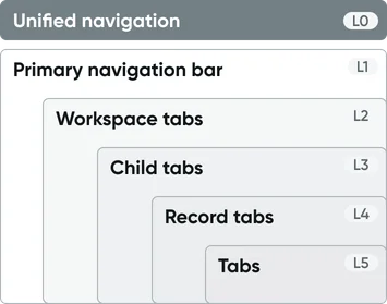
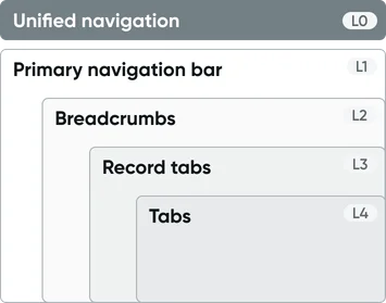
Level 0 — Unified navigation
The unified navigation header provides a consistent, global navigation experience across the entire ServiceNow platform, spanning both classic CoreUI modules and modern Workspaces. This single top-bar interface consolidates instance-wide controls—including navigation menus, platform search, notifications, and user settings—streamlining how users access forms, lists, dashboards, and workspace content. By making essential functions along with a consistent look-and-feel readily available, Unified Navigation significantly improves productivity and application switching efficiency across the platform.
Level 1 — Primary navigation bar
Important
Regardless of the workspace navigation architecture (e.g., tab-based or breadcrumb-based), you must include the Level 1 primary navigation bar. This is mandatory and must be included as part of the app shell.
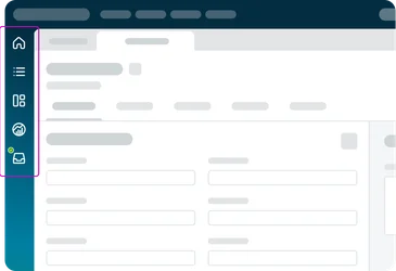
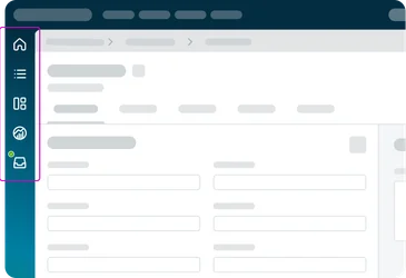
The primary navigation bar is an icon menu for main pages of the workspace (often on the left side or top, containing icons for pages and workflows such as Home, List, Inbox, etc.). This is a fundamental part of the Workspace shell. Each icon (which represents a workflow) opens its respective overview page in the workspace. Configured via Workspace settings (“Workflows”), it’s crucial for high-level navigation (e.g. switching between the landing page, list pages, dashboards).
Tab-based navigation
Breadcrumb-based navigation
Level 2 — Tabs or breadcrumbs
Level 2 is where you define the core navigational structure for your workspace; either tabs, breadcrumbs, or a custom design altogether. Designers must choose one of the following directions to ensure a consistent user experience.
Option A: Tab-based navigation
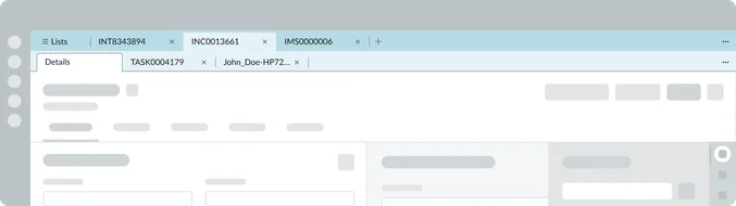
Workspace tabs (aka Session tabs) are the tabs that appear below the workspace header (in a tabbed App shell) whenever a user opens multiple records or tasks. They enable true multitasking by letting the agent have several items open in parallel. For example, in an Agent workspace, an agent might have an Incident record open in one tab, a Case in another, and perhaps a new incoming chat in a third.
They are automatically provided when you select this shell in UI Builder. They cannot be manually placed. An Admin can configure behavior like persistence and styling in workspace settings. Each primary navigation page opens a primary tab, and each record opens a session tab.
Usage rationale: Use Workspace tabs when your users need to multi-task across multiple records – it improves efficiency by avoiding constant page navigation. If your workflow expects users to handle several items at once or rapidly switch context, Workspace tabs are appropriate.

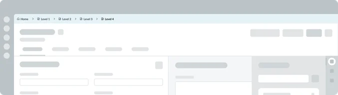
Option B: Breadcrumb-based navigation
Breadcrumbs are a horizontal list of links indicating the current page’s position in a hierarchy, often starting from a “Home” or top-level page and drilling down to the current item or page. Use breadcrumbs in workflows where users navigate stepwise into deeper records or pages, especially when you want to allow easy jumps back to higher levels.
For example, in a Customer 360 workspace, an agent might navigate via the following path:
Option C: Custom navigation
Choose this when neither the Tab-based nor the Breadcrumb-based architecture provides the specific Level 2 navigation needed for a highly specialized or custom workflow. The designer is responsible for building and wiring all Level 2 and subsequent navigation components (such as a custom side bar menu or unique navigation ribbon) to meet specific requirements.
Usage rationale: Use the Custom navigation option sparingly, only when the out-of-the-box Level 2 options impose unnecessary constraints on the desired user experience.