Overview
Unified navigation is a global navigation header that runs across the top of every page in the platform’s user interface. Like its name, it provides a unified experience across classic modules (CoreUI) and modern Workspaces, allowing users to access forms, lists, dashboards, and workspace content from a single consistent interface.
It consolidates instance-wide controls (navigation menus, search, notifications, and user settings) into one place, streamlining how users navigate and switch between different areas of the platform. This top-bar navigation improves productivity by making common functions (like searching the instance or accessing favorites) readily available and by providing a consistent look-and-feel across all applications in the platform.
Anatomy
App shell
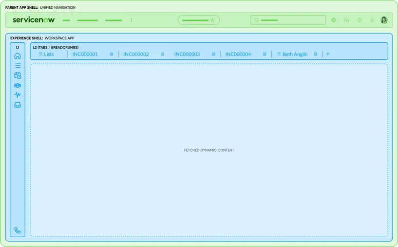
Unified navigation sits at the topmost layer of the ServiceNow UI, forming the Parent app shell that wraps all individual experiences. Within the Parent app shell lies the Experience shell (e.g. Workspace app shell or Breadcrumb app shell), which in turn renders the specific page layout. Splitting the Parent app shell into a root layer and per-experience shells enables true "single-tab" navigation: you can jump between workspaces or classic applications without opening new browser tabs, while the Unified navigation remains constant.

Branding
The far left of the unified navigation displays the ServiceNow logo by default or is often replaced with a company logo for branding. This acts as a home link - clicking it returns the user to the landing page (or specified homepage URL set by the admin). The logo area also doubles as an instance identifier; hovering over it reveals the instance name and description (useful in multi-instance environments).

- Branding: A visual home link containing the brand's logo; ServiceNow by default
Menus
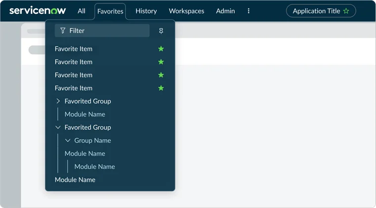
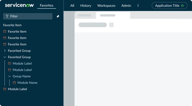
The global navigation menus, located next to the branding, centralize access to all applications and modules available to the user. By default, these menus appear as overlay panels, maximizing screen space until needed. Users can pin a single menu to transform it into a persistent, collapsible left-hand sidebar, similar to a traditional navigation panel. For smaller screens or windows, menu items automatically consolidate into an overflow menu to maintain responsiveness. Administrators have the flexibility to customize or disable specific menu items based on user roles.

- All: Lists all applications/modules (mirroring the classic application navigator)
- Favorites: Shows user-saved favorites
- History: Shows recently visited items
- Workspaces: Lists all available Workspaces
- Admin: Lists all available admin capabilities
Menu overlay
Clicking a menu item in the Unified navigation triggers a contextual menu overlay. These overlays are designed to provide quick, focused access to content without a full page reload, dimming the background to keep the user's attention on the menu. They are dismissible, allowing users to return to their work easily once they have found what they need. They can also be pinned so that they display persistently.

Persistent menu
Menus in the Unified navigation header contain a feature the enables users to pin a single menu so that it persistently displays on the left side of the viewport. The menu overlay is designed so that the contents wrapper for the overlay converts from a popover to a pane.

Contextual app pill
At the center of the header, the contextual app pill displays the context of what the user is currently viewing. This is a pill-shaped label (often showing the current application or record name) that helps users orient themselves within the instance. For example, if a user is viewing the "Incident > All" list, the pill might show "Incident - All".
The contextual pill essentially replaces the old CoreUI breadcrumb, providing a concise context indicator. It updates dynamically as the user navigates, ensuring they always know where they are in the system

- Location: Displays the context of what the user is currently viewing
- Favorites icon: A star icon is included in the pill, allowing the user to add the current page to their Favorites with one click
Global search
Allows users to search across the entire platform (tables, records, navigation items etc) from anywhere. The global search component is omnipresent and consistent - clicking the magnifying glass icon or the search box lets users type keywords and see results without leaving the current page. The search can even be scoped to specific areas (for example searching within a particular workspace's data if the user selects that scope). Administrators can enable or disable global search in the header via system property (glide.ui.polaris.global_search).

- Global search input field:. A Typeahead search input field where users type their query
Global Utilities
This is the area where all global utilities sit. A group of functionalities that can be triggered anywhere in the platform and is agnostic to a canonical URL.

- Scope: While Unified navigation provides global UI navigation, it also includes scope-related controls for developers and administrators. These controls are not about navigating between user experiences, but rather about defining the development or configuration context.
- Now Assist: Opens the AI-powered assistant panel. Clicking it slides out the Now Assist panel, where users can ask conversational queries, trigger guided actions (e.g. create a record, run a script), or get contextual recommendations without leaving their current page. It's always present but intelligently suggests contextual prompts based on where the user is in the system.
- Help: Provides on-demand assistance - for example, opening the Help panel or guided tours/documentation relevant to the current page. Admins can disable this feature, and the icon will not appear.
- Notifications: Bell icon indicates when there are new notifications; clicking it opens a panel listing relevant notifications (unified for classic or workspace notifications in one place). Users can personalize which notifications they see via this panel. Admins can disable this feature, and the icon will not appear.
- User menu (profile & preferences): Represented by the user's avatar or initials and/or their name. Clicking on this opens a dropdown menu with user specific options and preferences. From here, users can access profile settings, system preferences, and other account-related actions. Notably, certain menu items appear based on access controls - for example, Impersonate User or Elevate Roles will show up in this menu only if the user has the rights to use them (like admins). The user menu in Unified Navigation consolidates what used to be scattered (e.g. separate gear icon for preferences in Core UI) into one place. Preference categories are accessible here, including Display settings, Accessibility options, Notification settings, Theme selection, etc. all in a unified panel. This ensures that whether the user is in a Core UI page or a workspace, they can adjust their settings consistently via the same user menu.
- Phone (optional and not shown): If a contact/CTI (softphone) integration is installed, a phone icon will appear in this utility area.
Additional considerations
Scope
When working in UI Builder, developers can access an "Application scope" selector to specify which app their changes apply to (e.g. global or custom app scope). Similarly, an "Update set" selector may appear in the header to track platform changes, and in domain-separated environments, a "Domain" selector allows switching between domain contexts. These scope tools appear contextual in the Unified Nav - visible only to users with the necessary roles-and help ensure platform changes are made within the correct boundaries. They are essential for building and maintaining applications but are distinct from the navigation scope that governs user experience flows.
Customization and extensibility
Unified navigation can be customized via theming and menu configuration. Branding options include changing the logo and colors. Admins can add or remove menu items and hide default ones for specific user roles. When customizing, follow the most recent theme's design guidelines, avoid excessive custom icons, and consider placing external links under the Help or All menus to prevent UI clutter. Always test custom elements for responsiveness and accessibility. Extend Unified Navigation cautiously to maintain a simple, unified user experience.
Role based visibility
Unified navigation dynamically adapts to user roles, displaying or hiding elements like administrative tools, the Scope Selection menu, Impersonate User, and Elevate Roles options. Features such as the CTI phone icon only appear when relevant. This conditional rendering keeps the UI clean, relevant, and secure by only showing accessible controls. Designers should consider these visibility rules to ensure appropriate actions are available and avoid "dead" icons.
State persistence
Unified navigation retains user preferences like pinned Favorites, theme, and spacing. Notifications and help panels and Now Assist can also maintain context. These features ensure continuity within the Next Experience's single-page application.
Related components
Navigation menus & overlays
The All/Favorite/History/Workspace/Admin menus are Horizon overlay panels, functioning like dropdowns or popovers, but can also be pinned as persistent side panels. These panels contain scrollable, groupable, and filterable list items, consistent with Horizon's content tree and list controls. Their appearance and animation adhere to Horizon menu standards.

Learn more about this component

Learn more about this component
Content tree
A hierarchical tree-list component. It provides expandable/collapsible nested items for browsing catalog categories or page hierarchies and is used for side panel and dropdowns within the Unified Navigation.
Buttons & icons
Header interactives (menu triggers, utility icons, profile avatar) are icon buttons. Horizon provides iconography (star, bell, question mark, user avatar) and button styles. The menu toggle for All or Favorites is a stylized button conforming to standard sizes and hit areas. The Favorites star in the contextual pill is an interactive icon from Horizon's guidelines (filled vs outline state). All header icons use the Horizon icon library with consistent stroke and filled styles from Next Experience.

Learn more about this component

Learn more about this component
Contextual Pill & labels
This uses the Horizon poll styling to indicate selected context. The star icon is an interactive element within the pill. This component shows Horizon's handling of tags/pills for context laveling and can be reused, though it has a unique role in Unified navigation.
Search bar
Unified navigation's search filed utilizes a Horizon text input component, styled for the header with an embedded icon. It likely uses type-ahead/auto-complete. The search input meets Horizon form control standards: clear affordance, accessible placeholder text, and proper contrast. Search results appear in a dropdown, a list component within a popover.
Dropdown menu
User, Help, and overflow menus utilize Horizon's menu/list components. Clicking the profile avatar reveals a menu list with Horizon dropdown behavior, including text, optional icons, separators and grouping.
Responsive layout
Horizon responsive design principles enable menus to collapse into an overflow (hamburger) on smaller screens. The All/Favorites/History/Workspace/Admin menu toggles function like navigation tabs, with only one panel active at a time. The unified header, built on a flexible layout, reflows components (e.g. stacking or collapsing for mobile view). The Horizon design system ensures navigation usability in compact modes/smaller viewports (icons might hide labels, like responsive tab bar). Unified Navigation uses Horizon Design System components: buttons, icons, menus, lusts, inputs, and labels.
Accessibility
ServiceNow's Unified Navigation is built for accessibility, meeting WCAG 2.1 AA standards. It supports full keyboard navigation with clear focus indicators and proper semantic roles for assistive technologies, enhanced by ARIA labels for accurate screen reader descriptions. Consistent screen reader support, updated in the Yokohama release, ensures state changes and contextual information are announced. The Horizon design system ensures high color contrast, and an Accessibility Inspector flags custom theme contrast issues. Visual options include "Reduced Motion" for static UI and "Enable data table for charts" for alternative data representation.
High contrast and dark modes are supported, maintaining readability, and icons have visual indicators and text alternatives for color-blind users.
ServiceNow continuously tests accessibility, evaluating new components for screen reader compatibility, keyboard traps, and color/contrast, with fixes noted in release notes. The goal is full navigation capability via screen reader and keyboard, allowing users to access all features without sight. Designers are encouraged to maintain these features by following Horizon guidelines, ensuring an inclusive experience aligned with ServiceNow's accessibility standards.
