
Understanding
Invisible controls are a common design pattern used in modern web and application design, where buttons or other clickable content are visually hidden until a user's mouse or keyboard focus enters a specific region of the page. When the user interacts with this region, the hidden content is revealed. These are sometimes referred to as “ghost buttons” or “hover to discover” buttons.
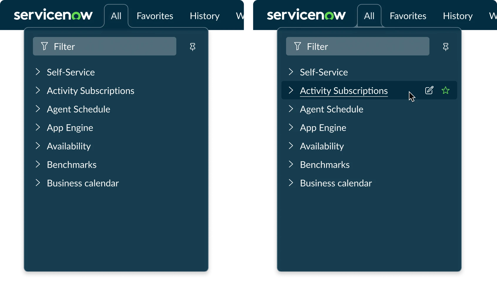
An example of an Invisible Controls are the Edit and Favorite buttons in the Next Experience “All” menu. These icon buttons appear when the mouse hovers over each row.
Invisible controls can negatively affect users with various disabilities. People with cognitive disabilities may not know what actions are available to them when looking at the page. Those with mobility impairments, such as users who rely on keyboards, alternative pointing devices, or voice input, may find it difficult or impossible to interact with these controls.
Invisible controls in Horizon
Horizon supports this design technique and users with accessibility needs by:
- Offering an end-user preference that allows users to choose to always make all controls visible
- Defining patterns for where and when Invisible Controls may be used
- Providing guidance for hiding and showing invisible controls in a way accessible for keyboard and screen reader users
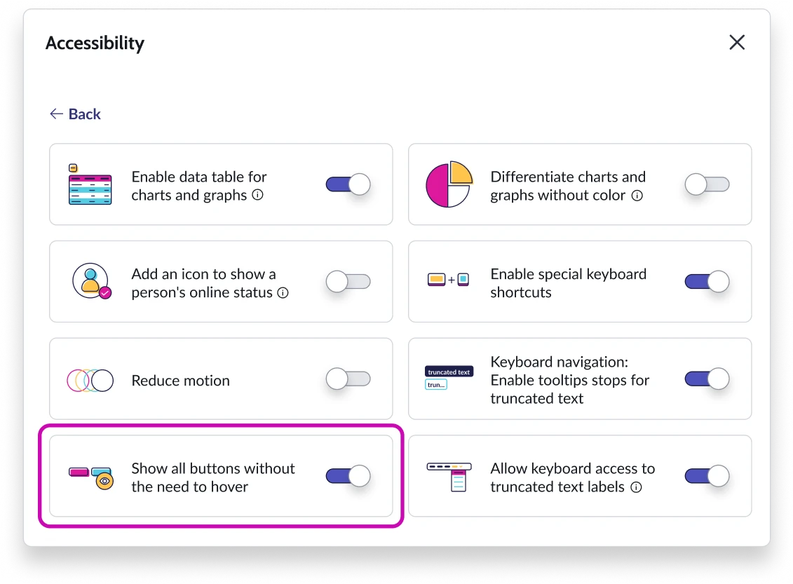
End users can choose to always Show Invisible Controls via the user preferences dialog.
Patterns for appropriate usage
When using Invisible Controls in your implementations, ensure that they align with these use cases to maintain consistency and accessibility across the platform.
Invisible Controls may be used for repetitive actions in a list, series of cards, or grid, reducing visual repetition.
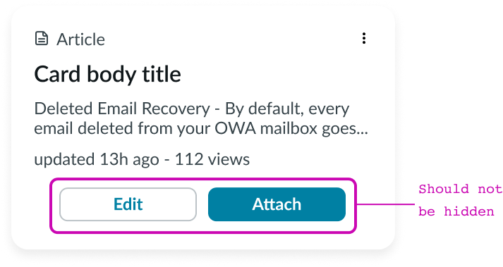
Buttons that are not repetitive should always be visible.
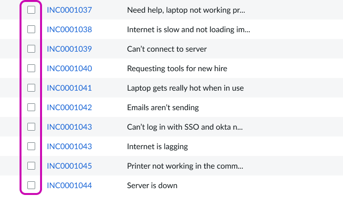
Checkboxes, radio buttons, and other form controls for aside from buttons should always be visible.
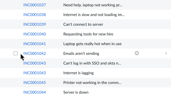
Don’t hide checkboxes, radio buttons, and other form controls under hover states.
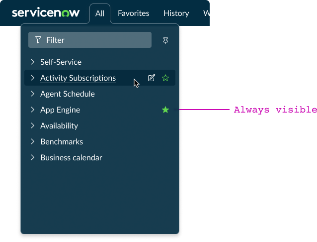
When stateful buttons are pressed, they should always be visible. In this example App Engine is marked as a favorite. This stateful button is visible even though the mouse is hovering over a different row.
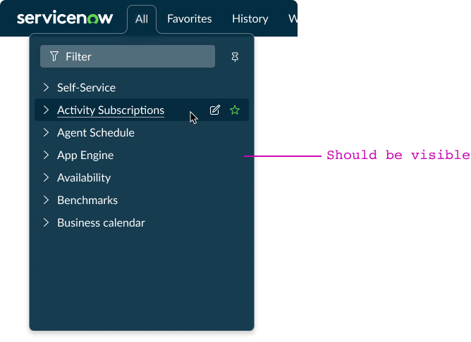
Don’t hide stateful buttons that are pressed. In this example App Engine is marked as a favorite. This stateful button is not visible even when the mouse is hovering over a different row, but it should be.
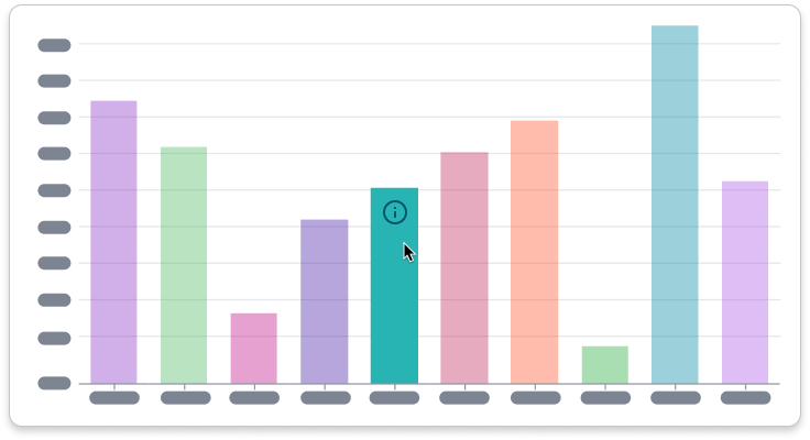
Repetitive actions on an interactive data visualization may be hidden to reduce visual repetition. Buttons or controls for analytical use cases may be shown on hover.
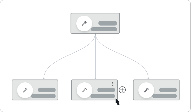
Action buttons on objects in canvas-based builder tools may be hidden to create a cleaner building experience.
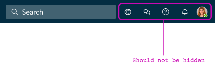
Primary actions: The main action on a page should be immediately apparent to all users.
Design Considerations
It is important to ensure that you consider how a design will work when controls are invisible, only appearing on hover or focus. Additionally, consider how a design will work when all controls are visible. For instance, you’ll want to ensure content does not overlap, shift, or cause any other visual issues.
This approach allows designers to continue using this common pattern with minimal restrictions while giving end-users the ability to choose their preferred experience.
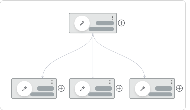
Make adjustments in your designs for when all invisible controls are showing, based on user preference.
Don’t allow content to interfere with other content when all invisible controls are showing, based on user preference.
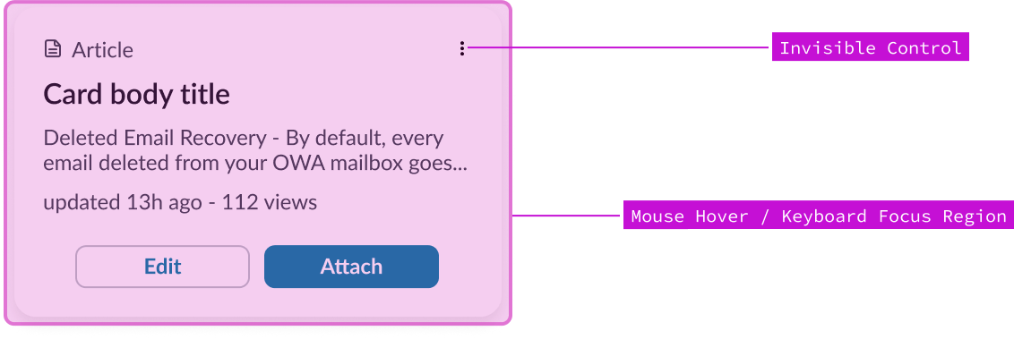
To specify your Invisible Controls in Figma, annotate the following:
- The invisible control itself
- The mouse hover region that reveals the control
- The focusable elements that reveal the control