Understanding
Color contrast is important to ServiceNow as it helps users easily distinguish between different elements and navigate the platform more efficiently. It also aids in creating a visually appealing interface that enhances user experience and makes the platform more engaging.
Horizon incorporates APCA (Advanced Perceptual Contrast Algorithm) to enhance accessibility beyond traditional WCAG 2.1 contrast ratios. While APCA uses a different approach than WCAG 2.1's simple contrast method, our implementation ensures Horizon themes provide optimal readability and accessibility for a diverse user base, including those with visual impairments.
Since the initial WCAG criteria on color contrast was written, there have been many advancements in display technology, CSS functionality, as well as vision science. APCA is a modern approach to measuring contrast that aims to better align with human perception.
While APCA is planned for incorporation into the next generation of WCAG standards, it’s current usage patterns aren’t yet defined by the W3C working groups. The following guideline describes ServiceNow’s approach to applying APCA for our modern themes. WCAG 2.1 conformant themes, which use the more traditional approach to calculating contrast, are also available to users on our platform.
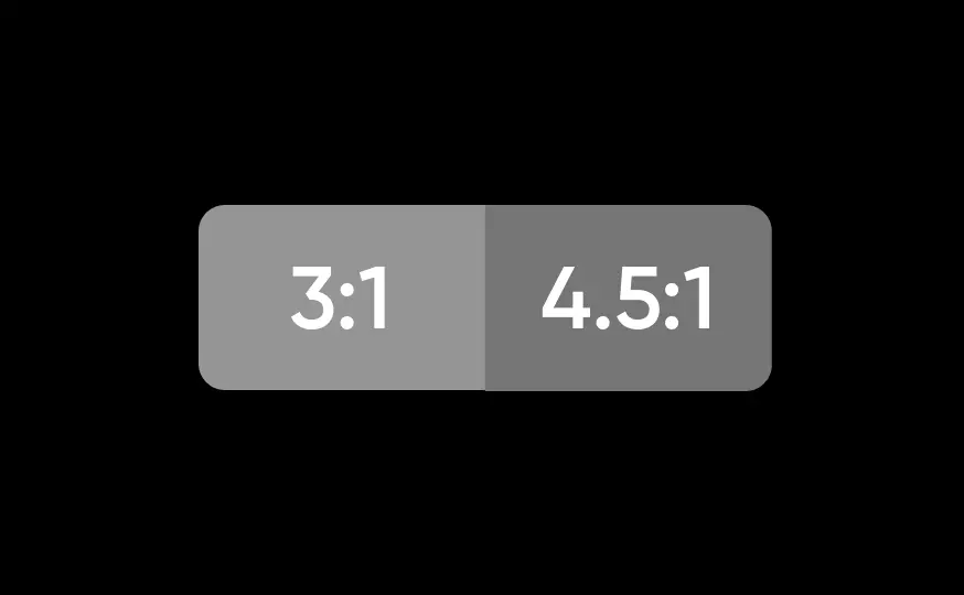
Traditional contrast WCAG 2.1 at the AA level primarily focuses on two tiers of color contrast: 4.5:1 for text (3:1 for large text) and 3:1 for non-text icons, controls and visual indications of state.
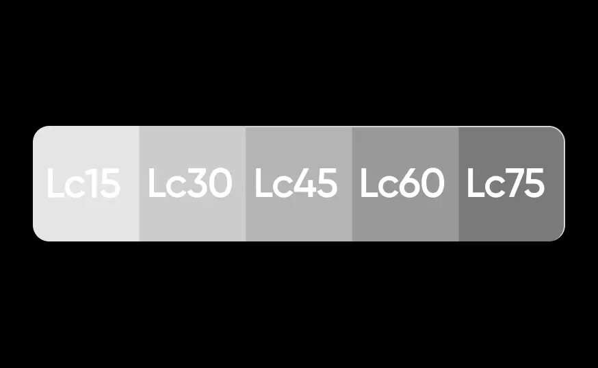
APCA contrast APCA supports several tiers of contrast depending on not just content type, but the size, purpose and whether or not the background is light or dark.
WCAG 2.1 at the AA level primarily focuses on two tiers of color contrast: 4.5:1 for text (3:1 for large text) and 3:1 for non-text icons, controls and visual indications of state.
Designing
For our APCA based design themes, we break components down into 5 basic categories:
- Text and icons
- Form fields
- Buttons
- Containers
- Data visualization
In the following sections, we’ll define the anatomy of these components and lay out the color system we follow in our APCA based themes.
Text and icons
Text and icon anatomy
Text and icons refer to any text or iconography used on a page to provide information. For our themes, we group text into 2 sizes:
- Large text: any text that is 18 pt or larger, or 14 pt bold (700) or larger.
- Regular text: any text smaller than large text.
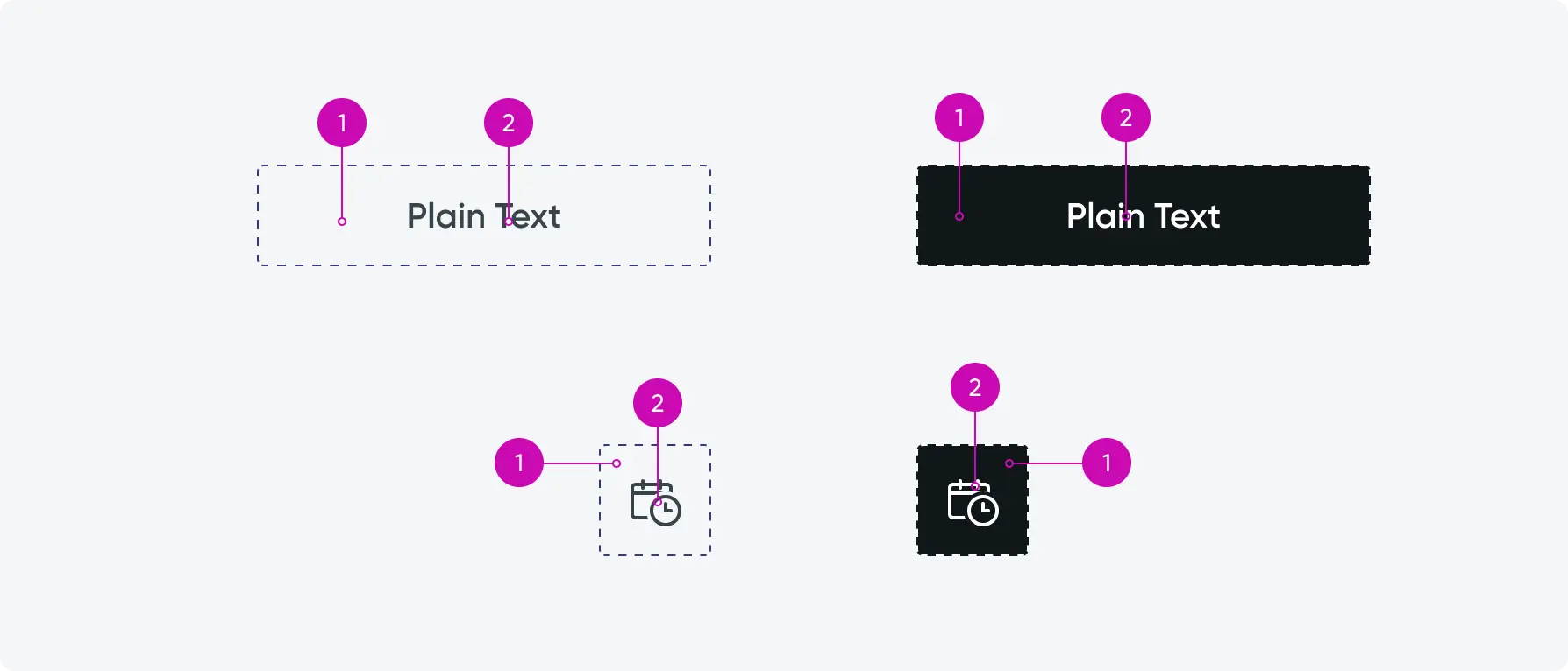
Text and icon anatomy
- Canvas: Background area
- Text: Text and icons
Text and icon contrast minimums
When measuring the Lc for text and icons, we compare the color of the canvas to the color of the text, or the icon. In the example above we measure a background of #F5F6F7 against text and an icon of #37444A. This gives us a contrast of Lc88. Our dark background at #10171A compared to text and icon of #FFFFFF gives us a contrast of Lc107.
Below are the contrast requirements for text and icons in the Horizon Design System:
- Large text vs canvas: Lc45
- Regular text vs canvas: Lc60
- Informational icons vs canvas: Lc45
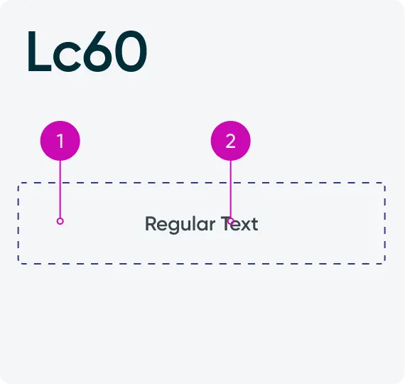
Regular text vs canvas: Lc60
- Canvas
- Text
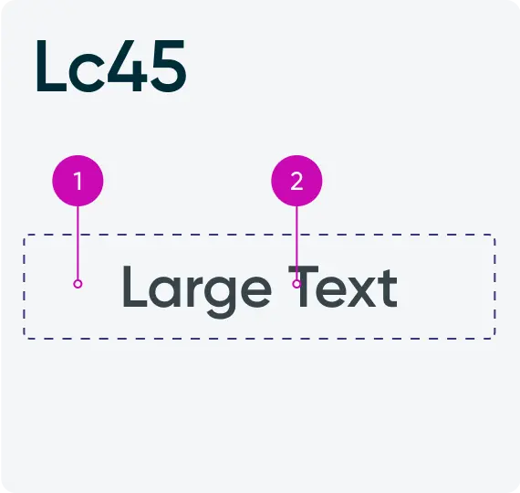
Large text vs canvas: Lc45
- Canvas
- Text
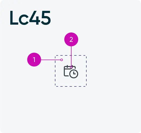
Icons vs canvas: Lc45
- Canvas
- Text
Form fields
Form field anatomy
When users interact with forms it is important that they can both identify a form field visually, but also recognize a it’s various states. Form fields include text and textarea inputs, radio buttons, checkboxes and toggles. These inputs can be editable, disabled, readonly, and at times can be in a state of error.
See the following images for the terminology we use when describing contrast minimums for input fields.
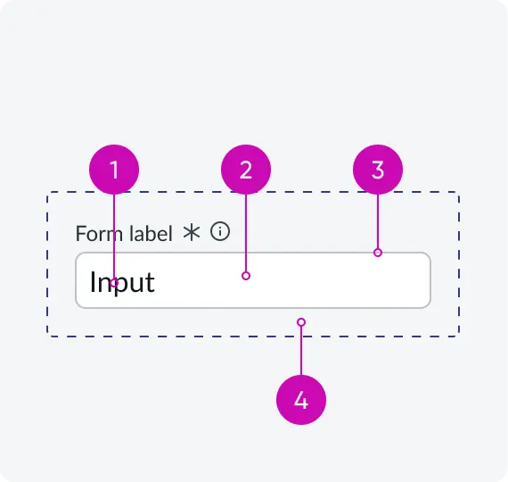
Input fields
- Field text: User inputted text
- Field: Fill color for field
- Border: Outline or boundary
- Canvas: Background area
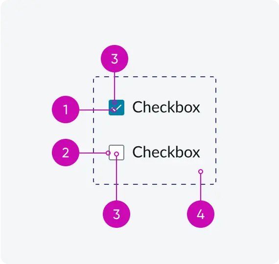
Checkboxes
- Icon: Mark, Dot, or other indicator of the item being checked
- Border: Outline or boundary
- Field: Fill color inside input
- Canvas: Background area
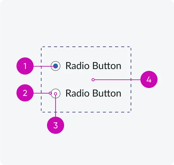
Radio buttons
- Icon: Mark, Dot, or other indicator of the item being checked
- Border: Outline or boundary
- Field: Fill color inside input
- Canvas: Background area
Form field text minimums
Below we’ll demonstrate the contrast requirements for input fields in the Horizon Design System.
To ensure text inside of inputs are visible across all states, we adhere to the following contrast minimums:
- Field text vs field: Lc60
- Disabled text vs field: Lc15
- Placeholder text vs field: Lc30
- Readonly text vs field: Lc60
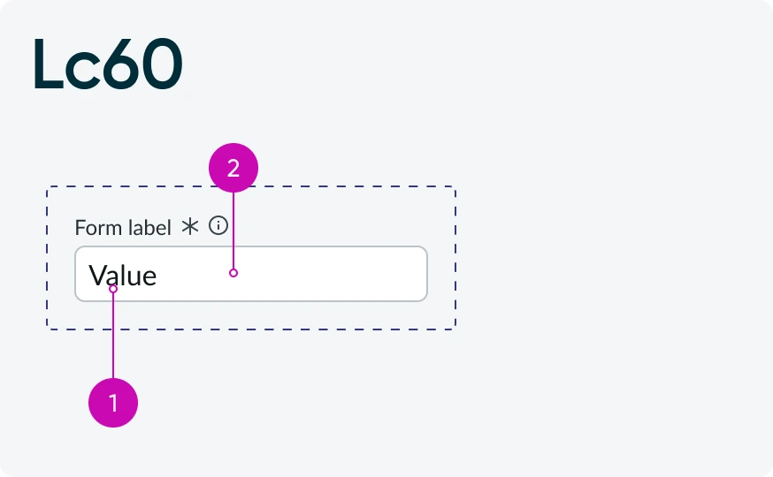
Field text
- Text
- Field
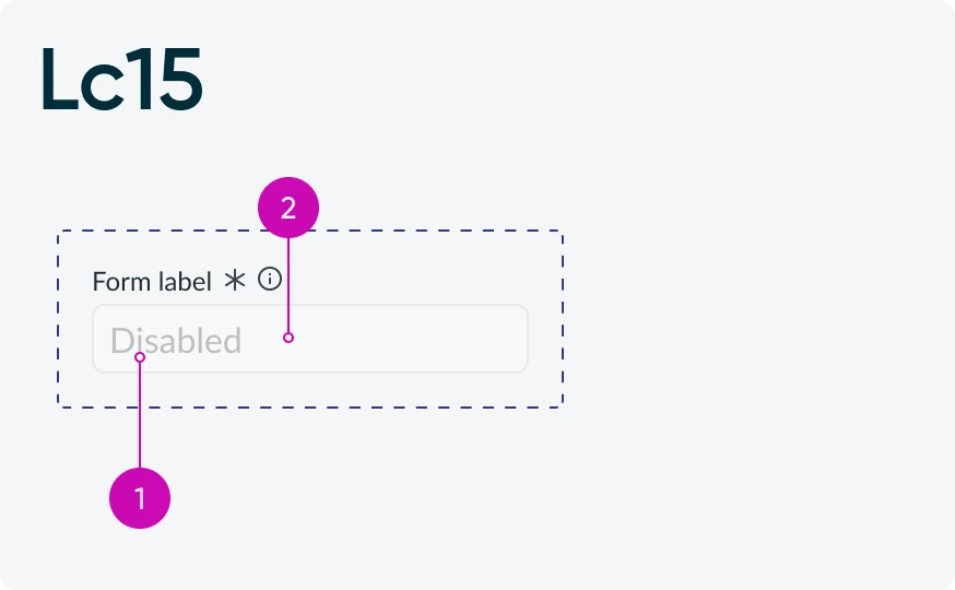
Disabled text
- Text
- Field
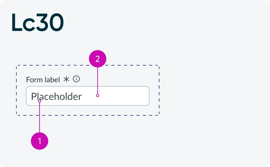
Placeholder text
- Text
- Field
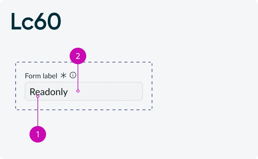
Readonly text
- Text
- Field
Form field visibility minimums
To ensure that inputs fields are visible on the page canvas, 1 of the 3 following pairs will meet Lc30:
- Field vs border
- Canvas vs border
- Canvas vs field
If the input field is read-only, the minimum drops to Lc15.
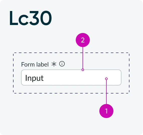
Field vs border
- Field
- Border
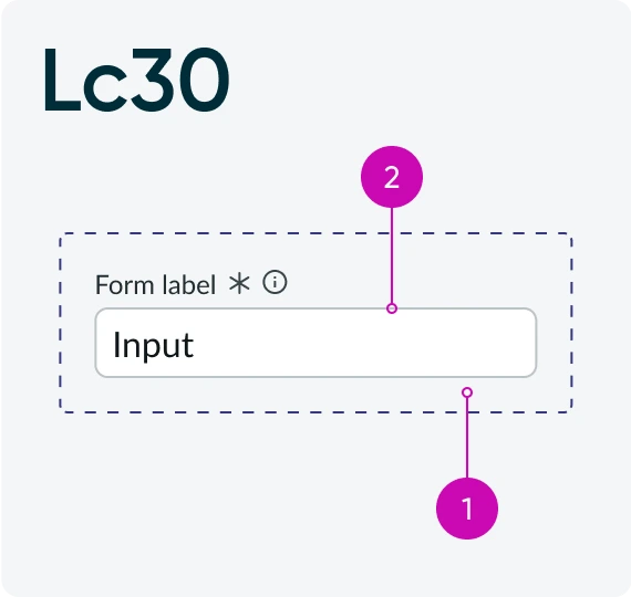
Canvas vs border
- Canvas
- Border
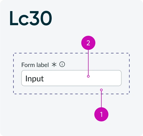
Canvas vs field
- Canvas
- Field
Form state minimums
To ensure that various states of inputs fields are visible, we adhere to the following contrast minimums:
- Focus ring vs canvas or Focus ring vs field : Lc30
- Default border vs error border: Lc30
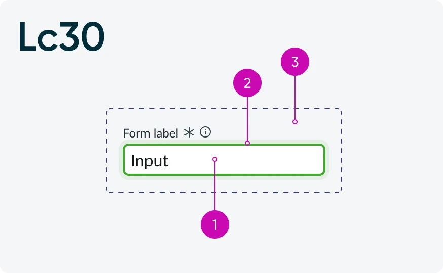
Focus ring vs canvas or Focus ring vs field
- Field
- Focus ring
- Canvas
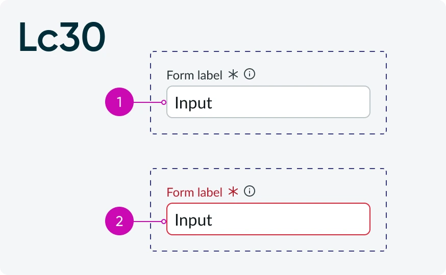
Default border vs error border
- Default border
- Error border
Buttons
Button anatomy
Buttons in Horizon come in several varieties including text buttons, icon buttons, stateful buttons, and bare buttons. Buttons are also available in Primary, Secondary, and Tertiary visual varieties.
For determining contrast, we’ll consider four parts to a button:
- Button face
- Button contents (text or icons)
- Button border
- Canvas
Button content minimums
Button contents, which include text and buttons, follow the same minimums for any regular text (Lc60) and information icons (Lc45) when compared to the button face.
If the button is disabled, this drops to Lc15.
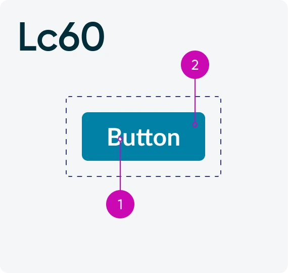
Button text vs Button face
- Text
- Face
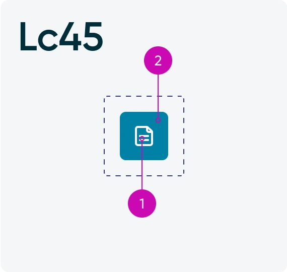
Button icon vs Button face
- Icon
- Face
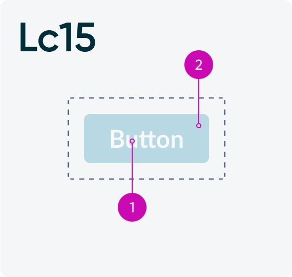
Button text vs Button face
- Text
- Face
Button visibility minimums
To ensure that primary buttons are visible on the page canvas, one of the three following pairs will meet Lc30:
- Face vs border
- Canvas vs border
- Face vs canvas
For secondary and tertiary buttons, the minimum drops to Lc15. Bare buttons do not have any requirements for visibility beyond ensuring the button text is visible.
Primary buttons
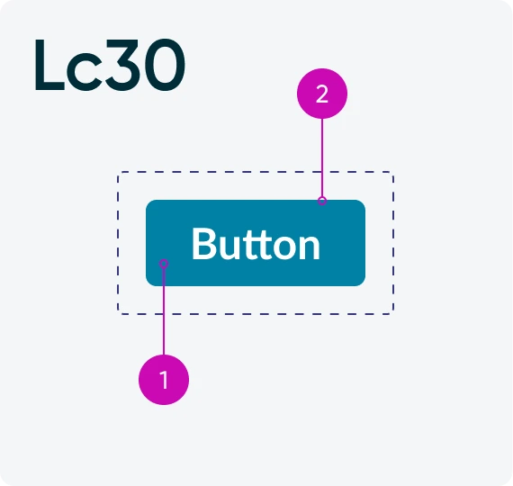
Button face vs button border
- Face
- Border
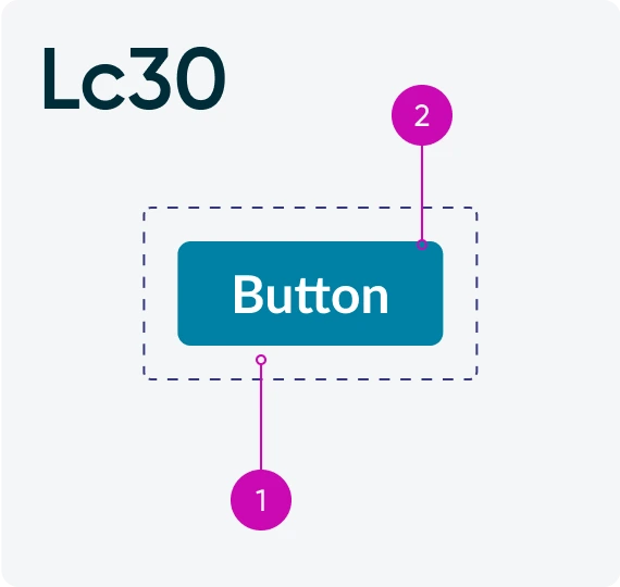
Canvas vs button border
- Canvas
- Border
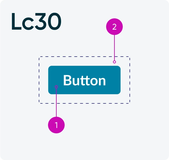
Button face vs canvas
- Face
- Canvas
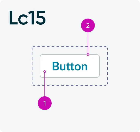
Button face vs button border
- Face
- Border
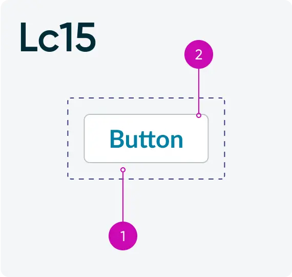
Canvas vs button border
- Canvas
- Border
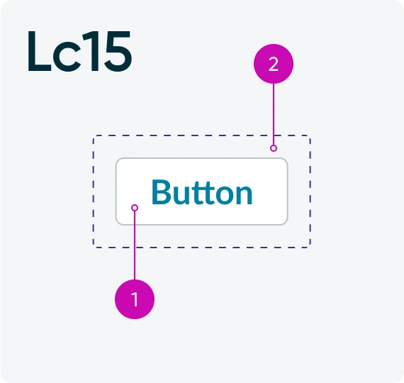
Button face vs canvas
- Face
- Canvas
Containers
Containers, highlight, and dividers
For cards, highlights, dividers, and other visual containers, we want to ensure at a minimum these are visible for all users. To achieve this, we ensure at least a minimum contrast of Lc15.
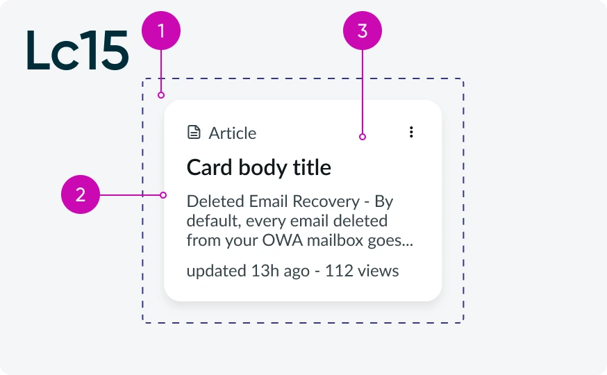
Cards fill vs canvas or Boundary vs canvas
- Canvas
- Boundary
- Fill
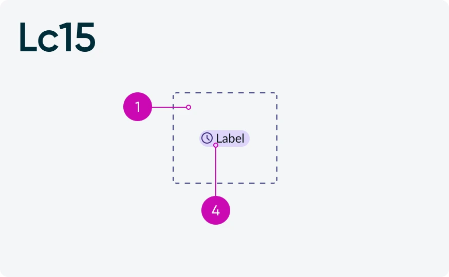
Highlighted value fill vs canvas
- Canvas
- Fill
Data visualizations
For data visualizations, we want to ensure that chart segments, lines, and other visual indicators of information are visible at Lc45.
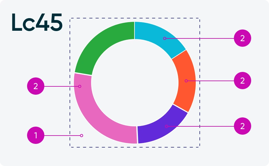
Chart segment vs canvas
- Canvas
- Segment
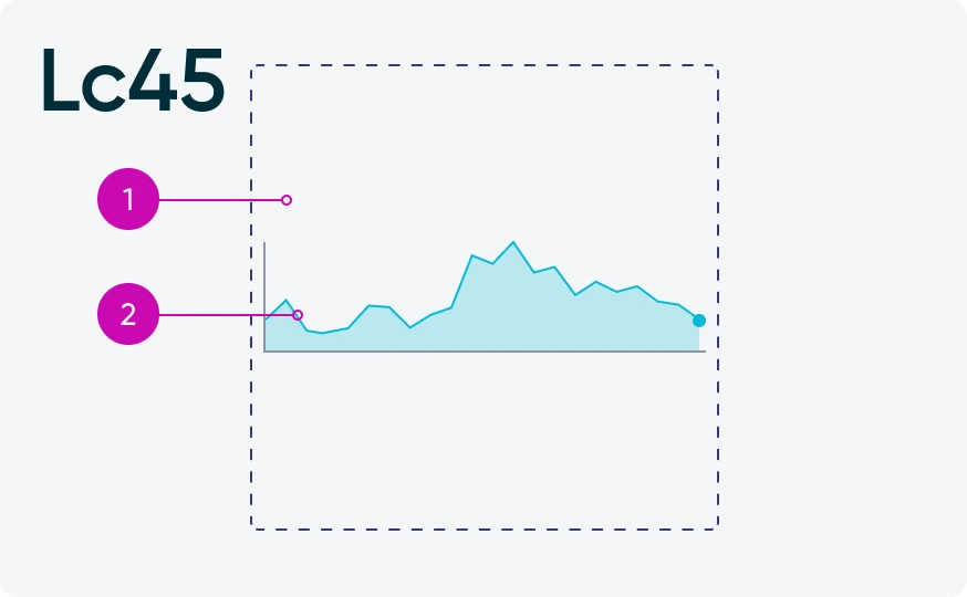
Chart line vs canvas
- Canvas
- Line
