
Understanding
Forced colors is a particularly important consideration for users with visual impairments or other color vision deficiencies. As designers and developers working with Horizon, it's crucial to ensure that products align with our design system's approach to forced colors, providing a consistent and accessible experience for our users.
CSS4 provides forced color keywords that map to specific colors defined by the user's operating system or browser settings. These keywords are grouped into pairs or triplets to ensure proper contrast and differentiation between various types of components and states.
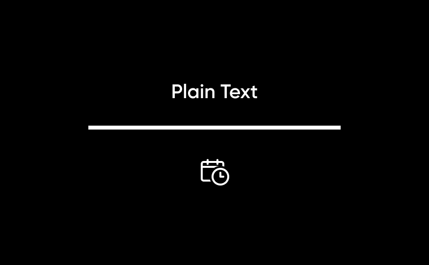
Static Content: Static content includes content including text, non-interactive SVGs and icons, as well as dividers and modal and popover borders.
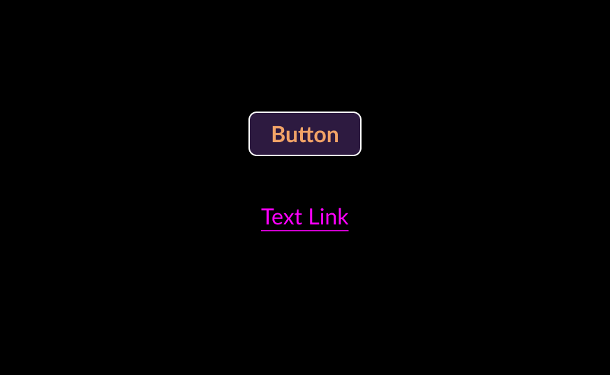
Interactive Content: Interactive content consists of components, such as links and buttons, that perform actions within a page or take users to other destinations.
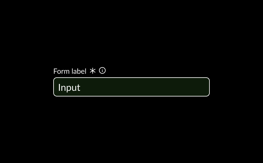
Input Fields: Input fields are used to capture user inputs in the form of text.
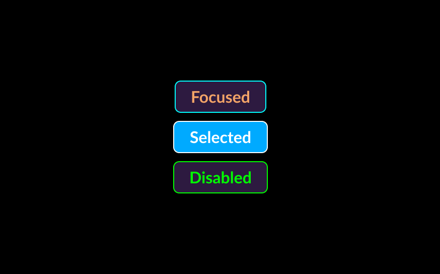
States and Emphasis: Certain forced color sets are used to communicate states such as selected states, disabled states, highlighted states, and other emphasized content.
Designing
When designing components and layouts, use the following practices to ensure alignment with forced colors best practices and with the Horizon design system’s techniques.
The main keyword groupings are:
- Static content: Canvas, CanvasText
- Interactive content (text-based): LinkText, VisitedText, ActiveText,
- Interactive content (target-based): ButtonFace, ButtonText, ButtonBorder
- Input fields: Field, FieldText, ButtonBorder
- States and Emphasis content: Highlight, HighlightText, SelectedItem, SelectedItemText, GrayText, Mark, MarkText
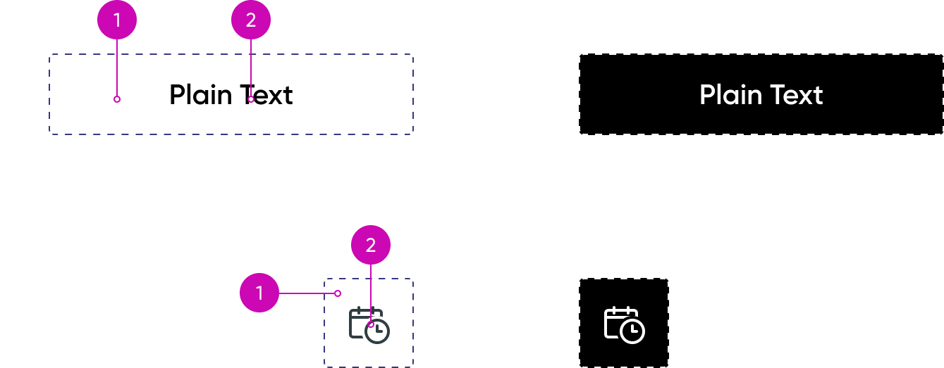
1. Canvas: Background area
2. CanvasText: Foreground elements like plain text, non-interactive SVGs, and visual separators such as lines and borders.
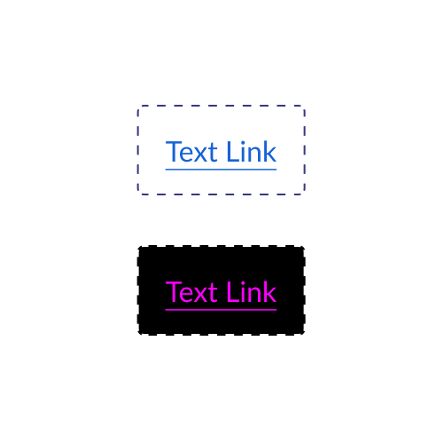
Links
- LinkText: Default state
- VisitedText: Visited links
- ActiveText: Active (pressed) state
These generally pair with Canvas as the background.
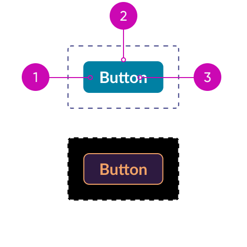
Buttons
1. ButtonFace: Fill color for buttons
2. ButtonBorder: Outline or boundary
3. ButtonText: Foreground content within the button (text or icons)
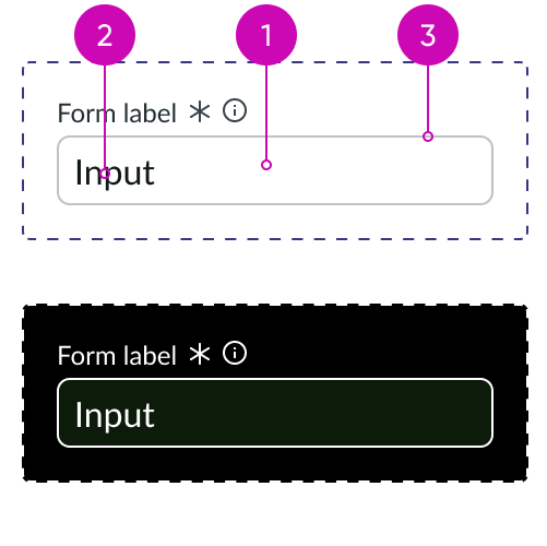
Input fields
1. Field: Fill color for field
2. FieldText: User inputted text
3. ButtonBorder: Outline or boundary
GrayText may also be used for text within read-only or disabled fields.
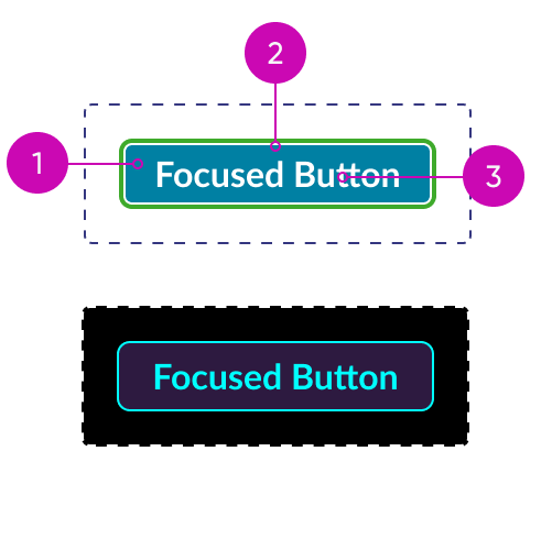
Focus
1. Highlight: Highlighted background content
2. HighlightText: Highlighted foreground content
This pairing is used for focus states, hover states, and user-selected text.
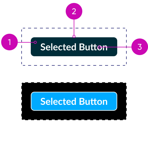
Selected elements
1. SelectedItem: Selected background
2. SelectedItemText: Selected foreground
This pairing is used for selected states in components like checkboxes, radio buttons, and selected items in comboboxes.
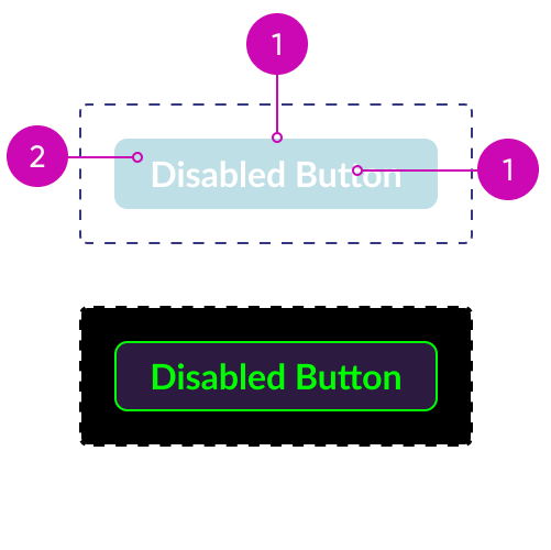
Disabled elements
1. GrayText: Disabled foreground content
2. ButtonFace: Fill color for buttons
Though it does not have a pre-defined pairing, GrayText is most often paired with Canvas or ButtonFace as the background.
Annotating
Next Experience Components are carefully annotated in Figma using assets that communicate which parts of a component are mapped to specific forced color keywords. Our accessibility specification template includes a sample forced color theme that you may use to examine how each component will render under a specific forced color scheme. By referring to these annotated components in Figma, designers can conceptualize the appropriate color pairings and apply them consistently across their designs, and developers and quality testers can better understand and visualize the required result.

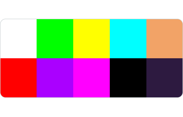
Forced Colors Theme: The Horizon design system uses this sample forced color theme for design and testing purposes. The goal is to maximize the visual separation between different keywords to ensure that parts of components are properly mapped.
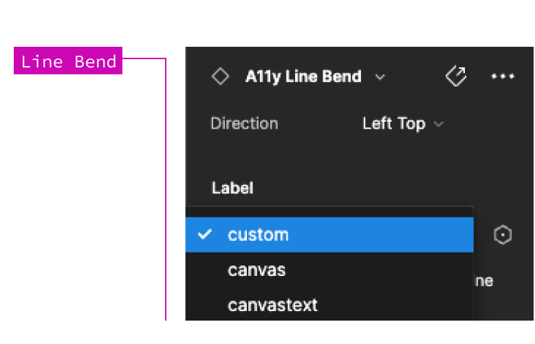
Line Bend: The Accessibility Line Bend asset may be used to annotate your specs to capture the forced color keywords on your design. Forced color keywords for this annotation component can be selected from the Design panel.