
Understanding
An essential aspect of accessibility is ensuring reflow support, allowing users with low vision to magnify content in their browser up to 400% (or to a 320px width viewport) without losing access to information or functionality. By aligning your implementations with the Horizon Design System's reflow guidelines and techniques, you can create products that are usable and accessible to a wider audience.
Reflow in Horizon
The components in the Horizon design system have incorporated reflow behaviors and techniques. By leveraging our pre-built components and aligning your implementations with the design system’s best practices for reflow, you can create designs and implementations that respond to different magnification levels.
Designing
When implementing designs that support reflow, consider the following best practices to align with the Horizon design system:
- Design down to a minimum viewport width of 320 pixels, ensuring that all content and functionality is available in a single column layout
- Use relative sizing and percentages to allow content to stretch and adapt to different column widths
- Implement appropriate breakpoints based on common device sizes and the specific needs of your users and workflows
- Ensure that all content and functionality are available at higher magnification levels without the need for horizontal scrolling
- Test your implementation at various magnification levels, using different browsers and assistive technologies to ensure a consistent and accessible experience
Minimum Viewport Size Design
Design down to a minimum viewport width of 320 pixels and a minimum height of 256 pixels. At this size, all content and functionality must be available in a single-column layout.
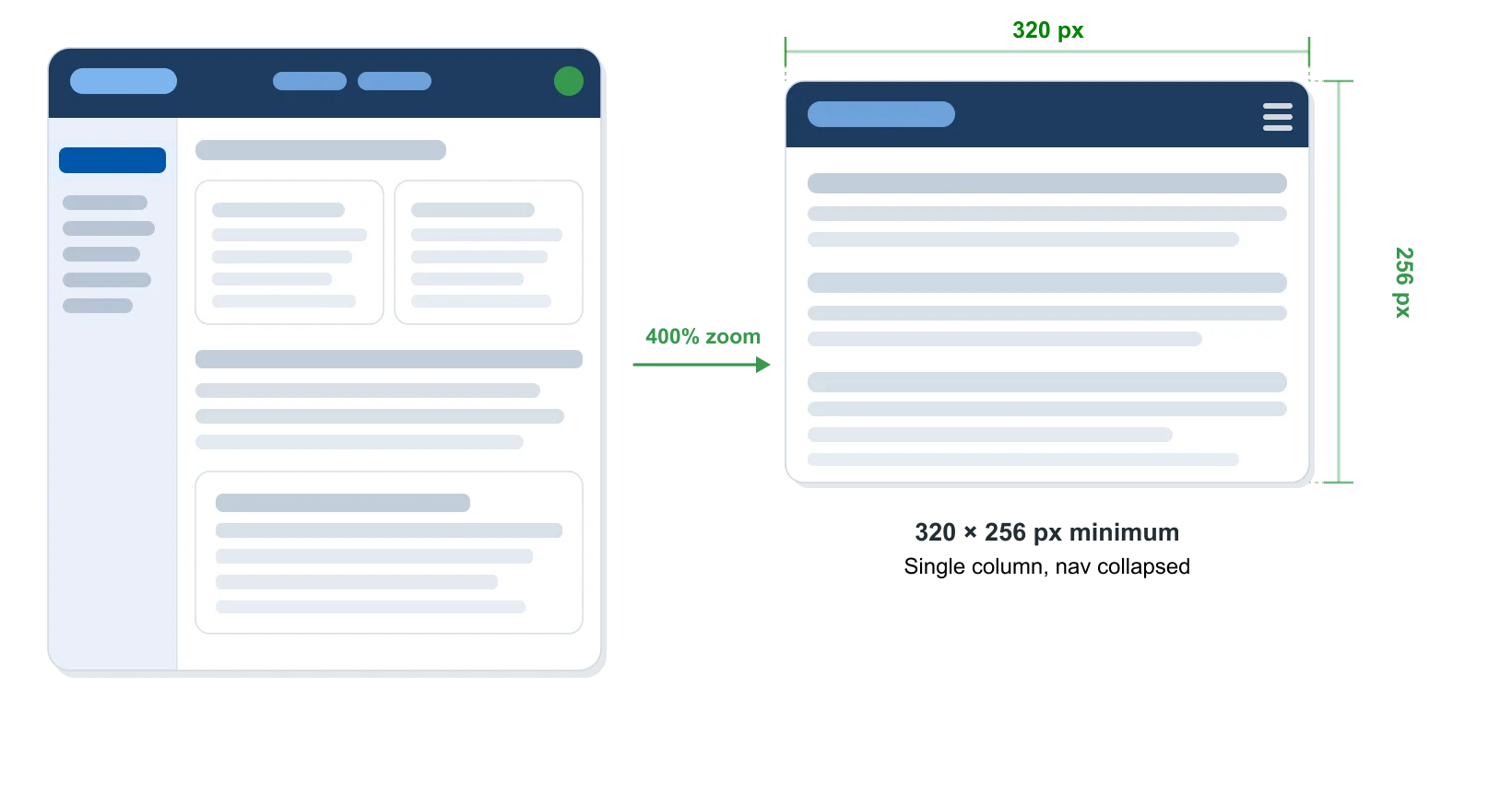
Full-width layout (left) reflows to a single 320×256px column (right)
Defining Breakpoints
There are three key breakpoints to design for. The breakpoints themselves are determined by the designer based on the user and workflow — but the minimum targets below apply to all implementations.
- Desktop — Varies based on workspace. Multi-column layouts are appropriate at full viewport widths.
- 640px wide / 200% magnification — Single column, no sidebar. This breakpoint can share the same layout as the 320px breakpoint.
- 320px wide / 400% magnification — The minimum reflow target. Single column, nav collapsed, all content stacked vertically. Viewport height is approximately 256px on a 1280×1024 display.
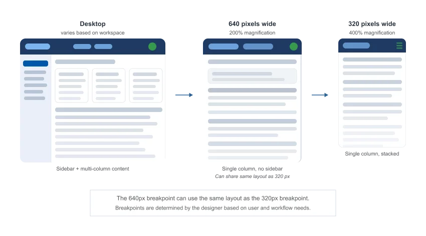
The 640px breakpoint can use the same layout as the 320px breakpoint. Breakpoints are determined by the designer based on user and workflow needs.
Use Long Scrolling Pages
Long scrolling pages are the minimum required approach to meet WCAG 1.4.10 Reflow. They reduce complexity and maintain a linear, predictable context for the user.
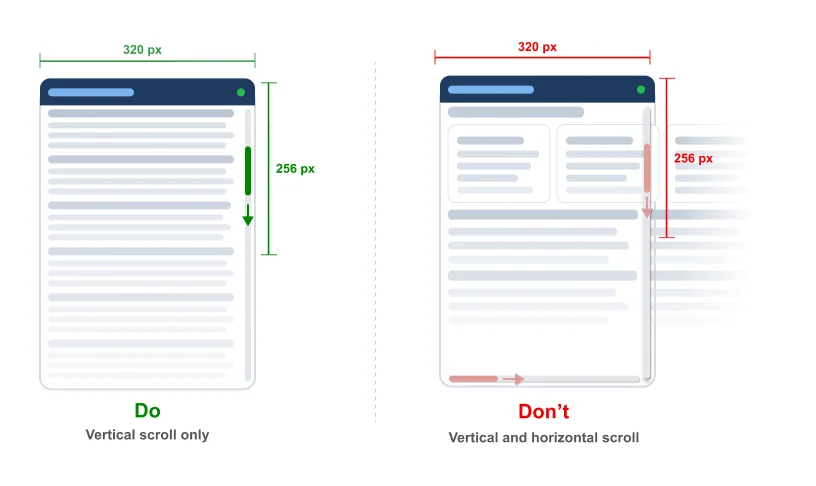
Vertical-only scrolling (left) vs. two-dimensional scrolling (right)
Do use long scrolling pages Use a single vertical scroll column to present content at high magnification.
Don’t allow two-dimensional scrolling Do not require users to scroll both horizontally and vertically to access content. Limited exceptions exist for specific content types.
Avoid Sticky Bars
At a 256px viewport height, sticky headers, footers, and vertical sidebars consume a disproportionate amount of screen real estate, making it difficult for users to interact with the underlying content.
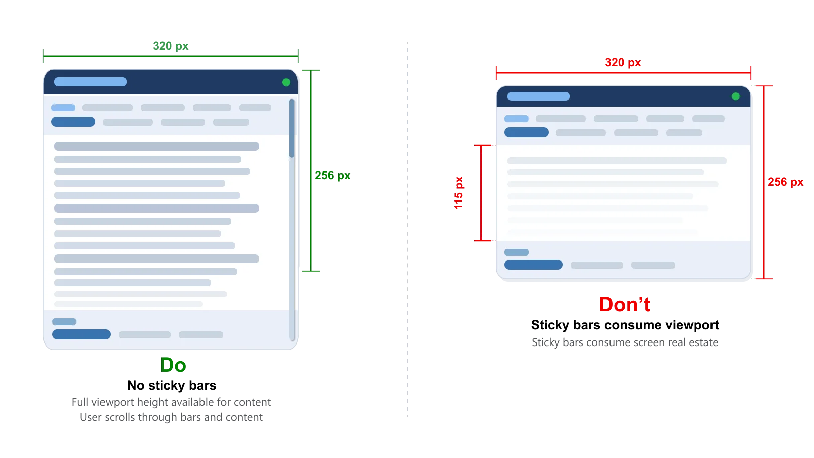
Without sticky bars (left), full content is accessible. Excessive sticky elements (right) leave almost no usable viewport area.
Transformation Techniques
Reflow relies on transformation techniques — design patterns that reshape components to fit smaller viewports as a user magnifies. The Horizon Design System’s components incorporate these behaviors.
Transform Vertical Content to Horizontal
Navigation and other vertically-oriented components can be transformed to a horizontal orientation as the viewport narrows. This conserves vertical space and keeps key controls visible.
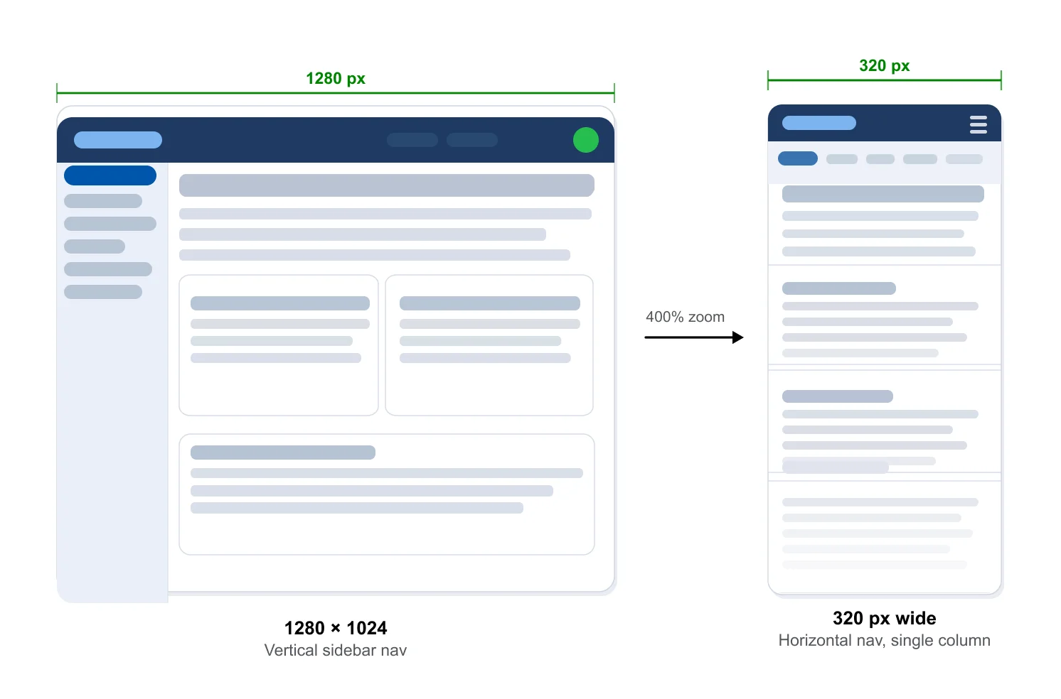
Vertical sidebar navigation (left) transforms to a horizontal nav bar (right), freeing full-width content area
Accordions
Accordions are a robust pattern for organizing, hiding, and showing information at small viewport widths. They allow users to focus on one section at a time without losing access to other content.
Do use accordions to organize content Collapsible containers — including accordions, toggles, and drawers — are recommended patterns for managing information density at high magnification.
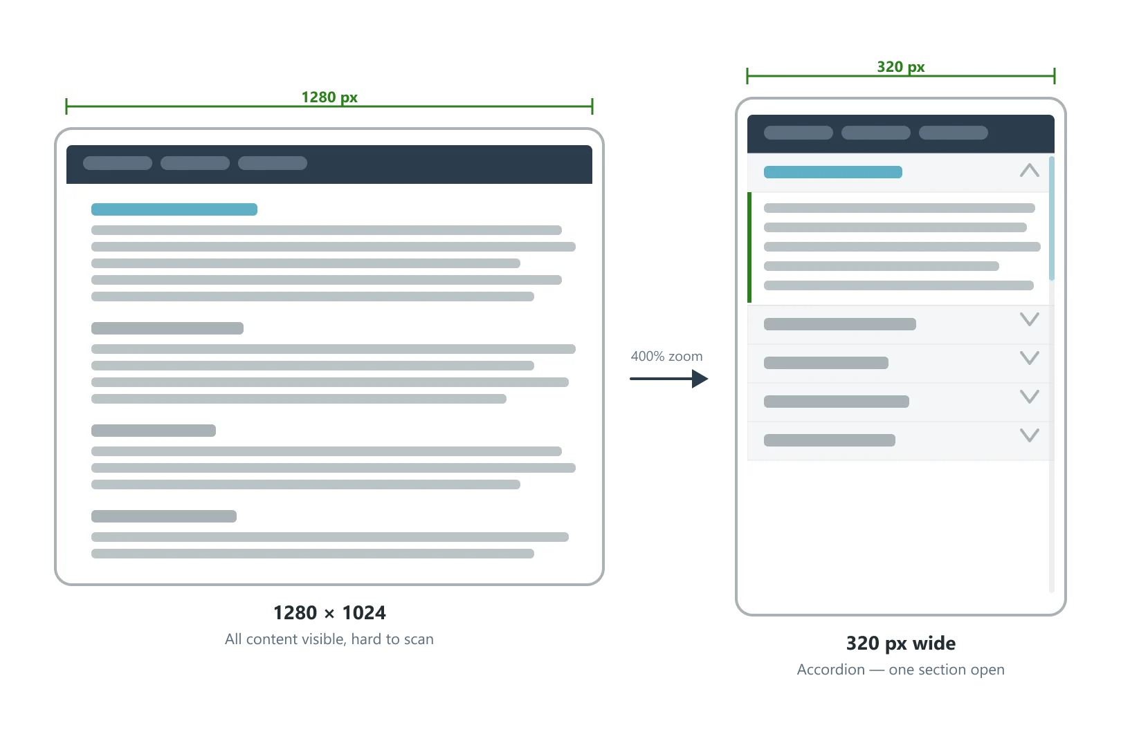
Dense stacked content (left) organized into an accordion pattern (right) with one section expanded.
Modals and Popovers
Use modals and popovers to surface functionality or content separate from the main page. At high magnification, modals may be configured to take over the entire visible screen — this is acceptable when it provides clear context and a clear way to return.
Do use modals and popovers Use modals and popovers to break up functionality or content separate from the main page. At 320px width, modals should fill the full viewport width so users aren’t required to scroll horizontally to interact with them
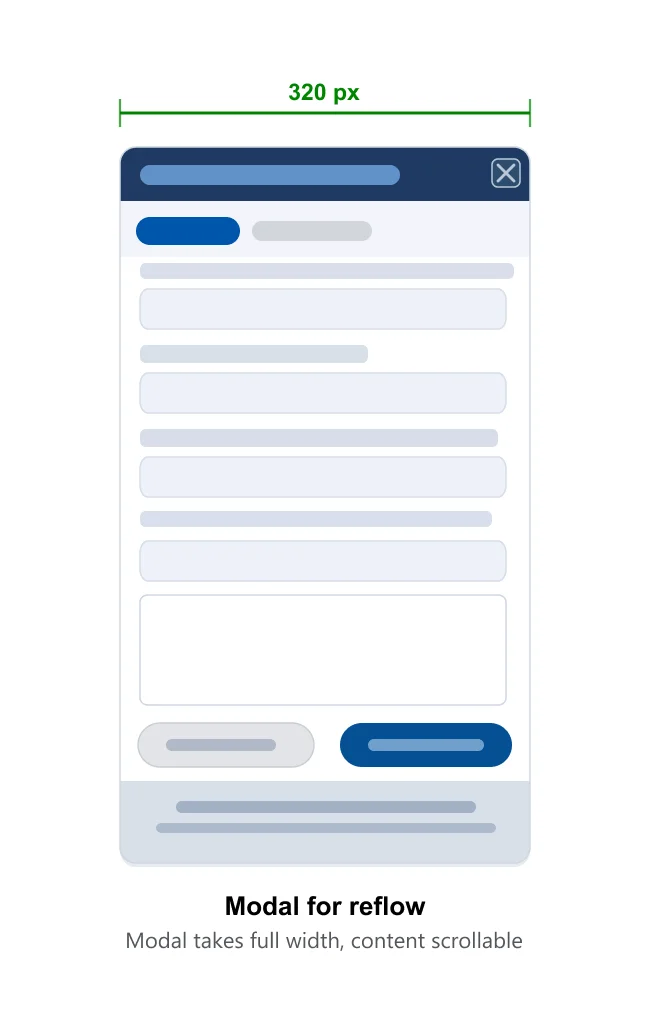
A modal dialog takes over the narrow viewport, providing a focused interaction context with a clear close action.
Horizontal Scrolling
Exceptions to the Reflow Requirement
As a user magnifies a web page, only one direction of scrolling — vertical — should be required. However, WCAG 1.4.10 permits horizontal scrolling for content that requires two-dimensional layout for meaning or usage.
- Data tables: Tabular data that requires column relationships to be meaningful
- Gantt charts and timeline interfaces: Interfaces operating on two-dimensional axes
- Complex data visualizations: Charts and diagrams requiring 2D spatial relationships
When an exception applies, you must design an integrated reflow experience within that component.
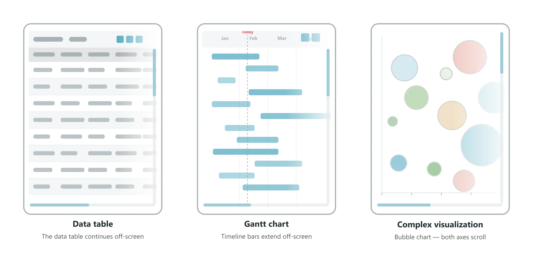
Data tables, Gantt charts, and complex visualizations are permitted exceptions to the reflow requirement.
Avoid Locking the Persistent Left Data Column
For components with a fixed data field column on the left, locking this column to a small area at narrow viewports significantly reduces usable content real estate.
Don't lock the persistent left column Use a toggle and drawer to hide the fixed left column, freeing the full viewport width for content.
Use a Toggle and Drawer
Use a toggle to hide and show the fixed left data column in a drawer. When the drawer is open, the left column is visible alongside the content. When closed, the full viewport width is available for content. The toggle control should remain accessible at the left edge at all times.
Do use a toggle and drawer for the fixed left column Design the fixed left data column to collapse into a hidden drawer, revealed by a toggle control. This frees the full viewport width for content when the column is not needed, and gives users control over their view.
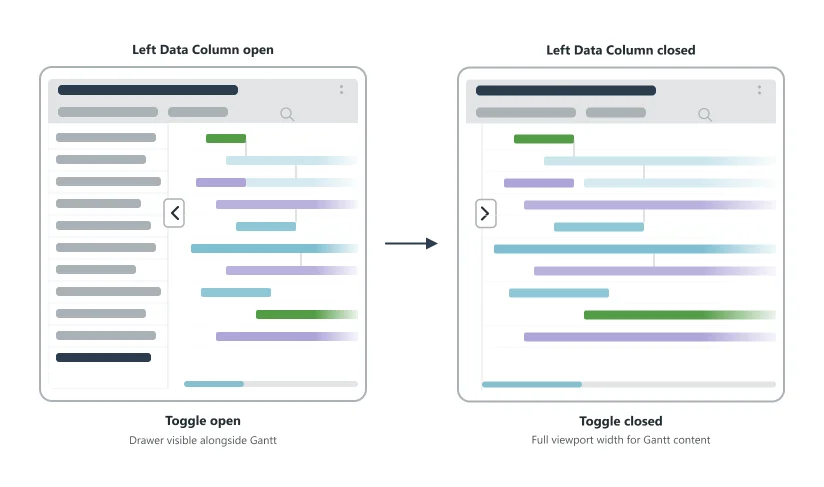
Toggle open (left) shows the fixed left data column alongside the Gantt content. Toggle closed (right) hides the column and frees the full viewport width.
Use Icons Only When Scrolling
For horizontal components with a fixed left column containing icon and label pairs, collapse the labels to icons only when the user scrolls right. Labels can reappear when the user returns to the left edge.
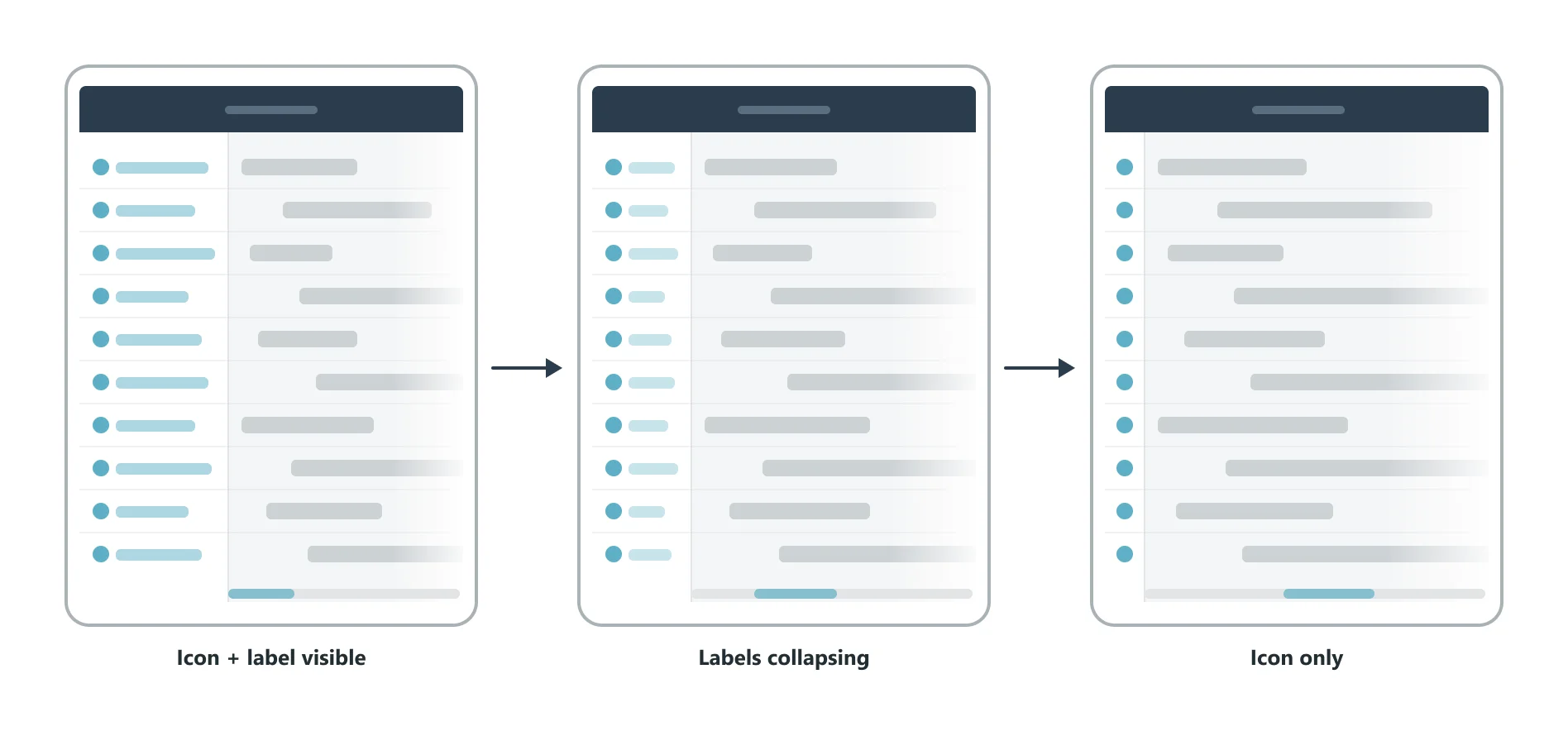
Left column shows icon + label at rest (left); collapses to icon-only as user scrolls right (center); far-right content is visible without obstruction (right).
Use Visual Affordances
Indicate to the user that additional content is available to the right through a visual affordance. A gradient fade, shadow, or partial view of an adjacent element at the right edge signals that the component is horizontally scrollable. Users should not have to discover scrollability by accident.
Do signal scrollability with a visual affordance Use a gradient fade, shadow, or partial element at the right edge of horizontally scrollable components to communicate that more content exists. Never rely on users discovering horizontal scrollability on their own.
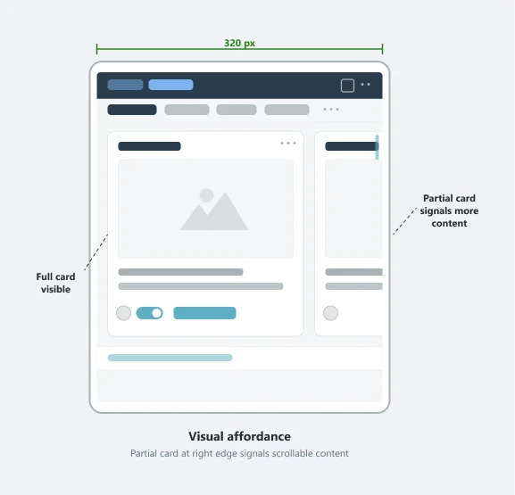
A visual affordance at the right edge signals additional content is available. The partially visible card confirms more items exist to the right.
Data Visualization Considerations
Scale Typography Appropriately
Data labels within charts and visualizations must remain legible at 400% magnification. Typography should scale proportionally — labels that become microscopic at high zoom are a usability failure even when they technically reflow.
Do scale typography with the visualization Ensure all data labels in charts and diagrams remain legible as the user magnifies. Test at 400% before shipping.
Don’t have poor label readability at 400% Avoid designs where chart labels, legends, or axis text become unreadable at high magnification. If labels disappear or become microscopic, the visualization must be redesigned.
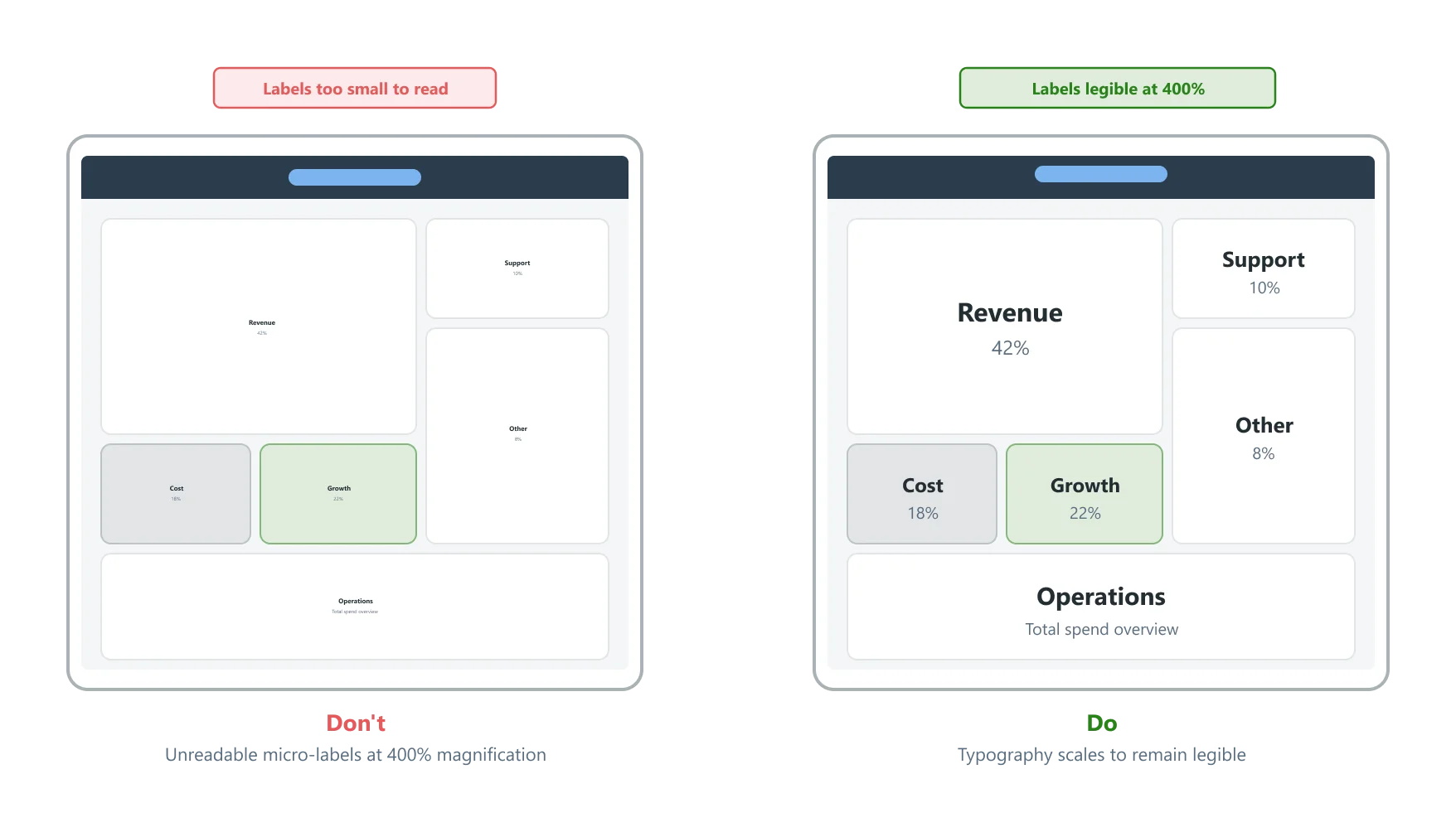
Unreadable micro-labels (left) vs. properly scaled, legible labels at 400% magnification (right).
Use Component-Level Magnification
Design data visualization components with built-in magnification controls so users can zoom into the data as part of the component itself — not by relying solely on browser zoom. Zoom in and zoom out controls should be embedded directly in the component, remain accessible at all magnification levels, and allow users to explore detail without losing context.
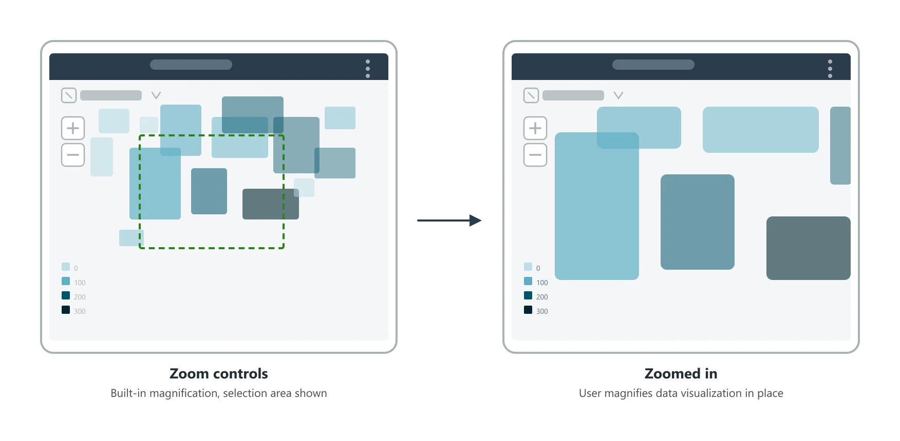
Zoom controls built into the component (left) allow the user to magnify the data visualization in place (right).
Annotating
The accessibility specification template includes a section to show the behavior of components and screens at viewport widths down to 320px width. When annotating for reflow, consider the following:
- Provide clear illustrations or screenshots of how the component or screen should appear at various viewport widths, including 320px.
- Describe any transformations or layout changes that occur as the viewport width decreases, such as stacking elements or content that collapses into menus.
- Specify any content or functionality that may be hidden or revealed using toggles, accordions, or other techniques at smaller viewport widths.
- Indicate how the component or screen should behave when magnified up to 400%, including any necessary adjustments to font sizes, padding, or margins to maintain readability and usability.