Anatomy
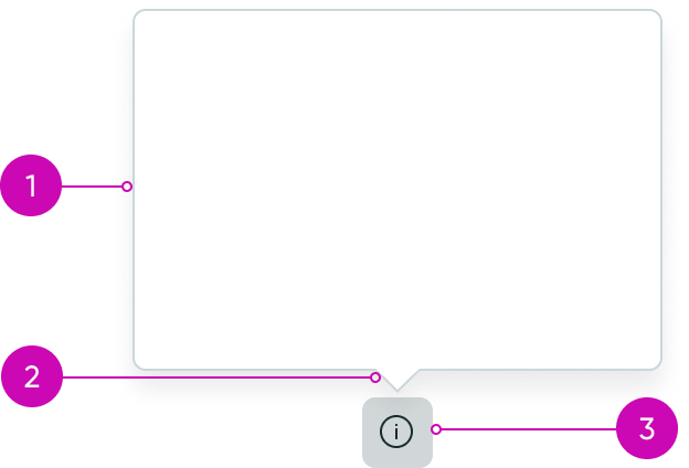
- Popover panel: Container for the popover content
- Popover tail (optional): Decorative element that establishes the relationship between the popover and the invoking trigger
- Trigger: Invoking element that opens the popover to display and then dismisses it; the popover position relative to the trigger is configurable
Subcomponents
See usage guidance for tooltip
Usage
You can use popovers in different contexts to display a variety of information, including instructions, actions, and links. However, be sensitive to data density and don't overload popovers with complex controls. Don't use popovers for advanced actions and workflows that require multiple component layers.
Popover vs. tooltip
The popover and tooltip components may look similar, but when you use them varies.
- If you are using an information icon in your design, use a popover to show the help text.
- If you want to provide rich text, use a popover. Popovers can include other components to offer the user additional actions.
- If you are providing supplementary information or guidance to the user (like an explanation of a form field), use a tooltip.
- If you are providing a label for an iconic button or icon, use a tooltip.
- If text has been truncated with an ellipsis, use a tooltip to show the full text on hover.
Variants
Learn about custom popover variants.
Types
Popover panels can have a tail or no tail that points to the triggering element. See the Configurations section for details.
Sizes
The maximum height and width of the popover is determined by the amount of content placed in the popover. When the content exceeds the maximum height of the popover, a scroll bar appears. The width of a popover is determined by the amount of slotted content.
Configurations
Learn how to customize a popover by configuring the available properties. Popovers are added to a page via event handlers and can be reused. For instructions on creating popovers, see Add a popover to a UI Builder page.
Popover tails
By default, popovers have a tail, which is useful for emphasizing the relationship between the triggering element and the content in the popover.
You can hide the tail without affecting the orientation of the popover.
Popover position
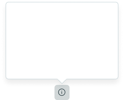
You can customize the position of popover relative to the trigger, depending on the use case. Possible positions are:
- Auto
- Top
- Right
- Bottom
- Left
Auto positioning places the popover in the best position relative to the trigger depending on the available space. For example, if the trigger is near the right edge of the page, the popover might display to the left of the trigger to avoid being cut off.
| Position | Description |
|---|---|
| Top | 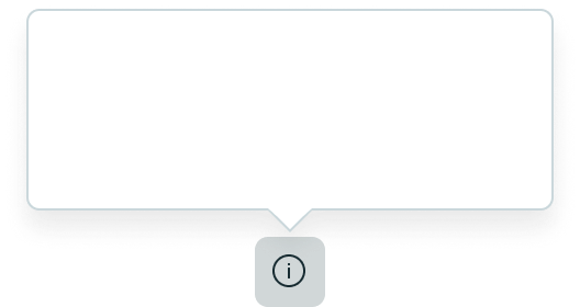 |
| Right | 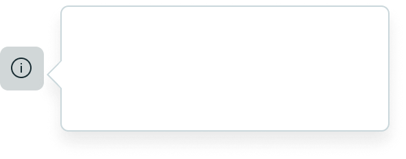 |
| Bottom | 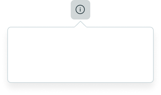 |
| Left | 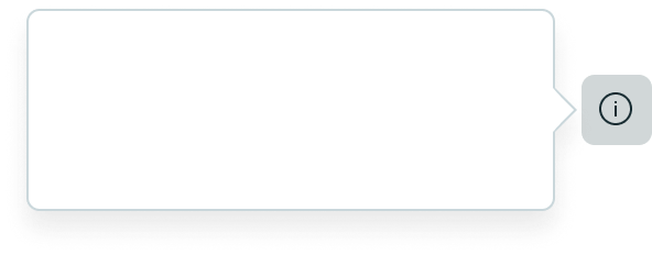 |
Content slots in popovers
You can display various components, including menus, buttons, and other subcomponents. Responsive behaviors for these elements are covered in the usage guidelines for each component used.
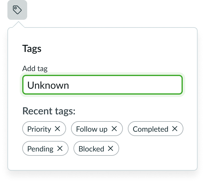
In this example, a popover uses a text input field and a pill subcomponent to add tags.
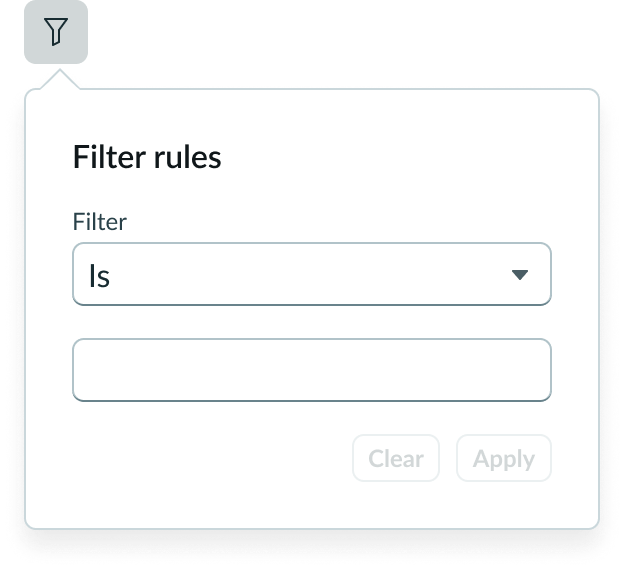
In this example a popover uses inputs and buttons as filter controls.
Scrolling
By default, a scroll bar appears when content overflows the popover container. An optional control allows you to disable scrolling if your popover content already contains a custom scroll container for handling overflow content.
Design recommendations
Learn how to apply popover in your design.
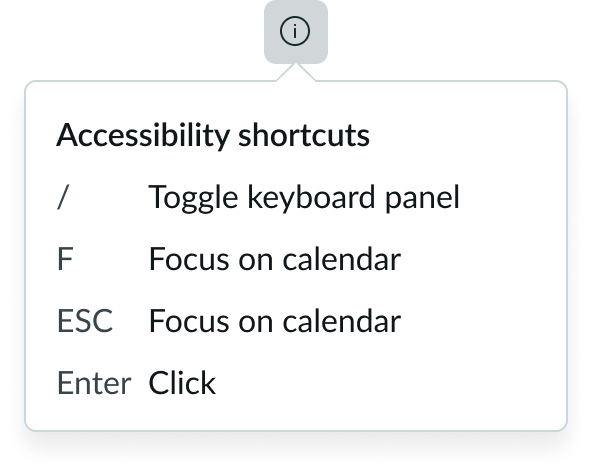
Keep popover content as concise as possible.
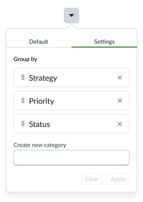
Don't use a popover for overly complex controls. Consider substituting a modal or contextual side panel for advanced actions.
Alignment and positioning
Position the popover relative to the triggering element, in a location where the user can view its contents. See the configurations section for available positions.
UI text guidelines
These are some recommendations for using text within popover:
- Because the component is flexible and can contain different types of information, follow the writing tips for creating UI text
- When using a popover associated with an Information icon, avoid placing critical details in it since they will only be visible once someone selects the icon
- Details in the popover should be supplemental and help the user understand the field or what to do to complete it
- Only use the popover if the field label could be misinterpreted and could use some additional explaining
Behavior
Learn how popover behaves when the display changes or a user interacts with the component.
Responsive behaviors
Learn how popover responds to changes in a container or display.
Overflow and wrapping
Overflow and wrapping behaviors are handled by the subcomponents in the popover. The popover doesn't have any inherent overflow or wrapping behavior.
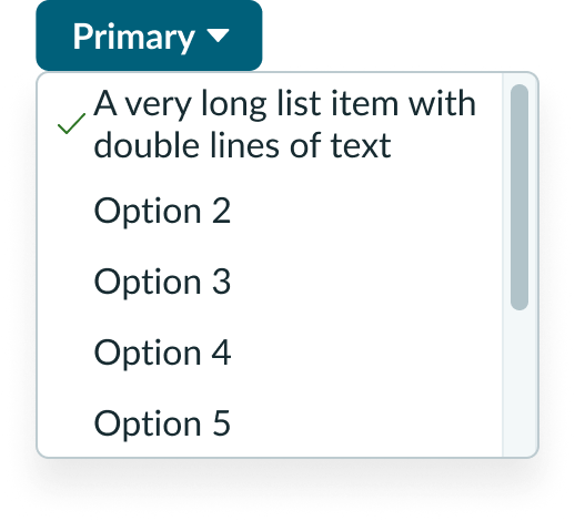
The dropdown list is a subcomponent placed in the popover. This example shows how dropdown list items wrap within the popover.
Scrolling
The popover maintains its position relative to the triggering element when the triggering element is scrolled out of view. When the content exceeds the popover's pre-determined maximum height, a scroll bar appears, allowing the user to scroll through the remaining content. Optionally, you can disable scrolling.
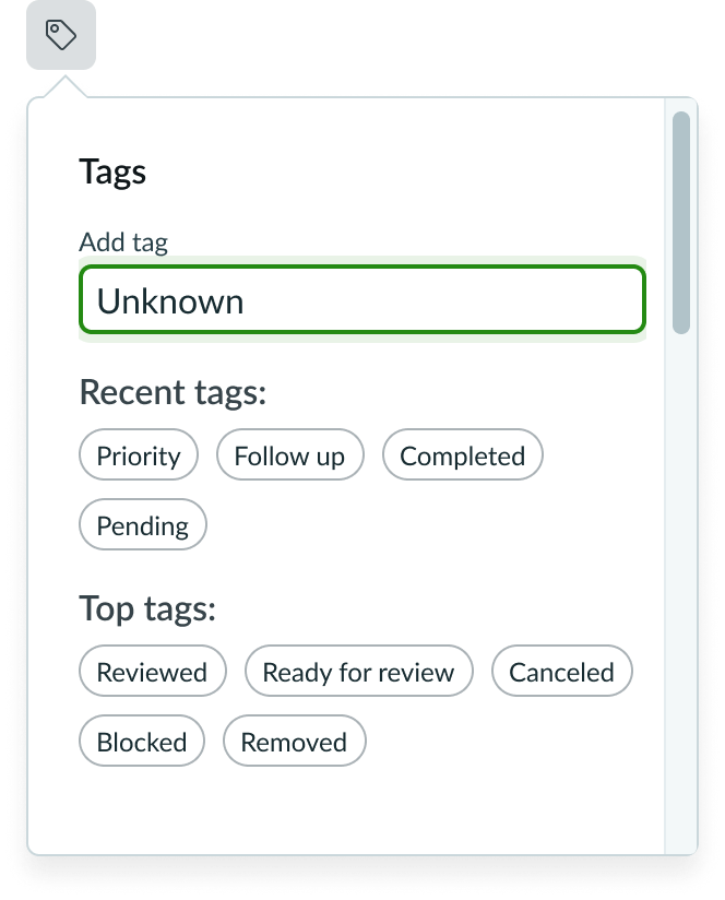
Interactions
Learn how popover responds when a user interacts with it.
Opening a popover
Select the triggering element to invoke a popover panel. Only one popover can be open at a time.
Dismissing a popover
There are multiple ways to dismiss a popover:
- Select the triggering element again
- Select any area outside the triggering element or popover panel
- Invoke another popover
Usability
Popover complies with all internationalization and accessibility requirements
Internationalization
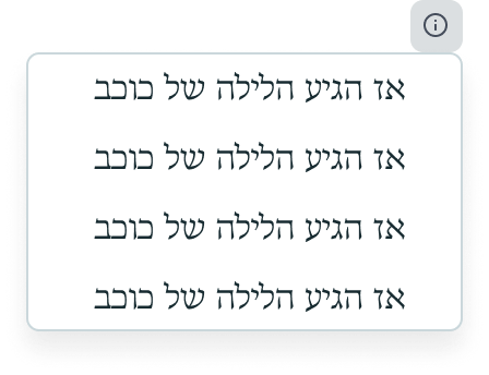
When a popover translates to a right-to-left (RTL) language, the content aligns on the right.
Accessibility
Learn how to access the actionable elements of popover through keyboard interactions and screen readers.
Keyboard interactions
- Tab: Tab order within a popover is controlled by its content and can be configured; in most cases, tab order should follow the logical reading order
- Escape: Closes the popover that contains focus and return focus to the triggering element
- Enter: Opens the popover when focus is on the triggering element
Focus in the popover
- Popovers must contain atleast one focusable element
- Focus is kept in the popover until the user closes the popover or performs an action that closes the popover; when the popover closes, focus returns to the triggering element
- Upon opening, focus must be placed an interactive element and stays within the popover until the popover closes
Screen readers
- Give the popover role=”dialog” and provide an accessible name using the aria-label attribute

