Overview
Grids and layouts provide a systematic approach to organizing and arranging elements on a screen. Grids act as a framework for placing and aligning elements, while layouts determine the overall arrangement and hierarchy of content, ensuring optimal usability and visual appeal. Using both together establishes a visual structure that helps designers achieve consistency, balance, and alignment, resulting in a harmonious and user-friendly interface.
Resources
Grids
A grid system also:
Keeps the content consistent and organized
Grid systems encourage alignment and set a structure for designers to align elements against. This kind of neat, clean layout results in an organized design and consistent user experience.
Saves designers time
Grid systems are particularly useful when designing complex interfaces with several layers of complexity. Instead of spending time re-creating your Workspace layouts over and over again, the grid system provides an existing structure with flexible layouts that can be customized according to the customer's needs.
Reinforces visual hierarchy
Grid systems serve as the basis of a design, so you can draw attention toward or away from specific content by simply scaling it up to extend across multiple columns in the layout.
Scales collaboration
Grid systems are especially useful in corporate design, where there are typically multiple designers jumping in and out of projects, as well other contributors who need to coordinate in the execution. A smart grid and layout system allows these teams to move swiftly, innovate, or adjust to unforeseen changes.
Layouts
There are a series of layouts you can use to quickly design Workspaces that are consistent and flexible.
There are two main elements of each template - the Chrome and the Stage.
The Chrome is a fixed element of every template. The Stage works on the grid system, which is where the flexibility lies.
The Chrome
The Chrome is a fixed global header that facilitates all Applications and their features.
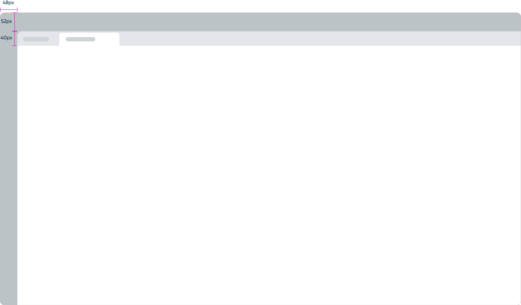
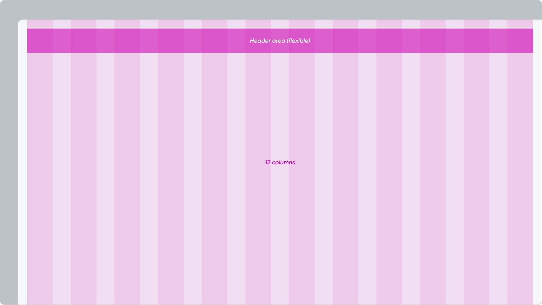
The Stage (12-column grid system)
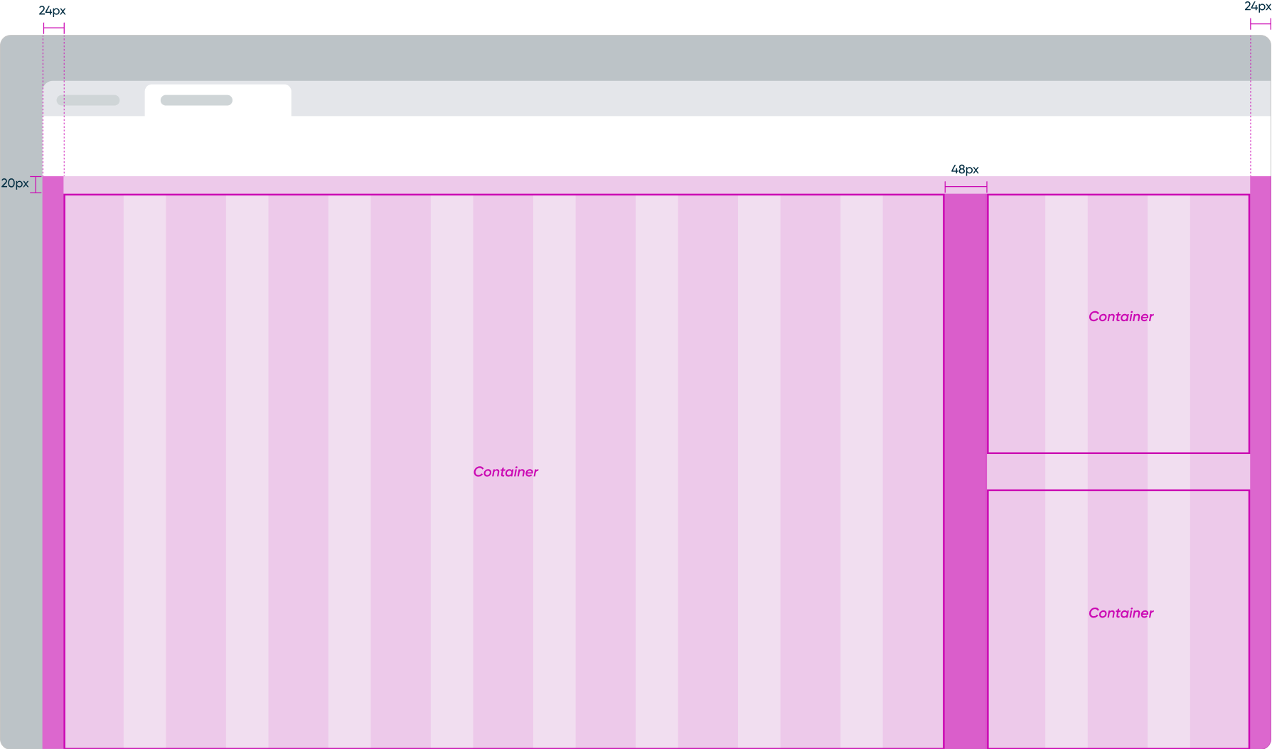
The Stage is where UI Pages for the Module are displayed. The layout of the Stage is designed with containers that align with the grid system. The inside of a container ignores the grid system for more flexibility.
Layout examples
The Stage can support up to twelve columns and you can configure the containers to your needs. You can also design a hybrid layout with multiple containers that each have different layouts/columns inside. However, each additional container and corresponding layout adds complexity to the UI.
Here are some examples of layouts that have one, two, or three containers that span across the twelve columns.
Containers
1-Container (12 columns)
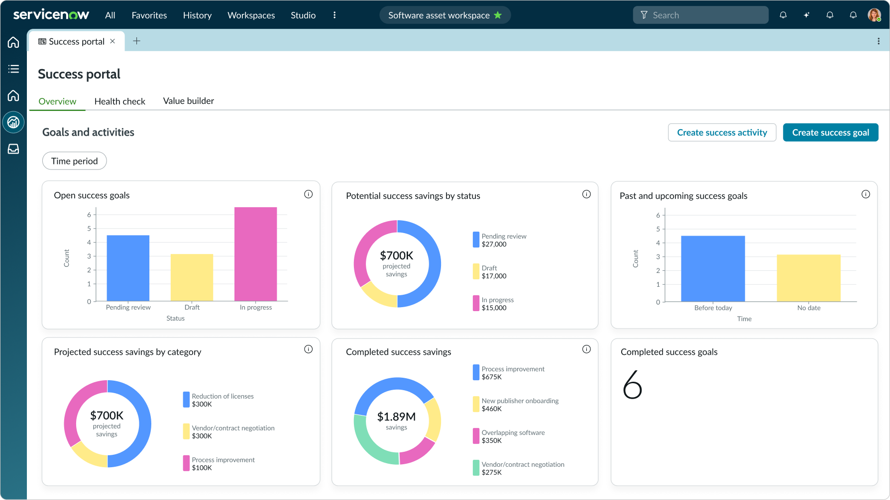
The widgets and list are contained in a single 12-column container and span across the full view.
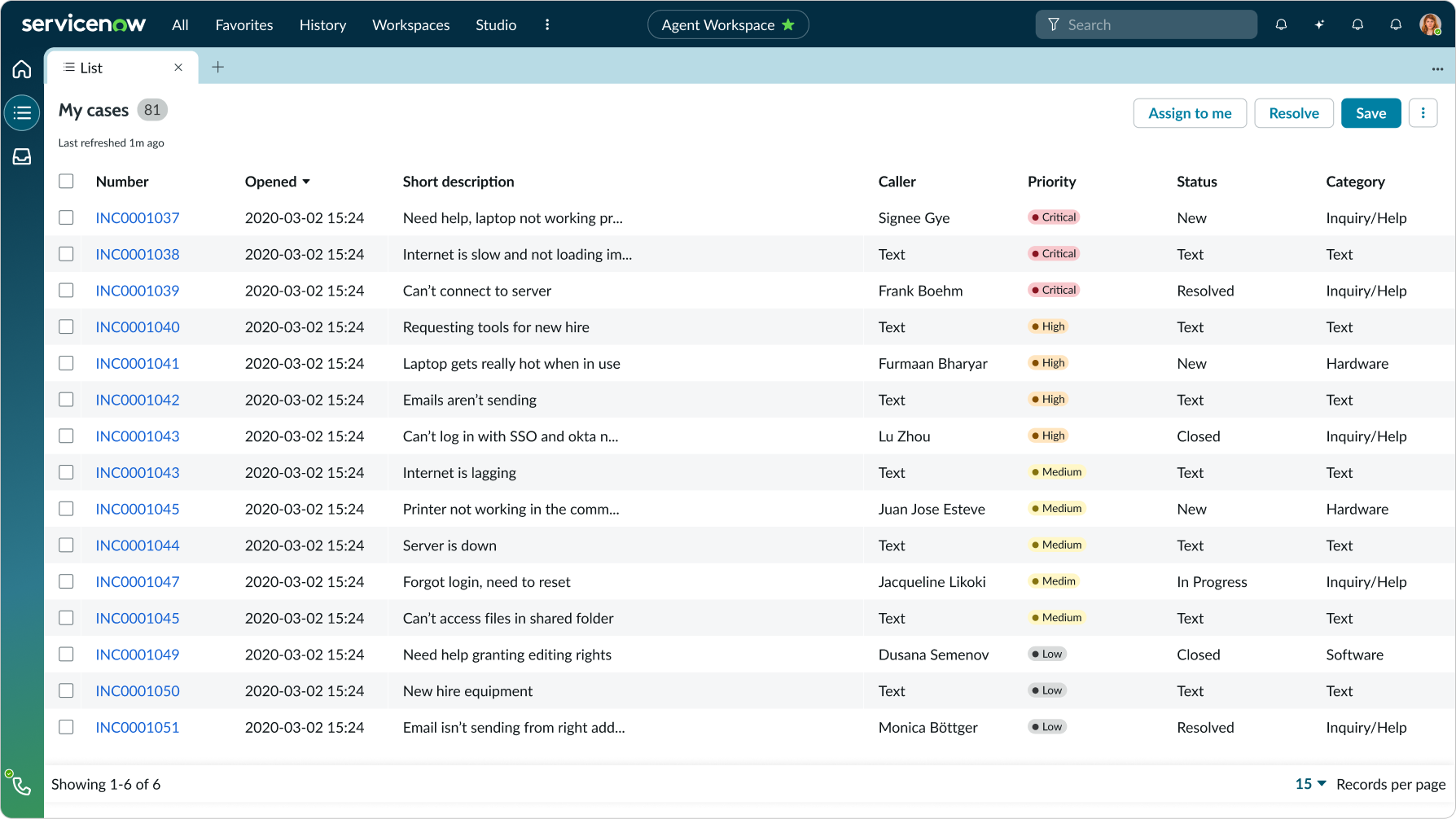
The list is in a single container and spans across the full view.
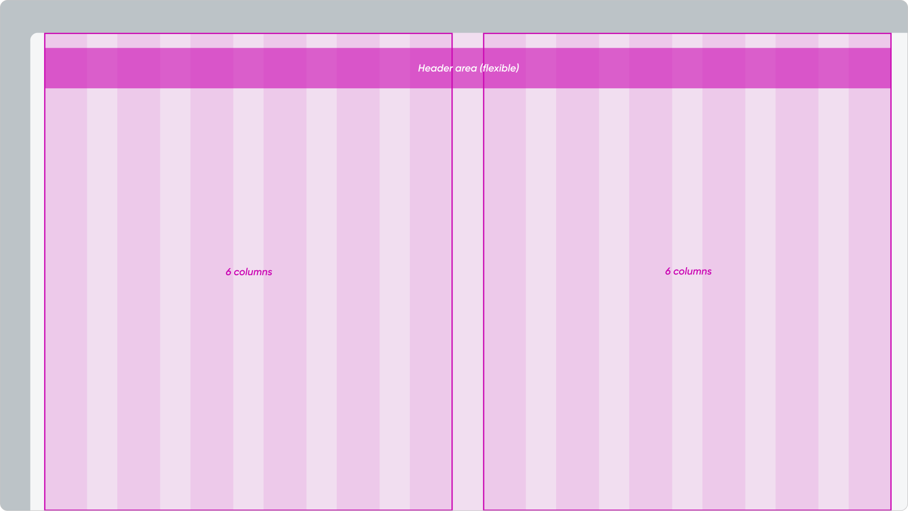
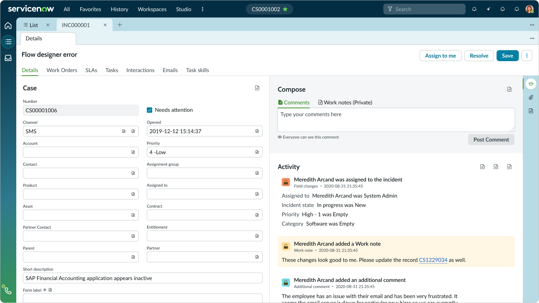
The Stage is divided equally into two containers of six rows each. The containers each hold different content (i.e. forms, activity feed, etc.).
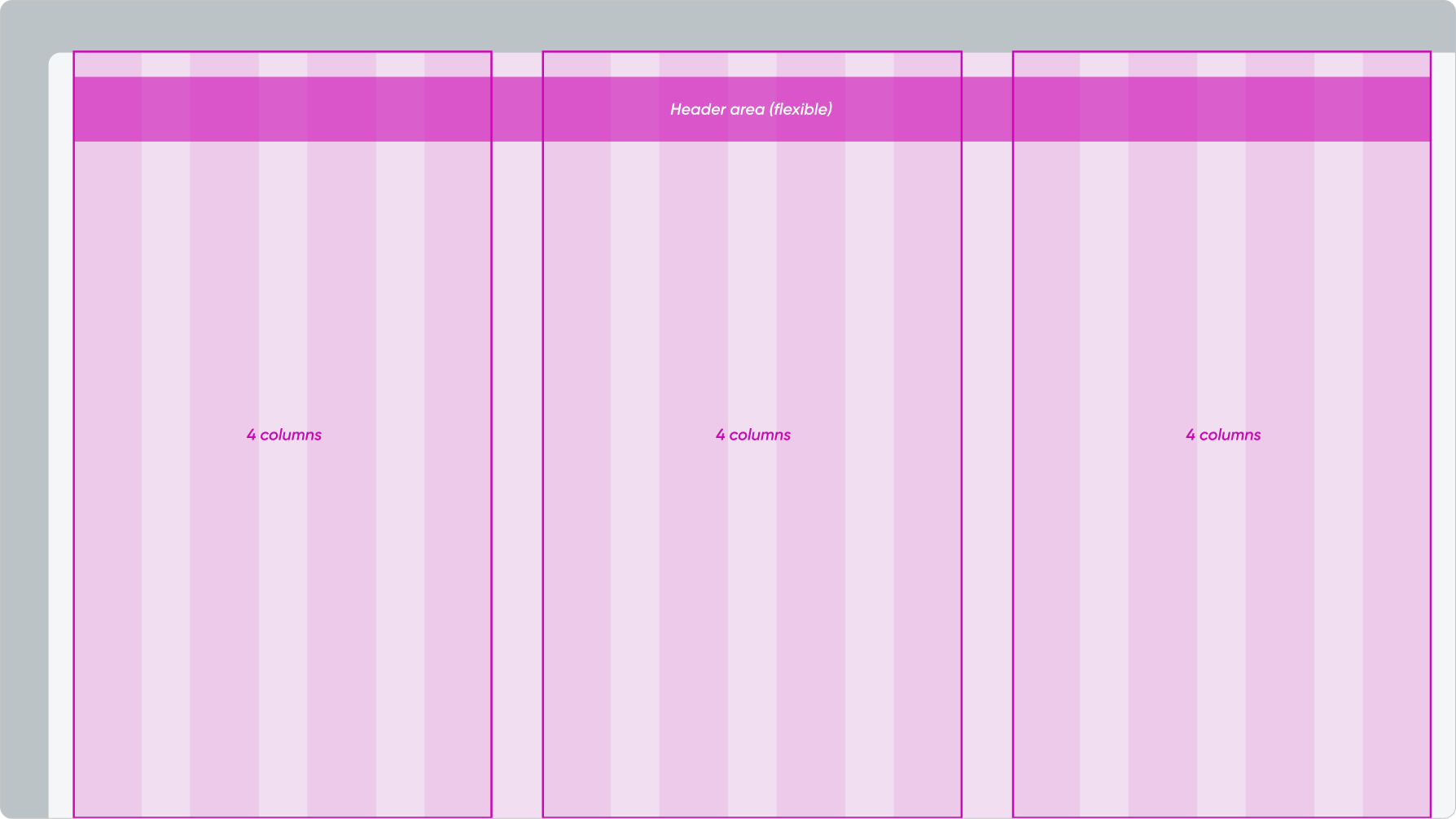
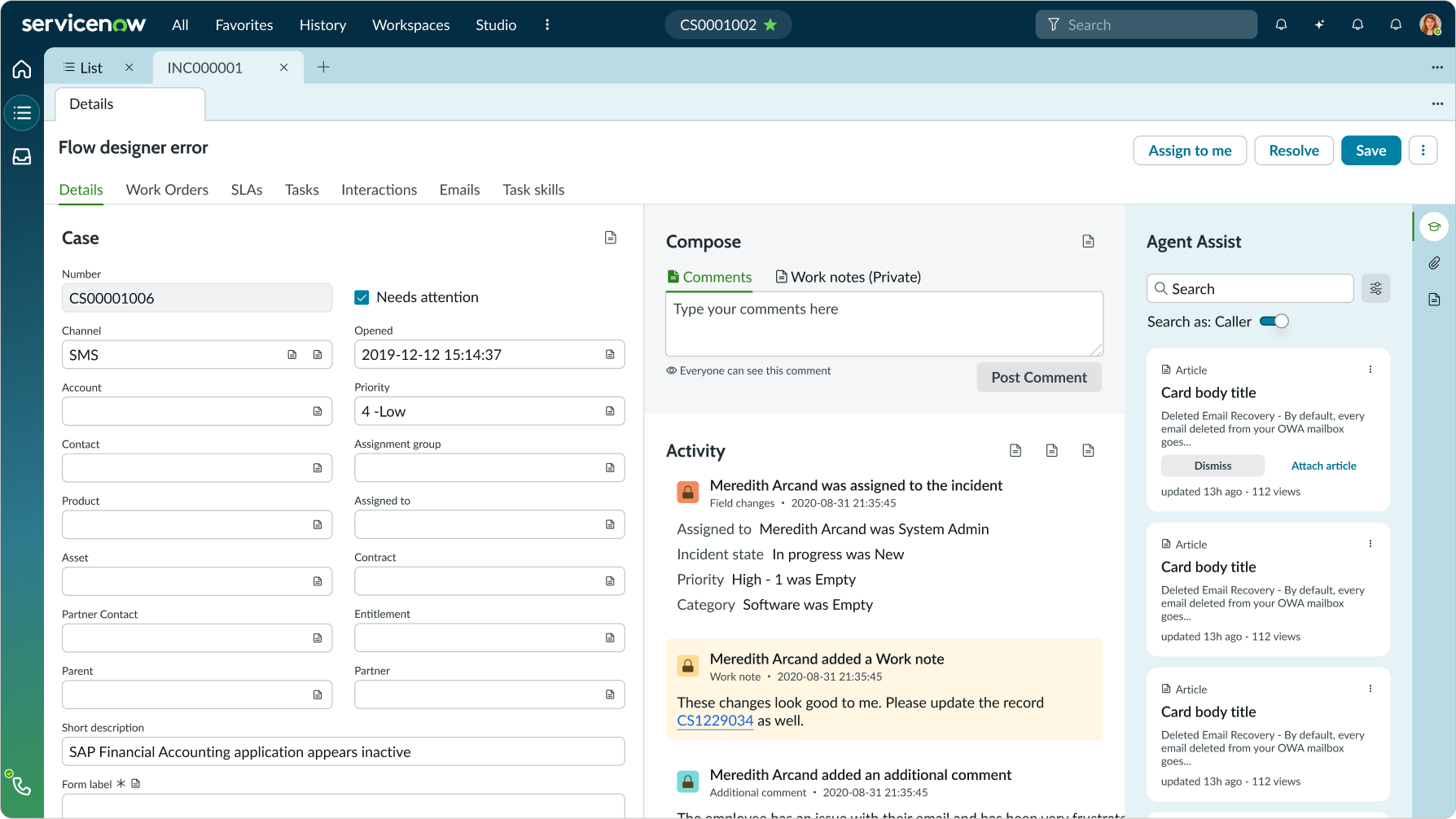
The Stage is divided equally into three containers of four columns each. The containers each hold different content (i.e. forms, activity feed, expanded side panel, etc.).
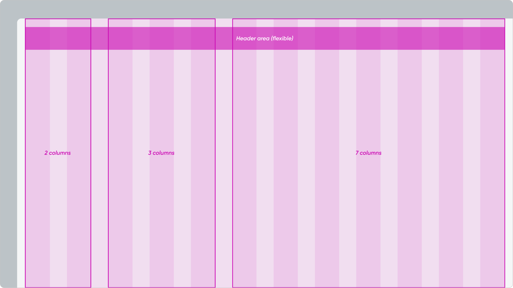
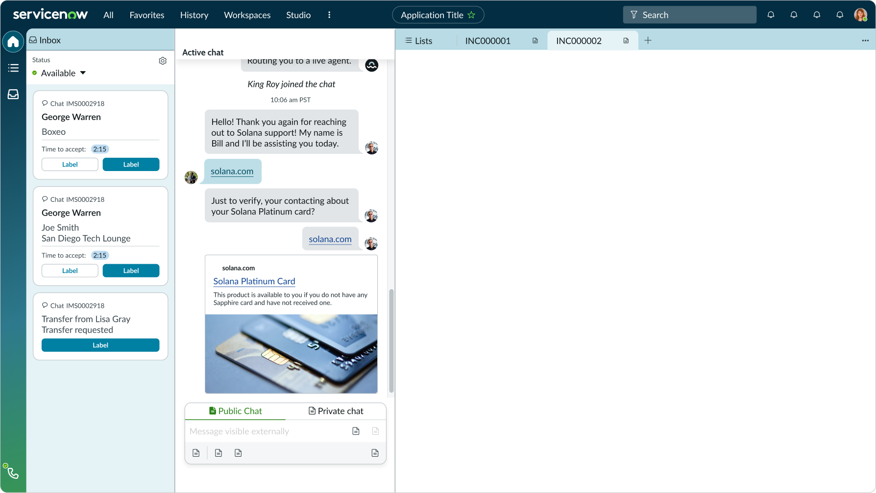
The Stage is divided unequally into two containers - one with seven columns and one with five columns. The containers each hold different content (i.e. widgets, list, etc.).
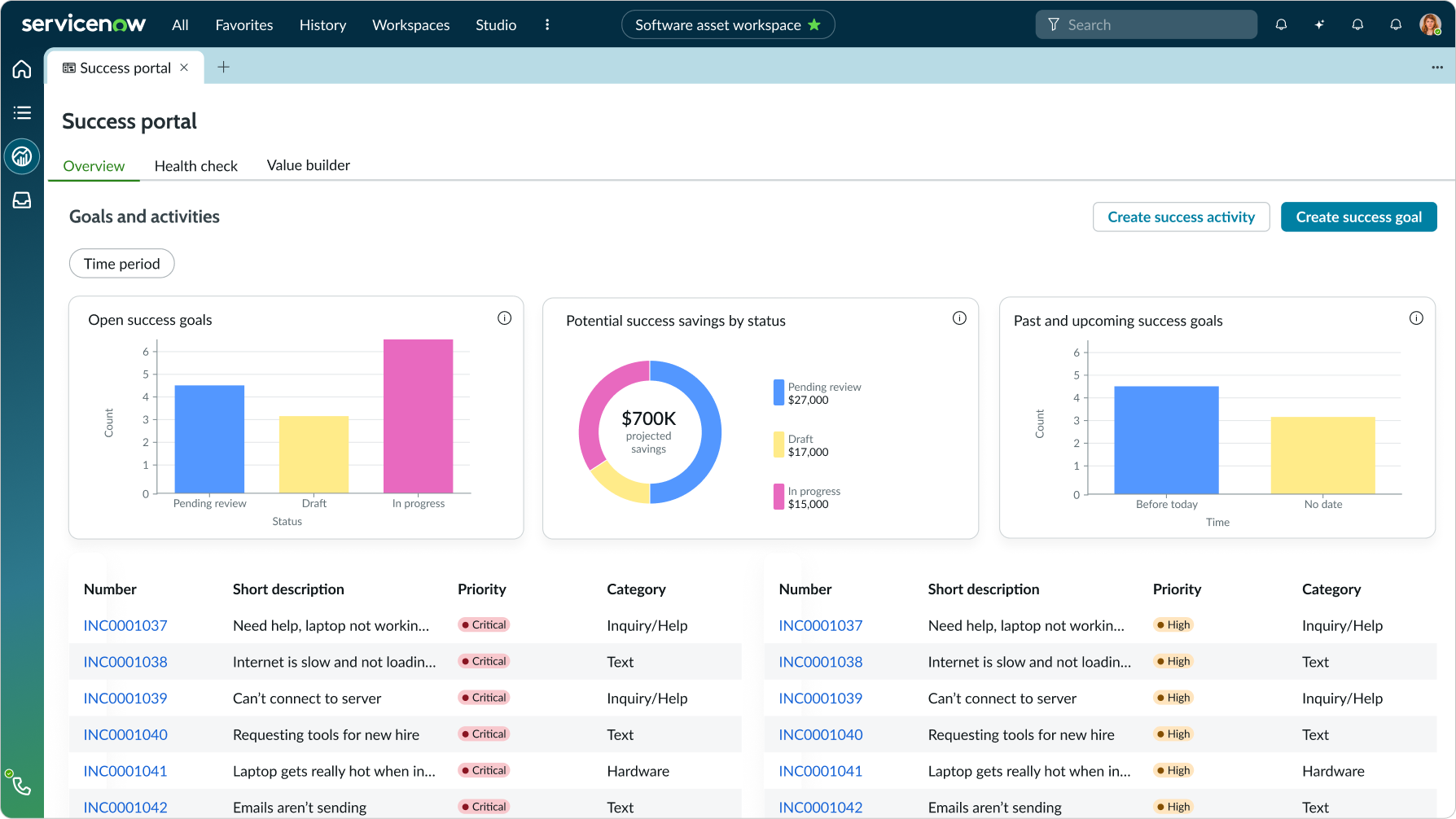
The ribbon is in a single container and spans across the full view. The cards inside are aligned with the grid. Underneath, there is an additional single container that contains the list.
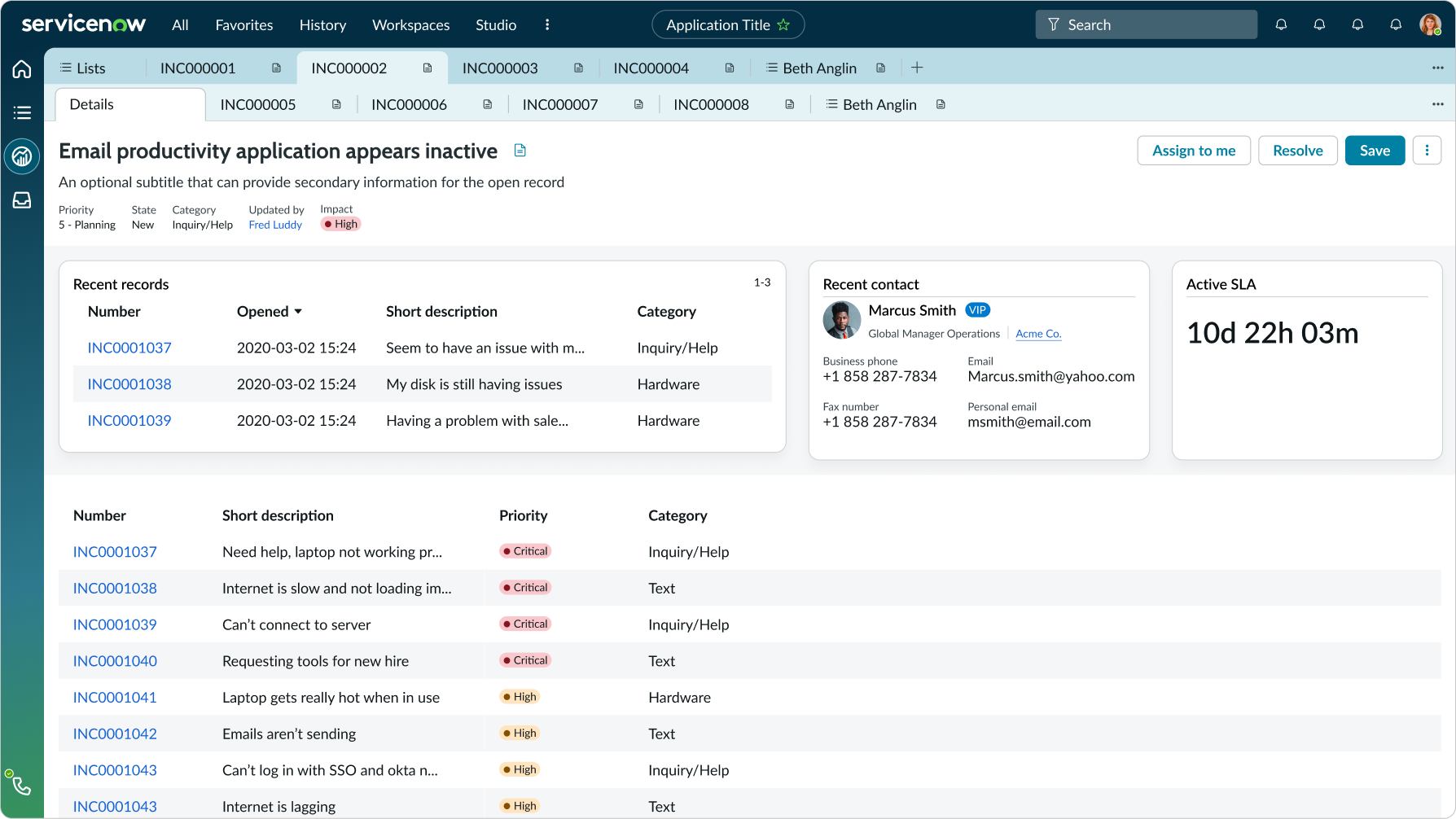
The ribbon is in a single container and spans across the full view. The cards inside are aligned with the grid. Underneath, there are two containers that each hold different content (i.e. forms, activity feed, etc.).
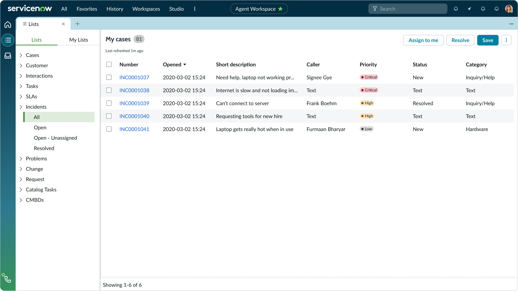
The side panel expands and squeezes itself into the left side of the full-page list.
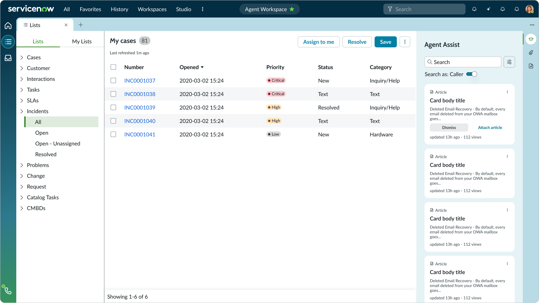
The side panel expands and squeezes the right part of the full-page list.

