Overview
Icons play a crucial role in product design by providing intuitive visual cues that guide users through a digital product's interface. They simplify navigation, enhance aesthetic appeal, and support global communication across different languages and cultures, making interactions more efficient and user-friendly.
Anatomy
Style
Our icons come in two styles to account for various interactions.

Outline style icons are our default style. Should be used for all wayfinding and actions.

Fill style icons are often used to toggle between two states— such as active and rest. They can often be used for small moments where more weight or emphasis is needed.
Size
Our icons come in various set sizes to account for the surrounding context and components. They maintain their form as they change in size. However, certain details may disappear as icons get smaller in size. For example, the calendar icon has fewer details as it decreases in size.
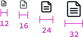
- sm (12px) — This small size is best used for informational usage. It’s too small for interaction
- md (16px) — This is our default size. A balance between form and function.
- lg (24px) — This is used in our L1 and mobile navigation. Also used in larger button styles.
- xl (32px) — This size is best used in small moments where you want to get the users attention.
Behavior
Interaction
Icons can streamline complex commands and interactions for users. They can help save space and allow for a cleaner aesthetic.
Informational
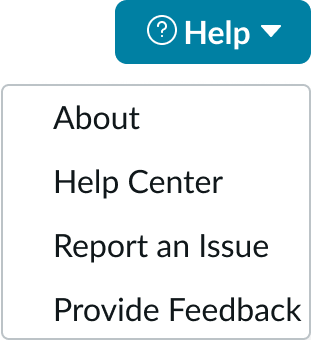
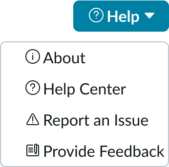
Icons can be added as noninteractive elements that add a visual cue or status to a component. They help add a extra level of information to the user.
Best practices
Clarity and Recognizability
Choose icons that are easily recognizable and have a clear meaning. Ambiguous icons can lead to confusion and hinder usability. Look at industry-standard metaphors for help.

The paper airplane visual is a common metaphor used around the industry to represent “send”. Users do not need to relearn what the visual means.

Don’t try to reinvent common concepts or use icons that are irrelevant to the context.
Consistency
It's important to maintain stylistic and behavioral consistency across the experience. This includes the design style, size, and interactions.
Be consistent in the style and approach to the iconography
Don’t mix styles, colors, or other aspects

Be consistent in the color with the icon and text label

Don’t mix different colors for icons and labels
Balanced Usage
Icons are visual tools to help convey messages. Overuse of icons in a UI leads to visual clutter, making it difficult for users to locate important information.
Use a single icon to concisely represent a concept
Don’t use too many icons in an UI as it can clutter the UI
Sizing and Transforming
Our icons do come in multiple sizes to account for various use cases. Use care when resizing assets if needed.

If you do need to scale an icon, maintain the square proportions and scale by even multiples. This will help keep the icon crisp.
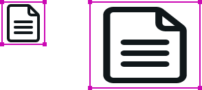
Do not skew, squish, or scale the icons outside standard sizes.
Accessibility
Aria attributes
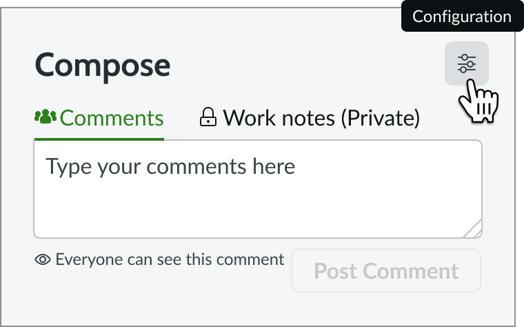
The icon requires configuration of the aria-label attribute in the configAria property to be accessible using a screen reader.
Using labels
Adding labels along with icons will improve the accessibility of the experience and help clarify the action for users. Use a tooltip when a label can’t be used.
Do include labels and tool tips to help make actions clear to users
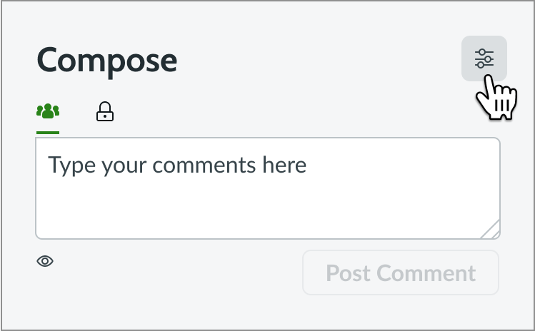
Not including labels or tooltips makes the experience unclear to the user.
Internationalization
When the display translates to a right-to-left (RTL) language, only icons that communicate direction (such as arrows) flip. All other icons can be configured to support RTL.
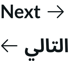
If you don't want directional icons to flip, use an icon that has the explicit direction you want it to face (for example a left arrow-left or a right chevron). These icons always point in the direction specified by the icon name.