Hover
Hover interactions breathe life into charts! As users move their cursor over data points, tooltips appear revealing details, values, or additional context.
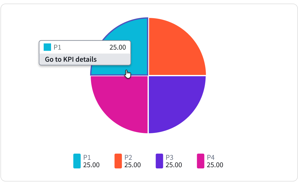
Highlight & Tooltip: Highlighting a chart area on hover is a common interactive feature that enhances data visualization. When a user hovers over a specific area or data point on a chart, that area is visually emphasized, seen above with a thick blue border around the hovered area. This highlighting effect draws attention to the selected area, making it easier for users to focus on specific data points or patterns. In most cases, highlighting goes hand in hand with tooltips. Tooltips provide additional information about the highlighted area, such as its exact value or label. When a user hovers over a chart area, a tooltip appears, displaying relevant details that provide context and improve understanding.
Click
Clicks unlock deeper dives! Clicking on chart elements goes beyond hovering. It allows users to drill down into specific data points, filter views, or trigger actions like opening detailed reports.
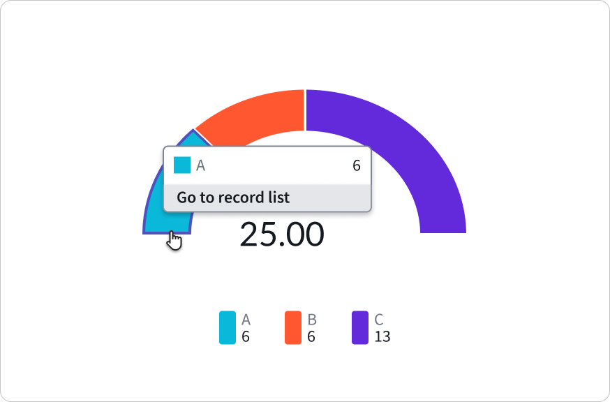
Go to record list/KPI details: This option under configuration called “Chart interactions” allows users to seamlessly navigate from a chart to a corresponding records table or key performance indicator (KPI) view. When a user clicks on a chart, this functionality redirects them within the same tab to a page displaying the relevant records or KPIs associated with the data source used to generate the chart.
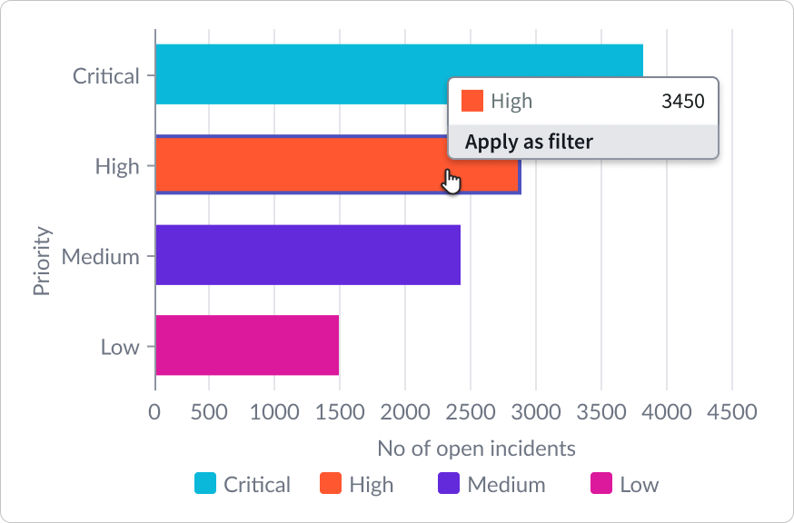
Apply as filter: Another powerful feature under “Chart interactions” allows users to dynamically filter the entire dashboard, particularly the charts, based on where they click within a specific chart. When a user clicks on a data point or area of a chart, this functionality applies a filter to the dashboard, refining the displayed data to show only the relevant information.
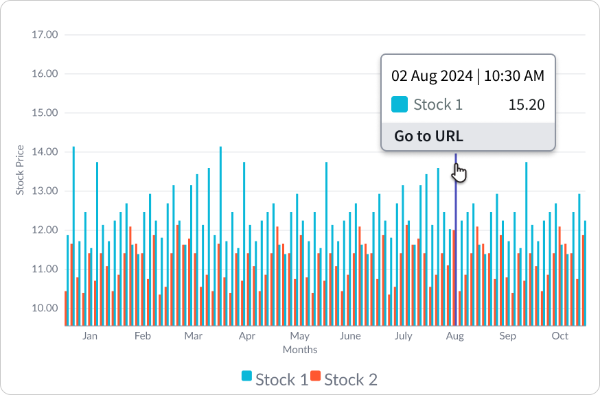
Go to URL: This is a versatile feature under “Chart Interactions” that allows users to redirect to any internally or externally configured URL to access additional supporting information related to a chart. When a user interacts with a chart, such as clicking on a data point or area, this functionality enables them to seamlessly navigate to a designated URL for further context or details.
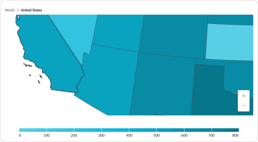
Geomap: The zoom controls in a geo map provide users with the ability to zoom in and out of the map, allowing them to adjust the level of detail and focus on specific areas of interest. By using these controls, users can easily navigate and explore the map to gain a better understanding of the geographical data being presented. In addition to zooming, users can also pan the map by clicking and dragging it.
Keyboard navigation
Not lost is the keyboard! Charts offer keyboard navigation for those who prefer a hands-on approach and who want to make the charts more accessible. The example below shows the tab order in a pivot table.
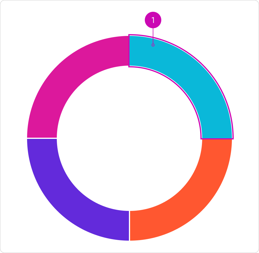
- With focus on segment (Pie/Donut/Semi Chart) - Each tab click moves one step into the pie/donut/semi as shown below.
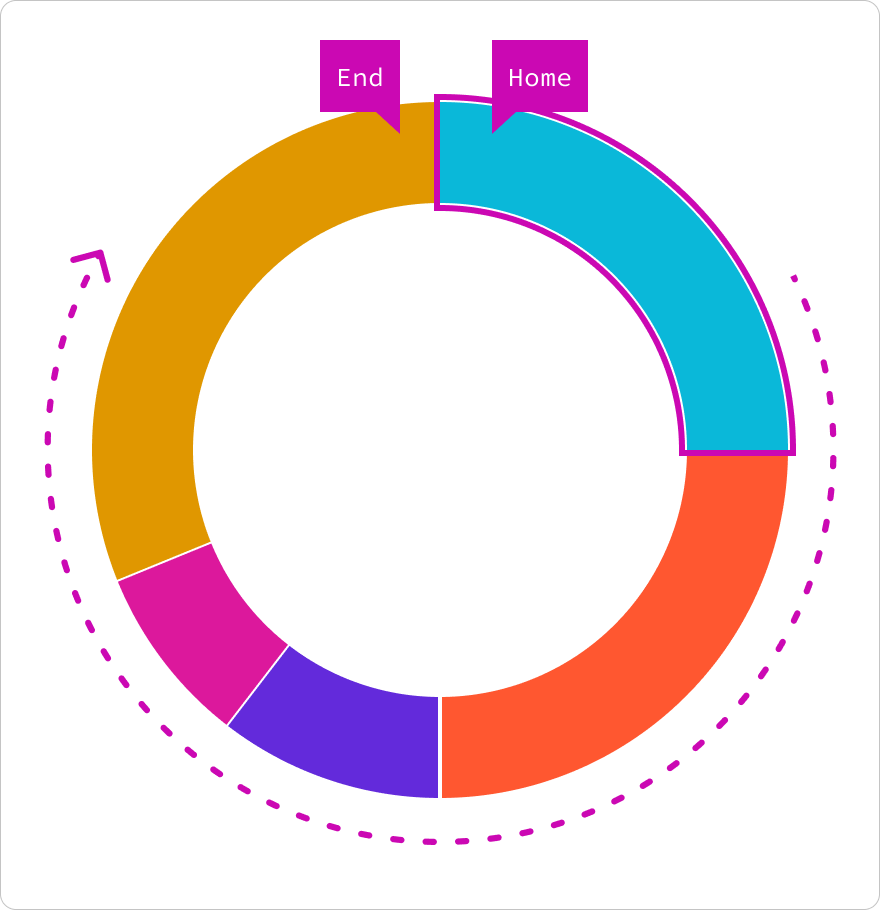
Tab
Enter chart
Moves one step forward to the next chart segment.
Shift + Tab
Move backwards in tab order
Moves one step backward to the previous tab order.
Up / Left / Down / Right
Left, right or up, down keys
Let users move between each data segments in the pie/donut/demi chart.
Directional behavior details:
| Key | Behavior |
|---|---|
| Right | Starting with the top right segment, the focus will move clock-wise around the pie/donut chart. For semi-donut charts the focus will start on the far left segment and focus will move around the arc to the right. |
| Down | Same as right behavior. |
| Left | Starting with the top right segment, the focus will move counter clock-wise around the pie/donut chart. For semi-donut charts the focus will start on the far left segment and focus will jump to the right-most segment and move left around the arc to the left. |
| Up | Same as left behavior. |
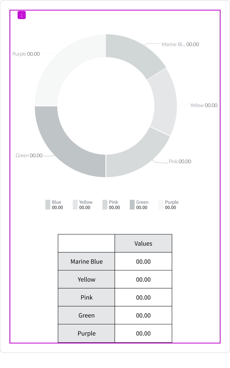
- Accessibility table Conditional. If there a reader table is on the container will be in focus. When active, a scroll bar will show to indicate to the user that they can scroll down the container to reader table.
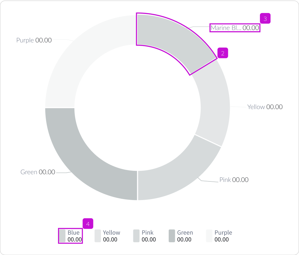
- Data segments: The first top-right data segment will receive the tab focus by default.
- Data label, when truncated: This tab order is conditional. If a label is truncated the truncated labels take precedence in order. A text tooltip will reveal a truncated label.
- Register/Legend: The first register cell will receive tab focus.
