Overview
Here, we'll cover all the basics for creating an icon for the now-icon library, including grid, padding, stroke alignment, and pixel perfection.
Before you start conceptualizing, research metaphors and industry standards to help you understand what users are accustomed to seeing when an icon is used and what it is typically used for.
Grid
Size and Padding
There are 4 icon sizes: 32, 24, 16, 12. All icon sizes are required for the icon to be added to now-icon library.
Generally, leave at least 2px of padding around the 32px icons, and a minimum of 1px around all other sizes to provide ample space around your icon.
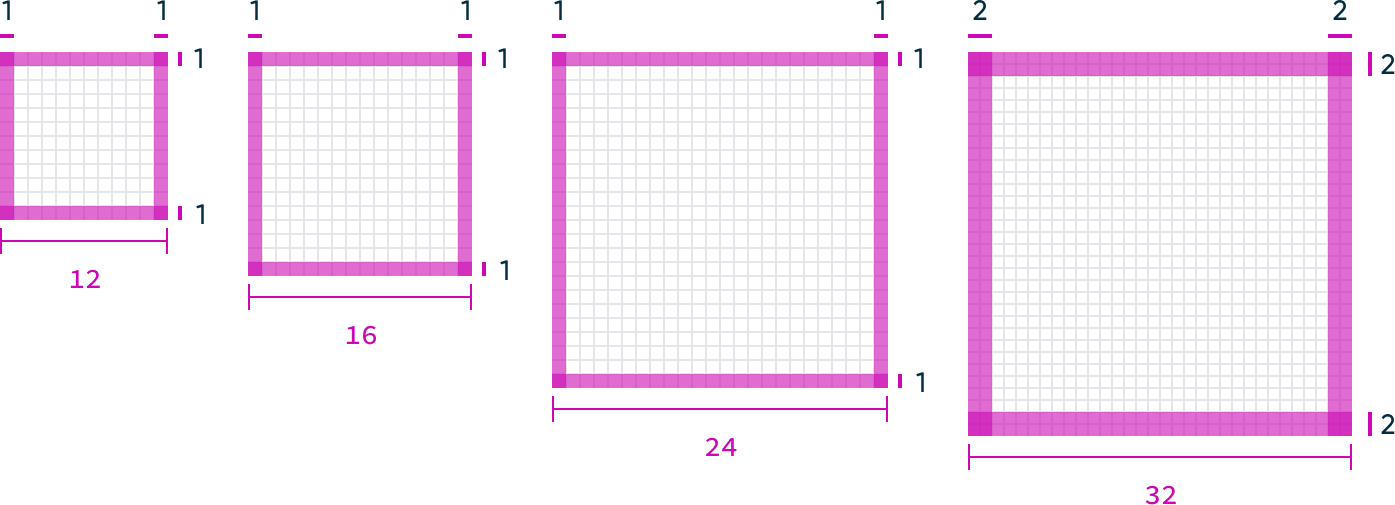
- sm (12px) — This small size is best used for informational usage. It’s too small for interaction.
- md (16px) — This is our default size. A balance between form and function.
- lg (24px) — This is used in our L1 and mobile navigation. Also used in larger button styles.
- xl (32px) — This size is best used in small moments where you want to get the users attention.
Keylines
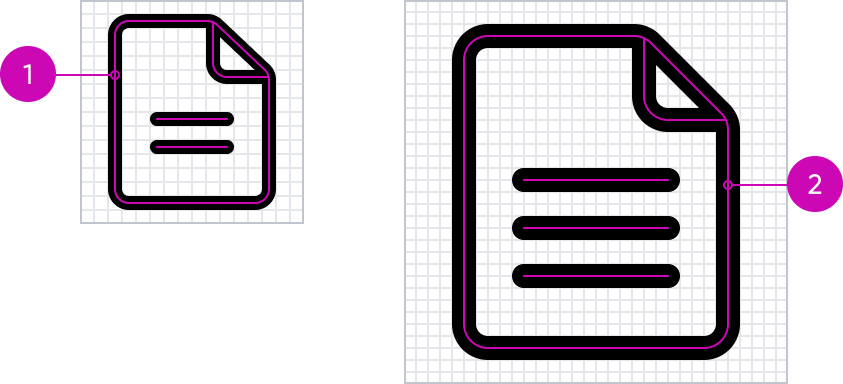
Keylines play a crucial role in icons as they define the boundaries and structure of icons. They help create consistency across our icons, enhancing the recognizability and scalability of icons.

These keylines are based on the way we perceive shapes and to give the icons an overall balance. Circles and other nonsquare shapes need to be higher and wider to be optically balanced with squares.

- sm (12px) — This small size is best used for informational usage. It’s too small for interaction.
- md (16px) — This is our default size. A balance between form and function.
- lg (24px) — This is used in our L1 and mobile navigation. Also used in larger button styles.
- xl (32px) — This size is best used in small moments where you want to get the users attention.
Corner Radius
Rounded corners on an icon can soften its visual appearance, creating a friendly and approachable aesthetic. We use three standard radius to help consistent look.
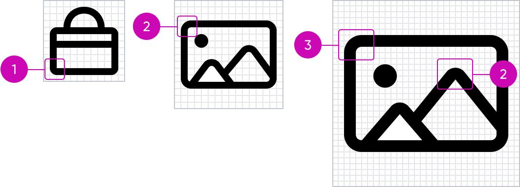
- Small Radius — .5px radius used for certain details and complex shapes. Can also be used in 12x sizes.
- Medium Radius — 1px radius is used most in 12x/16x sizes and smaller detailed elements.
- Large Radius — 2px radius mainly used in 24x/32x sizes and large shapes.
End Caps/Joins
Using rounded end caps and joins on lines and shapes makes a design look smoother and friendlier. It’s a simple setting that takes away the sharp corners, making everything feel softer and easier to look at.
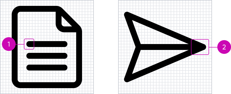
- End cap— set to round.
- Join — use the round join to create a rounded corner.
Alignment
Despite the prevalence of pixel-dense screens, such as tablets and phones, we still need to worry about how shapes align to the pixel grids. Drawing icons for each size and aligning the shapes to the grid strengthens our product's craftsmanship and makes our icons clearer and easier to read.
Align to the grid
It's important to align the pixels, particularly for low-res devices to appear crisp.
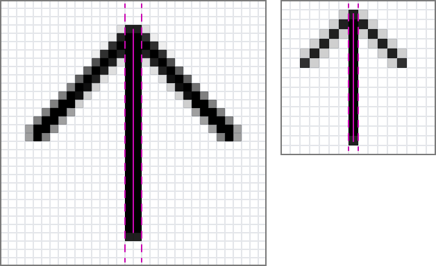
Make sure the stroke sits correctly on the grid.
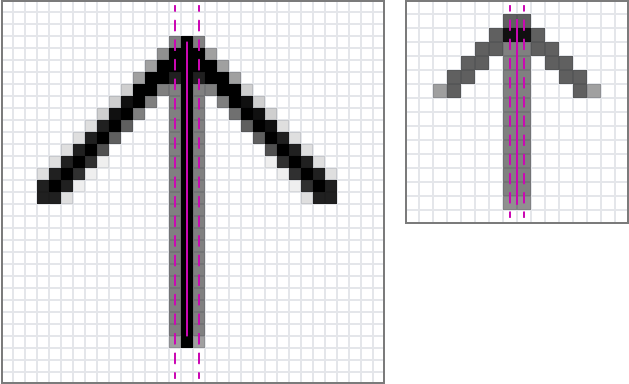
Off-grid strokes will create blurry, thicker, and lighter color strokes.
Offsetting
Often, with 1px strokes, if you center an icon in the canvas, the elements will be blurry and off-grid, resulting in the element looking thicker and lighter than other elements. This is most common with math symbols and arrows.
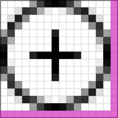
All elements are reduced by a pixel to offset the icon. All elements are now on the grid.
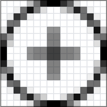
The plus symbol falls off the grid, creating a blurry and thicker element

Make sure you think about how an icon might work in a series of similar icons. Because some of these icons need to be offset, all of the icons should be offset
Modifiers
Modifiers add context or indicate a change in state, action, or attribute to the base icon. They extend its meaning and enhance clarity to an action.
Placement
Modifiers are placed 1 px into the padding with a gap between it and the base element. This helps increase the readability of the icons.

The gap should be the same thickness as the stroke weight.
Other Details
“Off” Slash
All slashes should go from top right to bottom left. On top of that, each slash should go the full length of the icon, only stopping at the margins.

In some cases, the direction of both the slash and the icon are in the same direction. In this case, you should flip the direction of the slash. This will allow it to be toggleable.
Multiples/Stacks
When creating an icon with multiple base elements, it's important to keep the clarity of the icon. Try to limit the elements to two. That should be enough to denote the concept of multiples.

The stacking order should be moving top-right.