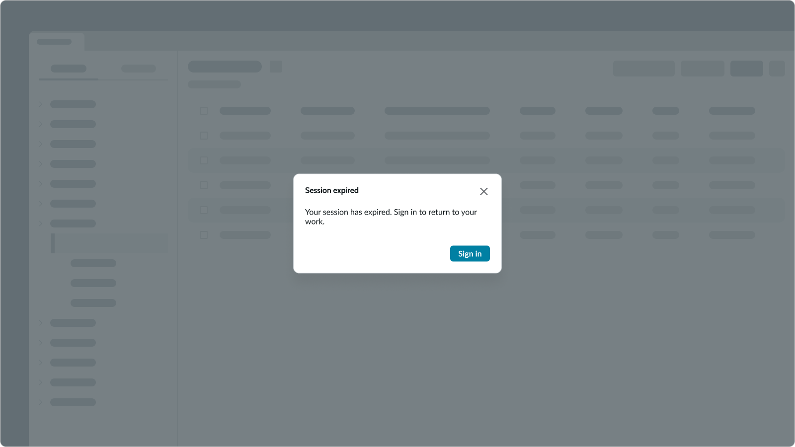
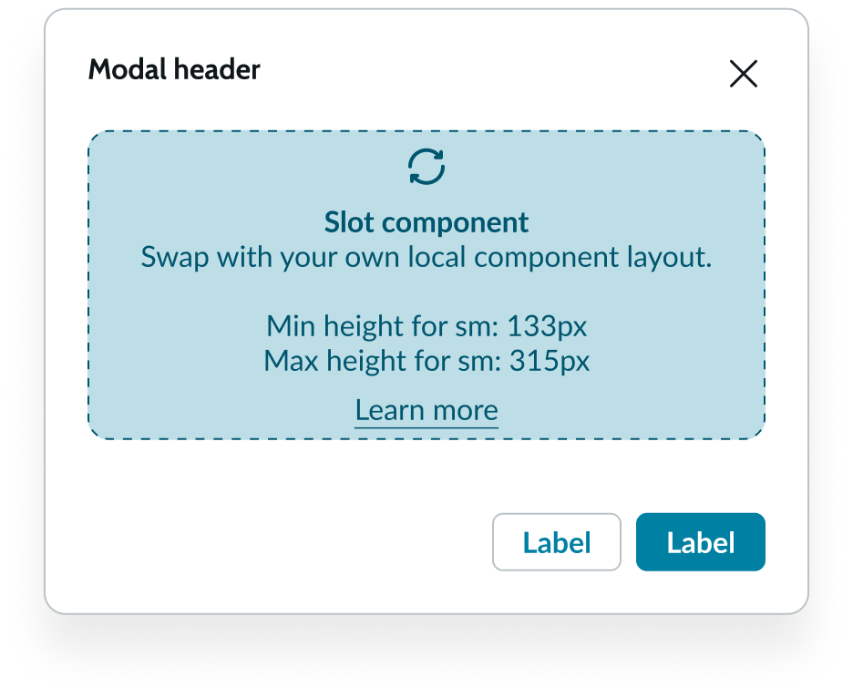
Messaging components serve as valuable information sources that can acknowledge a user's success, notify them of failures, provide warnings, or offer relevant contextual details. These components can convey a range of tones, ranging from non-urgent (low-priority) to urgent (critical), and come in various visual sizes.
Alert
Usage
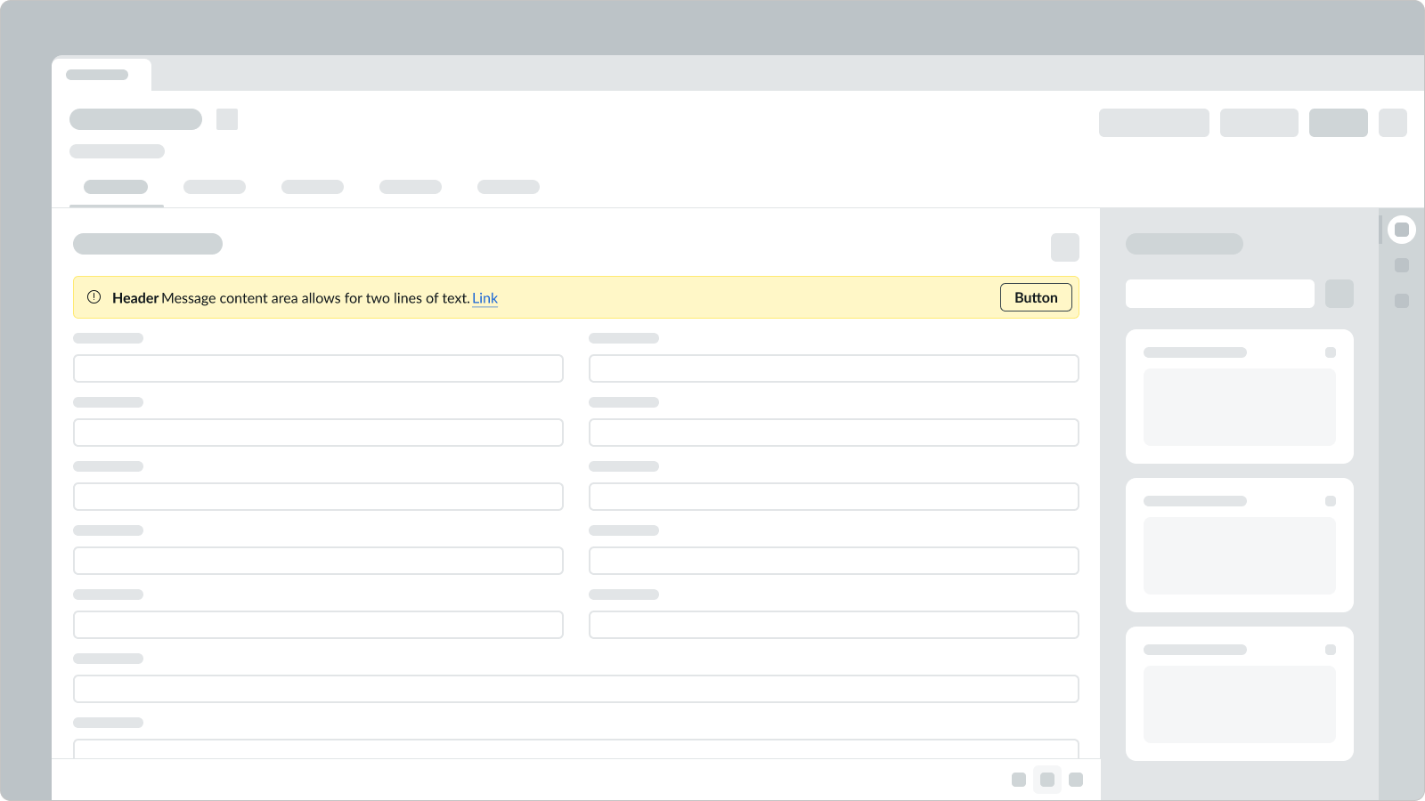
The alert component provides a message to the user as helpful information or as a warning. It is used to confirm an action or change a state in the context of where the action was performed.
Variants
Status & Non-Status
There are two categories of alerts: status and non-status alerts. From the most to least crucial, status alerts include Critical, High, Warning, Moderate, and Low. Non-status alerts include Info, which tells the user about something, and Positive, which serves as a confirmation.
| Status | Example |
|---|---|
| Critical |  |
| High |  |
| Warning |  |
| Moderate |  |
| Low |  |
| Non-Status | Example |
|---|---|
| Info |  |
| Positive |  |
Action
There are four variants: No action, dismiss, acknowledge, open.
| Action | Example |
|---|---|
| No action |  |
| Dismiss |  |
| Acknowledge |  |
| Open |  |
Other configurations
Icon is optional. A default icon is available for each status or non-status variant, which can optionally be configured to any icon in the library.
| Icon | Example |
|---|---|
| No icon | |
| Default icon | |
| Custom icon |
Header is optional.
| Header | Example |
|---|---|
| No header |  |
| Header |  |
Text links can be optionally used within the message content area.
| Link | Example |
|---|---|
| No link |  |
| Link |  |
The Show more/less button appears when the message exceeds two lines, and the message can be set to load in either an expanded or a collapsed state.
| Show More/Less | Example |
|---|---|
| Collapsed |  |
| Expanded |  |
Define a max height for content area and any overflow will bring in a vertical scroll.
| Height | Example |
|---|---|
| Max height |  |
Alert list
Usage
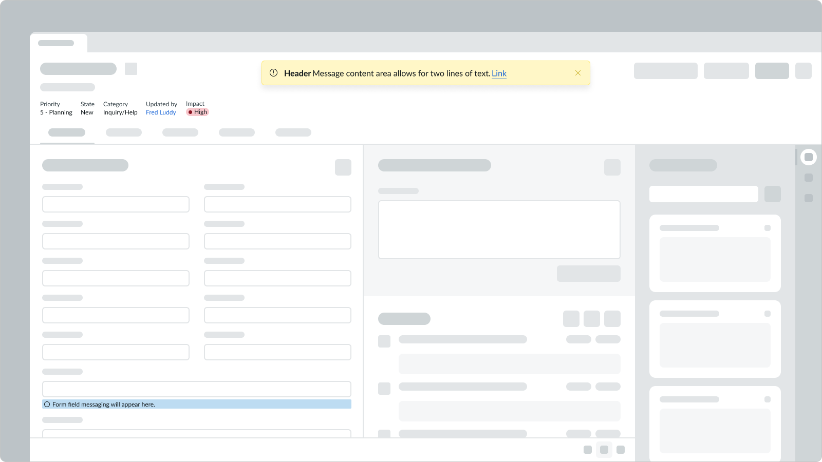
The alert list component displays alerts that appear above the UI. It can handle multiple alerts and allows you to expand or collapse them. The alert list is located in a central area where alerts will appear.
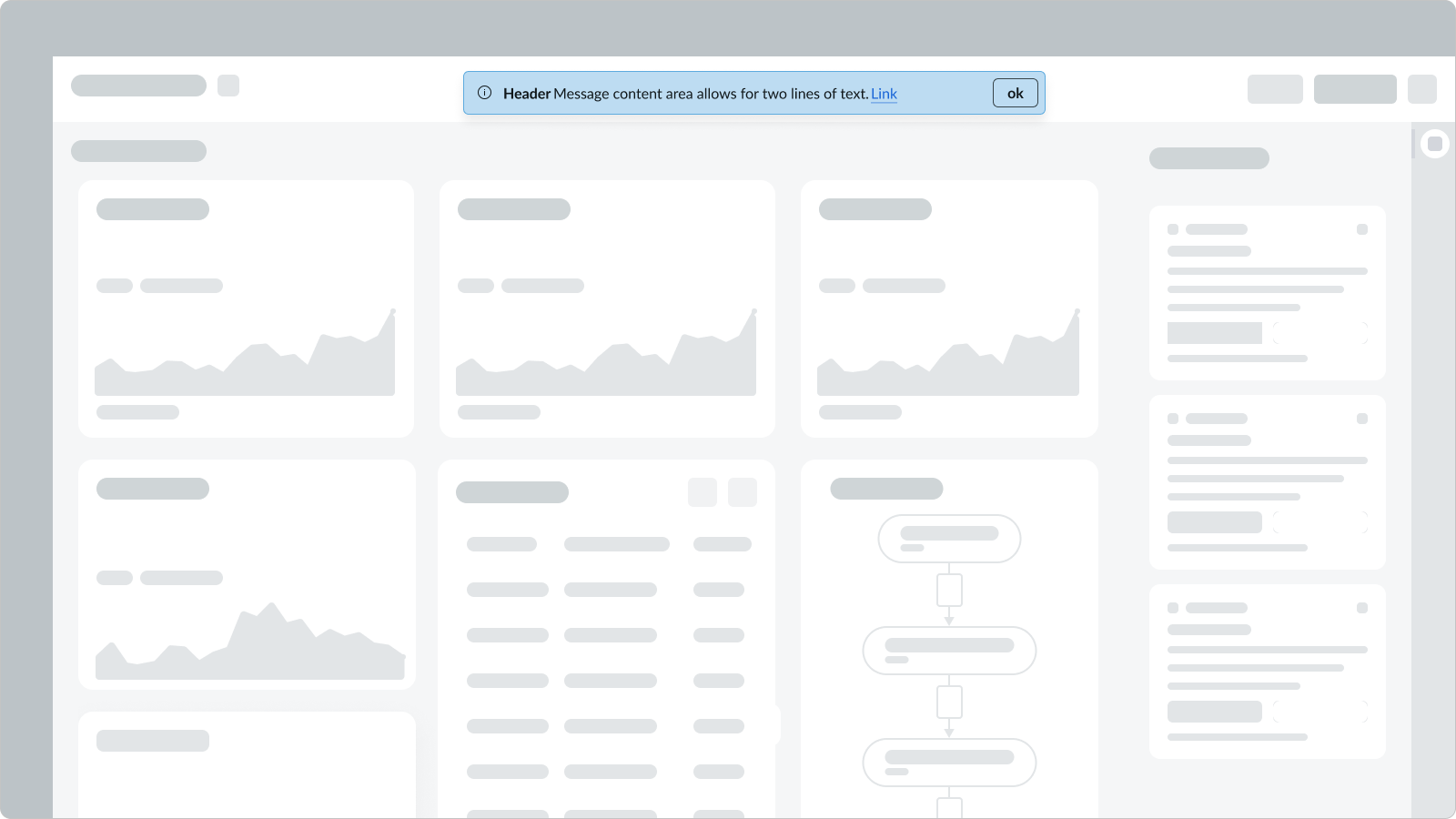
Variants
Single Alert List Item
A single alert list item can be used, which differs from the alert component as the alert list lives above the UI and alert lives contextually in the UI.

Stacking
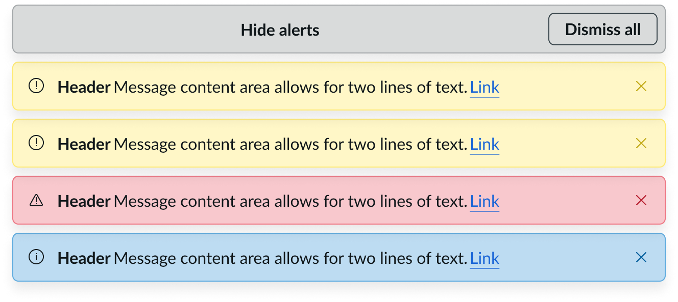
As multiple alerts appear within a queue, the alerts will appear in a stacking order. The alerts will stack from top to bottom in the order of receipt, with the most recent alert at the top of the list.

Multiple Alerts with Controller Collapsed
If the number of alerts rises above more than the configurable threshold for the controller to appear, they’ll group together and the controller will be added on top with buttons to show all of them and clear them all at once. The default threshold number is three.

Multiple Alerts With Controller Expanded
The expanded state allows you to see all alerts and dismiss them at once.
Form field messaging
Usage
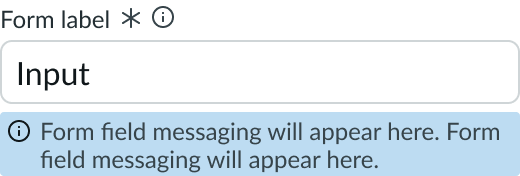
The form field messaging component is a custom message that can be configured to appear below a form field, such as input.
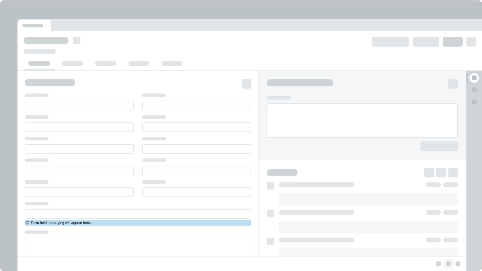
Variants
Status & Non-Status
Similar to alerts, there are two categories of form field messaging: status and non-status messages. Status messages include, from the most to least crucial, Critical, Warning, Suggestion. Non-status messages include Info that tells the user about something, and Positive that serves as a confirmation.
| Status | Example |
|---|---|
| Critical |  |
| Warning |  |
| Suggestion |  |
| Non-Status | Example |
|---|---|
| Info |  |
| Positive |  |
Multiple form field messages
A form field can have multiple messages appear in a stacking order. The messages will stack from top to bottom in order of receipt, with the most recent at the top of the list.
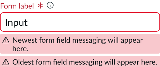
Text wrapping
When the length of message content exceeds the width of the form field, the text will wrap.
Message
Usage
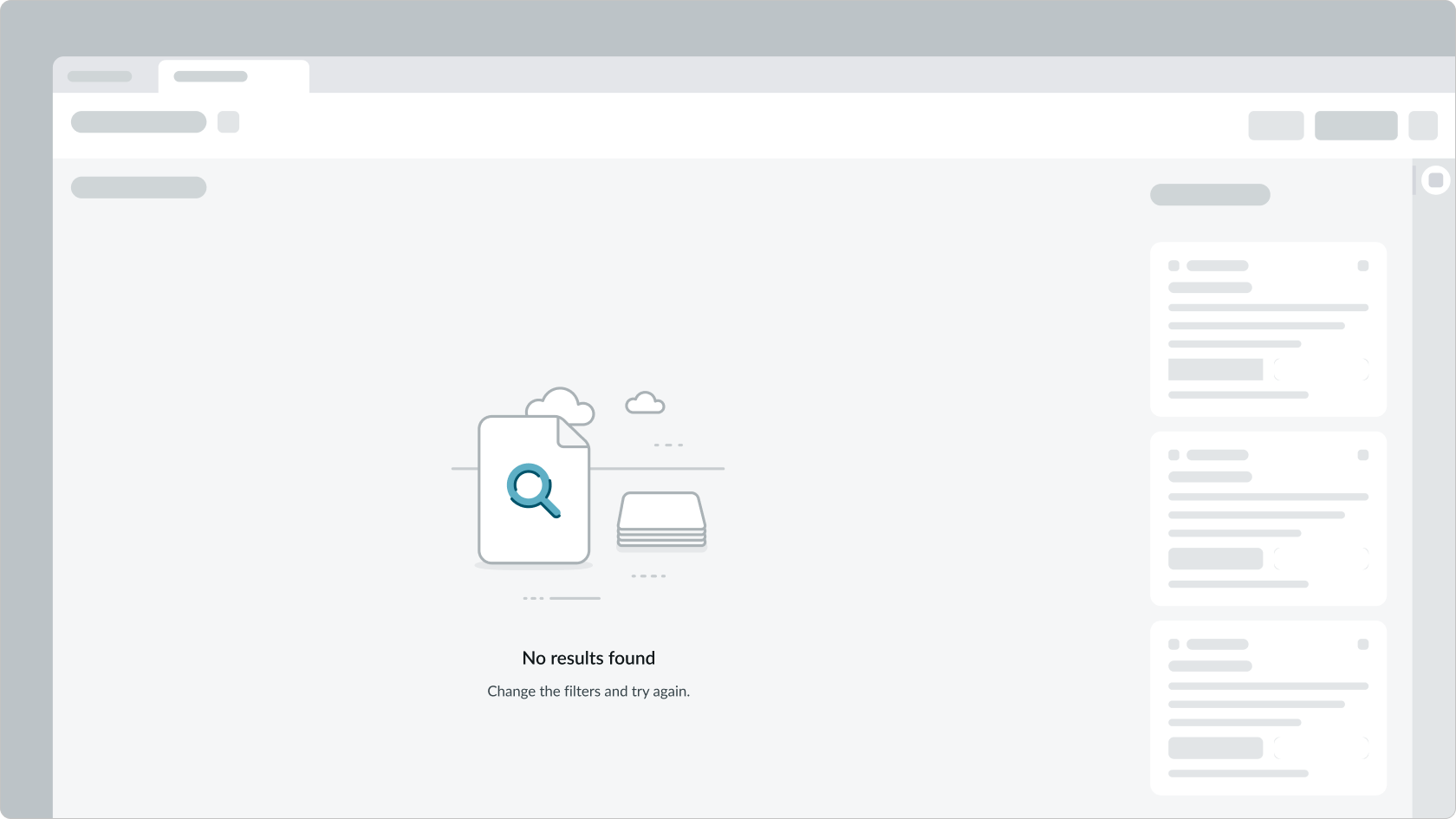
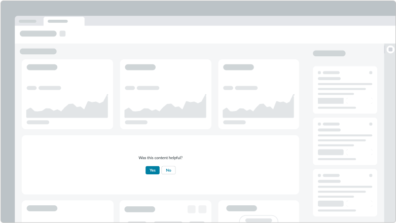
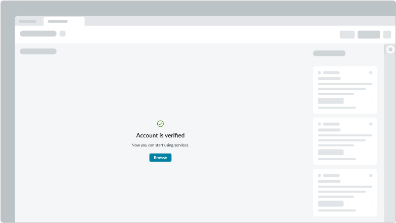
The message component lets you compose messages using standard interactions, patterns, behaviors and applied styles for use cases including empty states, boolean feedback, and confirmation messages.
Empty state
Boolean feedback
Confirmation message
Variants
Layout
Message component provides three types of alignments to cover many use cases. Media slot, message slot, and action slot should follow the following alignments.
| Layout | Example |
|---|---|
| Vertical |  |
| Vertical-centered |  |
| Horizontal |  |
| Adaptive (max container width) |  |
| Adaptive (min container width) |  |
Size
The empty states component, a template component that’s derived from the message component, comes in three sizes: small, medium, and large. This template component responds to the size of its container to ensure large media don’t appear in small containers.
| Size | Example |
|---|---|
| Small |  |
| Medium |  |
| Large |  |
Other Configurations
The media, header, body, and action buttons are all configurable elements.
| Media | Example |
|---|---|
| Illustration |  |
| Icon | |
| No media |  |
| Header | Example |
|---|---|
| Header |  |
| No header |  |
| Body | Example |
|---|---|
| Body |  |
| No body |  |
| Buttons | Example |
|---|---|
| Two buttons |  |
| One buttons |  |
| No button |  |
Highlighted value
Usage
The highlighted value component is used to convey status or category in a certain area, such as a card, list, or widget.
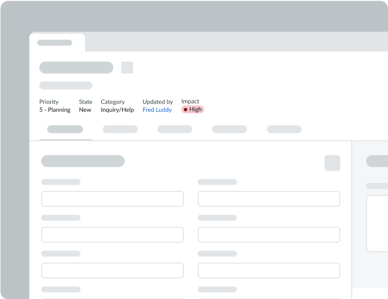
Status
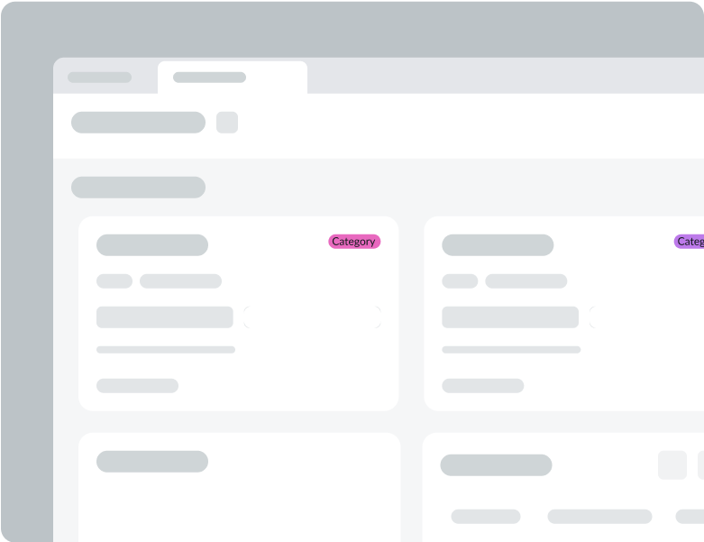
Category
Variants
Identifier and label
| Identifier and Label | Label |
|---|---|
| Label only | |
| Dot | |
| Icon | |
| Dynamic label |  |
Primary, Secondary, and Tertiary
- Primary variant: To signify items that are important and require immediate attention
- Secondary variant: To signify items that are important but don't need immediate attention
- Tertiary variant: To signify items that are of minor importance
- Both status and category colors have variants
| Status | Category | |
|---|---|---|
| Primary | ||
| Secondary | ||
| Tertiary |
Modal
Usage
The modal component can be used to interrupt users with urgent information, details, or actions. Some example scenarios are unsaved changes, expired sessions, and confirmation of deletions.
