Anatomy
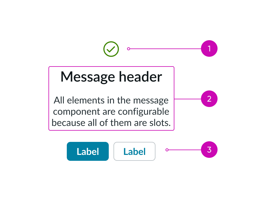
- Media (optional): An illustration, icon, image, or video that adds context to the message
- Content slot (optional): Text that conveys the topic and purpose of the message
- Actions (optional): Types of buttons or actions
Subcomponents
Usage
You can use the message component for an empty state, feedback, or confirmation.
Empty state
You can use a message in an empty state to explain the current situation and offer actions for next steps.
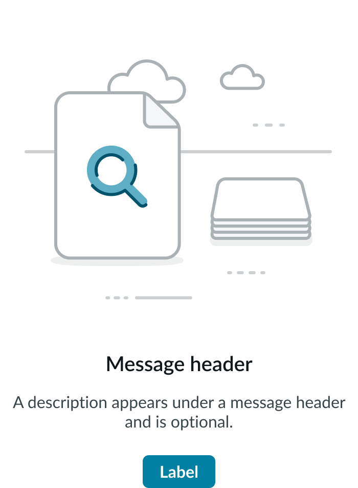
In this example, the content slot offers recommendations on how to see results.
Feedback
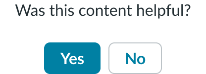
You can include a message when you want to get feedback from the user. These messages include positive and negative actions for the user to choose.
Confirmation
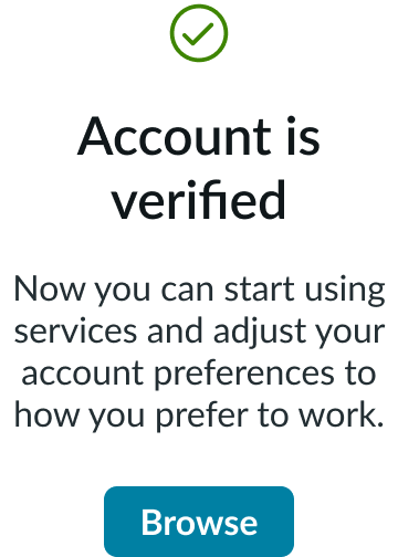
You can use a message as confirmation for a user-initiated action.
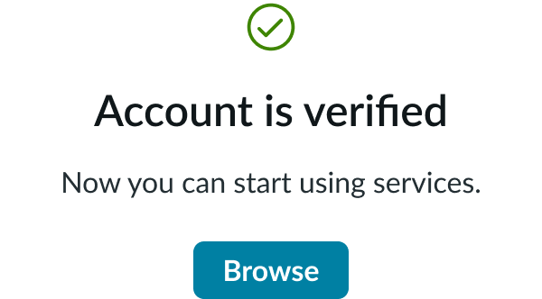
In this example, the message confirms that the user's account is now verified.
Variants
The order of the elements within message type is predefined and can't be changed.
Configurations
Learn how to customize message by configuring the available properties.
Alignment and positioning
The message component has different alignments for the media, content slot, and actions. Your individual use case determines the positioning for the parts of the message.
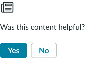
Vertical
Use the vertical alignment to display content in limited horizontal spaces.
Vertical centered
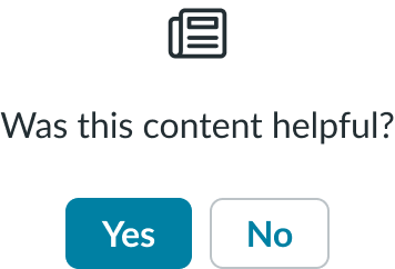
You can also use the vertical centered alignment in limited horizontal spaces, too.
Horizontal
Use the horizontal alignment to display content in limited vertical spaces. Text and actions adjust to left alignment or optional content may be omitted. Buttons in the action slot display side-by-side. Horizontal is the default alignment.

Design recommendations
Learn how to apply message in your design.

Use only 1 primary action in a message to show the most important or common action.

Avoid making a user choose between 2 primary actions.
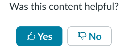
Make sure icons clearly distinguish positive and negative actions.
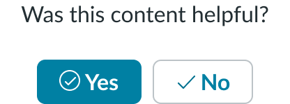
Avoid confusing users by displaying 2 positive icons.

Choose distinct button wording so users can easily distinguish between the choices.

Avoid lengthy wording that's not easily recognizable as a button label.
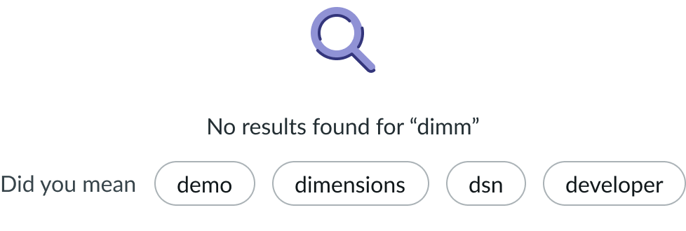
Only add another component in the content slot if it provides more context and actions.
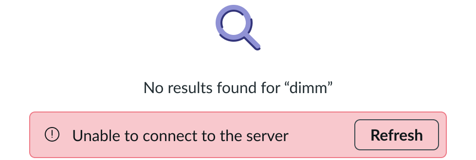
Avoid adding another component in the content slot if it doesn't suit the use case or might confuse the user.
UI text guidelines
These are some recommendations for using text within message:
- If using the content slot, provide the person with a message that tells them more about why this message appeared.
- If using header and body text in the content slot, make sure the text in each is unique to avoid repetition. Use the header to tell them what happened, then use the body text to provide any additional information, context, or next steps.
- For example, the header could be, “Message submitted” and the body text could be, “We’ll notify the recipient via email.”
- If using buttons in the message, they should be the next suggested actions the person should take. You can also offer independent choices instead of verbs to help the person respond to the message.
- For example, if the message is asking the user if they would like to provide feedback, the buttons could be “Yes” and “No”.
Behavior
Learn how message behaves when the display changes or a user interacts with the component.
States
Message doesn't have any states. Only the buttons have individual states. The buttons use the same interaction and behavior as the button component.
Responsive behaviors
If the message uses a horizontal alignment, it changes to a vertical alignment as the display gets smaller.

Interactions
The user can select the button(s), if available, to take an action on the message. You can configure the type of action the button performs. For example, you could direct the user to a different page or collect their feedback on a particular question.
Truncation
Message text doesn't truncate. Text in the content slot wraps to the next line as needed without truncation.
Usability
Message complies with all internationalization and accessibility requirements.
Internationalization
When the display translates to a right-to-left (RTL) language, the content flips and aligns on the opposite side, and the primary button appears on the left instead of the right. Only icons that indicate direction will flip.
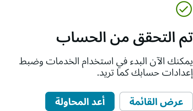
If you want to include an icon with the button labels, consider how other cultures may interpret the icon in a positive or negative way.
Accessibility
Learn how to access the actionable elements of message through keyboard interactions and screen readers.
Keyboard interactions
You can access the actionable elements of message with these keyboard keys:
- Tab: Moves focus to the button
- Space or Enter: Initiates the button when it has focus
Screen readers
When you apply ARIA labels to a component, screen readers announce the controls and content of message in the prescribed tab order.
- Screen readers announce the content slot and button, so users can understand a button function
- For buttons with icons and without text, apply aria-label to explain intent of the button

