Anatomy
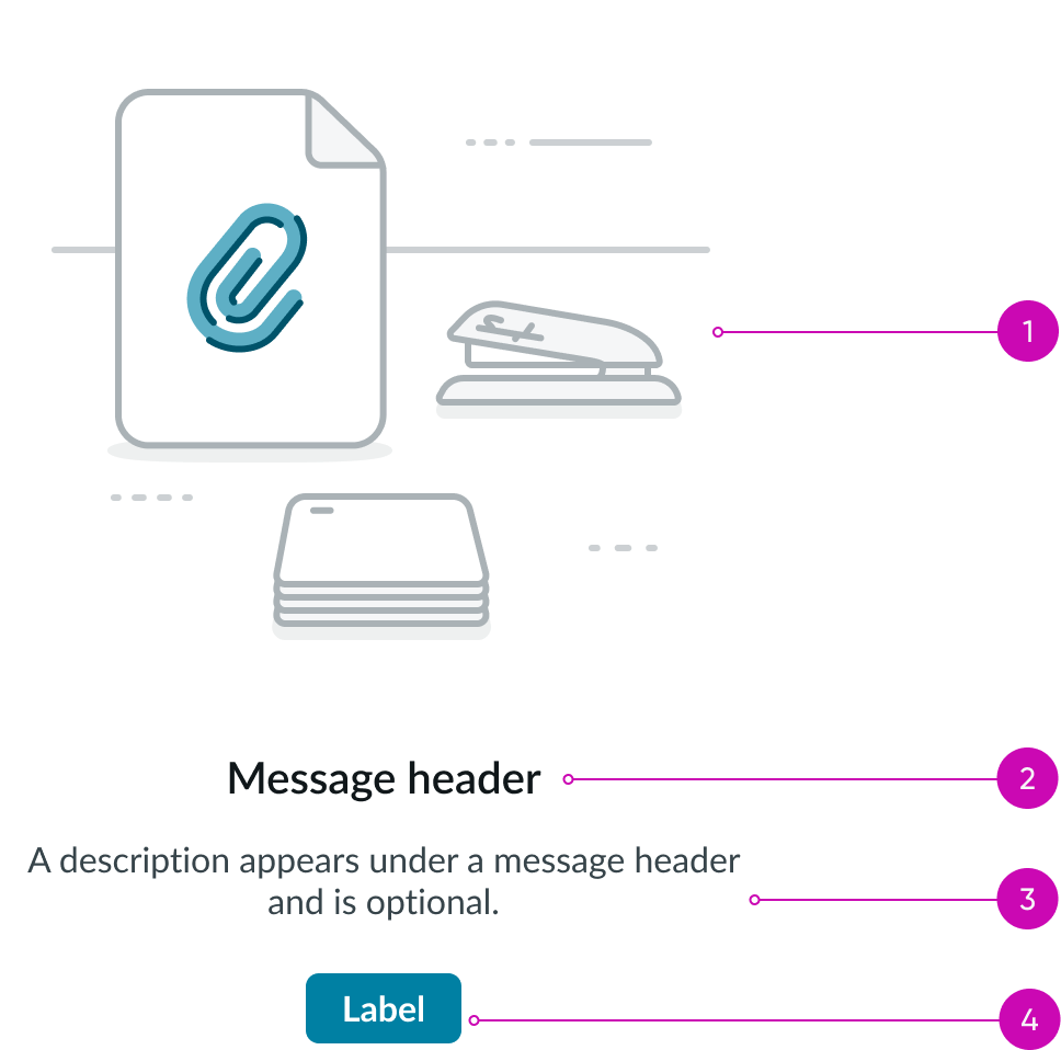
- Illustration (optional): Displays an image that relates to the empty state text
- Header (optional): Cites the subject of the empty state message
- Description (optional): Adds a detailed explanation of the empty state
- Action button(s) (optional): Offers action(s) to resolve the empty state status
Subcomponents
See usage guidelines for button
Usage
Learn how to use the empty state component when there is no information to show in a container.
Completed tasks
Notes a user has finished a set of tasks.
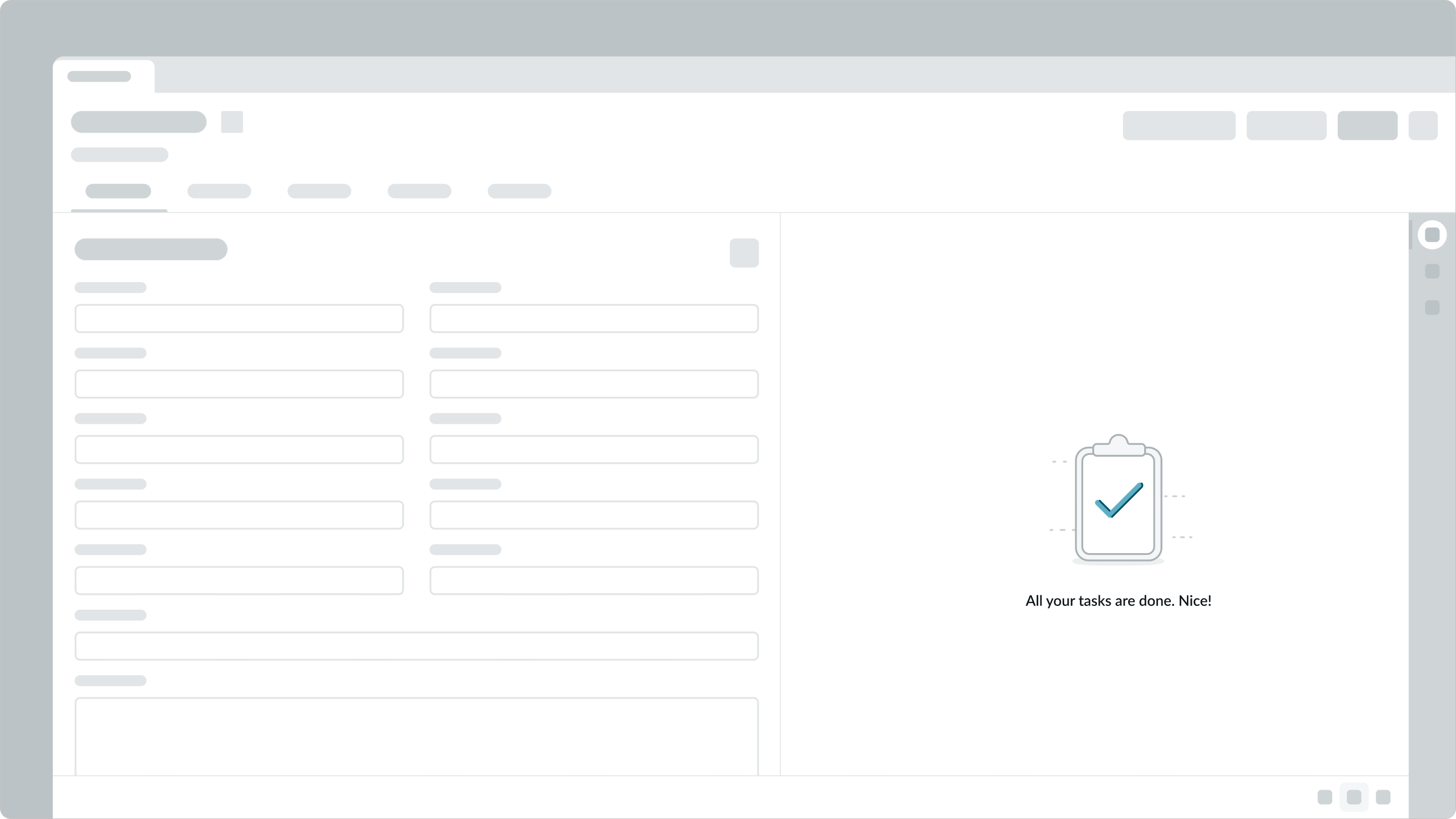
In this example, the user learns a checklist has been completed.
Interruption
Notes an issue prevents content being displayed.
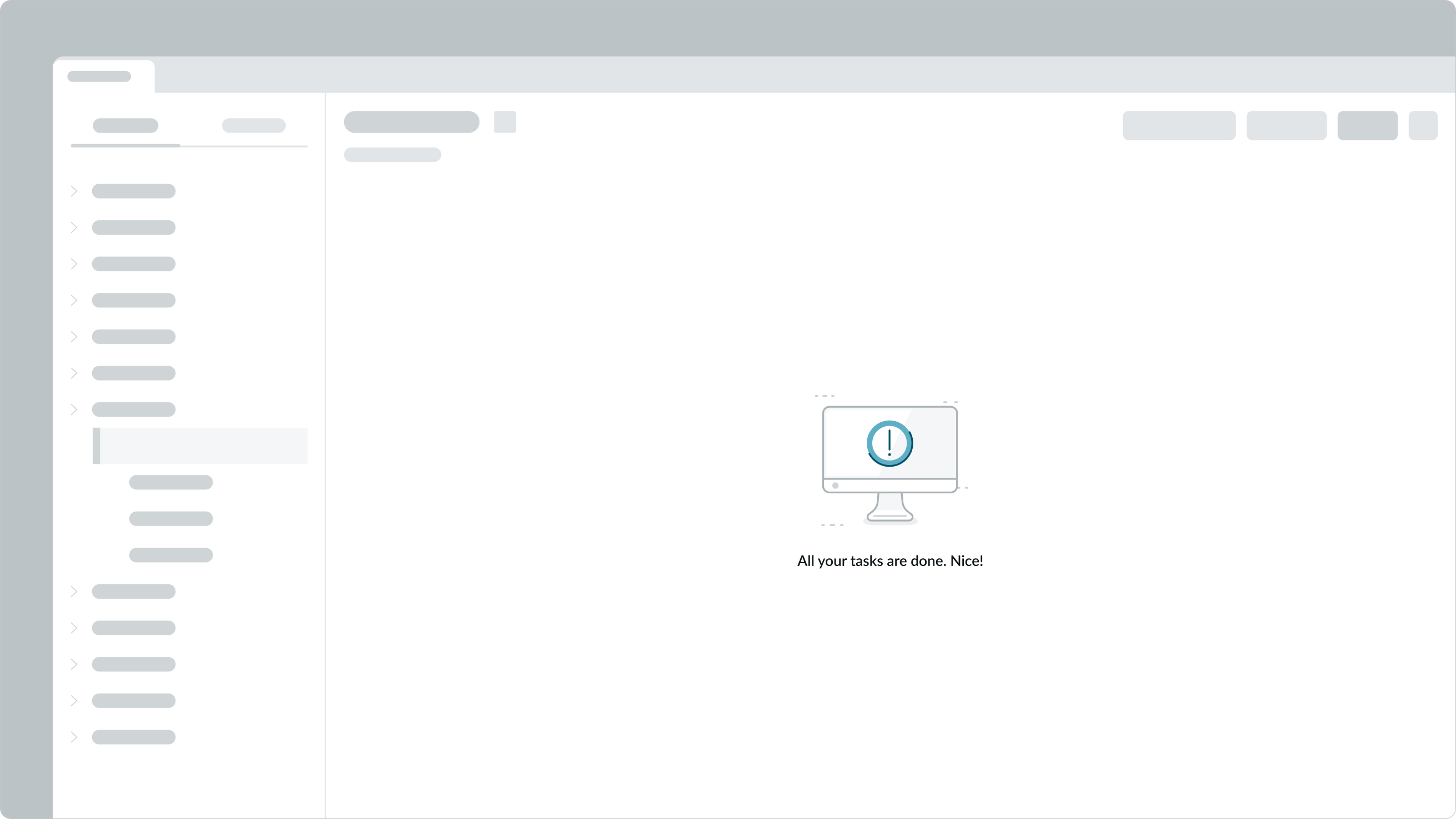
In this example, a user learns why a document can’t upload.
First-time use
Notes an open page has content still to come.

In this example, a user is invited to a new email inbox to view messages.
Error
Notes a generic error that can’t be described.
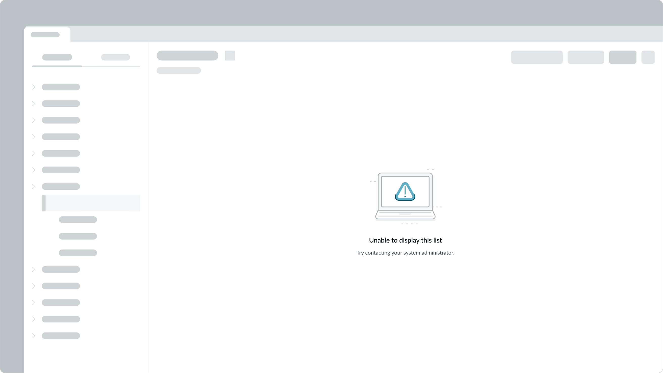
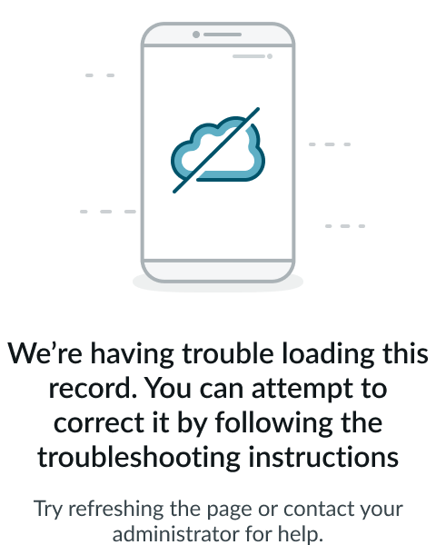
In this example, a user must address a loading error.
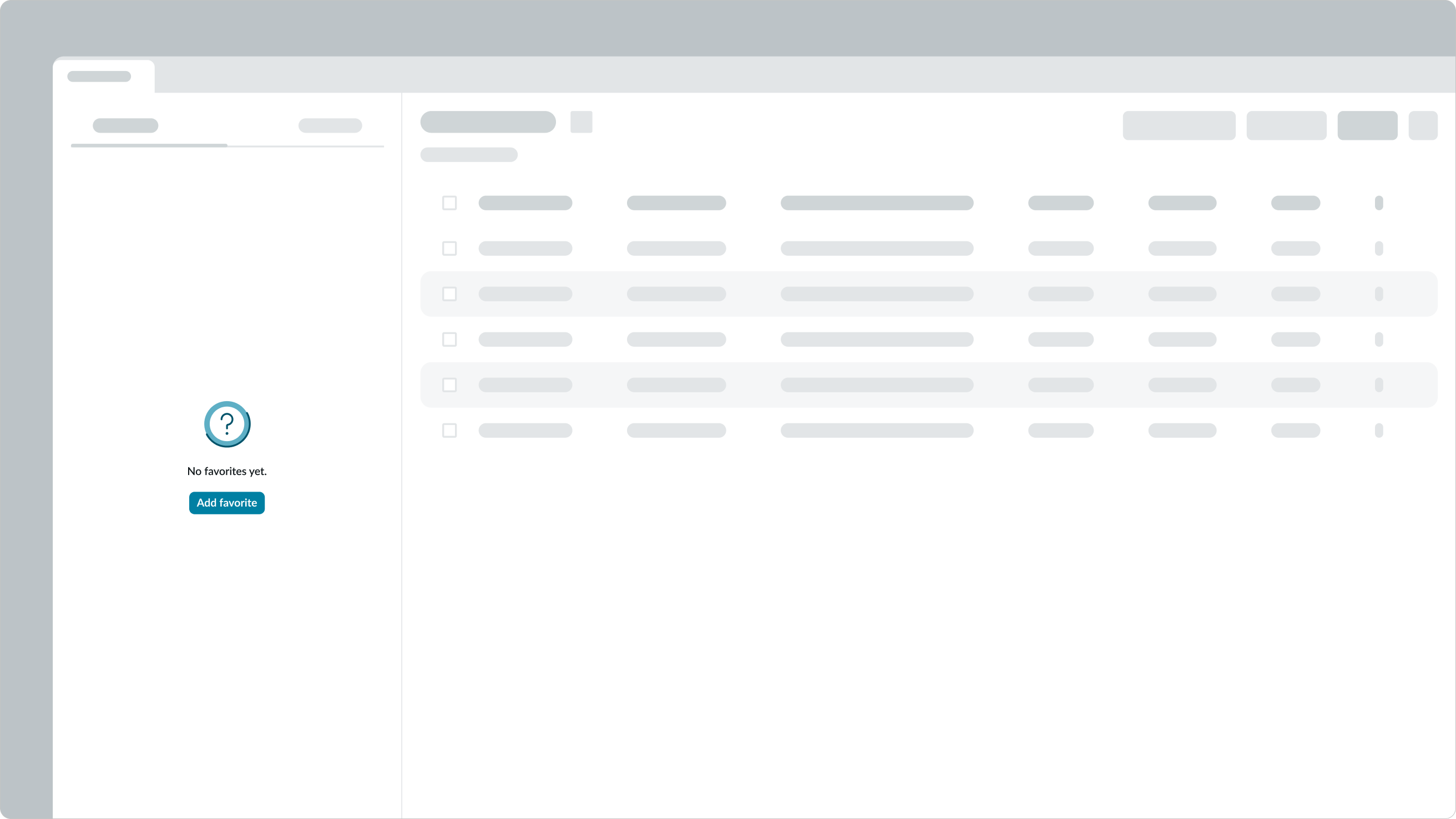
No data
Notes a space has no information but will eventually have content.

In this example, a user hasn’t added any favorites yet.
No activity
Notes a user has no activities yet.
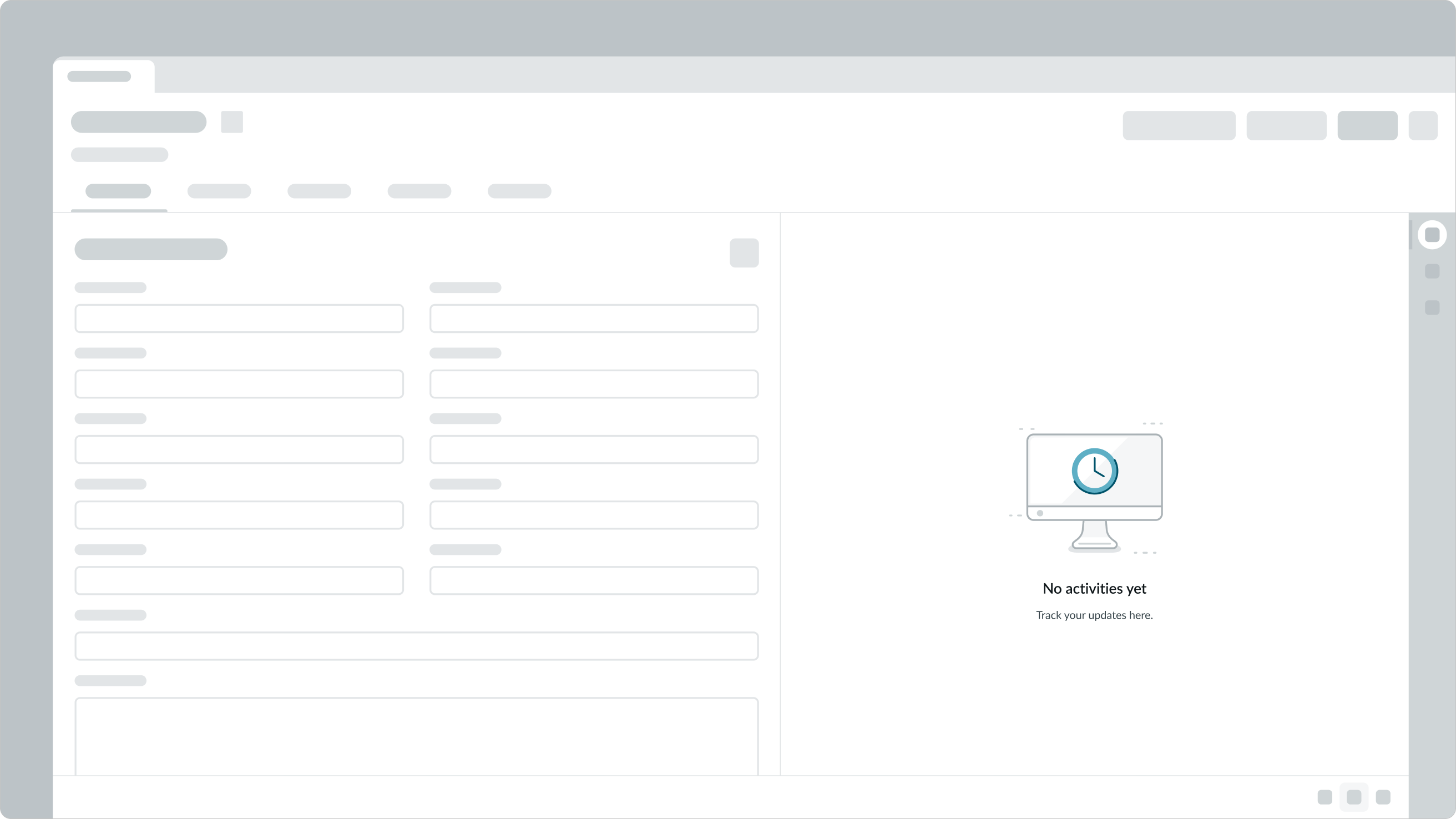
In this example, a user’s activity stream has no posts or progress yet.
Not configured
Notes a user with a specialized role can configure an item.
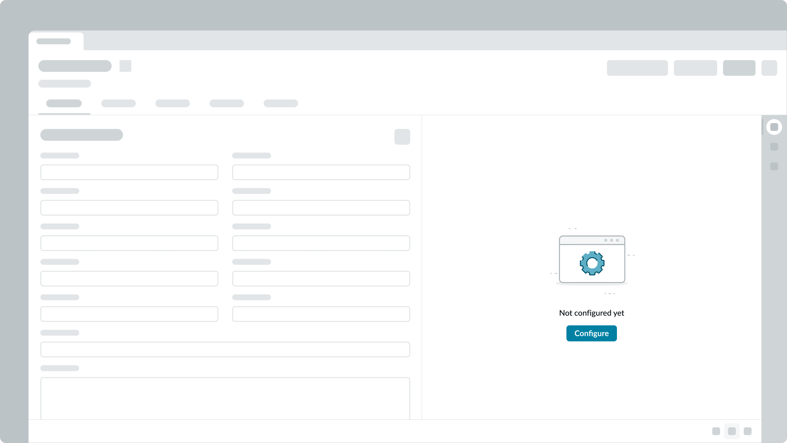
In this example, a user configuring a dashboard cites items that can be configured.
No search results
Notes a user searching or filtering information without success.
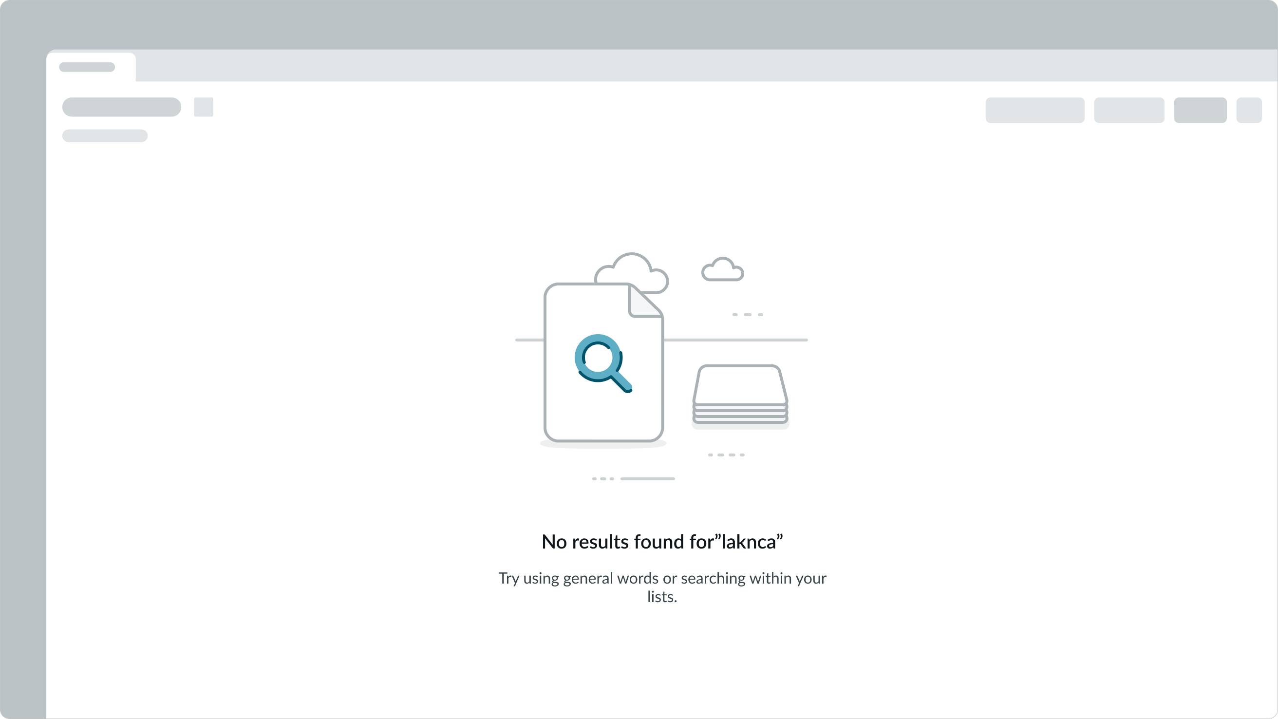
In this example, a user has input a word not found in the search results.
Permissions
Notes a permissions issue prevents sharing certain information.
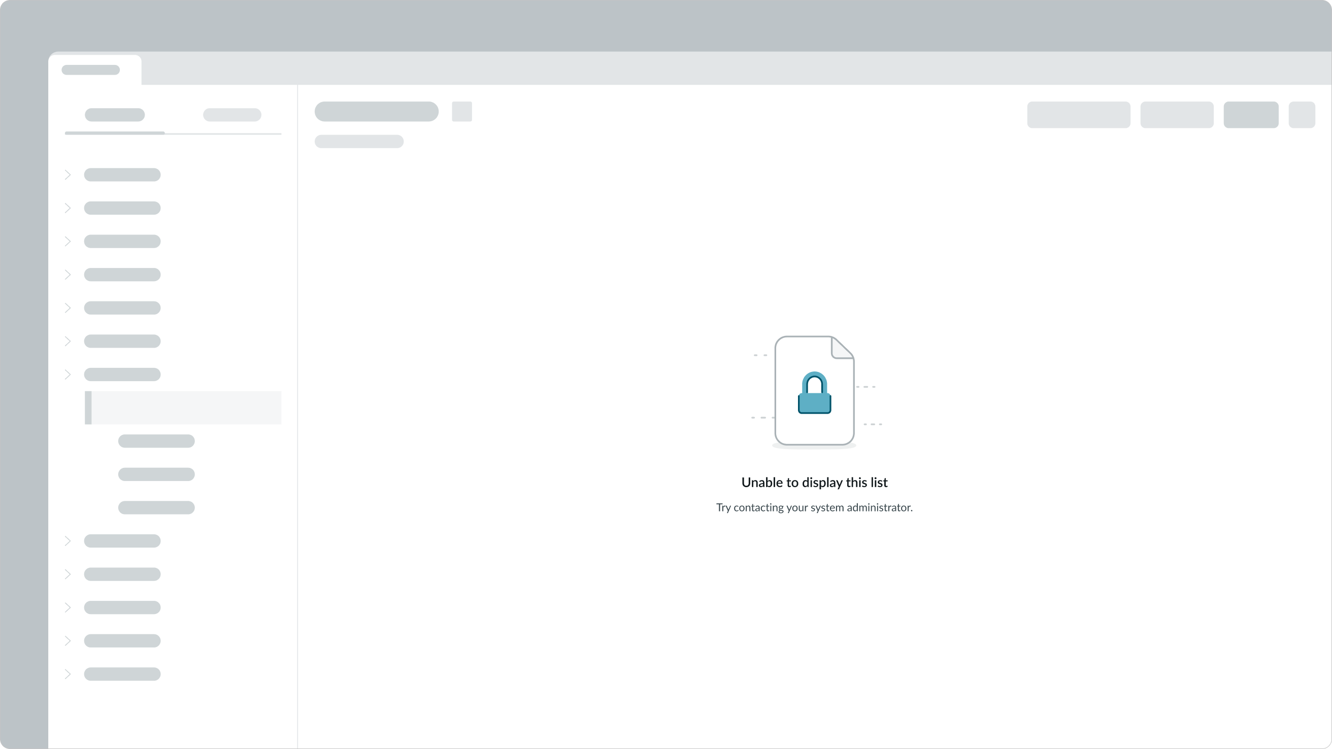
In this example, a user needs access to view sensitive data for customers.
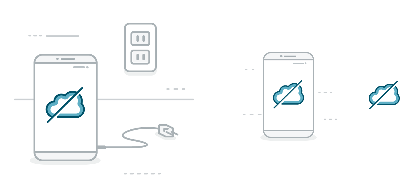
Offline
Notes a user can’t continue a task when our system is down.

In this example, a user working on a record encounters a server error and can’t access the details to view.
Add data
Notes a user can add custom data.
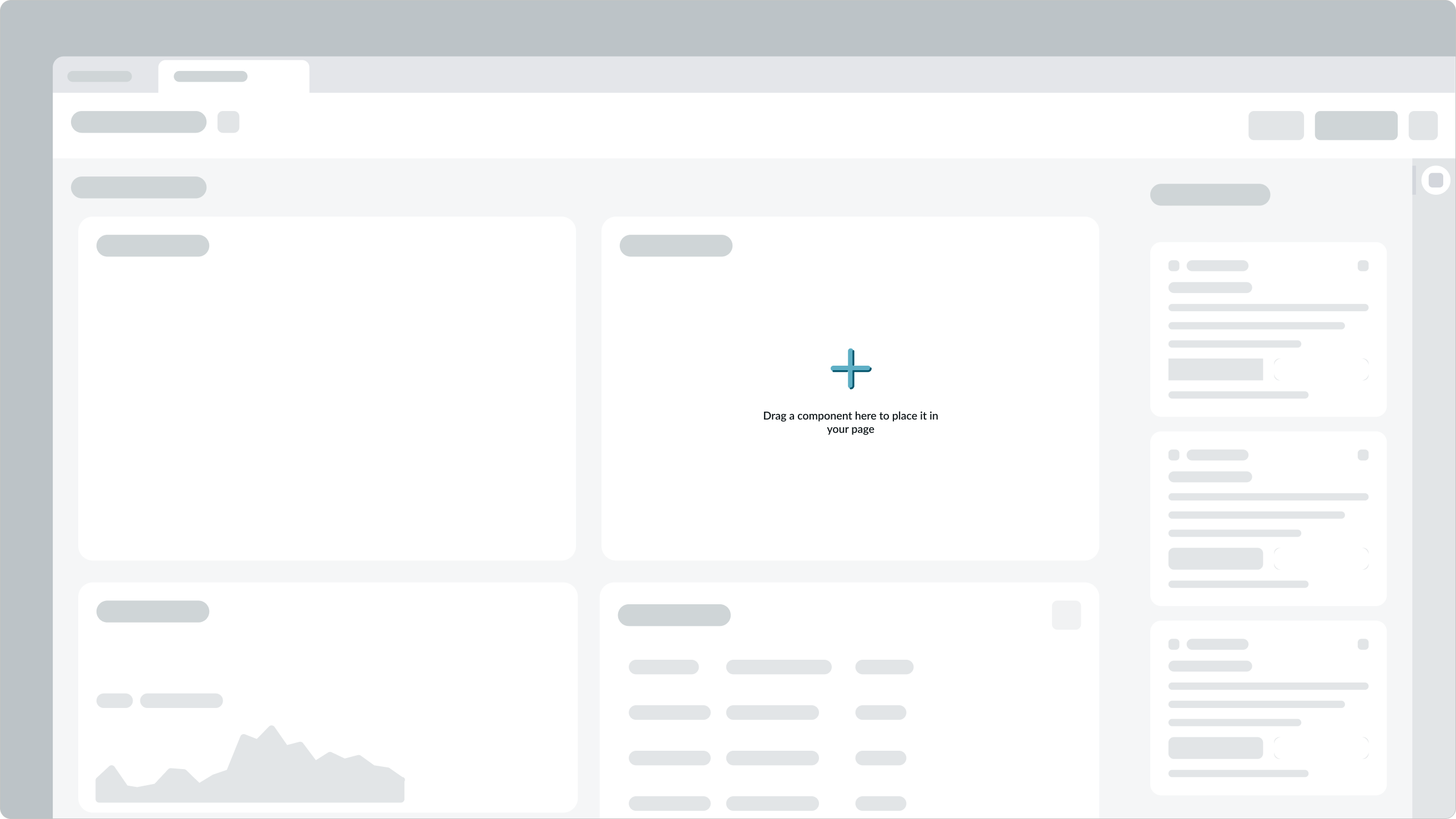
In this example, a user creating a page with the builder tool is directed to a screen to add more data.
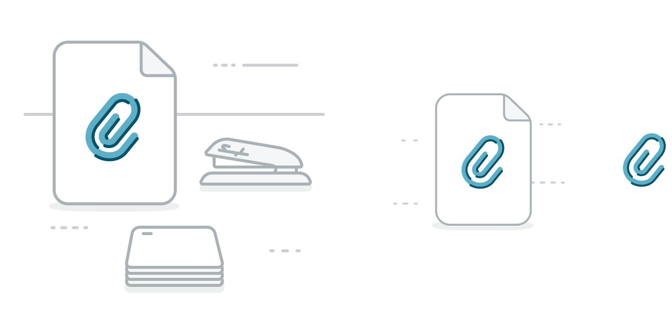
Add attachment
Notes a user can attach a document.
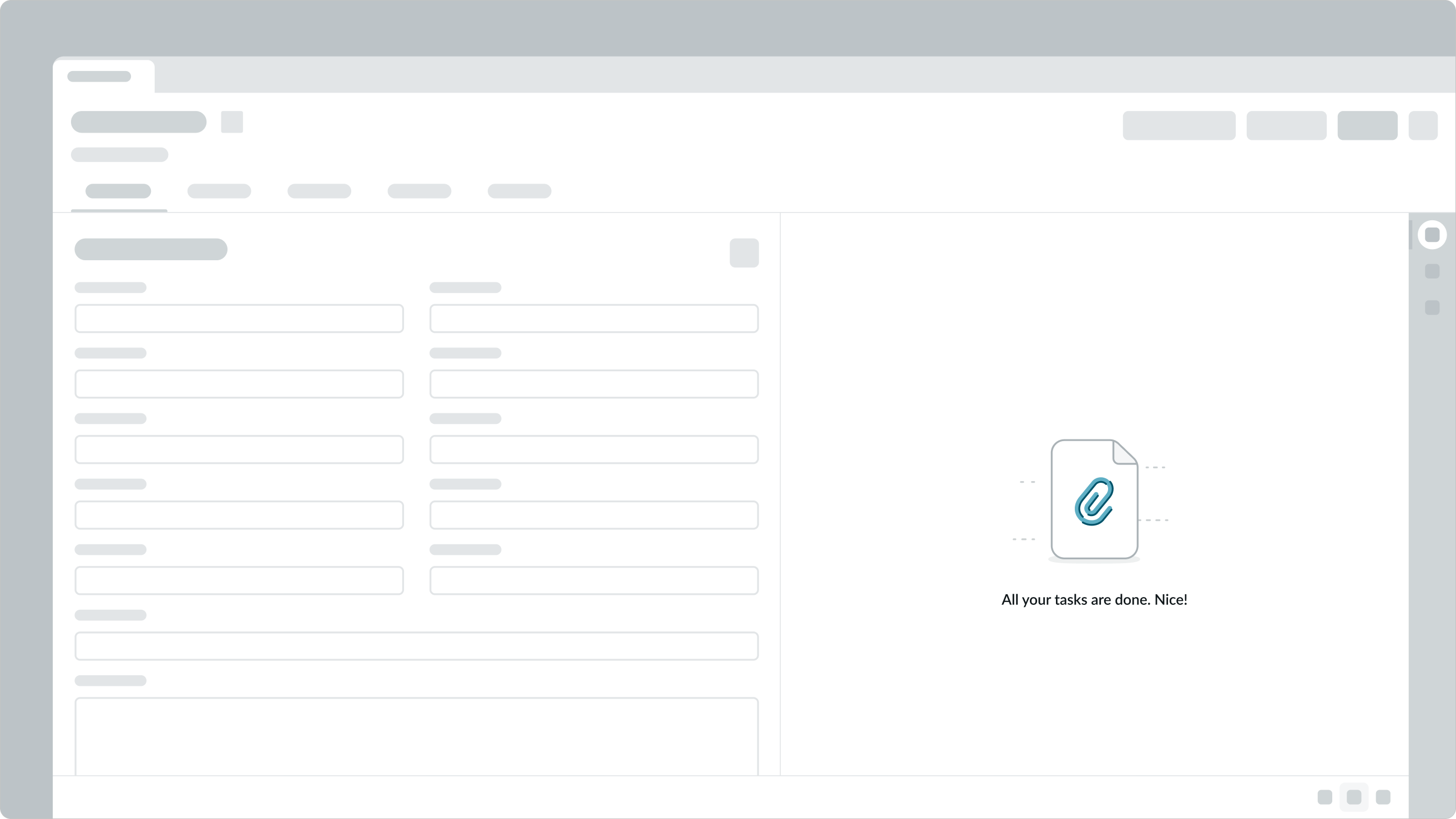
In this example, a user attaching documents to a record with no attachments is directed where and how to upload them.
Variants
Learn about the empty state component and find out how to use it in your design.
Types
There are 12 empty state use cases, and each comes in 3 sizes.
Completed tasks
Shows all assigned items or tasks are completed.

Interruption
Shows selecting an item (like a document) that is currently unavailable.
First-time use
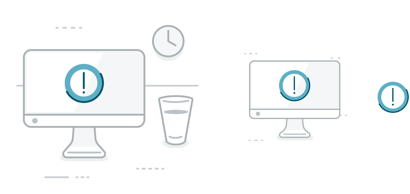
Shows a first-time experience.

Error
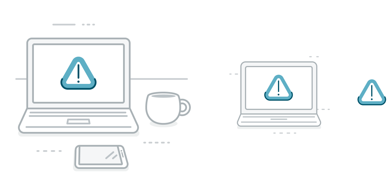
Shows an error, like a loading problem or a dead link.
No data
Shows placeholder content, like when a widget or screen has no information.

No activity
Shows there is no activity or update available, like changes to a form, comments, or new attachments, and signifies that future content will appear in the space.

Not configured
Shows an item has not been configured or needs to be configured.

No search results
Shows searched or filtered information has returned no results.

Permissions
Shows there is no permission to view an item or certain information.

Offline
Shows when a connection issue has occurred, and information can’t be retrieved from our system.
Add data
Shows information has yet to be added.

Add attachment
Shows a widget or screen has no information yet, and option to add an attachment.
Sizes
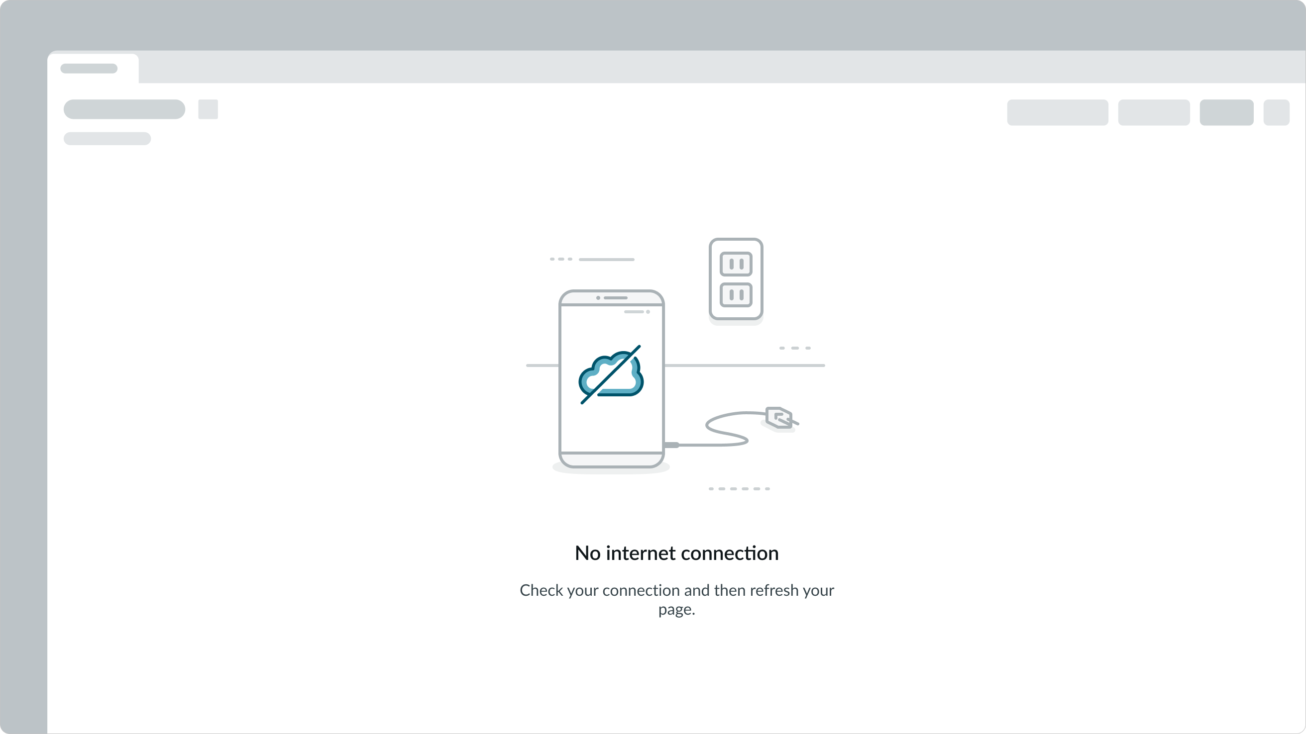
The empty state component has 3 sizes: small (sm), medium (md), and large (lg). The component size you apply depends on the height and width of the container.
Small
The small size is typically displayed within a side panel or widget.
Medium
The medium size is typically displayed in a half-width-screen.

Large
The large size is typically displayed in a full-width screen.
Configurations
Learn how to customize the empty state component by configuring the available properties.
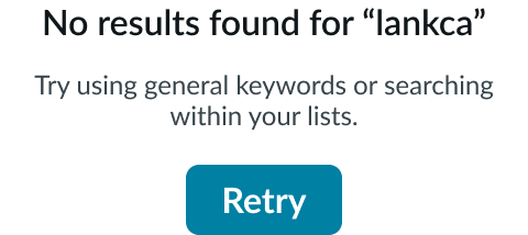
Illustration
The empty state component can be configured without an illustration.
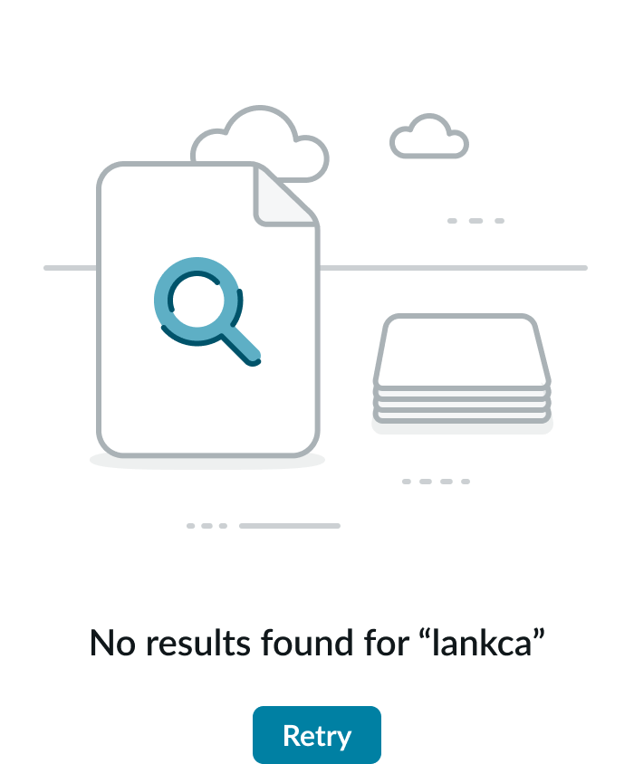
Description
The empty state component can be configured without a description.
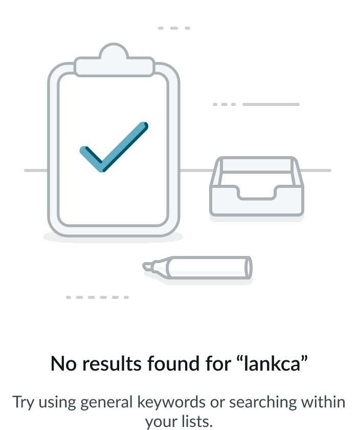
Action buttons
The empty state component can be configured without action button(s).
Maximum width
By default, the empty state component spans the full width of the container. If needed, you can configure a maximum width, so the component spans only to a certain point.
Design recommendations
Learn how to apply the empty state component in your design.
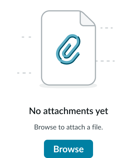
Apply the optional configurations in the correct top-to-bottom order of illustration, header, description, action buttons, so users can follow tasks easily.
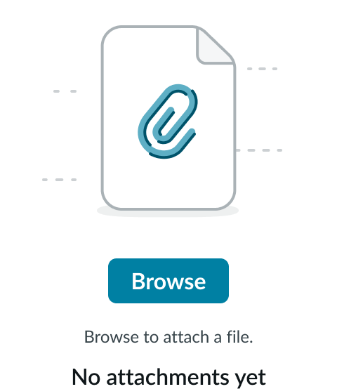
Don’t customize the standard order of optional configurations, or the meaning and options might be misunderstood by users.

Apply empty states on a background with no visual clutter to compete with the message.
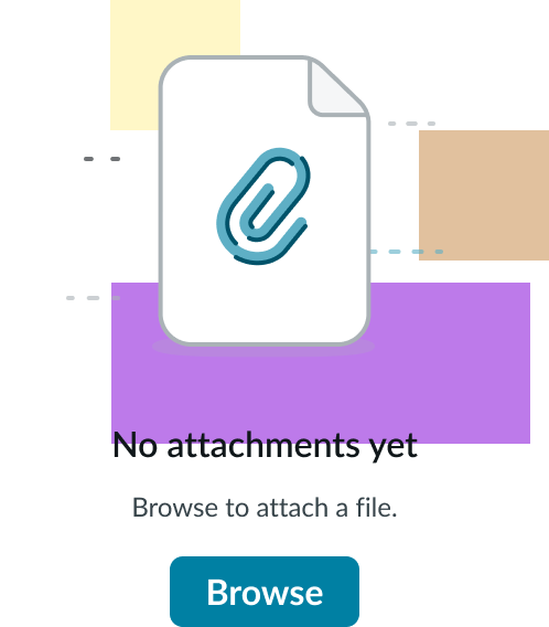
Don’t modify the background elements or overlay the empty state with other distracting visual elements.
Alignment and positioning
You can align the empty state component in vertical-center or horizontal order, based on your use case, and the component can occupy the full container height and width.

Vertical-center alignment
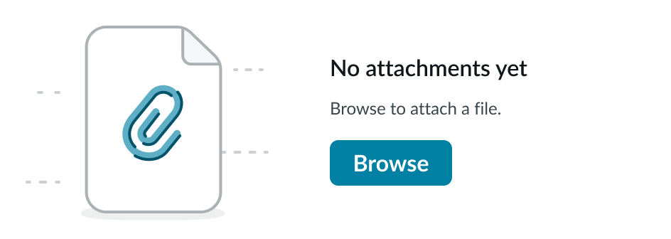
Horizontal alignment
UI text guidelines
These are some recommendations for using text within the empty state component:
- Depending on the scenario, the header can tell the person what happened, what to do, or give them information
- For example, the header could be, “No results found”
- The description can add more information about the scenario and explain what they can do next to move forward
- For example, the header could be, “No favorites yet” and the description could be, “Add a favorite to quickly access it from this list”
- The header or description shouldn’t blame the person, but should be direct about what happened, what isn’t showing up, or what they need to do
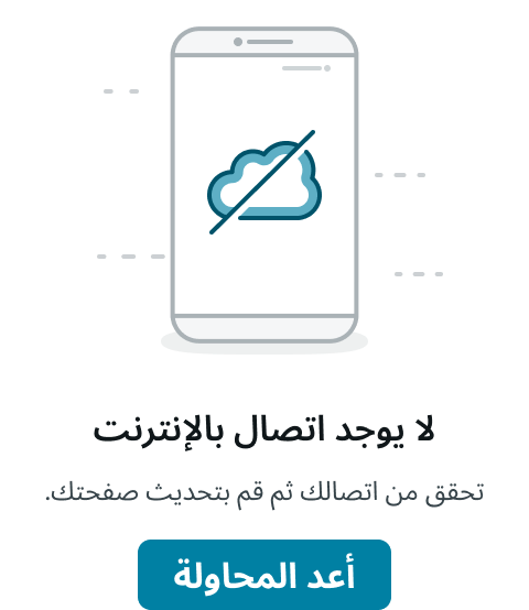
- For example, the header could be, “No internet connection” and the description could be, “Check your connection before refreshing the page”
- As you write the header and description, consider the person’s context and how the person might feel. Then adjust the tone of your text according to the situation.
- If you’re using a button, the label should describe the most logical next verb you want the person to take
- For example, the header could be, “No attachments yet” and the button could be, “Browse files”
Behavior
Learn how the empty state component behaves when the display changes or a user interacts with the component.
Responsive behaviors
The empty state component automatically resizes to fit a container.
Interactions
Learn how the empty state component responds when a user interacts with it.
Action buttons
Optional action buttons are the only interactive element of the empty state component.
Truncation
The empty state component header and description text doesn’t truncate, but overflows the next line, as needed.
Usability
The empty state component complies with all internationalization and accessibility requirements.
Internationalization
When the display translates to a right-to-left (RTL) language, the following changes are made.
- For the header and description, content changes order from right to left. Maintain any center-aligned content.
- Action buttons switch positions with each other.
- The existing illustration applies for RTL languages.
Accessibility
Learn how to access the actionable elements of the empty state component through keyboard interactions and screen readers.
Keyboard interactions
You can access the actionable elements of the component with these keyboard keys:
- Tab and Shift + Tab: Moves focus through the action buttons
- Enter or Space: A user focused on an action button can press enter or space to launch the button’s action
Screen readers
When you apply ARIA labels to a component, screen readers announce the controls and content of the component in the prescribed tab order.
The screen reader announces in order:
- Header
- Description
- Action buttons
The reader doesn’t announce the image because it is purely a decorative element.

