Anatomy

- Alert controller: Shows or hides alerts when more than three alerts appear
- "Dismiss All" button (optional): A method for dismissing all alerts
- Icon (optional): Appears next to the message copy to emphasize the type of alert; for example, a warning icon can indicate a failure in a process
- Container:* The space that contains the header, message, link, and button; it also provides a color mapped to the urgency of the alert
- Header (optional)*: Title for the alert
- Message (optional)*: Description of the alert
- Link (optional)*: Adds a link to the message to help a user navigate to the alert context
- Button (optional)*: Dismisses or acknowledges an alert; it can be an icon or a labeled button
*These are part of the alert component
Usage
The alert list manages alerts at the application or page level. For repeated actions, use screen transitions or inline confirmations to avoid confusing a user with an alert. Consider using a modal instead if you need to display a log of alerts.
Configurations
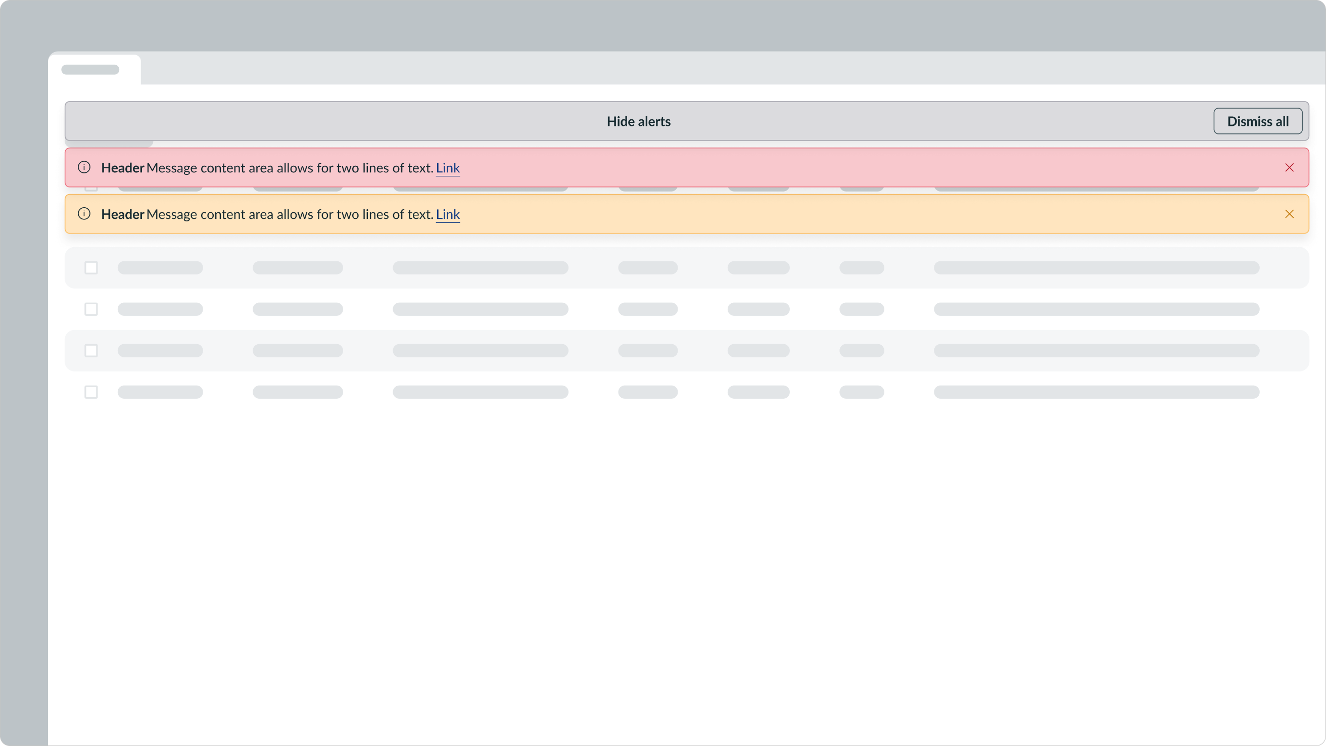
The alert controller is a mechanism for managing alerts when many alerts appear at the same time. It also consolidates alerts if the user chooses not to dismiss them. An alert controller expands, collapses, or dismisses an alert list. Inside the controller, a user can select a button or select the container to activate an action.

This depicts an alert controller that displays a collapsed alert list. A user can either select the controller to expand the list or select the “Dismiss All” button to dismiss all alerts within the alert list.
Single alerts
The alerts in the alert list float above the UI to avoid interrupting a user's workflow. A user can dismiss these alerts at their convenience.
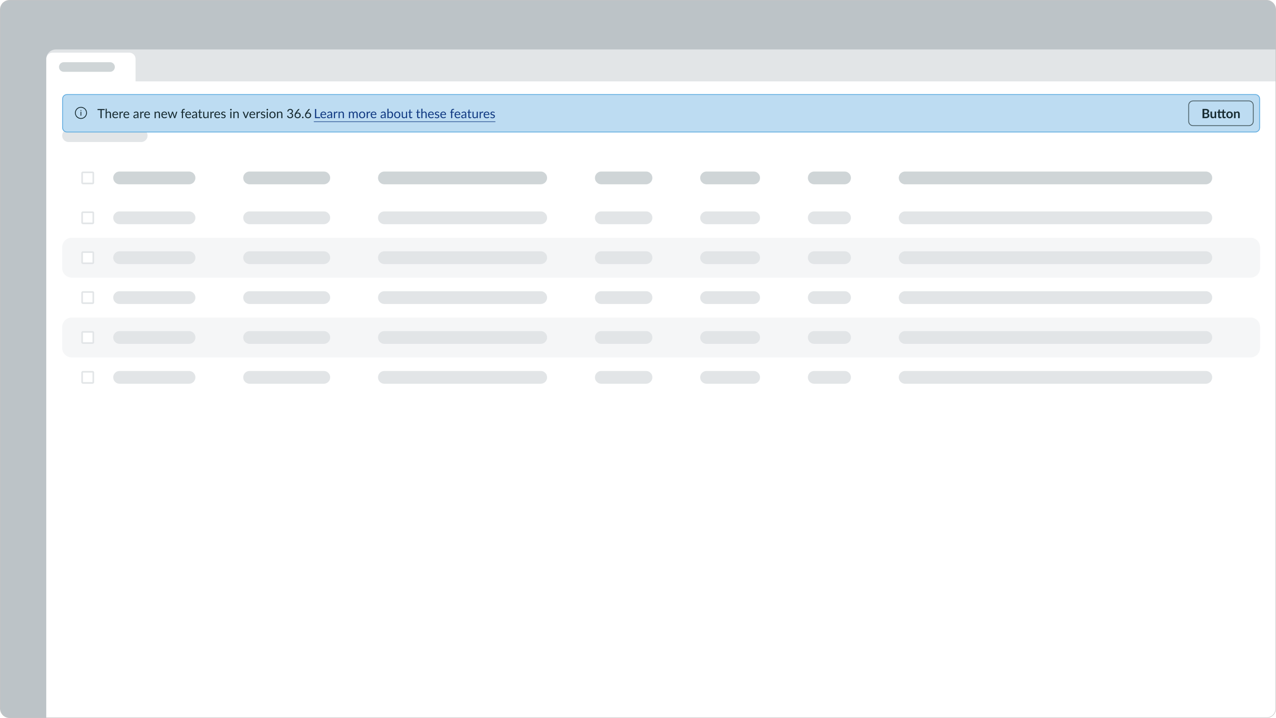
Fewer than two alerts
As multiple alerts appear within a queue (up to two), the alerts appear in a stacked list order. The alerts are arranged from top to bottom in the order they were received, with the most recent alert at the top of the list.
Note: An alert controller won't appear for 2 or fewer alerts.

More than two alerts
If a user receives more than 2 alerts at any given moment, the alerts collapse under the alert controller. The alert controller appears in the first position, and all alerts appear in the list from newest to oldest, from top to bottom. This minimizes the alert list's size in the display.
Note: The alert controller is only available for more than 2 alerts.
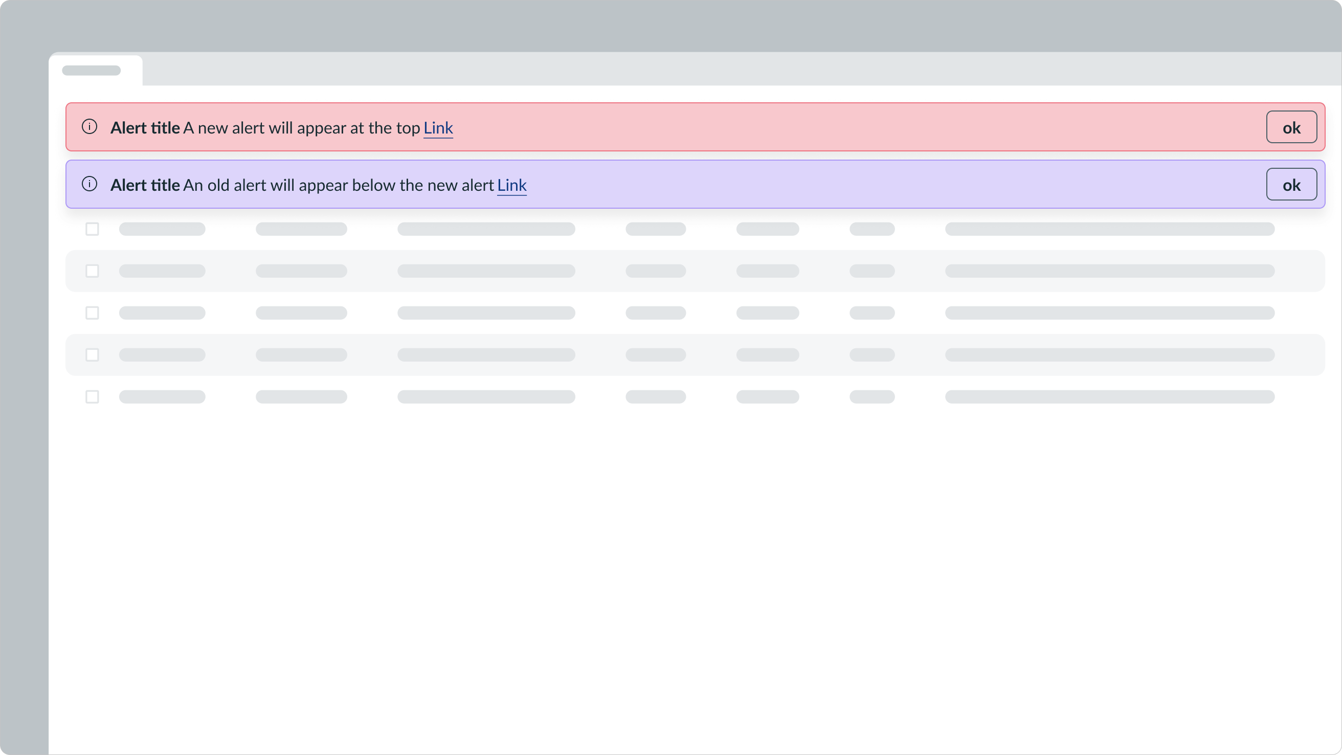
When there are 3 or fewer alerts, the alert controller won't appear.
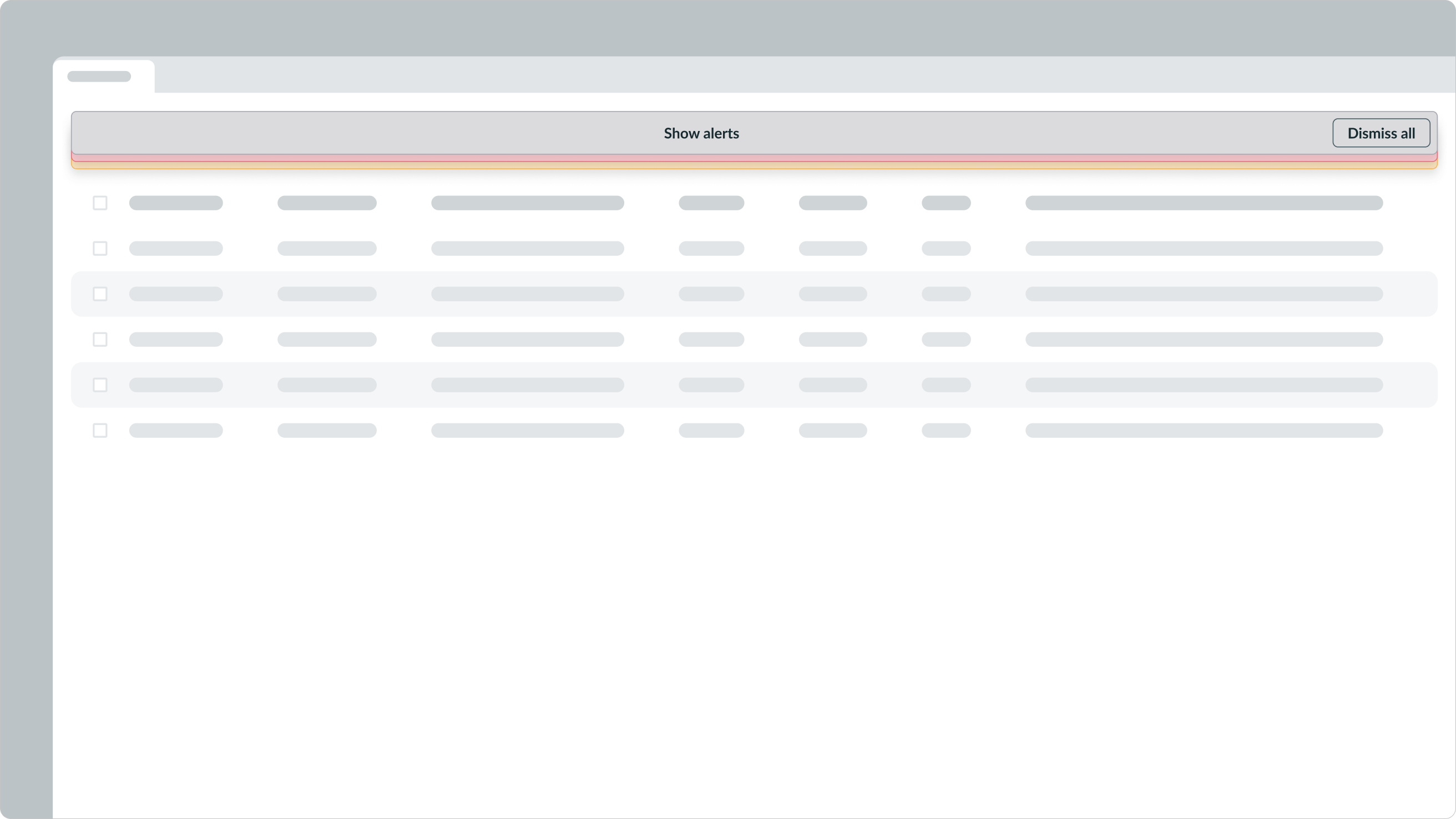
When there are more than 3 alerts, the alert controller appears and stacks the alerts underneath.
Design recommendations
Learn how to apply alert list in your design.
UI text guidelines
These are some recommendations for using text within alert list:
- Keep the header brief and to a maximum of two sentences
- Punctuate sentences when there are more than one, and leave off punctuation at the end of single sentences
- If the alert includes a message, avoid repeating info already in the header and make sure it provides a reason for the alert and guidance on how to resolve any issues
- For example, you wouldn’t want to say, “Task created. The task has been created successfully.” Instead, you could say, “Task created. We’ll notify you when it has been resolved.”
- Be clear about what happened and avoid blaming the person
- For example, you could say, “Update failed. Try refreshing the page.”
- If you need to provide more information, include a text link in the alert message and follow the usage guidelines for text link
Behavior
Learn how alert list behaves when the display changes or a user interacts with the component.
Responsive behaviors
When the alert list reaches the minimum size, labels longer than the maximum width wrap to a second line. Any label longer than 2 lines truncates, and the alert adopts the "Show More/Less" behaviors.
The message fills the remaining area in the alert.

Within the alert controller, the alert button also has a max width and height. When the text exceeds these limits, the button label wraps to 2 lines.

When the alert controller reaches its minimum size, the button label wraps to 2 lines. The “Show Alerts” UI text also wraps to 2 lines and center aligns in the container.
Interactions
Learn how alert list responds when a user interacts with it.
Dismissing multiple alerts
The alert controller also has a "Dismiss All" button. This action is available in its expanded and collapsed state.
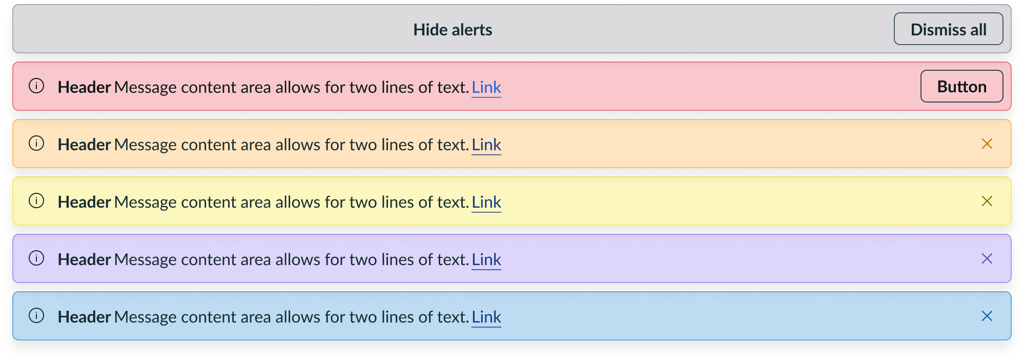
Expanding multiple alerts
A collapsed alert control container has "Show Alerts" UI text centered in the container. To expand all nested alerts, a user selects any part of the container. After expansion, the alert list controller remains at the top of the list, and the UI text changes from "Show Alerts" to "Hide Alerts."

For 3 or more alerts, the user can select the alert controller to collapse the alerts into a stacked view. This consolidates all alerts and provides an option to show or dismiss all alerts.
Collapsing multiple alerts
The list controller displays until there's only 1 alert available.
When a user expands the list and clears all but one alert, the user can select the alert controller to dismiss it, leaving only the single alert in the display.
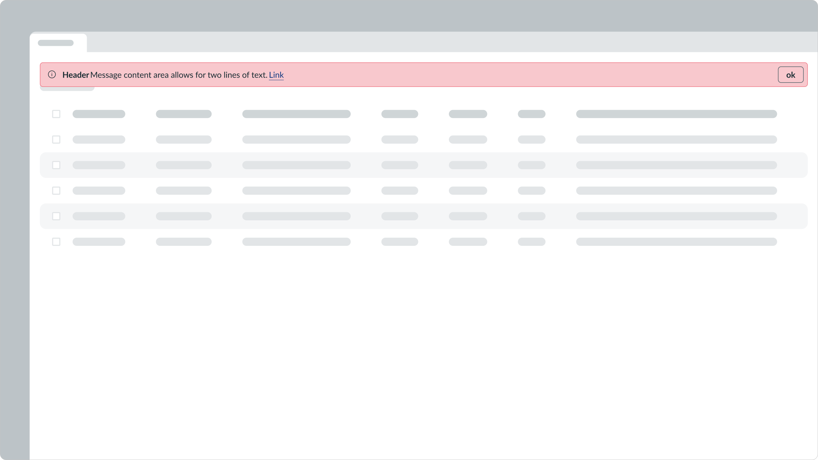
This example shows what happens when a user dismisses the alert controller so that only 1 alert remains.
Usability
Alert list complies with all internationalization and accessibility requirements.
Internationalization
When the display translates to a right-to-left (RTL) language, the alert list layout flips so that the action button is on the left while the header stays center aligned.

Accessibility
Learn how to access the actionable elements of alert list through keyboard interactions.
Focus Not Obscured Considerations
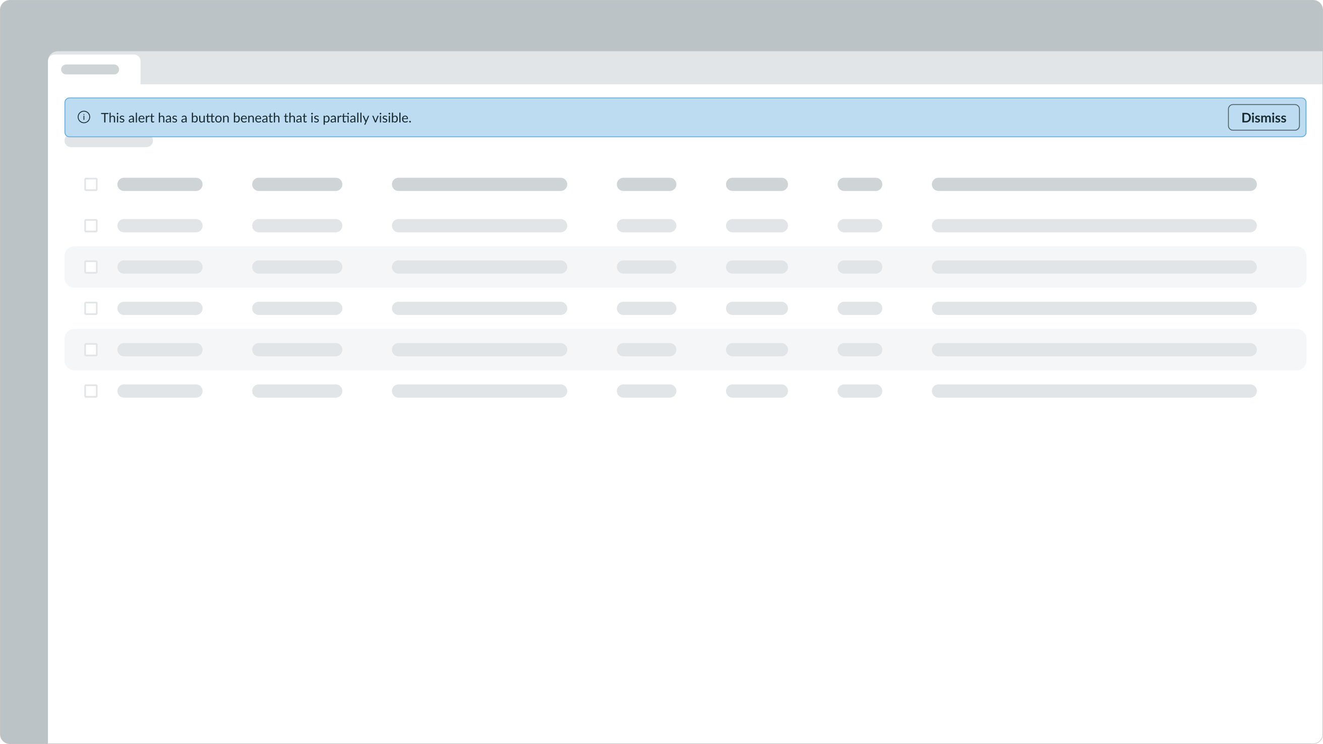
- To comply with 2.4.11 Focus Not Obscured (Minimum), the Alert List must not fully obscure any interactive element that can receive keyboard focus. Designers must ensure that the placement of the alert list component leaves at least partial visibility for any components beneath them.

You may shift content below the alert list to avoid obscuring any content.
Keyboard interactions
By default, the user can focus on the alert if it has a link or action-oriented button within it.
When Enable auto-focus on page alerts is turned on in User Preferences, keyboard focus automatically moves to the alert when it appears.
- Tab: Move focus from the alert to the link or action
- Enter: Launch the link or action
Be sure to consider this functionality in the tab order of your design.


