Anatomy
Learn about the individual parts of alert.

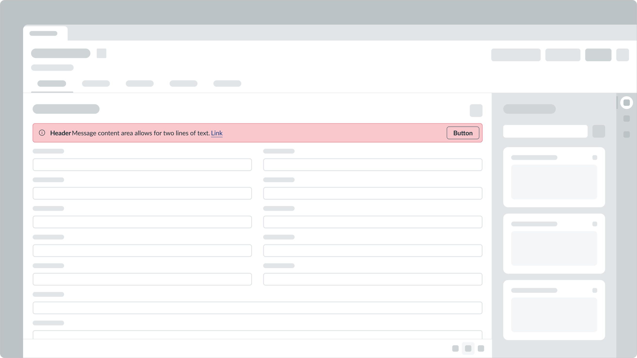
- Container: Space that contains the header, message, link, and button; it also adopts a color that maps to the urgency of the alert
- Icon (optional): Appears next to the message to emphasize the type of the alert
- Header (optional): Title of the alert
- Message (optional): Description of the alert
- Link (optional): A way for the user to quickly navigate to the context that triggered the alert
- Button (optional): Dismisses or acknowledges an alert; it can be an icon or a labeled button
Subcomponents
See usage guidance for text link
See usage guidance for alert list
Usage
Use an alert for the confirmation of an action or the change of a state in context of where the action was performed.

In this example, an alert displays to show that the user entered an incorrect value for the zip code field.
Configurations
Learn how to customize alert by configuring the available properties.
Status colors
Use status colors to indicate the importance of your alert.
| Status | Example |
|---|---|
| Critical | |
| High | |
| Warning | |
| Moderate | |
| Info | |
| Positive | |
| Low | |
| AI |
Icons
You can use an icon to provide visual context to an alert. Select an icon that reinforces both the alert title and the message.
Text links
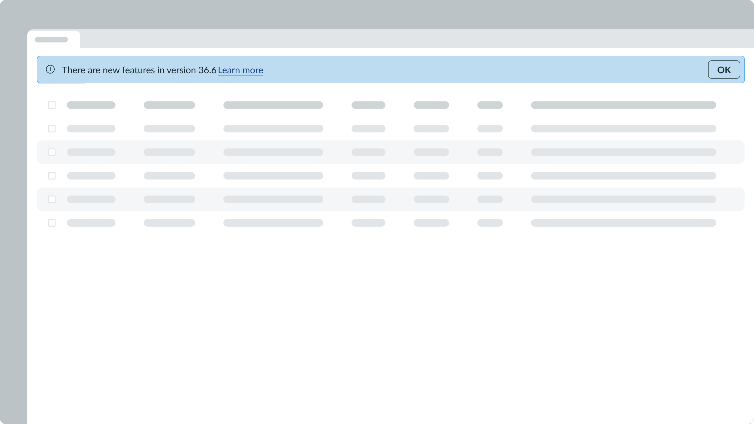
You can use text links within the alert message area to provide more context to the user.

In this example, the case number is a text link that takes the user directly to the case.
Make sure the label for the text link clearly describes what the user should expect when they select it.

Note: When the user selects the text link within the message area, it also dismisses the alert.
Actions
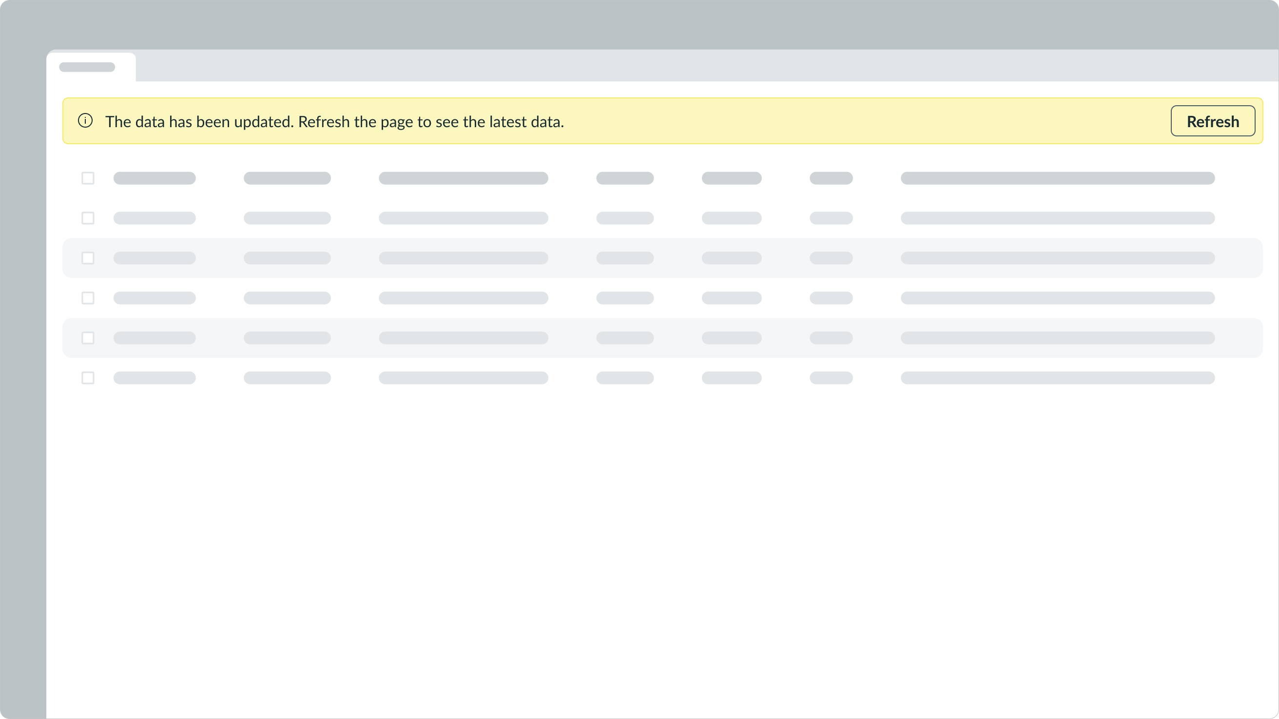
You can use an action-oriented button to give the user access to additional content or context. This lets the user act or acknowledge the alert directly within the component itself. Whether you use an action depends on your use case. Most actions that the user needs to take are in the UI elements or layouts where the alert appears.

In this example, the “Refresh” button is the action, which will refresh the page when the user selects it.
Design recommendations

Use an icon that matches the status color of the alert. The alert displays information that is not critical but useful. The icon reinforces this alert is informative, and the status matches that message.

Avoid using icons that don't match the importance of the alert. In this example, the icon indicates the message is a critical matter, but the alert color and message reflect a non-critical message.

Use alerts to notify a user of something that requires their attention. Clearly and concisely tell the user what happened and provide an action if necessary.

Don't use an alert message to explain a step-by-step process.
Alignment and positioning
Alerts appear within UI elements or layouts and don't float above the UI like an alert list.
UI text guidelines
These are some recommendations for using text within alert:
- Keep the header brief and to a maximum of two sentences
- Punctuate sentences when there are more than one, and leave off punctuation at the end of single sentences
- If the alert includes a message, avoid repeating info already in the header and make sure it provides a reason for the alert and guidance on how to resolve any issues
- For example, you wouldn’t want to say, “Task created. The task has been created successfully.” Instead, you could say, “Task created. We’ll notify you when it has been resolved.”
- Be clear about what happened and avoid blaming the person
- For example, you could say, “Update failed. Try refreshing the page.”
- If you need to provide more information, include a text link in the alert message and follow the usage guidelines for text link
Behavior
Learn how alert behaves when the display changes or a user interacts with it.
Interactions
Learn how alert responds when a user interacts with it.
Expand and collapse
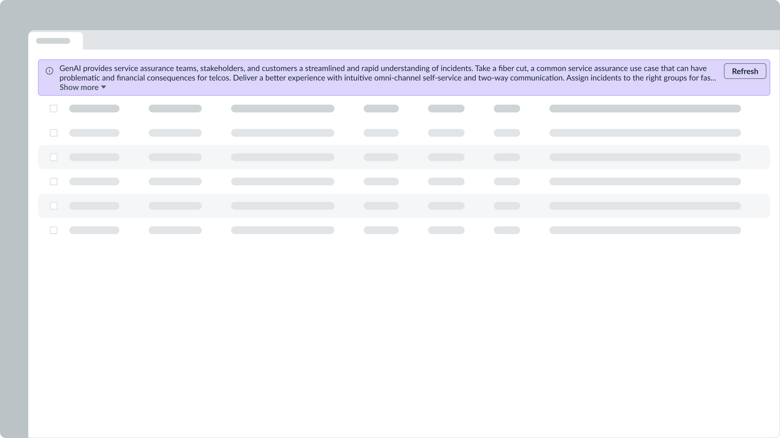
An alert message shows two lines of text by default. If the message exceeds two lines, the Show More option appears. When selected, the container expands to display the full message.

Selecting “Show More” expands the container to show the entire message. After expansion, the “Show More” trigger changes to “Show Less”. Selecting this option collapses the alert message back to its original state.
Usability
Alert complies with all internationalization and accessibility requirements.
Internationalization
When the display translates to a right-to-left (RTL) language, the alert layout flips. The action-oriented button appears on the left and the header appears on the right.

Accessibility
Learn how to access the actionable elements of alert through keyboard interactions.
Keyboard interactions
By default, the user can focus on the alert if it has a link or action-oriented button within it.
When Enable auto-focus on page alerts is turned on in User Preferences, keyboard focus automatically moves to the alert when it appears.
- Tab: Move focus from the alert to the link or action
- Enter: Launch the link or action
Be sure to consider this functionality in the tab order of your design.


