Anatomy

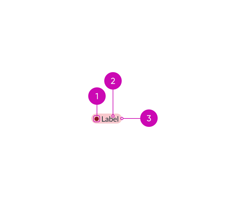
- Icon: Visual element that supplements a highlight color to indicate the status or category
- Label: Text that describes the status or category of the highlighted value
- Highlight: Background color that visually expresses the status of the highlighted value; the status or category color you choose determines the color highlight
Subcomponents
See usage guidance for label-value pair (stacked)
See usage guidance for label-value pair (tabbed)
See the icon gallery for available icons
Usage
Learn how to use highlighted value in a list, as a label-value pair, and with cards.
List
You can use highlighted values in a list to visually indicate the priority of certain items.

Label-value pair
You can also use a highlighted value within the stacked or tabbed type of the label-value pair component to indicate the status or category.

Cards
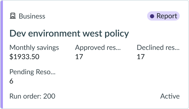
You can use highlighted values to group similar card content.

In this example, all cards related to a report can have a category color of purple and a label citing 'Report.'
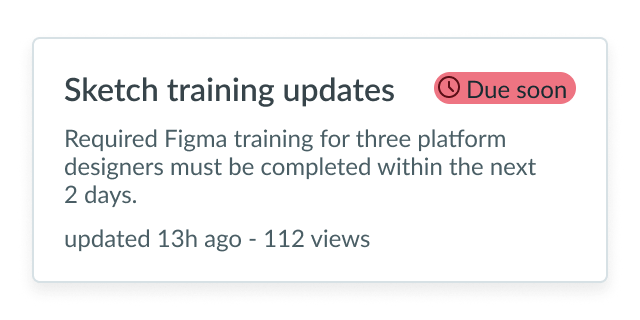
You can also use highlighted values to emphasize the state of card content.

In this example, a pending action of high importance can have a status color of red and a 'Due soon' label.
Variants
Learn about highlighted value and find out how to use it in your design.
Colors
Highlighted value has the following different color variants: primary, secondary, and tertiary. These variants communicate a hierarchy of importance. Color saturation also provides a differentiation and changes in intensity between variants.
Primary
Use the primary variant to signify items that are important and require immediate attention.

Secondary
Use the secondary variant to signify items that are important but don't need immediate attention.

Tertiary
Use the tertiary variant to signify items that are of minor importance. The tertiary variant is the default for highlighted value.

Configurations
Learn how to customize highlighted value by configuring the available properties.
Sizes
You can configure the size using one of the following options. The default configuration is small.
Small

Medium

Tooltip
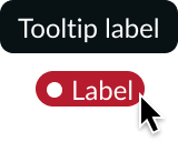
You can configure a tooltip label that displays when the user hovers over highlighted value. By entering a custom string, you can offer specific information or instructions.

Colors
Sets the background color. See “Design recommendations” below for determining which highlighted value colors to use for your use cases.
| Color Use | Primary Variant | Secondary Variant | Tertiary Variant |
|---|---|---|---|
| Critical | |||
| High | |||
| Warning | |||
| Moderate | |||
| Positive | |||
| Info | |||
| Low | |||
| Magenta | |||
| Pink | |||
| Orange | |||
| Yellow | |||
| Brown | |||
| Green | |||
| Green-yellow | |||
| Blue | |||
| Gray | |||
| Teal | |||
| Purple | |||
| AI |
Icon
The highlighted value can contain an icon that supplements the label and reflects a status or category. Avoid using an icon that can be misunderstood for a button.
| Without icon | With icon |
|---|---|
The icon in the highlighted value defaults to a circular status icon that is always filled and matches the highlight style. However, you can choose an icon other than the status icon. If you implement a different icon, remember to use either the outlined version to complement the label or the filled version to convey more importance.
Text wrapping
If highlighted values are set to wrap, the label wraps to the container width. By default, the highlighted text doesn’t wrap.

Helper content
Use this field to provide additional context for a highlighted value. When the highlighted value is selected, the text displays in a popover. Unlike tooltips, popover content an be styled and formatted.

Design recommendations
Learn how to apply highlighted value in your design.
Colors
Highlighted value supports the following color palettes: Status colors and category colors.
Status
Status colors convey an importance range from most critical to least critical.
| Color Use | Primary Variant | Secondary Variant | Tertiary Variant |
|---|---|---|---|
| Critical | |||
| High | |||
| Warning | |||
| Moderate | |||
| Positive | |||
| Info | |||
| Low |
Category
Category colors can represent groups of content, such as parts of an organization, including human resources, marketing, or finance. The colors can also designate types of objects, such as articles on troubleshooting, information security, or travel policy. Use the color that best fits your use case.
| Color Use | Primary Variant | Secondary Variant | Tertiary Variant |
|---|---|---|---|
| Magenta | |||
| Pink | |||
| Orange | |||
| Yellow | |||
| Brown | |||
| Green | |||
| Green-yellow | |||
| Blue | |||
| Gray | |||
| Teal | |||
| Purple |

Use a highlighted value to display the importance of a specific task.

Don't use a highlighted value as a numerical counter. Use a badge instead. Highlighted values indicate status, while badges are dynamic numeric counters.

Use a highlighted value that captures attention and reflects the importance of the task.

Don't use a category color that reflects low-priority status for something important.

Use a highlighted value to draw attention to important information, such as when content has been generated by AI.

Don't use a highlighted value as an interactive element, such as a button or link, to avoid confusion and maintain the clarity of its purpose.
UI text guidelines
These are some recommendations for using text within highlighted value:
- Keep the text brief but informative to make scanning easier
- Use the label to help the person make a decision, inform them, or help them move forward
- For example, a “Draft” label can tell a person that the object hasn’t been published yet
- You can also use the label to provide categories for UI elements (like cards)
- For example, you can use “Article” and “Video” to categorize content
- The label should be relevant to the person’s task at hand and should be in words they understand
- Make sure the label you use matches the criticality of the color.
- For example, an item that is “Due soon” should have a yellow highlighted value color to indicate a warning
Behavior
Learn how highlighted value behaves when the display changes or a user interacts with the component.
Interactions
Learn how highlighted value responds when a user interacts with it.
Tooltip
Hovering over highlighted value displays the custom tooltip text string.

Usability
Highlighted value complies with all internationalization and accessibility requirements.
Internationalization
When the display translates to a right-to-left (RTL) language, the highlighted value flips. If it contains an icon, the icon appears to the right of the text.

Accessibility
Learn how to access the actionable elements of highlighted value through keyboard interactions and screen readers.
Visual
Label and icon colors for the highlighted value have a minimum 5:1 contrast ratio that applies to all variants and both the status and category colors.
Screen readers
The screen reader can announce the highlighted value and any related content together. Use aria-labelledby and aria-describedby to connect the highlighted value to the related content.

