Overview
In addition to the app shell navigation, individual pages contain their own navigational UI components. These include in-page tabs for switching between content sections on a single record, and side-panel navigation for accessing related tools without leaving the primary page. A well-designed workspace combines these different navigation patterns to create a cohesive and intuitive experience.
| Component | Description |
|---|---|
| Workspace tabs | Facilitates easy navigation between multiple open records and tasks. |
| Record tabs | Organizes structural content within a single open record. |
| Tab set | Switches between content sections or data views on a single page. |
| Breadcrumbs | Provides a hierarchical trail of links to show the user's location and facilitate movement up the application path. |
| Content tree | Navigates deep, nested data hierarchies via expandable nodes. |
| List menu | Switches between different predefined list views, queues, or filters. |
| Contextual side bar | Hosts utility tools and secondary navigation (e.g., Agent Assist) within a record page. |
Workspace tabs
Workspace tabs are the tabs that appear below the workspace header (in a tabbed App shell) whenever a user opens multiple records or tasks. They enable true multitasking by letting the agent have several items open in parallel. For example, in Agent workspace an agent might have an Incident record open in one tab, a Case in another, and perhaps a new incoming chat in a third. Use Workspace tabs when your users need to multi-task across multiple records – it improves efficiency by avoiding constant page navigation. If your workflow expects users to handle several items at once or rapidly switch context, Workspace tabs are appropriate.
Within the tabbed shell, there are three types of tabs managed automatically:
- Primary tabs: one for each primary page (each icon in the primary navigation bar opens one, e.g. a “List” page) – these typically can’t be closed by the user.
- Record tabs (aka Session tabs): for each record or secondary page opened (these can usually be closed via an “X” on the tab).
- Child tabs: subtabs that appear within a record tab when opening related records or tools (for example, opening a related record in an existing session might open as a child tab under that session). By default, the first child tab (often “Details” of the record) is fixed and cannot be closed.
Workspace tabs, part of the Workspace app shell (tabbed), are automatically provided when you select this shell in UI Builder. They cannot be manually placed. Configure behavior like persistence and styling in workspace settings. Each primary navigation page opens a primary tab, and each record opens a session tab. Use them if users need multitasking; otherwise, a simpler breadcrumb shell might be better.
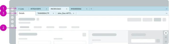
Record tabs
“Record tabs” refers to the pattern of splitting a record’s information into multiple contextual tabs. For example, an Incident record page might show the main form in one tab (“Details”), and related information (like “Activity Stream”, “Attachments”, or related lists of child records) in additional tabs. Use record tabs when a single record contains a lot of information or sub-sections – it keeps the interface cleaner and allows users to navigate record details vs. activities without scrolling excessively. It’s essentially a specialized use of the Tabs component for record context.
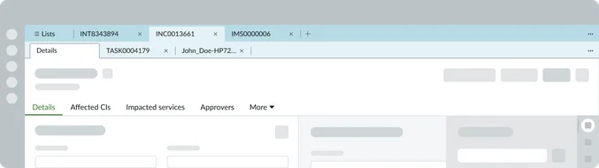
Tab set
The Tab set component is a generic container that presents multiple content panels with labeled tabs, either horizontally (typically) or vertically. Use this for in-page navigation – i.e. when you want to let users switch between different sections of content on the same page.
Common scenarios: Separating a form into logical sections (e.g., “Details” vs “Approvals” on a record, if not using the record tabs preset). Toggling between different data views or widgets on a dashboard page. Organizing a complex page into simpler sub-pages without leaving the page (like a mini navigation).
Unlike Workspace tabs (which span multiple records), these Tabs are within a single page. They improve usability by not overwhelming the user with one long scrolling page; instead content is chunked under intuitive tab labels. The Tabs component is often used in OOB templates – for instance, the baseline Record page in Tokyo+ uses a Tabs component to separate record details from related lists. You can either use such templates (which include pre-configured tabs) or add the component manually.

Horizontal Tab set

Vertical Tab set

Breadcrumbs
Breadcrumbs are a horizontal list of links indicating the current page’s position in a hierarchy, often starting from a “Home” or top-level and drilling down to the current item. Use breadcrumbs in workflows where users navigate stepwise into deeper records or pages, especially when you want to allow easy jumps back to higher levels.
For example, in a Customer 360 workspace, an agent might go from:
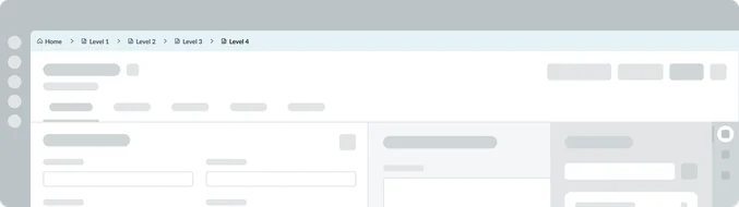
Breadcrumbs at the top would show this path and let the agent click “Acme Corp” to go back to the account, or “Accounts” to go back two levels up. They are best for non-multitasking scenarios, guiding the user along a single path (this is why the Breadcrumb App shell is recommended for focused flows that don’t require opening multiple tabs).
Breadcrumbs improve the user’s sense of context (“Where am I?”) and reduce back-and-forth navigation by providing direct links to ancestor pages. They are also space-efficient for shallow hierarchies. Choose breadcrumbs if your users will benefit from contextual awareness of hierarchy and need one-click access back to earlier steps. Do not rely on breadcrumbs if users are likely to jump arbitrarily between unrelated records – that’s better served by tabs or global search. Breadcrumbs shine in structured drill-downs (like moving through a related list from one record to another in a chain).
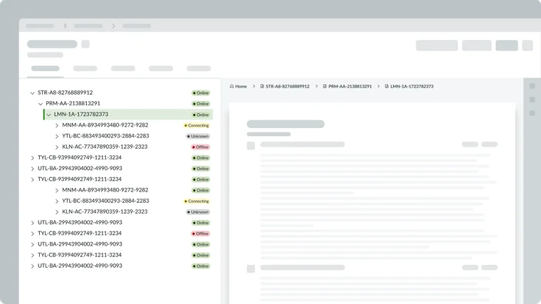
Content tree
The Content tree component displays data in a tree hierarchy with expandable/collapsible nodes. This is useful when users need to navigate through nested structures. Common use cases:
Browsing a hierarchy of categories (e.g., a knowledge base taxonomy: knowledge base → category → subcategory). Exploring an organizational chart or any parent-child record structure (like a CMDB hierarchy, project tasks breakdown, etc.). Selecting multiple levels of filters or drill-down (like geographic region → country → state).
If your workspace has a scenario where users are able to expand a node to see its children and select one, a content tree is ideal. It provides a familiar navigation paradigm for deep hierarchies, which might be more intuitive than multi-level menus or breadcrumbs alone in some cases.
Use a Content tree when hierarchical depth is unpredictable or more than 2—3 levels deep. It can complement breadcrumbs: for instance, breadcrumbs might show where you are, while a content tree on the side lets you explore siblings and cousins of that node. Ensure to size the tree area appropriately. They can grow vertically as nodes expand.
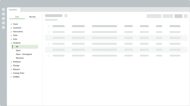
List menu
The List menu is the vertical menu that can only be used on a workspace’s list page. It enables users to pick which list or queue they want to view. For example, in an ITSM workspace list page, the left side might have category headers like “Incident lists” with items for “My incidents”, “All incidents”, “Open incidents last 30 days”, etc. Selecting one will display the corresponding list of records on the right. Use the List menu when you have multiple lists that can be categorized into filtered views. These views allow an agent to toggle between frequently used views. This provides a quick, in-context navigation without leaving the list page..
In UI Builder, remember to manage roles on list items via Audience records if needed (so that certain users see certain list options, etc.).
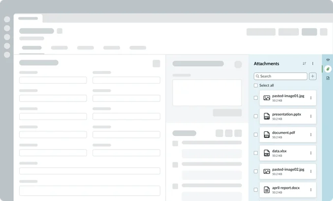
Contextual side bar
The Contextual side bar is an organizational component, typically residing on the right side of an Record tab. Its main function is to host utility tools and secondary navigation that relates to the main record without distracting the user from the primary workflow. It often utilizes vertical tabs (displayed as iconic buttons) to switch instantly between tools (like Agent assist, attachments, or related records).
The Contextual side bar contains localized elements, including a header for internal navigation (like a back button), action buttons, a search input, and a panel footer for specific actions or pagination. It ensures essential tools are always available for quick context switching while the user remains focused on the main record form.