Anatomy
Learn about the individual parts of content tree.
Content tree
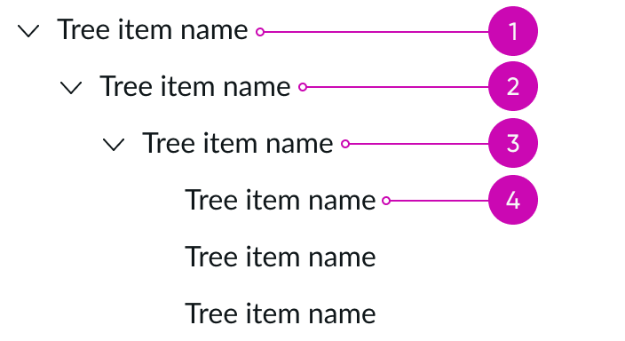
- Root node: Topmost node in the tree structure
- Parent node: Node (excluding the root node) that connects to only one other node
- Child node: Subnode of any given parent node
- Leaf node: Node with no child nodes; it's the lowest node in the entire hierarchy
Note: The data set determines what nodes get passed into the content tree.
Content tree node

- Expand or collapse control (optional): Opens and closes a node with attached child nodes
- Identifier (optional): Visual indicator in front of the label that provides additional context; indicators make nodes easily identifiable and scannable, which is helpful when a content tree contains multiple node types
- Label: Text description of the node
- Subcomponent area (optional): Can be an icon, badge, or presence indicator; subcomponents can either trigger a contextual action or behave as a visual indicator
- Highlighted value (optional): Styled value that communicates priority or status information
- Divider (optional): Line that creates a visual relationship between elements; the divider also improves the readability of the content tree
Subcomponent
See usage guidance for highlighted value
See usage guidance for accordion
Usage
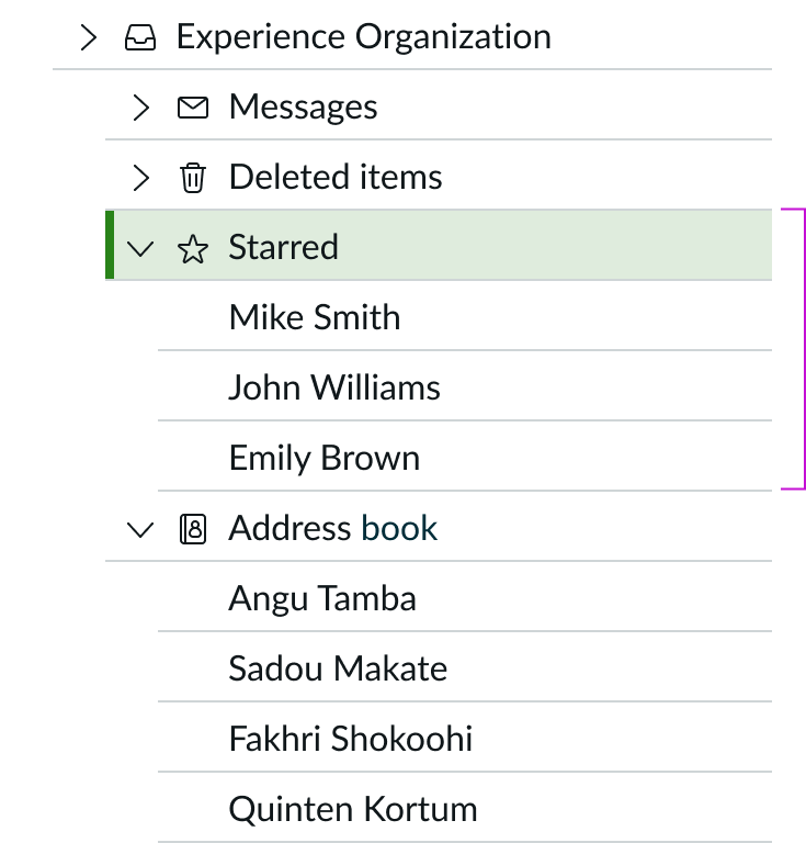
Use a content tree to categorize nodes in a logical hierarchy, with easy-to-read labels and familiar icons. Keep the hierarchy shallow to allow users to scan the information quickly and get to the information they need. You can simplify navigation in large hierarchies by allowing users to collapse and expand parent nodes. Drag and drop capabilities allow users to reorganize the content tree.

Variants
Learn about content tree and find out how to use it in your design.
Sizes
The data set and your page structure determine the height of the content tree. Be sure to leave enough space in your design to limit the amount of horizontal scrolling.
Node sizes
Although the content tree doesn't have predetermined sizes, the nodes within a content tree have 2 different sizes. These sizes affect the size of the chevron, label, and elements in the node. Choose a size that best fits your individual use case.
Small

Medium

Configurations
Learn how to customize content tree by configuring the available properties.
Text
Use text to clearly and succinctly describe the node.

Identifiers
Identifiers provide additional visual context to a specific text label. You can use either icons or avatars as identifiers.
Icons
An icon can supplement the label and provide a visual cue.

However, be cautious when using repetitive identifiers because they may cause visual noise. Always evaluate if identifiers are meaningful and necessary for users before using them.
Avatars
Instead of using an icon, you can use any type of avatar to identify an individual.

Avatars are especially helpful when you want to build org charts using a content tree.

Highlighted values
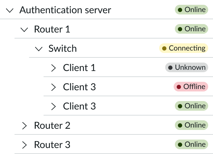
The area dedicated for a highlighted value may require an adjustment if the longest highlighted value label exceeds the default width. In this example, you would have to adjust the width to fit the 'Connecting' label.
When you use a highlighted value with an actionable icon or icon, the highlighted value will appear to the right.

Actions
Use an actionable node to trigger an event.

When an action is embedded in a node, the identifier and label appear in the actionable color.
Subcomponent selection
There are 3 types of subcomponents that can appear to the right of the label: an icon, a presence icon, or a badge. There is no limit to how many of these you can include next to the label. However, too many may visually overload the user. To reduce cognitive overload, you can also make the subcomponents appear only after the user hovers or focuses on a specific node.

In this example, the presence icon shows that the servers are online.
Presence indicators and badges don't have any actions and only display a status. However, icons can indicate a status or contain an action. If an icon is actionable, it always appears to the right of any status elements.

In this example, a badge appears to show the total number of templates available.
Expand or collapse control
There are 3 options for the expand or collapse control trigger: chevron, caret and "plus or minus". It's recommended that you use the same type within a display or throughout a product to create a visually consistent experience.
| Trigger Type | Example |
|---|---|
| Chevron (default) |  |
| Caret |  |
| Plus or Minus |  |
Dividers
You can also add divider to the content tree to help visually break up the nodes. Dividers are optional and aren't part of the default configuration.

Design recommendation
Learn how to apply content tree in your design.
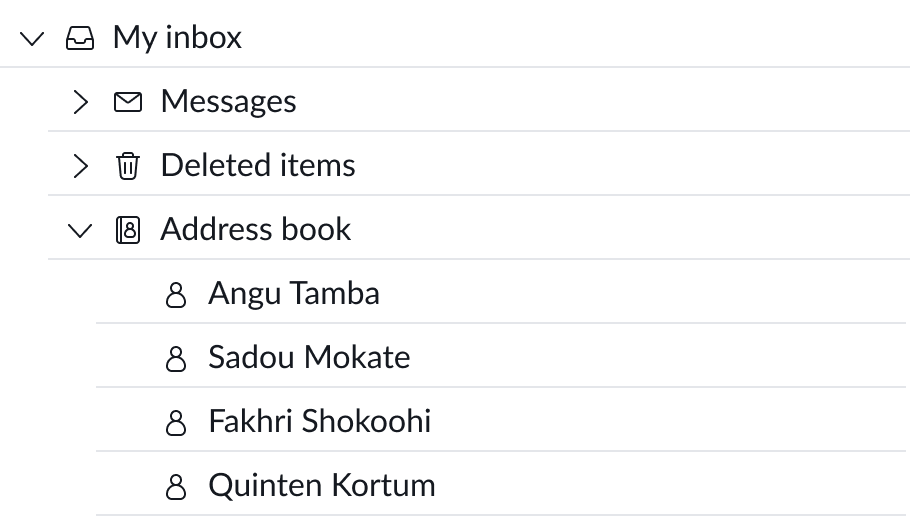
Use an identifier when the data set contains multiple sets of unique items.
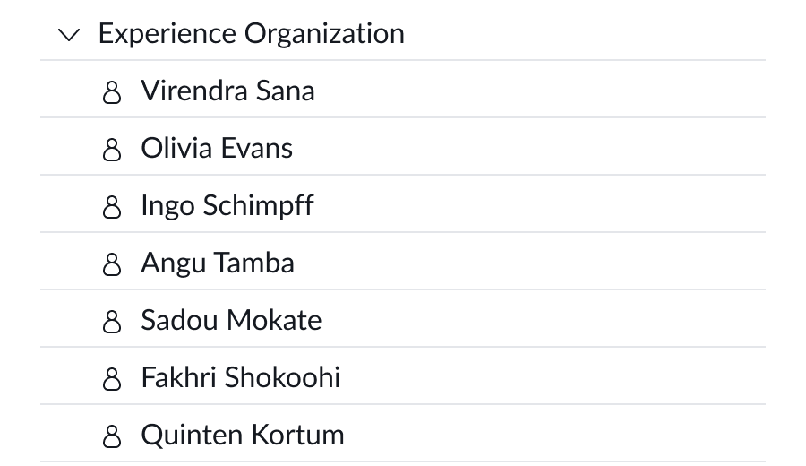
Using an identifier for known entities introduces more visual noise and doesn't provide clarity.
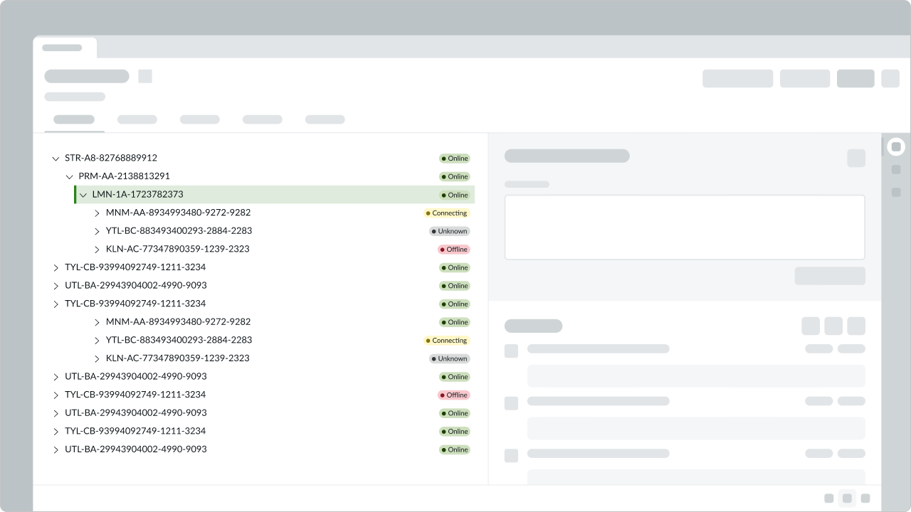
In this example, the labels have a clear visual relationship with the highlighted values (the elements).
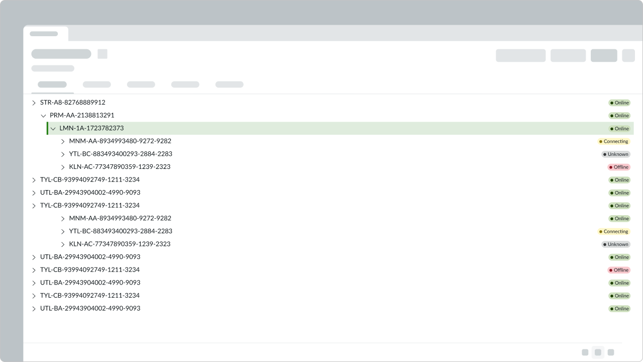
Avoid filling an entire space with a content tree because the distance between the labels and values makes it difficult to determine the relationship.
Alignment and positioning
The content tree always aligns to the left of its container. When a parent node expands to show the child nodes, the child nodes appear indented from the left to show the visual hierarchy.
UI text guidelines
These are some recommendations for using text within content tree:
- If content tree node is closed by default, the label you use should help the person understand what will show if they open it
- Consider the hierarchy when organizing items in a content tree—based on the labels, the relationship between the items should be clear
Behavior
Learn how content tree behaves when the display changes or a user interacts with the component.
States
Content tree has the following states: default, hover, selected, and disabled.
| State | Example |
|---|---|
| Default |  |
| Hover |  |
| Selected |  |
| Disabled |  |
Responsive behaviors
Learn how content tree responds to changes in a container or display.
Lazy loading
If you are using a large set of data in your content tree, you can use the lazy loading behavior to load data on demand. This functionality can be applied to any set of data at any level.
When using lazy loading, determine what data to load first by considering how a user will engage with the data set. For example, if you expect a user to identify the parent before drilling into a child node, you can load batches of parent nodes first. Then load batches of parent nodes until the list is complete.
A content tree can load child nodes on demand.

When the user expands a node, this starts the lazy loading process. A loading state appears within the children node area. Collapsing the node will cancel the loading request.

Once the process is done, the loading state disappears, and the child nodes appear in its place.
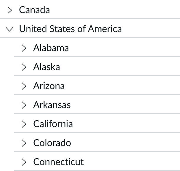
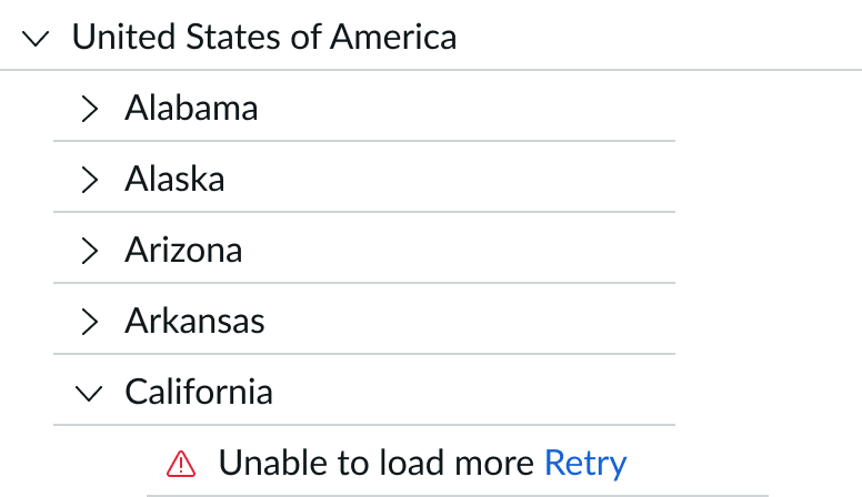
If it takes too long to return nodes during a lazy load request, the request stops and displays an error message. The user can try to load the nodes again with the "Retry" option.
You can also use lazy loading within a branch to mitigate long load times, especially if a branch has a large set of data. You can set a predefined number of nodes to load before the "Show more" option appears.
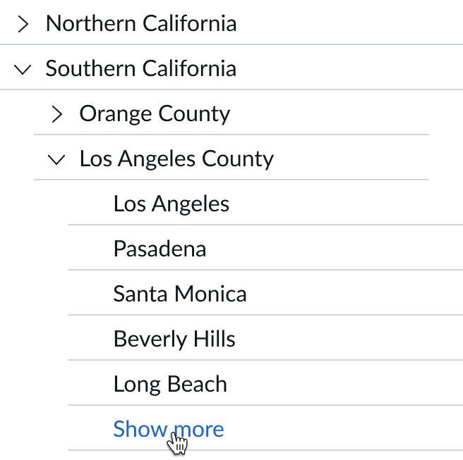
In this example, the branch loads only 5 items at a time. The user can select the 'Show more' option to load more nodes.
Interactions
Learn how content tree responds when a user interacts with it.
Action icon
If you include an icon to the right of the label, you can also add a click or hover action to it.

In this example, the tooltip informs the user that they can't view the content.
Selection
The content tree allows a user to select either a single item or multiple items. This behavior is optional, and you can turn it off at any time.
When multi-selection is enabled, each selection highlights after the user selects it. The user doesn't need to hold the Shift key to select more than one item in the content tree. The user can select the item again to deselect it.
Single-select
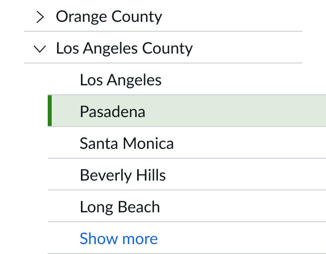
Multi-select
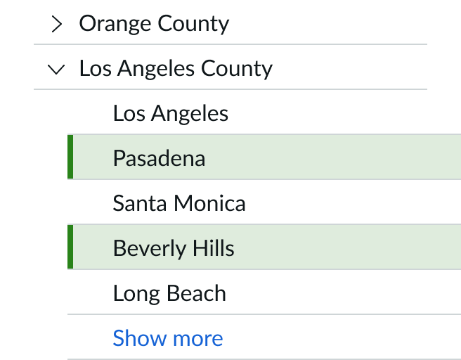
Highlight options
There are 2 different highlight options in a content tree: string highlight and node highlight.
String highlight
The content tree component supports string highlighting when the user enables a search or filter option.
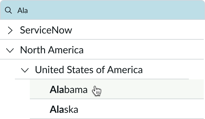
Items that match the search query will appear in bold. If the string is a text link, it will retain the underline and color styling.
Node highlight
You can configure whether to highlight only the selected node or the selected node and its immediate parent node. The default option is to highlight only the selected node.

In this example, only the selected node is highlighted.
If you choose to highlight the selected node and its immediate parent node, the selections highlight in different colors.
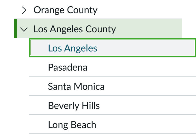
In this example, the selected node and its immediate parent node are highlighted.
Drag and drop
You can allow the user to drag and drop nodes within a content tree. When you enable drag for a node, by default a copy will be dragged to the drop location. You can change this effect to move the node.
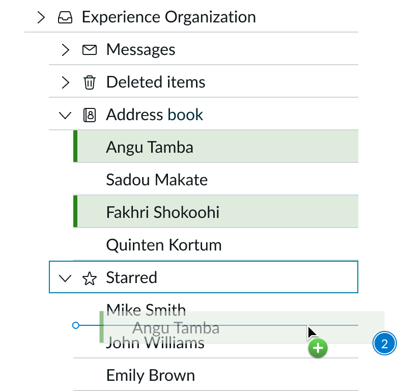
When the user selects and begins to drag a node, a ghost image of that node appears. As the user drags it, an insertion point appears to show where the node moves to when dropped. The precise cursor position determines the drop location. When a node can accept a drop, a node can be dropped above, below, or on it to create a parent/chid relationship. The drop target is the parent and the dragged node is the child.
If the user tries to move a node that is not draggable, no action takes place. If they try to drop a node on a node that doesn’t allow drop, no action will take place and the cursor returns to its default state. If the user drags a child node, the immediate parent node receives a border. This allows users to know exactly where they are within the content tree.
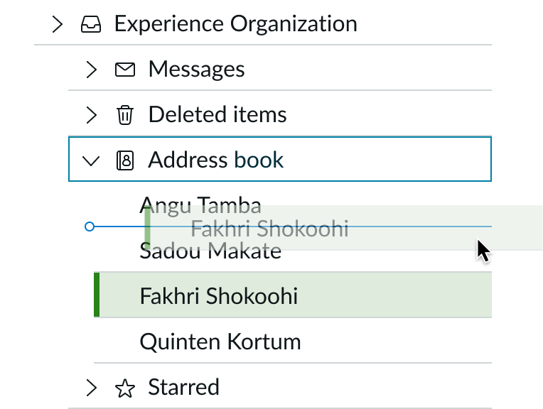
In this example, the user is dragging Fakhri Shokoohi's record. The insertion point shows that its new location is above Sadou Makaté's record.
If the user wants to drop the child node at the bottom of the content tree, the location of the insertion point will determine the node's hierarchy. To place the node at the bottom of the current list of child nodes, the user must be within the correct parent node.
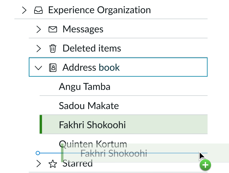
In this example, the user is dragging Fakhri Shokoohi's record. The insertion point shows that its new location is underneath Quinten Kortum's record.
If the user wants to convert the selected child node into a parent node, they can shift the insertion point to appear outside the current parent node.
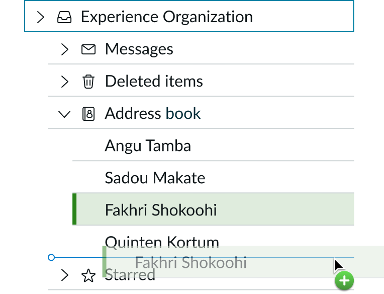
In this example, the user is dragging Fakhri Shokoohi's record. The insertion point shows that its new location is as a parent node on the same hierarchy level as Address Book, Deleted Items, and Messages.
If the user wants to place one or more nodes within a collapsed parent node, they must first expand the node by hovering the selected ghost nodes on top of the parent node. This action expands the collapsed node.
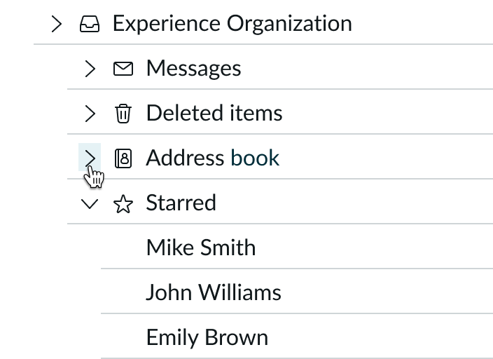
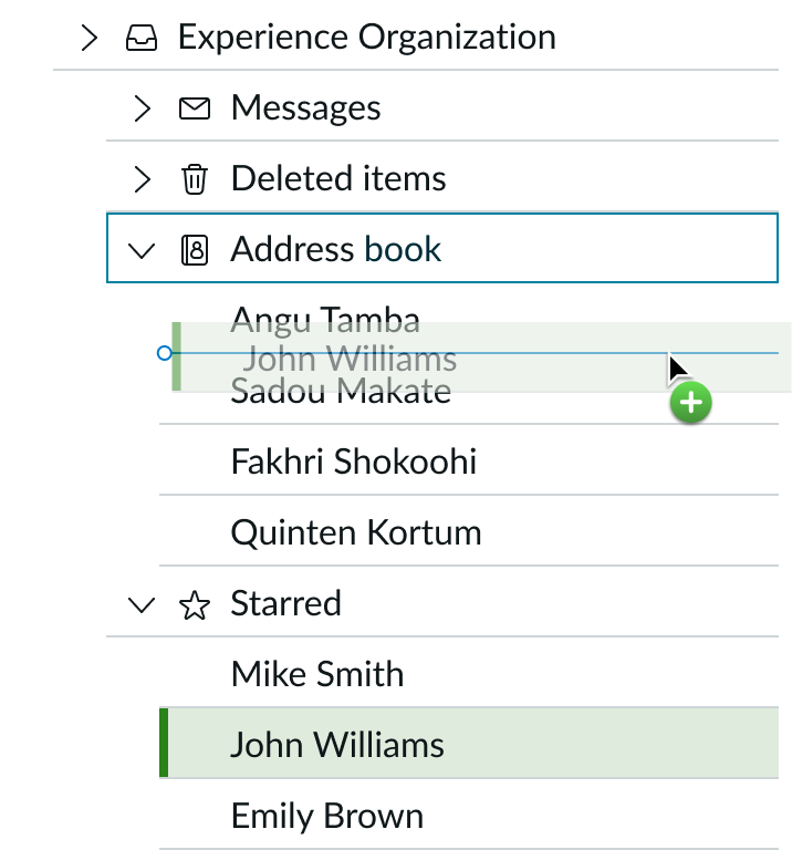
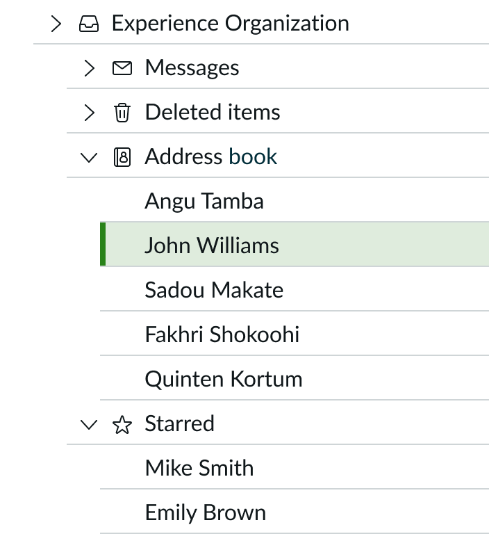
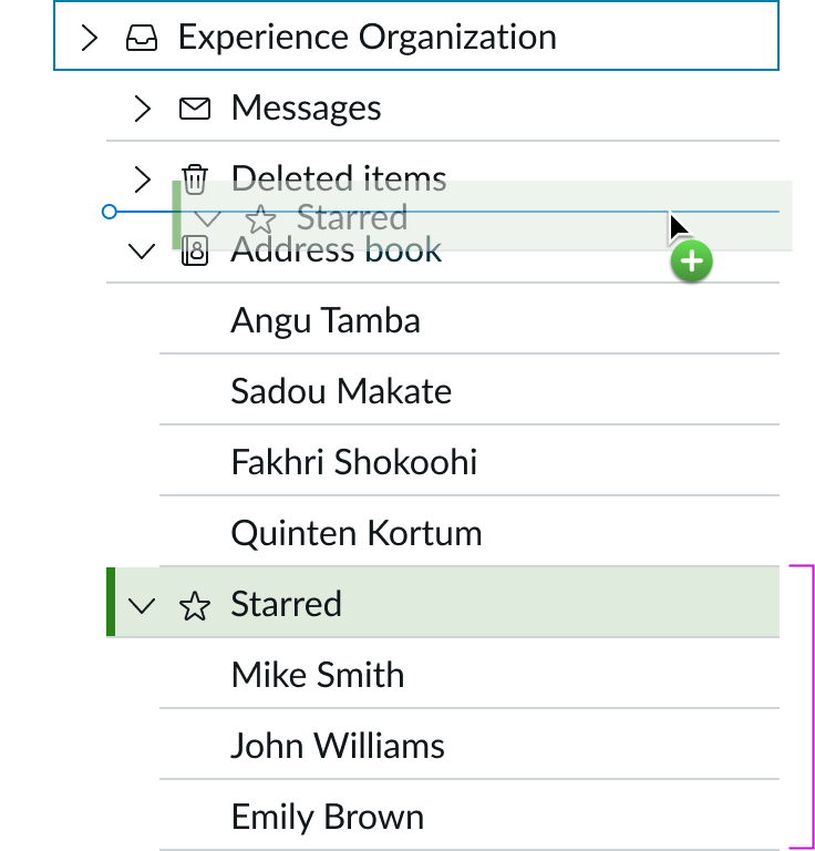
If the user is dragging and dropping an expanded parent node, the node collapses while it's being moved. Once it's dropped in its new location, it returns to its expanded state.
If you enable multi-select, the user can drag more than one node at the same time. As the user drags the nodes, the total node count appears next to the first selected node, which turns into a ghost node.
Truncation
The following options are available for handling long labels in a content tree: truncate with an ellipsis or wrap the label to the next line. Use only one of these options to keep your design consistent.
Ellipsis
You can truncate a label with an ellipsis, and the full label shows in a tooltip on hover. However, the elements on the right will always be present.

Wrap
You can also choose to wrap the label instead of truncating it or adding a scrollbar. The label wraps to the second line, and any elements stay positioned to the upper right of the label.

Usability
Content tree complies with all internationalization and accessibility requirements.
Internationalization
When the content translates to a right-to-left (RTL) language, the nodes flip and align on the right. Any icons in the content tree flip their orientation only if they are direction-based.

Accessibility
Learn how to access the actionable elements of content tree through keyboard interactions and screen readers.
Keyboard interactions
When focus is outside of the content tree, you can access the actionable elements of content tree with these keyboard keys:
- Home: Moves focus to first node in tree
- End: Moves focus to last node in tree
- Space or Enter:
- If focus is on a node, it selects the node
- If focus is on the expand or collapse control, it expands or collapses the node tree
- If focus is on actionable text or an icon, it selects and initiates the action
- Tab: Goes to next actionable item in a node; if there isn't one, it exits the tree
- Arrow up: Moves focus to the previous visible node; if focus is on or within the first visible node, it does nothing
- Arrow down: Moves focus to the next visible node; if focus is on or within the last visible node, it does nothing
- Arrow right:
- Expands a collapsed node that is in focus
- If focus is on an expanded parent node, moves focus to the first actionable item within the parent node; does nothing if the parent node doesn’t have any actionable items
- If focus is on a node that is not a parent, moves focus to the first actionalble iterm within the node; does nothing if the node has no actionable items
- If focus is on an actionable item, moves focus to the next actionable item; does nothing if the actionable item is in the last position - furthest right
- Arrow left:
- If focus is on an expanded node, it collapses the node; does nothing if focus is on a collapsed parent node,
- Does nothing if the node is not a parent node
- If focus is on the first actionable item within a node, moves focus to the node
- If focus is on the first node in the tree, it moves focus to the content tree
To initiate drag and drop mode for content tree nodes:
- Shift + Spacebar: Initiates drag and drop mode; no actions is taken if initiated on a non-draggable node
When the user is using the drag and drop interaction: - Escape: Cancels drag mode
- Enter: Drops the node(s) the user is dragging; if the user attempts to drop on a node that doesn’t allow dropping, the insertion point will not appear
- Arrow up: Moves insertion point up
- Arrow down: Moves insertion point down; if the insertion point is already at the bottom of a subtree, the insertion point goes to the parent node hierarchy level
- Arrow right: Expands a collapsed node
- Arrow left: Collapses an expanded node
Screen readers
Content tree has no specific screen reader considerations.

