

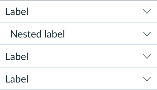
Anatomy
Learn about the individual parts of accordion.
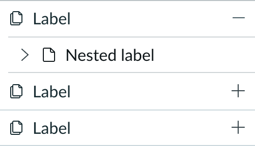
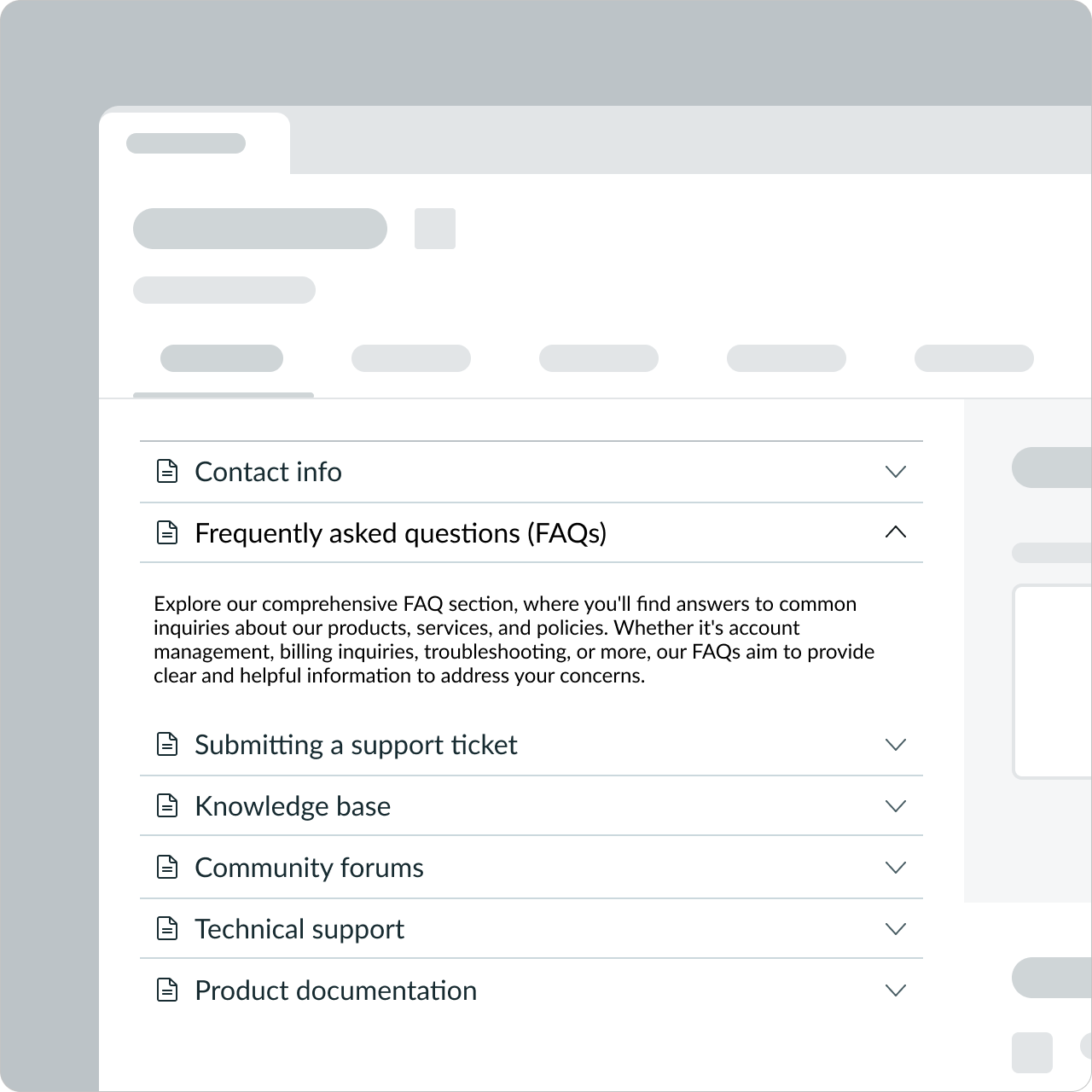
Accordion container
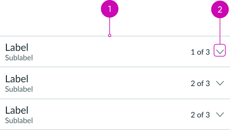
- Divider (optional): Line that divides collapsible content sections from one another
- Trigger icon: Configurable icon that triggers the accordion header to expand or collapse its content; can be configured as a chevron or plus/minus icons
Accordion item
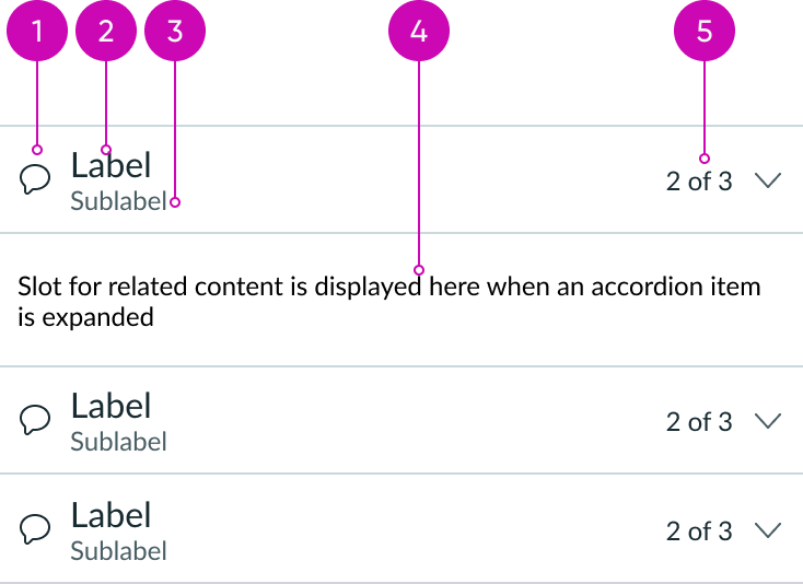
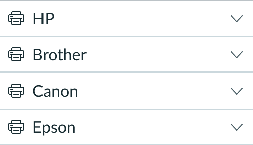
- Identifier (optional): Slot for icon or avatar that identifies the content or purpose of the accordion
- Header label: Required label that identifies a collapsible section of content; can also act as a control for showing and hiding that content
- Caption (optional): Sub-label that displays supplemental information about the item; can be shown or hidden
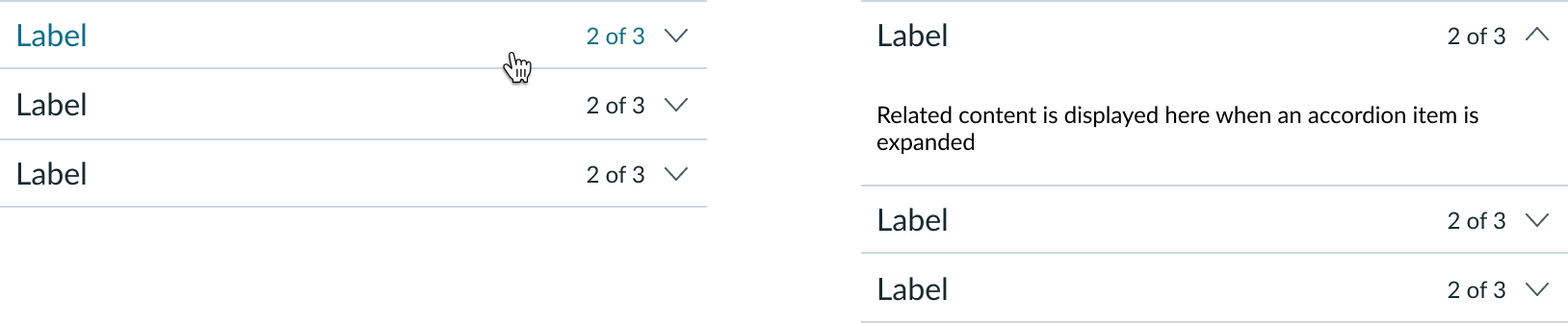
- Content: Slot for related content displayed when an accordion item is expanded
- Metadata (optional): Slot that can be configured as a text string, or badge; can be shown or hidden
Subcomponents
See usage guidance for highlighted value
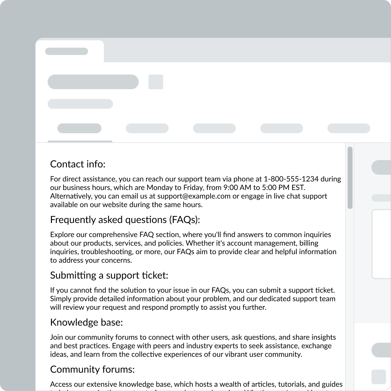
Usage
Use accordion to give users access to large amounts of related content in a restricted space, such as in a side panel. Users can scan accordion headers for relevant data before expanding the sections they want to read. This provides a better experience than searching long, scrolling pages.
Used as a subcomponent
Place an accordion component within another component, panel, or container.
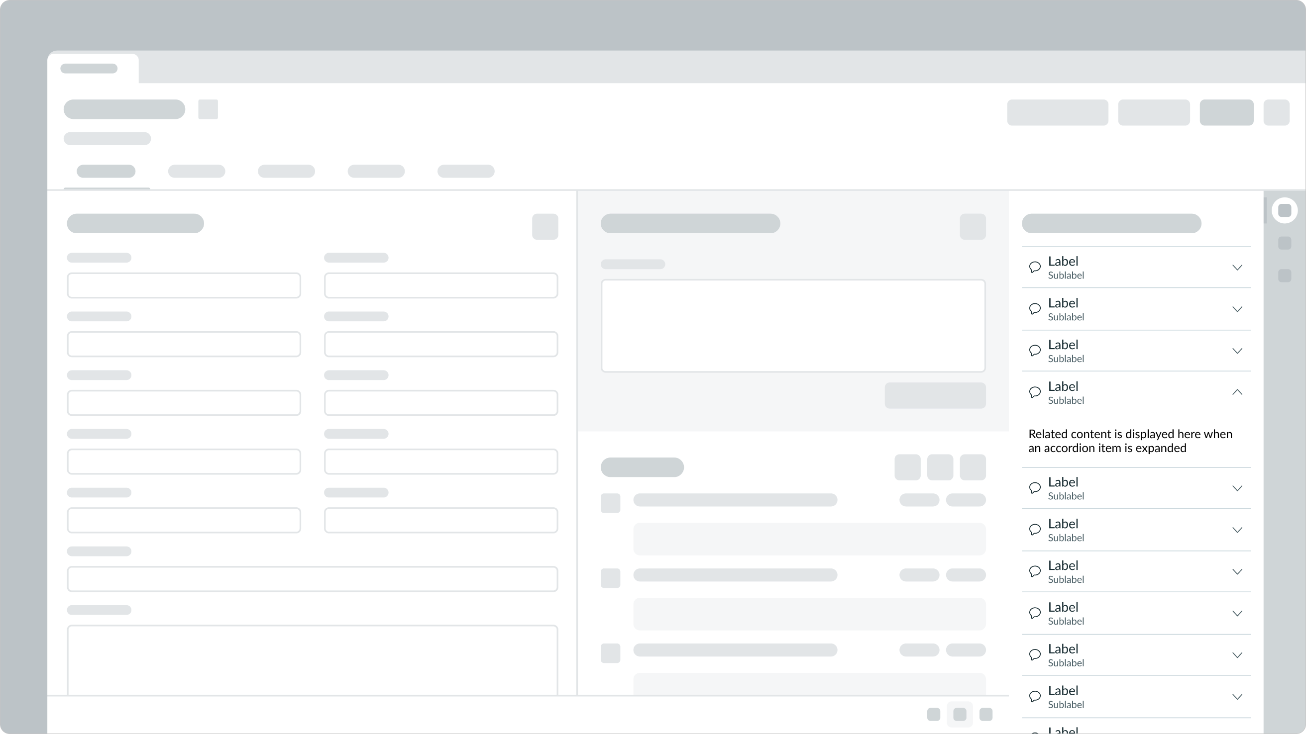
In this example, the accordion is used as a subcomponent within a resizable pane, outside of the tab set.
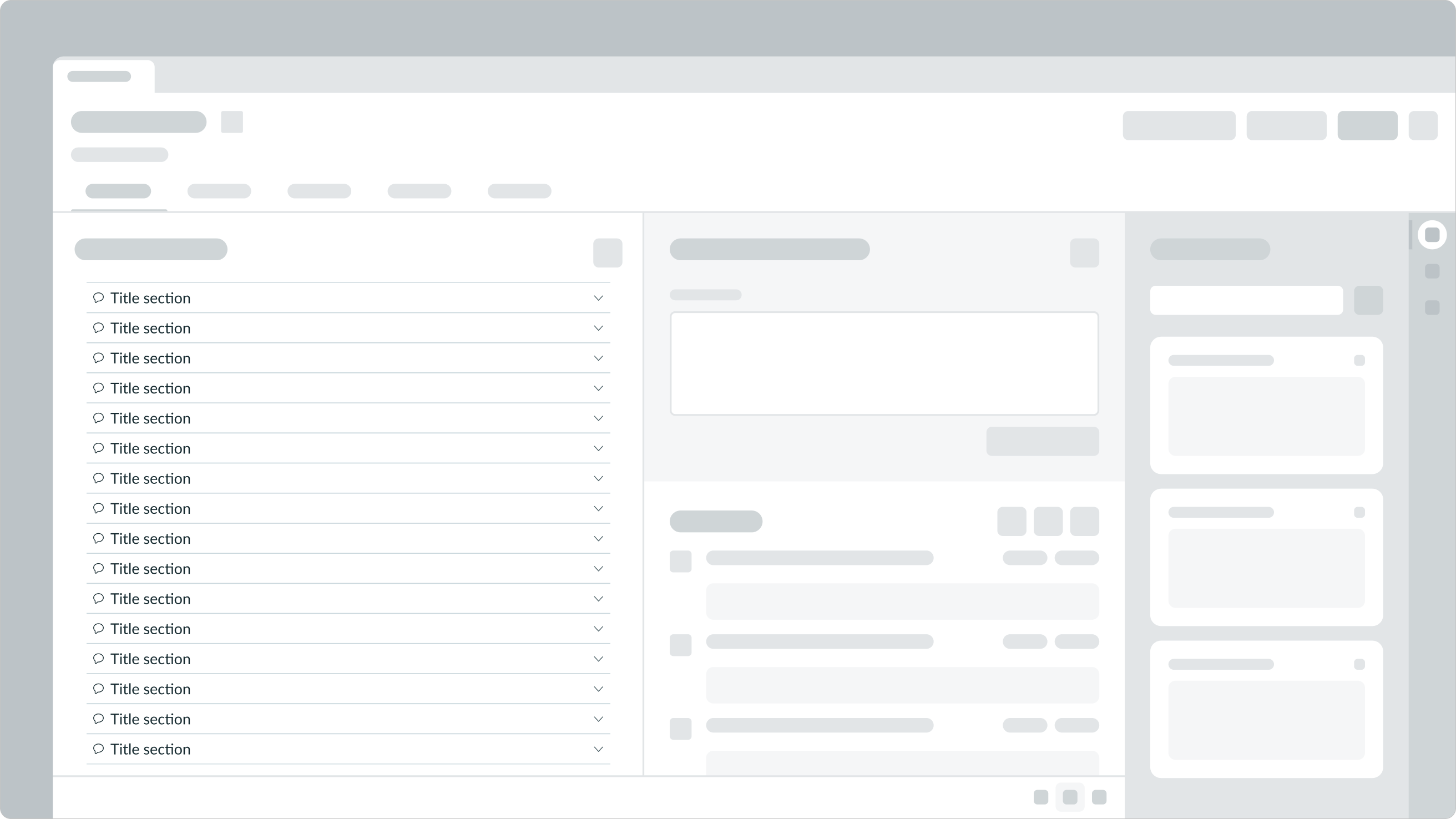
Used in sections
Place accordion components in different sections of a page, such as in a tab, to consolidate and group content within the tab by categories.
Accordion versus card
The amount of information determines whether to use an accordion or a card component. Cards summarize data and provide access to additional details. Accordions consolidate data of interest in a collapsed format that a user can open and close without leaving the page.
Variants
Learn about accordion variants for the header and caption (sub-label) and find out how to use them in your design.
Color
Headers and captions (sub-label) can be configured to appear in primary or secondary color. The default color variant is primary.
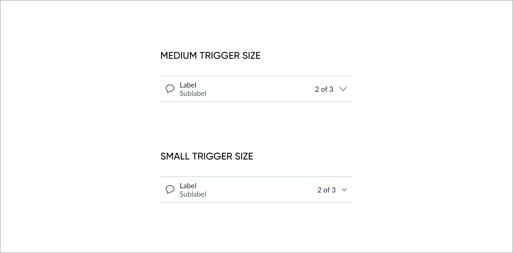
Sizes
Headers are available in the following sizes: small (sm), medium (md), or large (lg). The default header size is medium.
| Size | Example |
|---|---|
| Small |  |
| Medium |  |
| Large |  |
Font weight
Headers can be configured to appear in normal or bold font weight. The default header font weight is normal.
| Font weight | Example |
|---|---|
| Normal |  |
| Bold |  |
Style
Captions (sub-labels) are available in the normal or italic font style. The default caption font style is normal.
| Style | Example |
|---|---|
| Normal |  |
| Italic |  |
Configurations
Learn how to customize accordion by configuring the available properties.
Dependent components
Accordion consists of two dependent components: the accordion, which is a container, and the accordion item. The accordion item is an expandable and collapsible content section within the accordion container. Both components are required for an accordion to function. The accordion item component can't be used in any other component.
The property values set for the accordion container apply to the its accordion items. These includes trigger settings, dividers, heading levels, and whether one or multiple items expand at a time.
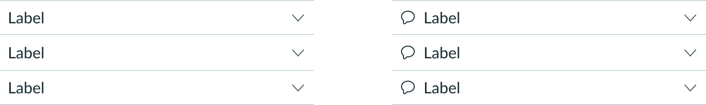
Trigger icon
The expand/collapse trigger icon can be either a +/- symbol or a chevron (up and down arrows) icon. The default position of the trigger icon is on the right side of the header. An optional position is on the left side of the header.
| Trigger icon | Example |
|---|---|
| Chevron icon |  |
| Plus/minus icon |  |
| Trigger position | Example |
|---|---|
| Left side |  |
| Right side |  |
Trigger icon size
You can change the size of the trigger icon to small. Medium is the default size.
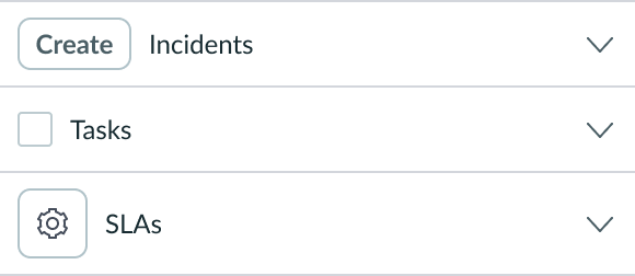
Identifier icon
You can show or hide the identifier icon associated with the header label in the identifier slot.
Divider lines
You can show or hide the divider lines between the accordion items.
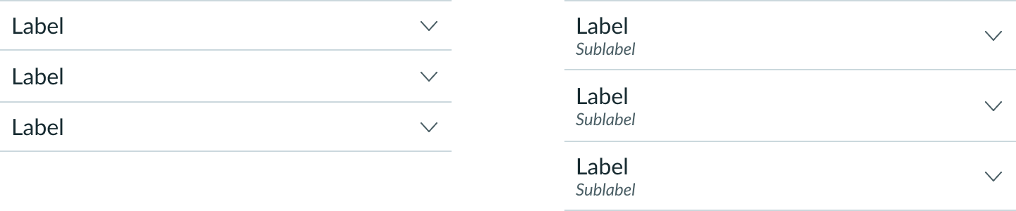
Caption (sub-label)
You can add a caption in the header that provides additional information about the header label. If the caption exceeds the width of the accordion item, the text truncates and shows a tooltip on hover.
Metadata
| Element | Example |
|---|---|
| Highlighted value |  |
| Badge |  |
| Text string |  |
Display configurations
You can combine elements to display in several configurations.
| Option | Example |
|---|---|
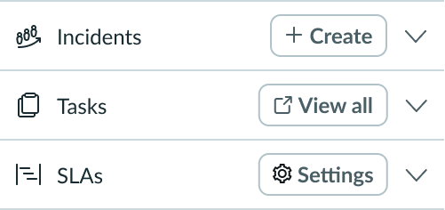
| Header label + caption + trigger icon |  |
| Identifier + header label + trigger icon |  |
| Header label + metadata + trigger icon |  |
Heading level
You can configure heading levels 1 through 6 for the item. There is no heading level default.
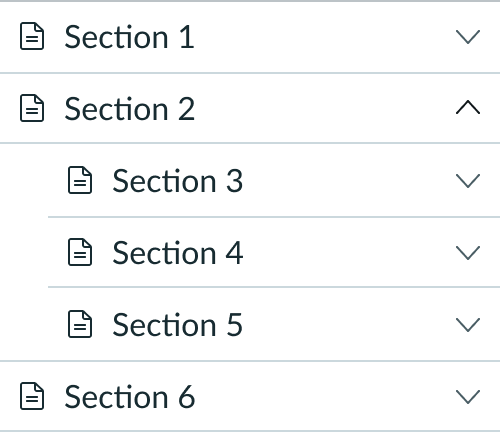
Nested layers
Create nested layers within an accordion that can be expanded and collapsed independently of the primary layer. The trigger icon can be either a +/- symbol or a chevron (up and down arrows) icon and can display on either side of the nested label.
Nested accordion with a trigger
In this example, the trigger icon for the nested label is on the right.
Nested accordion with a trigger and identifier
This example shows a nested label with the trigger icon on the left next to the identifier icon.
Expand single item
By default, users can expand multiple accordion items at the same time. However, you can configure the component to allow only a single accordion item to expand at a time.
Design recommendations
Learn how to apply accordion in your design.
Keep nested accordions to two levels of related content. This helps users find relevant content.
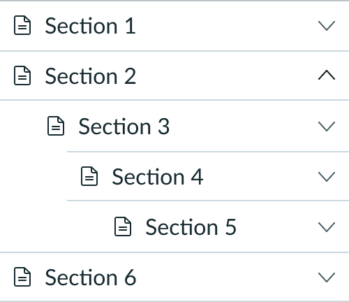
Avoid nesting accordions more than two levels deep.
Pair icons with labels to help users easily identify the contents of each accordion.
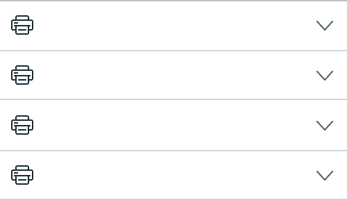
Don't use icons by themselves as header labels. Users won't explicitly know what is contained in the accordion.
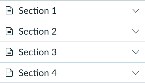
Order labels logically (such as 1st, 2nd, and 3rd) to meet the needs of your use-case.
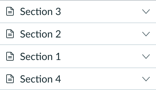
If the use-case requires labels to be in a logical order, don't create confusing labels.
Use accordions with descriptive labels to help users find relevant information faster.
Avoid displaying content in expanded layouts if it creates excessive scrolling.
Use the same type of component as an interactive element across all accordion items within the same accordion. An accordion item doesn’t have an associated interactive element, even if the other accordion items do.
Don’t mix and match different components as interactive elements across accordion items within the same accordion.
Use the identifier slot for non-interactive identifiers, such as icons. Use only the metadata slot for interactive controls.
Don’t use the identifier slot for interactive controls.
Alignment and positioning
Multiple accordion components are always stacked vertically.
UI text guidelines
These are some recommendations for using text within accordion:
- Use short labels for each item so they fit the visual design of the component and are easy to read. This also helps with translation.
- If stacking more than one accordion item, keep the same format for all items so they’re easier to scan.
- For example, you may have an FAQ section that expands to show answers. Each accordion should be either a question or a statement, but not a mix of both.
Behavior
Learn how accordion behaves when the display changes or a user interacts with the component.
States
Accordion has the following states: default, hover, selected and disabled
| State | Example |
|---|---|
| Default |  |
| Hover |  |
| Selected |  |
| Disabled |  |
Responsive behaviors
The accordion component adjusts automatically to the width of its container.
Interactions
The user expands or collapses the content from the header, using either the trigger icon or the label. When expanded, the hidden content displays in a container below the header. To hide the content, the user selects the collapse trigger icon or the label again.
Truncation
When content in the header reaches the threshold of its container, the heading label and the caption truncate with an ellipsis. A tooltip displays the hidden content for each on hover.

Usability
Accordion complies with all internationalization and accessibility requirements.
Internationalization
When an accordion translates to a right-to-left (RTL) language, the label aligns on the right as does the content in the expanded container. The trigger icon can display on either side of the label.

Accessibility
Learn how to access the actionable elements of accordion through keyboard interactions.
Keyboard interactions
You can access the actionable elements of accordion with these keyboard keys:
- Space or Enter: When the focus is on a collapsed accordion item, expands the content panel.
- Tab: Moves focus to the next focusable element in an accordion item.
- Shift + Tab: Moves focus to the previous focusable element in an accordion item.
- Arrow down:
- When focus is on an accordion header, moves focus to the next accordion header.
- If focus is on the last accordion header, moves focus to the first accordion header.
- Arrow up:
- When focus is on an accordion header, moves focus to the previous accordion header.
- If focus is on the first accordion header, moves focus to the last accordion header.