
Anatomy
- Value: A number that displays in the badge; the badge only supports numerical values
- Status color: A color that determines the importance of the badge
Usage
A badge displays information to the user and helps them understand if it requires an action. Where you use a badge depends on the information you want to display to the user. Rather than use badges to simply count items, you can use them to highlight actions or items that require the user's attention.
Variants
Learn about the attributres of badge.
Colors
Badge has 2 different color variants: primary and secondary.
Primary
The primary color variant uses stronger and higher-contrast colors to emphasize importance or urgency. It should only be used for critical notifications. The primary variant is the default for badge.
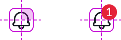
In this example, the bell icon has important notifications that require the user's attention. Therefore, the design uses a primary badge with the red alert color.
Secondary
The secondary badge color variant uses lighter and lower-contrast colors to identify less critical notifications without immediate attention. Use the secondary variant to provide a visual contrast to the background.
In this example, the secondary badge variant shows items as non-critical notifications. In this case, the count is important but does not require emphasis.
Sizes
Badge has 3 sizes: small (sm), medium (md), and large (lg). The size you choose depends on your use case. Always verify that the badge is sized relative to the icon or surrounding text.
Small
Use small badges with large iconic buttons or with smaller text.
In this example, small badge appears on an iconic button.
In this example, small badges appear in a list.
Medium
Use medium badges with medium-sized components or text.
Large
Use large badges with larger text or when you want to emphasize a value (like in a list).
Configurations
Presets and controllers
This component contains a preset configuration that automatically configures properties and event handlers for a component, making the component ready to work when you add it to a page. A preset is designed to suit a specific use case. However, you can override preset property values with a custom configuration if you find it necessary for your design. Preset values that you override aren’t upgraded when updates are available. If you don’t want to use the preset values provided, select the option to configure the component manually. You can apply one preset to a single instance of a component on a page. For more information, see Presets.
A preset is always associated with a controller, which acts as a data resource for the component. Controllers provide the configuration data and event bindings the component needs to function in your experience. By selecting a preset, the required controller is added to the page. By adding a controller to the page, any new applicable components will have that controller's preset. For more information about how controllers work, see Controllers. For instructions on using the data inspector to view the default presets for a component, see View properties and events in the Controller API.
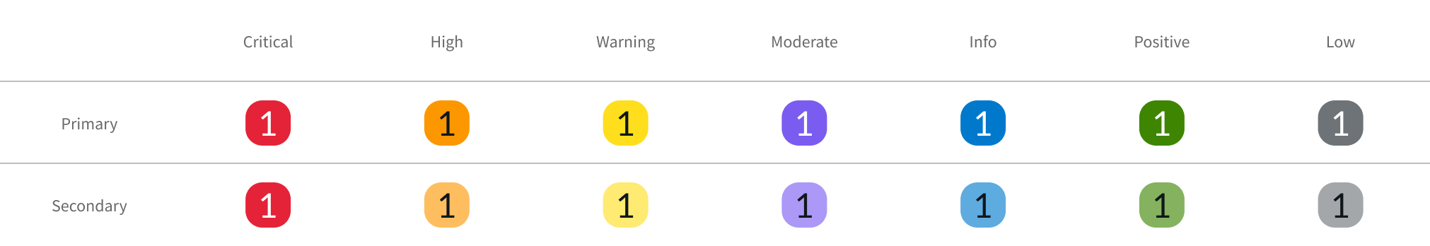
Colors
Sets the badge background color. See “Design recommendations” below for determining which badge colors to use for your use cases.
| Color | Primary | Secondary |
|---|---|---|
| Critical |  |
 |
| High |  |
 |
| Warning |  |
 |
| Moderate |  |
 |
| Positive |  |
 |
| Info |  |
 |
| Low |  |
 |
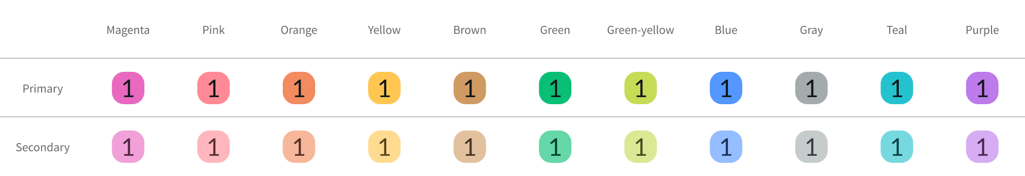
| Magenta |  |
 |
| Pink |  |
 |
| Orange |  |
 |
| Yellow |  |
 |
| Brown |  |
 |
| Green |  |
 |
| Green-yellow |  |
 |
| Blue |  |
 |
| Gray |  |
 |
| Teal |  |
 |
| Purple |  |
 |
Round
You can configure the badge to display a rounded value that uses the abbreviations 'K', 'M', 'B', and 'T' to represent large numbers.
A value of 1,230,678 can be rounded to display a rounded value of 1.2M
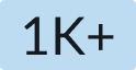
Additional characters
You can configure the badge to display an additional character such as a “+” after the badge number.
A value over 1000 can be rounded to 1K and display a “+” character to indicate “more”
Design recommendation
Learn how to apply badge in your design.
Colors
Badge supports 2 color palettes: Status colors and category colors.
Status colors
Use status colors to reflect the urgency or critical nature of a badge. It’s important to consider where the badge appears as well as the background color it rests on to inform what color you use.
Use cases that required alerts should help you decide which color to use as the badge status color. Choose color that fits the intent of the alert.
Category colors
Use category colors to differentiate items and categorize information on the UI. Unlike the status colors above, category colors don’t communicate severity information. Below are color options to help you choose the right badge color.
Alignment and positioning
How you position a badge defines its relationship with other components, labels, or content on the page.
Icons
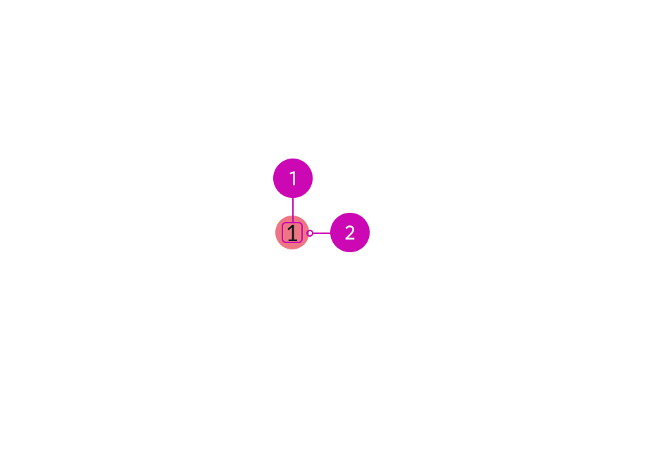
For icons, the badge appears in the upper right corner.
If you divide the icon area into four quadrants, you can identify where the badge appears.
This positioning allows the user to identify the icon first, then the badge.
In this example, the badge appears on top of the icon and shows the number of notifications, keeping the icon still in view.
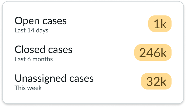
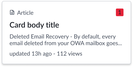
Titles
For titles, position the badge at the end to distinguish the title from the badge.
In this example, a medium secondary badge appears next to the title and indicates how many cases exist. The size keeps the value from overwhelming the title, yet still provides supplemental information.
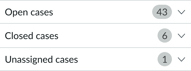
List
For lists, position the badge to the right in a list format. This allows the user to scan the content easily and to distinguish the text from the values.
In this example, a medium badge is right aligned within the list.
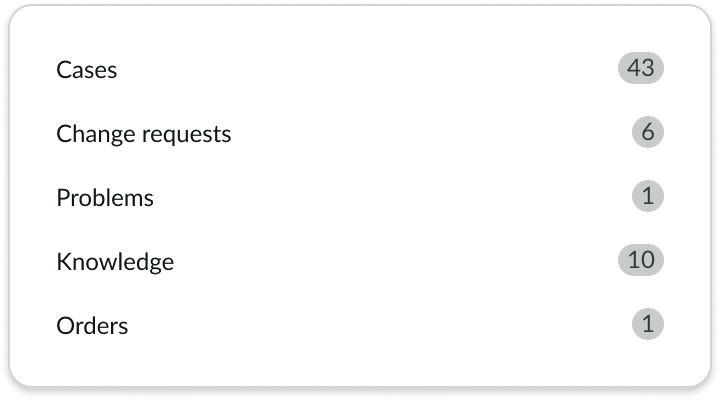
Card base header
The card base header component has a built-in slot to display a badge.
See usage guidelines for card base header
Behaviors
Learn how badge behaves when the display changes or a user interacts with the component.
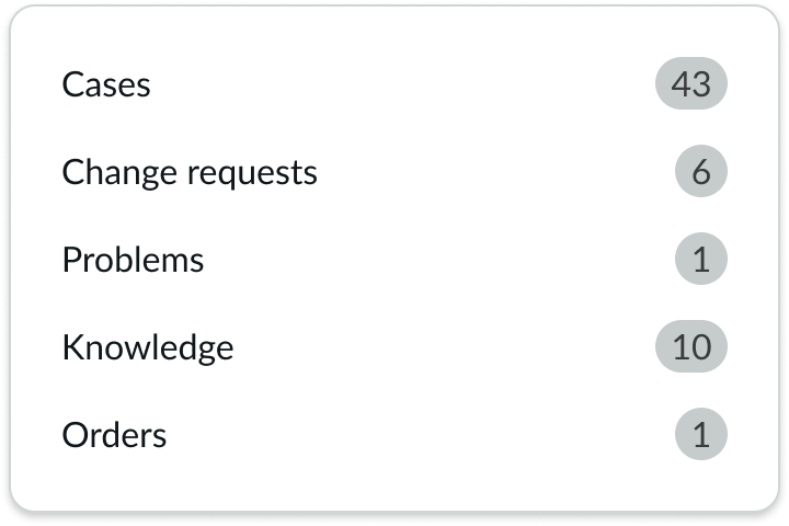
Truncation
Truncation is not supported for badge. When large values in a list need to fit in a limited space, use the rounding property to abbreviate the value. This provides context when an exact value isn't needed. For very large numbers (between thousands and trillions), badge will round them up. These convert to more readable strings with a unit indicator (i.e. 1000 becomes '1K', and 5376000 becomes '5.4M')
The badge value is abbreviated and rounded to fit in the limited horizontal space. For instance, the 'Top Cases' value of 124,987 rounds to 125K.
Usability
Badge complies with all internationalization and accessibility requirements.
Internationalization
A badge only supports numerical values and can only display Arabic digits.
When the display translates to a right-to-left (RTL) language, the badge does not flip its positioning.
Accessibility
Learn how to access the actionable elements of badge through keyboard interactions and screen readers.
Screen readers
Badge on icon
For an item where a badge appears on an icon or an iconic button (with or without a visible label), use aria-label on the icon or iconic button to convey: [Item Name] - [Number of item] [item name].
Examples:
- Notifications - 2 notifications
- Messages - 3 unread messages
Don't use aria-labeledby or aria-describedby.
Secondary badge
For an item where a badge appears as a secondary badge (next to a label), use aria-label to convey: [Item Name] - [Number of item] [item name]
Examples:
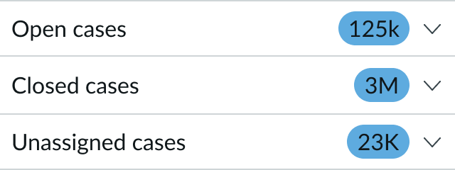
- Open cases – 125,000 open cases
- Closed cases – 3 million closed cases
- Unassigned cases – 23,000 unassigned cases
Don't use aria-labeledby or aria-describedby.