Overview
Forms are the cornerstone of data interaction and interaction design. They act as structured containers that organize and present various form controls in a logical, user-friendly manner. While bridging the gap between users and the underlying data model, transforming complex database operations into intuitive interfaces.
From simple text inputs to sophisticated reference fields, forms orchestrate controls into cohesive experiences that guide users through data entry, viewing, and modification tasks. Ranging from small, single-purpose forms to complex, multi-step workflows, they are the primary touchpoint where users interact with records—whether creating a new incident, updating an existing problem, or reviewing case details. By providing a consistent, predictable structure, forms reduce cognitive load, ensure data integrity, and directly impact operational efficiency across the entire ServiceNow ecosystem.
Anatomy
At its most fundamental level, a form is a container that holds a collection of form elements. Remembering this simple concept is the key to effective form design. The form container isn't just a passive box; it establishes a system of organization and hierarchy that guides the user's eye and facilitates data input and transmission. Like any well-designed physical container, a form: establishes clear boundaries for its content, creates a cohesive experience for users, and maintains visual consistency across the platform.

Form elements
Regardless of how a form is expressed, all forms are composed of elements and controls that together create a unified experience. These form elements and controls can be broadly understood as follows:
- Container: The foundational, structural element that acts as a boundary for all form controls, content, and logic.
- Layout: The structural positioning (e.g., sections, groups, columns, etc.) used to organize form fields and components into manageable logical groups that break up complex forms into easily digestible chunks via a clear visual hierarchy. Forms utilize a flexible, responsive column system to optimize for both readability and screen real estate across devices.
- Single column: Used primarily for mobile devices, or when a form is short and requires maximum user focus on sequential completion.
- Double column: Used on desktop/web to efficiently group related information side-by-side, improving scannability for complex records; while maximizing screen real estate.
- Form controls: The individual controls (e.g., text fields, dropdowns, checkboxes, reference lookups, etc.) where users enter, select, and/or modify data. These are the fundamental user interface components for data capture. Highly specialized components (e.g., Condition builder, Data grid) that are used for complex interactions or configuration tasks often combine the logic of multiple basic form fields.
- Actions: Interactive elements (e.g., buttons) that allow a user to trigger state changes, such as submitting the form, saving progress, or navigating to a different stage in a workflow. Actions may be placed at a higher hierarchical level (e.g., the page header) when they apply to the entire record or page and not just to the data currently displayed in the form container.
States
The visual and functional condition of the entire form or a major section at any given time (e.g., loading, disabled, submitting, or reflecting the overall status of field validation). These states communicate current status and user eligibility to interact with the form.

Unsaved state: An indicator (dot) with a background highlight to show that a field is not yet saved. The save happens when the form is saved.

Validation: Displays the system logic that processes and checks user input against business requirements, providing immediate, in-context feedback to ensure data integrity before form submission.

Read-only: The visual state that communicates the field can only be viewed. This state is used when a field is read-only based on user permissions or form state.

Disabled state: The visual state that communicates the field, or action is unavailable for user input or interaction.
Accessibility
The Forms pattern is designed with underlying features and markup (e.g., proper ARIA roles, logical tab order, and semantic structure) that ensure that forms are fully navigable and usable for all users, including those using assistive technologies like screen readers. All forms and controls adhere to the ServiceNow’s WCAG 2.1 AA compliance standards.
Modes
Forms use distinct modes to adapt their interface and controls, ensuring the experience is optimized for the user's current goal, such as editing or reviewing a record.
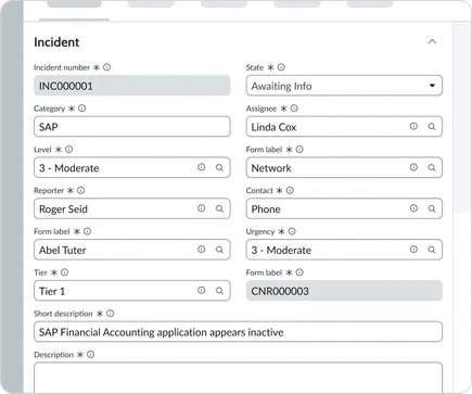
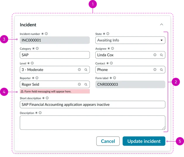
Edit mode: This is the primary mode for user interaction, allowing for the creation or modification of a record. It presents the full range of interactive form controls, enabling users to enter data, make selections, and perform actions like Save or Update.
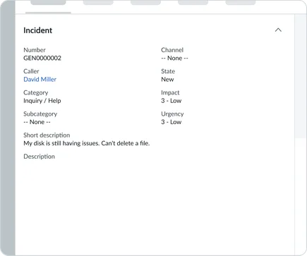
View mode: Presents data in a non-editable read-only format, replacing interactive inputs with static text displays. Use this mode for information review, approval workflows, and displaying historical records where modification is no longer permitted.
Usage examples
Forms can be expressed across the platform in numerous ways to accommodate every level of complexity and interaction. The following examples illustrate how the Form pattern adapts from simple forms to full-featured experiences.
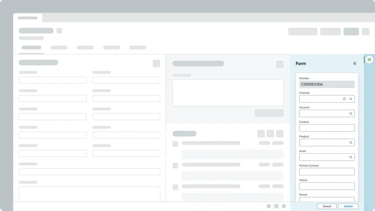
Contextual side panel
The Contextual side bar pattern presents a full-featured form experience within a dedicated pane. These forms provide comprehensive access to all record data, supporting complex field types, related lists, and advanced functionality. This pattern is ideal for detailed data management where the user needs to reference or stay anchored to the main list or dashboard while editing a single record.
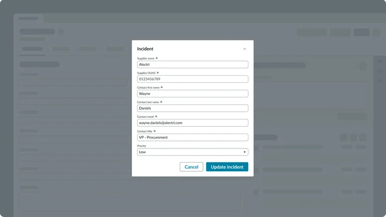
Modal
The Modal component is used when a form requires focused, temporary user input that must be completed before returning to the main application context. Modals are typically employed for small, single-purpose forms (like creation or quick configuration tasks) that require immediate user attention. This presentation ensures the user’s focus remains entirely on the task at hand, minimizing distraction and promoting efficient completion.
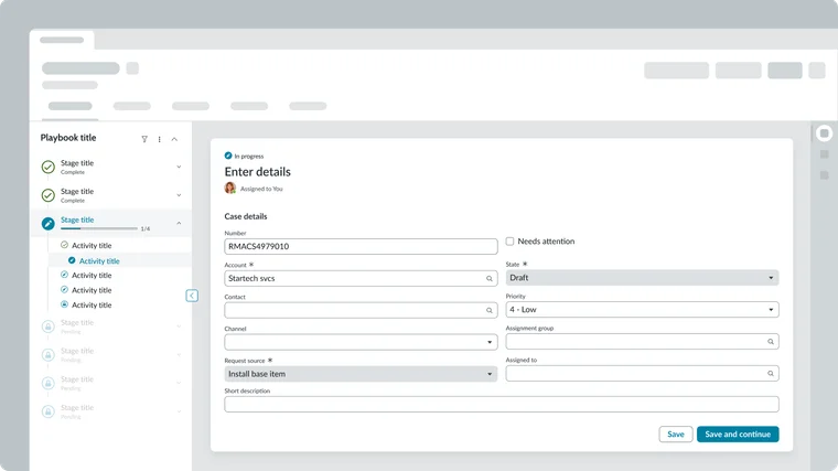
Playbook
The Playbook component, as documented in the All things guided pattern, integrates the form experience into a structured, multi-step workflow. Here, the form fields are presented within a guided, linear process that walks the user through a complex task. Playbooks are designed for complex, multi-step forms and processes, providing visual context and step-by-step accountability to ensure all required fields and actions are completed in the correct order.
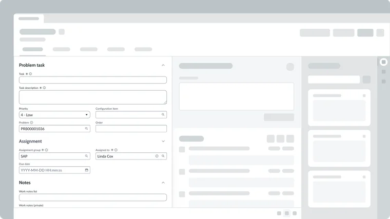
Record page
Record pages represent the full-featured form experience on web platforms. These forms provide comprehensive access to all record data, supporting complex field types, related lists, and advanced functionality like attachments and activity streams. Record pages serve as the primary workspace for detailed data management and are optimized for keyboard navigation and screen reader accessibility.
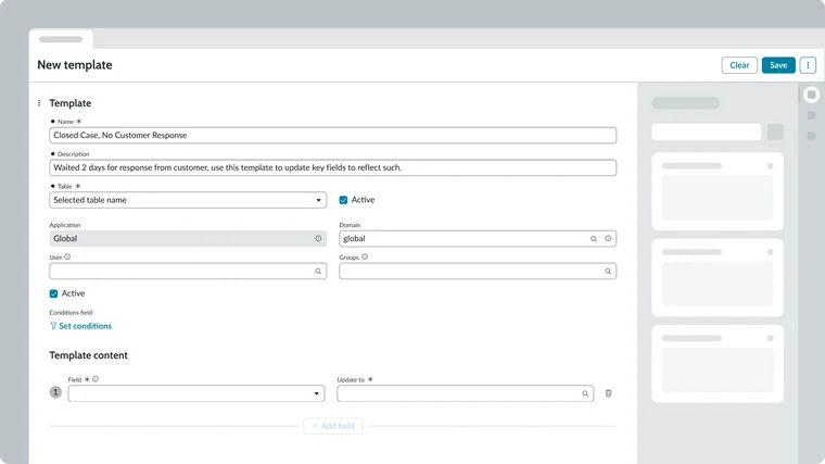
Template page
The Template page represents a form used specifically for creating or managing templates that define the structure and content of new records. These forms include specialized fields, such as those for defining variables and conditions, which control how the template will apply its values to a record. This pattern is optimized for configuration and repeatable setup, allowing users to standardize complex record-creation processes across the platform.