
ServiceNow provides Workspace page templates and a structured approach to combining these navigation components, which can save time and ensure best practices are followed:
App shell selection
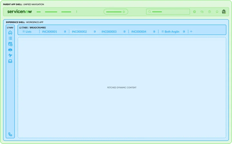
First, at the workspace level, you choose an App shell (either the Tabshell a.k.a Agent workspace shell, or the Breadcrumb shell). This decision itself is a combination of components – the Tabshell gives you the Primary nav + Workspace tabs interface, whereas the Breadcrumb shell gives Primary nav + Breadcrumb path. Decide this based on multitasking needs. You cannot easily have both Workspace tabs and breadcrumbs simultaneously at the shell level; it’s one model or the other.
Landing page template
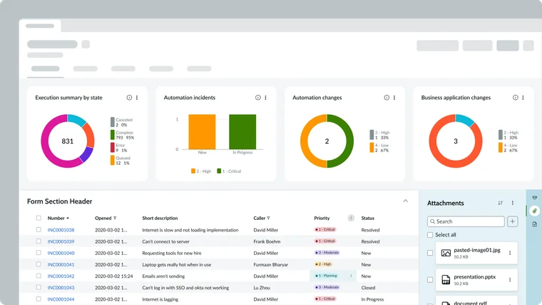
When creating a landing page, you can use UI Builder’s templates (if available in your version) or build from scratch. A landing page typically combines multiple components: e.g., a header (maybe just the page title or user greeting), a grid or layout, and inside it several containers or card components representing tiles. You might also include reports/charts directly for key metrics.
List page template
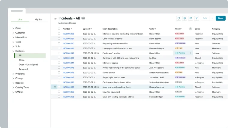
The out-of-box List page template (which you can select when making a new page in UI Builder) usually comes pre-wired with a List menu and a List component side by side. This template shows the best practice combination: a List Menu (left) + a List (right). The two are linked by the context (the menu selection controls what the list displays). Additionally, you might see a List title or controls at top (like a header that could show which list is active, or buttons like “New” to create a record). These are part of the overall List page composition.
When you use the template, much of the wiring is done – you just plug in your specific list definitions into the menu config. This is an example of combining navigation (the menu) with content (the list) in one page. If needed, you can also include a Breadcrumbs component at the top of a list page if the lists have a hierarchy (less common for lists, more for records).
Record page template
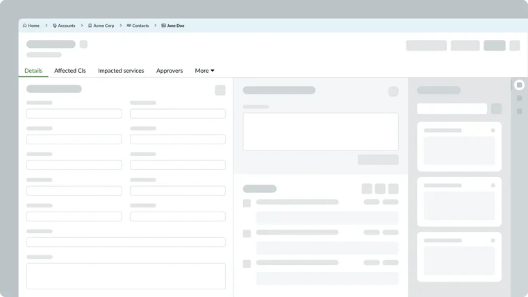
The standard Record page template in a workspace is quite complex and combines several navigation and content components:
- A Record header (with the title, maybe bread crumbs or a back button if using breadcrumb shell, and UI actions as buttons).
- The Ribbon or highlights (sometimes showing key info in badges at the top).
- A Tab set for record content (as discussed under Record tabs) – this is a navigational component (horizontal tabs) combined with content components (Form, Related lists, Activity, etc.). The template by default in recent releases has a resizable split: the left portion has the Tabs for main vs. related content, and the right portion is a Contextual side bar with its own vertical tabs for utilities (for example, an Agent assist panel or an AI search panel accessible via vertical icons – those vertical tabs are yet another combined navigation element within the Contextual side bar).
- Possibly Breadcrumbs if using breadcrumb shell (the breadcrumb path would appear at top of the page, above the record header, indicating the record’s context like which list or hierarchy it came from).
All these are pre-combined in the template to work together. For instance, clicking a tab under the record header will switch the content but not navigate away – it’s contained in the page. If you use a Tabshell, each record page also is itself a tab (session tab) at the top; if using breadcrumb shell, the breadcrumb is updated when navigating between related records.
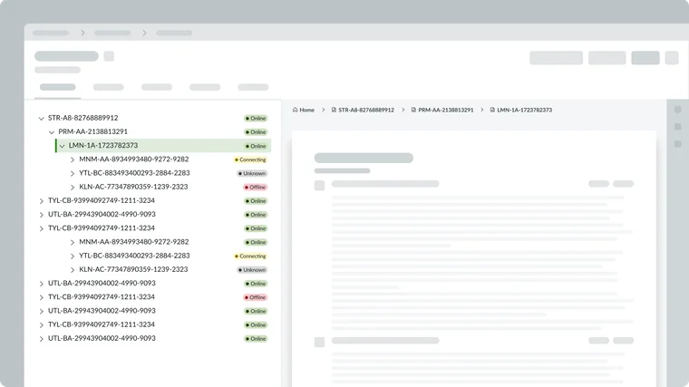
Combining breadcrumbs with content tree
It’s possible to use a content tree for navigation and still have breadcrumbs for context. For example, say you design a knowledge browsing page: on the left is a Content Tree of categories, on the right is a list of articles. You could also put a Breadcrumbs component above the list to show which category is selected (Home > Hardware > Laptops > list of articles).
The tree allows jumping around categories, while the breadcrumb shows the current path and allows going up one level easily. This dual-combination covers both hierarchical navigation paradigms – some users might click around in the tree, others might use the breadcrumb links.
Using tabs and breadcrumbs together
Generally, if you’re using Workspace tabs (Workspace Shell), you wouldn’t use breadcrumbs for the overall nav, but you might still use breadcrumbs in a specific context if needed. Conversely, if using the Breadcrumb Shell, you won’t have Workspace tabs for records, but you might still break a record into in-page tabs. So you can see tabs and breadcrumbs at the same time – one is global style, the other is in-page.
For example, a breadcrumb-style workspace could have: Home > Reports > “Q3 Report”. The “Q3 Report” page might itself have Tabs (say “Summary” and “Details” sections). That’s a valid combination. Always ensure the user isn’t confused by too many different navigational UI elements: use each for distinct purposes (breadcrumb for the hierarchy of pages, tabs for switching content on the current page).
Contextual side bar and secondary navigation
Many workspaces include a Contextual side bar. These often employ vertical tabs or icon buttons to switch between tools (knowledge search vs. similar cases vs. attachments, etc.). This is another navigational element often combined in record pages. If your workspace uses the OOB record page template, the vertical side bar tabs might be included (for example, in Service Operations Workspace, a vertical tab for “Playbooks” vs “Recommendations”). Keep this in mind as part of the overall nav design – they are essentially Tabs components in vertical mode. If designing custom, you can add a Tabs component and configure it vertically in a side panel.
Presets and controllers
The page templates come with presets where possible. As noted in the Record page template, the Tabs component came with a preset that automatically hooked into the record’s related lists via a controller. Leverage these presets – for example, adding a “Related List” component might automatically show under a record tabs arrangement if the controller is present. Combining components is easier when you utilize the provided controllers that manage data flow between, say, a list and form or a list and its menu.