

Anatomy
- Icon: A symbol or character that supports a specific action or use case
- Container (optional): The area that contains the icon
Subcomponents
Usage
Use a button iconic for minor actions that the user accesses infrequently. Iconic buttons are smaller and lighter than text buttons, so they're useful for adding actions in small spaces. They also create a hierarchy in the display because iconic buttons have a lower priority when positioned next to text buttons.
In this example, the iconic buttons don’t visually compete with the main actions on the page.
Variants
Learn about button iconic and find out how to use it in your design.
Types
Choose an icon for the button that clearly identifies its use case. Remember to choose icons that are universal and consistent with existing patterns.
In this example, the “X” symbol is a button iconic. The “X” symbol is universally recognized as a method for closing a window.
Colors
A button iconic has the following different color variants:
- Primary
- Secondary
- Tertiary
- Primary AI
- Secondary AI
- Tertiary AI
| Variant | Default style |
|---|---|
| Primary |  |
| Secondary |  |
| Tertiary |  |
| Primary AI |  |
| Secondary AI |  |
| Tertiary AI |  |
Primary
Use a primary button iconic for the key action in a workflow or component. This variant grabs the user's attention and stands out among all components in the display.
Secondary
Use a secondary button iconic when its action aids in the completion of a workflow. This variant has a neutral style that works well alongside other buttons.
Note: The secondary variant is the default option.
Tertiary
Use a tertiary button iconic for actions that are optional or of less importance to a workflow. This variant is visually light and muted, allowing other primary or secondary actions to stand out.
Sizes
A button iconic is available in the following sizes: small (sm), medium (md), and large (lg). Choose a size based on the available space and the action's importance.
Small

Medium

Note: medium is the default size.
Large

Configurations
Learn how to customize button iconic by configuring the available properties.
Presets and controllers
This component has a preset configuration that sets properties and event handlers, making it ready for use. You can override preset values with a custom configuration if needed. Preset values won’t upgrade with updates. To avoid using presets, configure manually. One preset can apply to a single component instance. See presets for more info.
A preset is linked to a controller, which serves as a data resource. Controllers provide configuration data and event bindings for the component. Selecting a preset adds the required controller to the page, allowing new components to use its preset. For more on controllers, see controllers. For default presets, see view properties and events in the controller API.
Icon
You can select any of the icons in the Icon Gallery for the button circular. When selecting an icon, be sure that it always provides context around what happens when the user selects the button circular. Avoid selecting an icon that is ambiguous or could refer to multiple actions. The default is “magnifying-glass-outline.”
Variant
Configure the variant for your button to assign your button’s level of priority.
Size
Configure the appropriate size for your button. The default is medium.
Animated icon
You can set an animated icon instead of a normal icon.
Accessibility
You can configure the ARIA properties for your button, set high contrast, and enable the landmark focus keyboard shortcut to focus on the button.
Design recommendations
Learn how to apply button iconic in your design
Do use an iconic button with a set of related buttons when it is used to indicate additional actions. In this example, the overflow menu serves as an exception for when it can be used with different button types, and when it can be placed to the right of the primary action.
Avoid using button iconic with different types of button as it makes it difficult for users to determine which actions are the most important.
Alignment and positioning
Group button iconic with similar button types. When placing them side by side, order the buttons based on their importance starting from the left. You can use the variant styles to help distinguish primary, secondary, and tertiary actions.
UI text guidelines
These are some recommendations for using text with button iconic:
- Use a tooltip to provide a label for the button that shows only an icon
- For example, a gear icon could have the tooltip “Settings”
- Use verbs to express what will happen when the person selects the button
- For example, a filter icon could have the tooltip “Create a filter”
Behavior
Learn how button iconic behaves when the display changes or a user interacts with the component.
States
| State | Primary | Secondary | Tertiary | AI Primary | AI Secondary | AI Tertiary |
|---|---|---|---|---|---|---|
| Default |  |
 |
 |
 |
 |
 |
| Hover |  |
 |
 |
 |
 |
 |
| Pressed |  |
 |
 |
 |
 |
 |
| Focus |  |
 |
 |
 |
 |
 |
| Disabled |  |
 |
 |
 |
 |
 |
Responsive behaviors
Learn how button iconic responds to changes in a container or display.
Overflow
Limit your designs to three iconic buttons or fewer in one area. If you put too many buttons in one area, it creates visual noise.
If you have more than three actions, use the overflow behavior to display additional options.
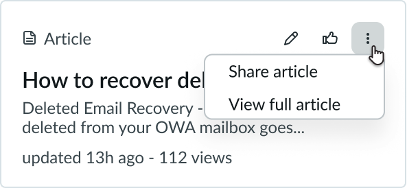
The overflow behavior turns the third button iconic into an overflow menu, represented by three dots. When a user selects this button, a dropdown menu displays to list all additional actions.
Usability
List complies with all internationalization and accessibility requirements.
Internationalization
When the display translates to a right-to-left (RTL) language, the actions and their order of importance flips. The iconic buttons align on the left, with the primary action farthest to the right. Any secondary actions appear to the left of the primary action.
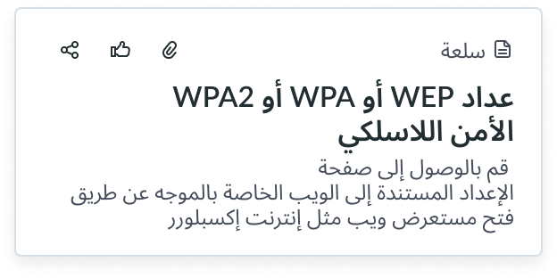
In this example, the “Attach” button iconic (i.e. the paperclip) is the primary action for this card, and “Share” (i.e. the 3 connected dots) is the least important.
Accessibility
- Hiding padding introduces the risk of violating the WCAG 2.2 standard of Target Size, which mandates a minimum of 24x24 pixels between any two interactive elements.
- Verify adequate size+spacing between buttons with hidden padding and other such elements.
Do ensure adequate spacing with other interactive elements when padding is hidden.

Don’t hide padding without ensuring adequate spacing from other elements.
- Two button iconic elements with padding hidden have a height of 12 px each. Spacing must be added to ensure an effective target size of 24 px.
- Two button iconic elements with 6px of padding above and below ensure a minimum of 24px of effective target size.
Keyboard interactions
- Tab: Navigates to a button iconic; consider this when organizing actions in your display
- Enter: Launches the action
Screen readers
The button iconic requires configuration of the aria-label attribute in the configAria property to be accessible using a screen reader.
By default, the screen reader announces the button label based on any text content inside the button element. However, because there is no text inside the button iconic, a text label must be provided another way. Use aria-label to add a text label to the button iconic.
When the button is linked to a dialog or non-modal window, It should have a label that indicates the availability of an interactive element that can be initiated by the button. To do this, use the aria-haspopup property.