

Anatomy
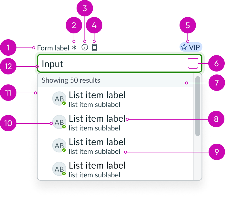
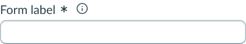
- Label: Title of the input field; a label must be present for accessibility, either as the component's label element or external to the component
- Required indicator (optional): Field decorator that indicates a field is required
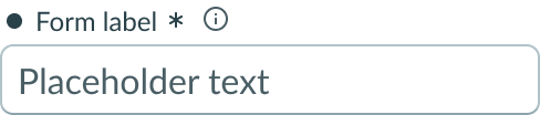
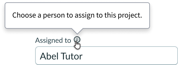
- Information button (optional): Opens a popover and shows the field helper text
- Label-inline slot (optional): An available slot for an additional label icon
- Label-end slot (optional): An available slot at the end of the label line
- Input field slot (optional): Displays additional field decorators or actions; a maximum of three can be added
- Section header (optional): Header inside the dropdown that displays additional information about the list items
- List item label: The main information in a list item; this label fills the field when that list item is selected
- List item sub-label (optional): Supplemental information that is associated with the list item label; provides users with more information about the list item
- Avatar (optional): The avatar associated with the list item can be displayed; use when avatar is relevant to the dropdown options
- Dropdown list: Displays a list of selectable options to fill the field
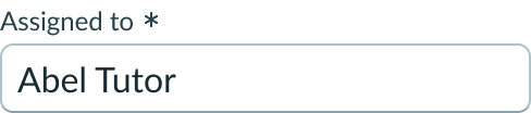
- Input field: Space where the user enters text; a dropdown opens and responds dynamically as the user adds text
Usage
Learn about typeahead and find out how to use it in your design. Typeahead should be used to help a user quickly fill an input field by narrowing down many results of a similar type.
Form field
Typeahead can be used as a single form field or part of a group of related form fields.
Variants
Learn about the variants of typeahead.
Types
This usage guidance is for the typeahead component. For use cases that require the option to fill an input field with more than one result, see usage guidance for typeahead multi.
Sizes
Typeahead has the following sizes: small (sm) and medium (md). Choose a size that fits with your display and complements the surrounding content.
Small
Use the small size for areas that have limited space. The font size is reduced compared to the default medium size.
Medium
Use the medium size alongside similarly sized components and content.
Note: Medium is the default size for typeahead.
Configurations
Learn how to customize typeahead by configuring the available properties.
Slots
The typeahead input field slot can appear at the beginning or end of an input field. You can add up to three field decorators that are associated with the typeahead input field.
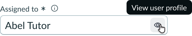
Typeahead input field with a preview button iconic. After filling the input field, the user can select this field decorator to view the profile associated with the name in the "Assigned to" field.
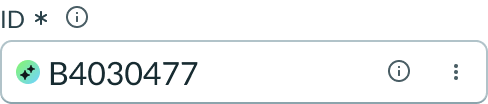
This example shows an AI icon used to indicate the value was AI generated.
The label has an end and in-line slot for additional information. The label-end slot is available at the end of the label line. The label-inline slot is available immediately after the field helper icon. You can add anything to the label-inline slot, but icons are the most appropriate use for this slot.
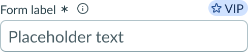
This example shows a color label with optional icon to indicate status or category.
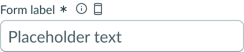
This example shows a device type indicator in the label-inline slot.
Unsaved field indicator
You can use the label-start slot to add an unsaved field indicator. The indicator appears as a small dot next to the field when the field contains unsaved changes and disappears when the changes are saved.
Note: If you want to add the unsaved indicator to all the fields fields in a form, see Form usage guidelines.
This example shows an unsaved field indicator next to the label of the input field.
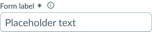
Placeholder text
You can add unique placeholder text for each input field. Placeholder text should be a hint that supplements the label. This can be the suggested format for the expected input or guidance on how to complete the field. The placeholder text disappears when the user enters the first character.
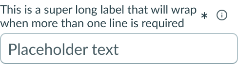
Label wrapping
By default, field labels truncate with an ellipsis when they exceed the container width. To wrap labels, enable this property.
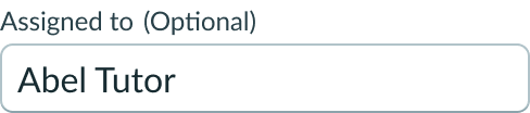
Optional indicator
You can configure an input field as “optional” to indicate the user isn't required to select a value in this field to complete the form. Optional fields display "(Optional)" text next to the form label.
Note: Don't use this indicator in conjunction with the required field indicator.
Required indicator
You can configure an input field as required with an asterisk indicator after the form label. The user must enter a value in a required field to complete the form. When the user hovers over the asterisk, a tooltip appears and displays "Required."
Note: Don't use this indicator in conjunction with the optional indicator.
Read-only field
You can configure an input field as read-only to indicate that the user can’t modify the value in this field. However, users can select and copy the values in the input field. If the input field doesn't contain a value, it displays an em dash (—) to denote an empty value. When the user hovers over the field a tooltip appears and displays “Read-only.”
Disabled field
You can disable an input field which makes the field unavailable for users to interact with.
Invalid field
Use to show when the user enters an invalid input. Typically, it indicates an error has occurred.
Field helper text
You can add an information button iconic next to the form label. Use the field helper text to display information needed for guiding users on how to complete the field. This can include formatting guidance, requirements, or an explanation of the input field's purpose. The helper text displays in a popover when the user selects the information icon.
See usage guidance for button iconic
See usage guidance for popover
Field layout
You can configure the field layout to be horizontal or vertical. The default field layout is “vertical”.

Example of horizontal layout
Field messages
You can configure custom messages to appear beneath the typeahead input field. These provide users with error messages, helpful suggestions, guidance, or information for completing the input field.
| Message type | Example |
|---|---|
| Error | 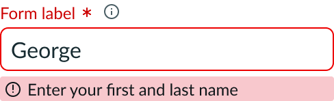 |
| Warning | 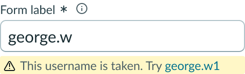 |
| Positive | 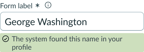 |
| Field information | 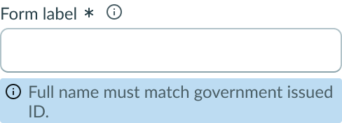 |
| Suggestion | 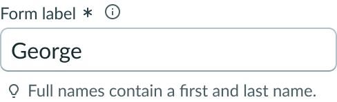 |
Auto-focus
Use this configuration to automatically place focus on an input field when a user opens the page.
Search behavior
You can choose a type of search behavior for your use case. The search behavior instructs the dropdown how to respond as the user enters text into the input field. Typeahead search behavior: managed, initial, and contains.
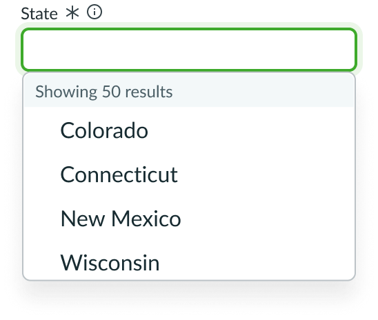
The default search behavior is "managed." In this configuration type, the dropdown list is not filtered, allowing the user to view the full list as the user enters characters into the input field.
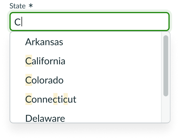
When search behavior is in "managed," the full list is shown while matching values are highlighted.
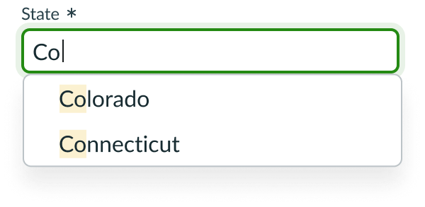
The second type of search behavior is "initial." This configuration type returns list items whose initial characters match the input field text entered by the user. The matching characters are highlighted.
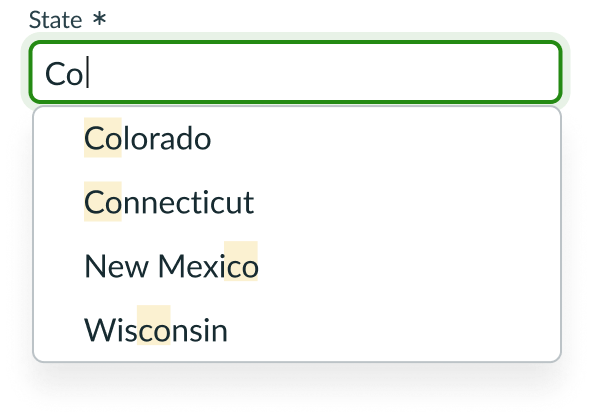
The third type of search behavior is "contains." This configuration type returns list items that contain any of the user input characters in the list item.
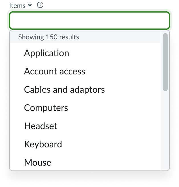
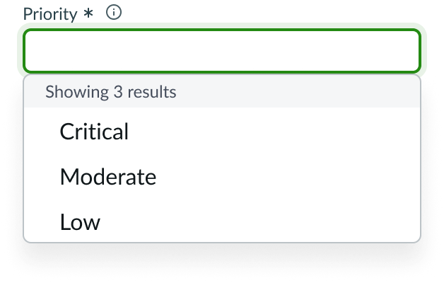
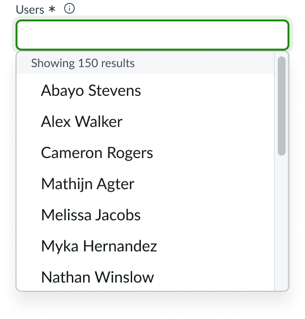
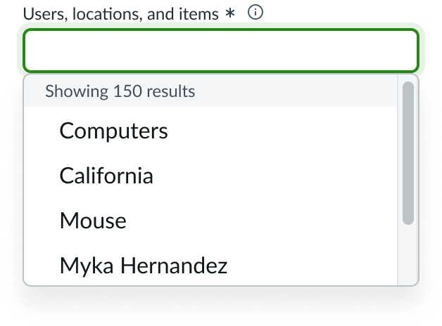
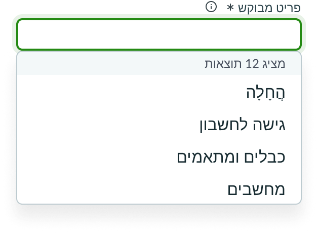
Section header
Section headers can be configured into the dropdown to add clarity and organization to the dropdown list items.
In this example, the section header adds clarity by keeping a count of the list items.
Item sub-labels
The dropdown list items can be configured to show supplemental information.
In this example, the dropdown list items display state names. Sub-labels are added to specify the city.
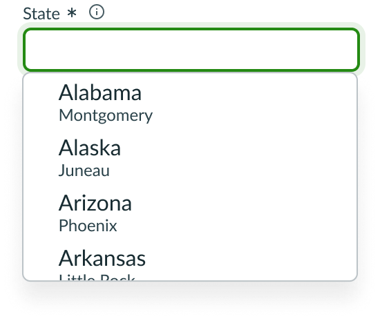
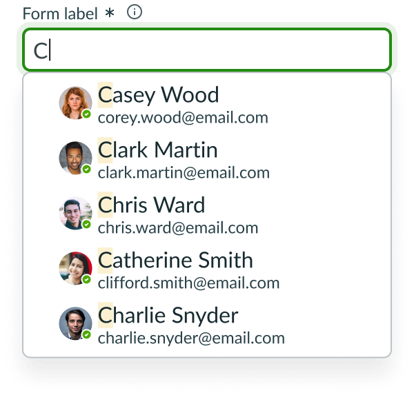
Avatar
The dropdown list items can be configured to show associated avatars. Only use an avatar if it is relevant to the list items.
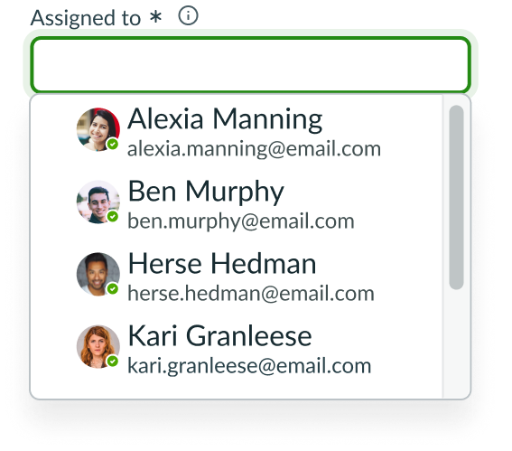
In this example, avatars provide visuals that help the user select the right list item.
Behavior
Learn how typeahead behaves when the display changes or a user interacts with the component.
States
The typeahead input field has the following states: default, hover, focus, read only, disabled, and invalid.
| State | Example |
|---|---|
| Default | 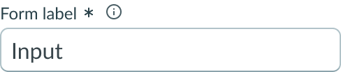 |
| Hover | 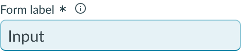 |
| Focus | 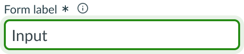 |
| Read-only | 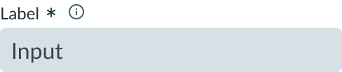 |
| Disabled | 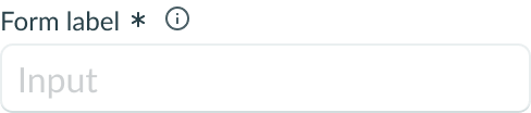 |
| Invalid | 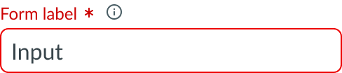 |
Disabled state
Users can’t interact with an input field when it’s disabled.
Read-only state
Users can't interact with any elements in the input field when the field is in a read-only state with the exception of selecting and copying the value in the field. If the input field doesn't contain a value, it displays an em dash (—) to denote an empty value.
Invalid state
In an invalid state, the indicator and label of a required input field appear in red. If the label includes either a required indicator or an optional indicator, it also appears in red. This can be triggered if the field is required and not filled in.
A form field message can appear below the input field to help communicate what has caused the error. To learn more about types of form field messages, see usage guidance for input field.
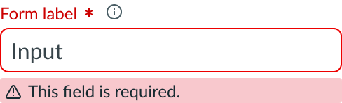
In this example, the input is invalid and a message is provided to help the user resolve the error.
Dropdown list item states
Dropdown list has the following states: default, hover, focus, selected, and disabled.
| State | Example |
|---|---|
| Default |  |
| Hover |  |
| Focus |  |
| Selected |  |
| Disabled |  |
Highlighted search value
The highlighted search value is a visual indication in the result list. When the user types something in the input field, any matching values from the dropdown list are highlighted.
Responsive behaviors
Typeahead inherits the width of its container and resizes with the container.
Input field overflow
If text in the input field exceeds the width of the container or content area, the leftmost characters fall out of view in order to accommodate new characters.
Interactions
Users can interact with typeahead through the input field and dropdown list. This includes any field decorators.
Selection
A user can select the input field to open the dropdown list and use typeahead to filter list items. As the user types, the dropdown list responds dynamically in accordance with the configured search behavior. Once the user selects an item, the dropdown collapses.
Note: A user can choose to enter a full list item into the input field to generate a complete match in the dropdown list. If you use this method, the user can select outside the input field to close the dropdown and fill the input field with the chosen list item.
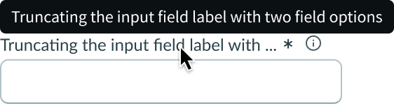
Label truncation
The label truncates when it exceeds the input field width or when the label indicators prevent the full label from displaying.
Dropdown list text wrap
In this example, the required field indicator and information icon prevent the label from fully displaying. Therefore, the label truncates with an ellipsis, and the full label is available in a tooltip on hover.
Dropdown section header text, list items, and sub-labels wrap upon reaching the end of the panel.
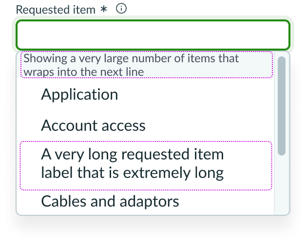
In this example, the section header text and third list item exceed the width of the dropdown and wrap into the next line. Above, the input field accommodates overflowing text.
Design recommendations
Learn how to apply typeahead in your design.
Do use typeahead when there are many list items to select from and filtering by typing is more efficient than searching through the entire list to select an option.
Don't use typeahead if there are only a few distinct list items to select from. Instead, use select dropdown.
Do use typeahead to help users select an item from a list of related items.
Don't use typeahead if the items in the dropdown list cannot be relevantly grouped. For fields that requires more open-ended results, use an input field without typeahead.
UI text guidelines
Typeahead uses the input component. These are some recommendations for using text within input.
Label
- Use a label that describes the expected input or a question you’re asking the user
Form field messaging
- Informational message
- Use clear and concise language to help the user fill out the input
- For example, “Only use letters and numbers in your username.”
- Use clear and concise language to help the user fill out the input
- Warning message
- Include information that helps the user understand any consequences or next steps
- Use present tense since this message shows up before any input.
- For example, “Credit card information is only used for purchasing purposes.”
- Error message
- Avoid blaming the user. Instead, tell them what happened and how they can fix it.
- Use past tense since this message shows up after the user enters something
- For example, “Someone used this name already. Try entering a different name.”
Field helper text
- Provide additional information to help the user understand the field and what they're expected to input
- Avoid putting critical information in an Information icon because they aren’t always visible
Placeholder text
- Use sparingly because it disappears once the user puts their cursor in the input field
- Format placeholder text as an example of what should go in the input or a brief description of how to complete the field
- For example, “Enter what has changed in this version of the app.”
Usability
Typeahead complies with all internationalization and accessibility requirements.
Internationalization
When the display translates to a right-to-left (RTL) language, the contents of the typeahead input field and dropdown flip sides. This includes text and field decorators.
Accessibility
Learn how to access the actionable elements of typeahead through keyboard interactions and screen readers.
Keyboard interactions
- Tab or shift + tab: Moves between the typeahead field and any interactive elements in the standard tab order
When the focus is in typeahead input field:
- Enter: Toggles the dropdown open or closed
- Arrow down: Opens the dropdown
When the focus is in the dropdown:
- Arrow down: Moves focus to next list value
- Arrow up: Moves focus to previous list value or closes the dropdown, if the focus was on the first list value in the dropdown
- Enter: Selects the focused list value by populating the value in the input field and closes the dropdown
- Escape: Collapses the dropdown and moves focus to the input field
- Tab: Collapses the dropdown and moves focus to the next interactive element in the tab order
- Home: Moves focus to the first option and selects it
- End: Moves focus to the last option and selects it