

Anatomy
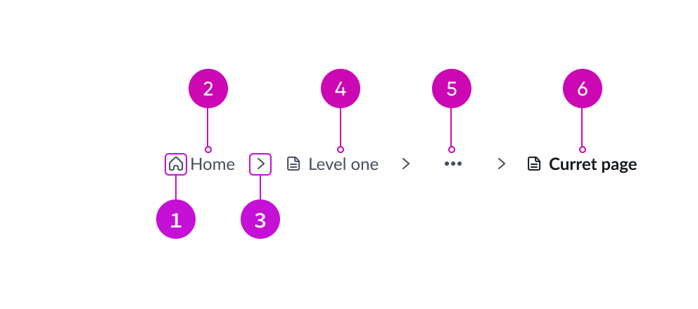
- Icon indicator (optional): Identifies the primary page link in the navigation
- Home link: Provides a visual indicator in front of the page link that includes additional context
- Delimiter: Separates each subpage link in the sequence of the navigation
- Subpage: Presents a secondary page link
- Overflow menu: Nests subpage links when the overflow property is set to “collapse” or “truncate-collapse”
- Current page: Highlights the current page and endpoint of the navigation (non-interactive)
Subcomponents
See usage guidance for Icon gallery
See usage guidance for Stepper
See usage guidance for Tooltip
Usage
Breadcrumbs provide secondary navigation and should never replace global navigation. As navigation, breadcrumbs establish page links in a set reading order. There's no limit to the number of page links you can display but aim for a single line to avoid complex truncation and text-wrapping.
Variants
Breadcrumbs have the following variants: default, home icon only, home icon with home link, and icons with links.
Default
Displays home page link, subpage links, separators, and current page.

Home icon only
Displays the home page icon followed by subpage links, separators, and current page.

Home icon with home link
Displays the home page icon and page link followed by subpage links, separators, and current page.

Icons with links
Displays the home icon and page link followed by icons with subpage links, separators, and current page.

Configurations
Learn how to customize breadcrumbs by configuring the available properties.
Delimiter
You can replace the default separator with any directional icon from the ServiceNow icon gallery.

Overflow
You can configure the overflow behavior to display the breadcrumbs as collapse, truncate-collapse, or wrap.
Collapse

Collapses items into a dropdown when the breadcrumb is too large for its container and cannot remain on one line.
Truncate-collapse

First truncates text down to a minimum size, then collapses it into a dropdown.
Wrap

Causes the breadcrumb to wrap to multiple lines.
Overflow menu position
When a breadcrumb is configured to “collapse” or “truncate-collapse,” users can set the overflow position to start or end. By default, the overflow menu position is set to start.
Start

In this example, the overflow menu is set to the default start position.
End

In this example, the overflow menu is set to the end position.
Design recommendations
Learn how to apply breadcrumbs in your design.
Alignment and positioning
Breadcrumbs are placed at the top left of a page, beneath the global navigation, and above the page content.
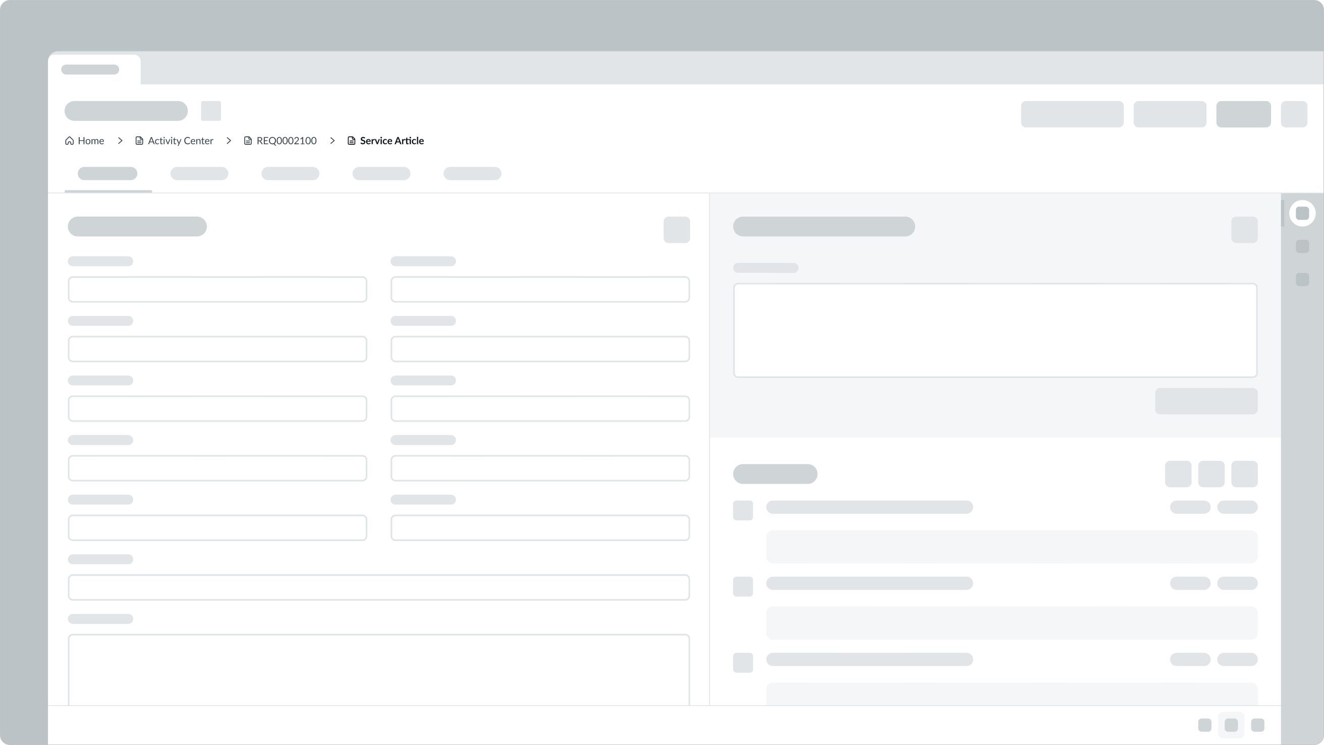
Position breadcrumbs properly below global navigation and above page content.
UI text guidelines
These are some recommendations for using text within breadcrumbs:
- To save space, consider using a shortened version of the page title for the page link
- For example, you could use “Resources” instead of “Design System Site Resources”
- Avoid truncating, or shortening the length of, page links to prevent confusion or misinterpretation
Behavior
Learn how breadcrumbs behave when the display changes or a user interacts with the component.
States
Breadcrumb links have the following states: default, hover, and active.
| State | Example |
|---|---|
| Default |  |
| Hover |  |
| Active |  |
Responsive behaviors
By default the breadcrumbs component will collapse subpage links into an overflow menu when it exceeds the container width. Additional configurations for overriding this responsive behavior can be seen in the Overflow section under Configurations.
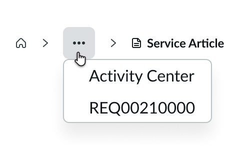
In this example, selecting the overflow menu button displays two subpage links in the overflow menu.
Interactions
Breadcrumbs help users identify their location in a record hierarchy and navigate those records with links. Users select a link to open a record above the current record in the hierarchy or to return to a home page.

Users can navigate back to a previous page by clicking on any link prior to the current page.
Truncation
Breadcrumbs will only truncate when the overflow property is set to “truncate-collapse.” This allows for links in the breadcrumb component to truncate when it exceed the width of the container. The full subpage text can be accessed through a tooltip.

The middle subpage link truncates with an ellipsis to accommodate the full name of the current page.
Usability
Breadcrumbs comply with all internationalization and accessibility requirements.
Internationalization
When this component is used in a platform configured for right-to-left (RTL) language, subpage links and separators mirror to reflect the direction.

Accessibility
Learn how to access the actionable elements of breadcrumbs through keyboard interactions.
Keyboard interactions
You can access the actionable elements of breadcrumbs with these keyboard keys:
- Tab: Moves focus to the next subpage link
- Shift + Tab: Moves focus back to the previous subpage link.
If focus is on the home page link:
- Shift-tab: Moves focus to the prior item in the tab order before the breadcrumb
- Tab: Moves focus to the next item in the tab order