Anatomy
Learn about the individual parts of the activity stream.
Main anatomy
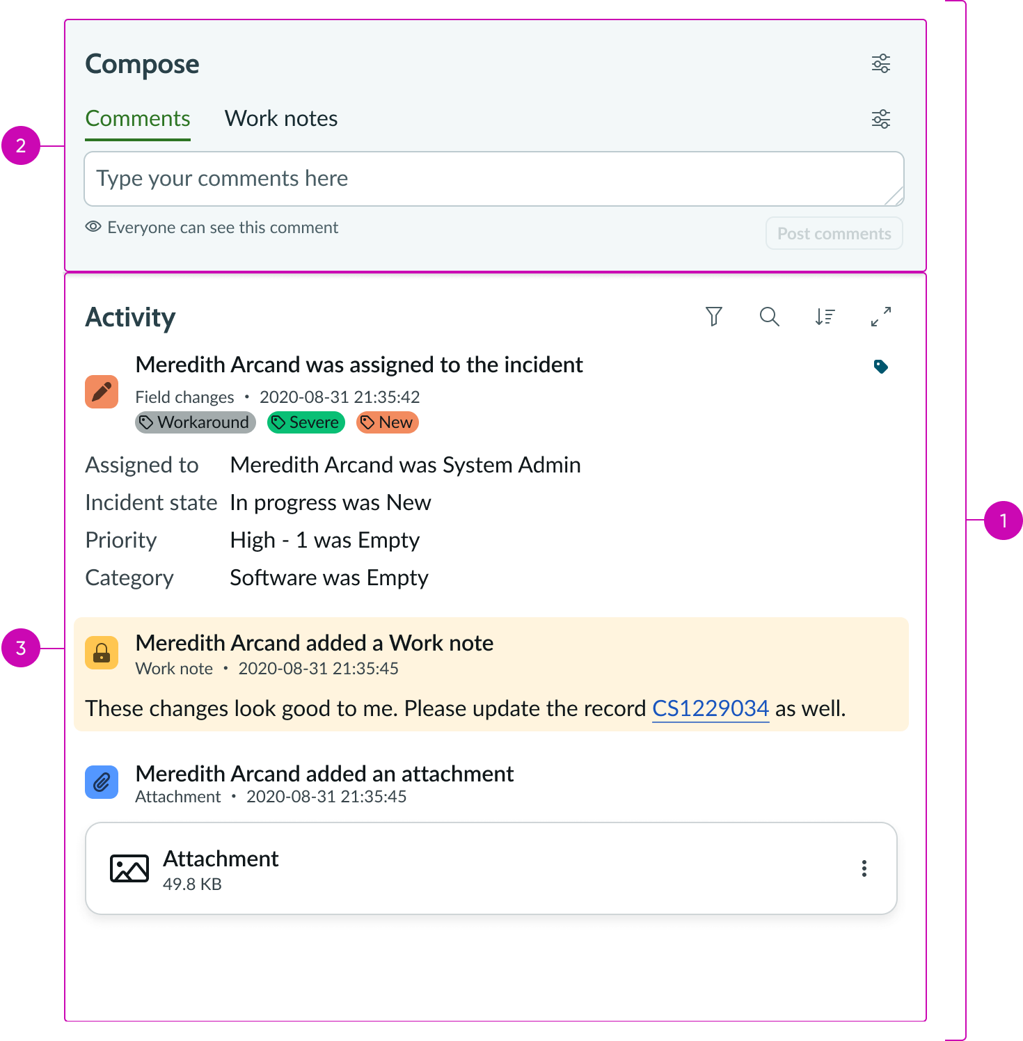
- Activity stream including activity stream compose: Contains activity stream compose and the activity feed
- Activity stream compose: Subcomponent of activity stream; enables a user to easily post journal field entries to a record
- Activity feed: Displays a customer's activity feed in a timeline manner and provides date range filters to filter the feed
Activity stream feed anatomy
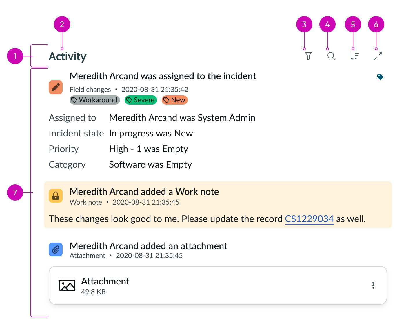
- Activity stream feed header: Header containing the activity stream title, filter panel, simple sort, and action menu
- Title: Title of the activity stream
- Filter panel: Actionable icon; selecting this icon opens a panel menu with available filter categories
- Search bar: Actionable icon; that opens search bar to search activity stream
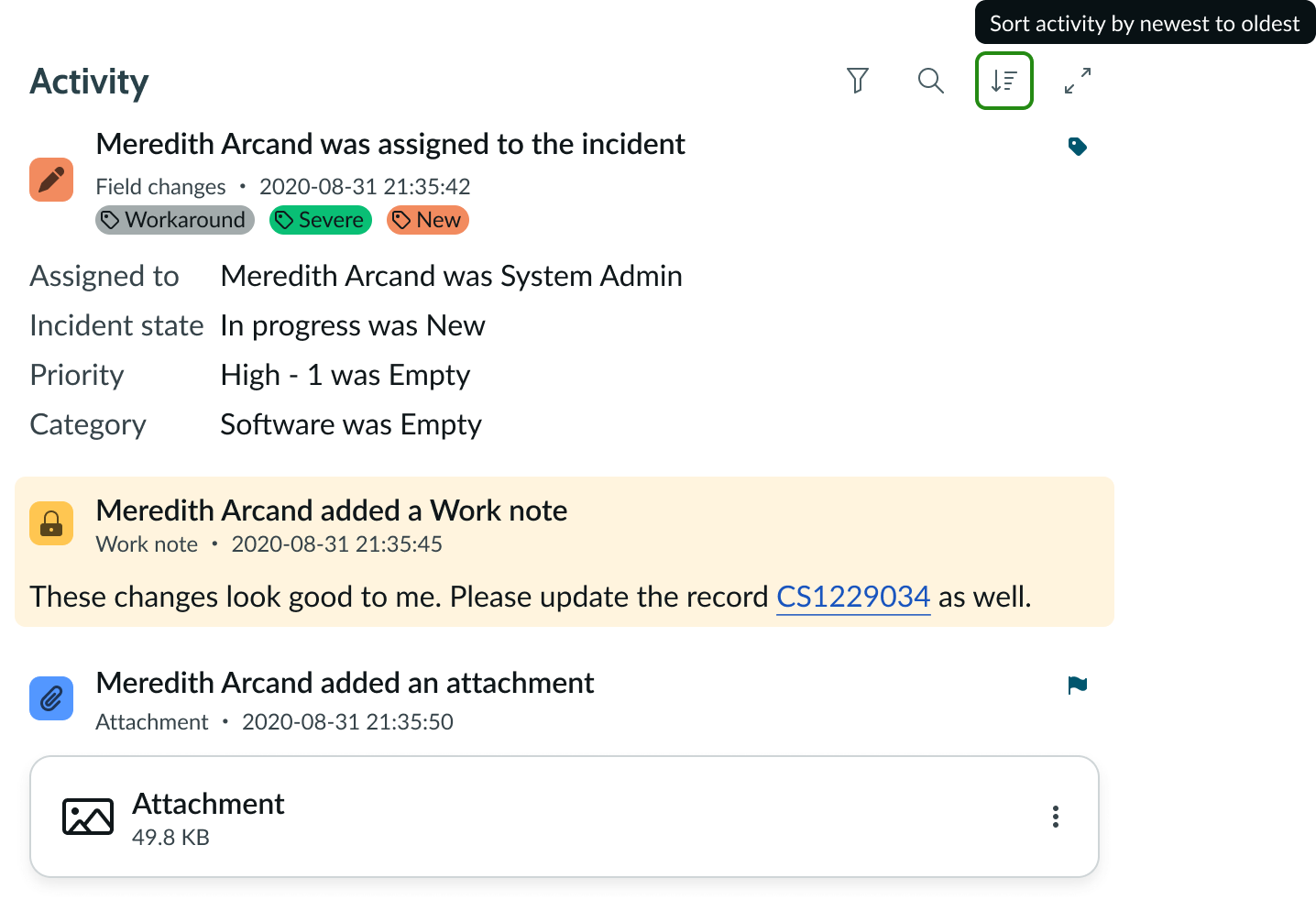
- Simple sort button: Stateful button; can sort the activity stream event posts by newest to oldest or oldest to newest
- Action menu: Actionable icon; contains additional actions beyond filtering and sorting
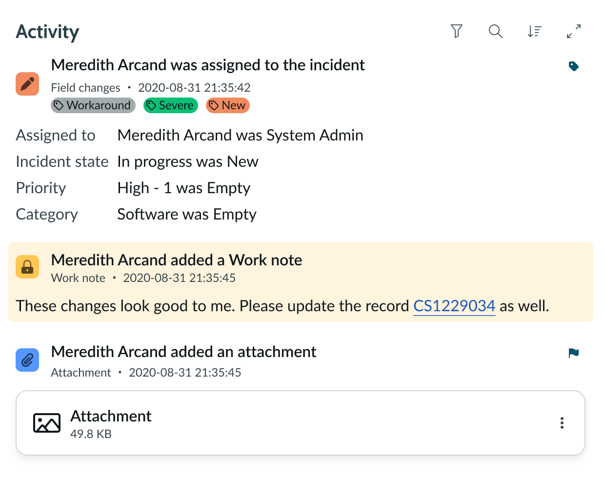
- Event posts: Activity from records configured to display in the activity stream feed
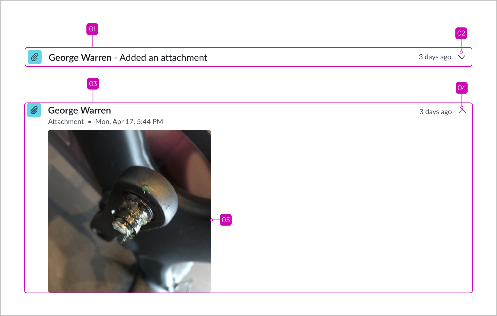
Post anatomy
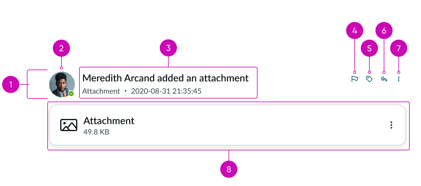
- Event post header: Header that contains the event post icon and title
- Event post icon: Icon associated with the record; often the avatar of the user assigned to the record
- Event post title: Contains information from a record’s “Assigned to” field and other metadata
- Actionable icon: If available, initiates an action on the event post
- Actionable icon: If available, initiates an action on the event post
- Actionable icon: If available, initiates an action on the event post
- More actions menu: Actionable icon; contains additional actions for the event post
- Event post container: Container; holds the event post content below the header
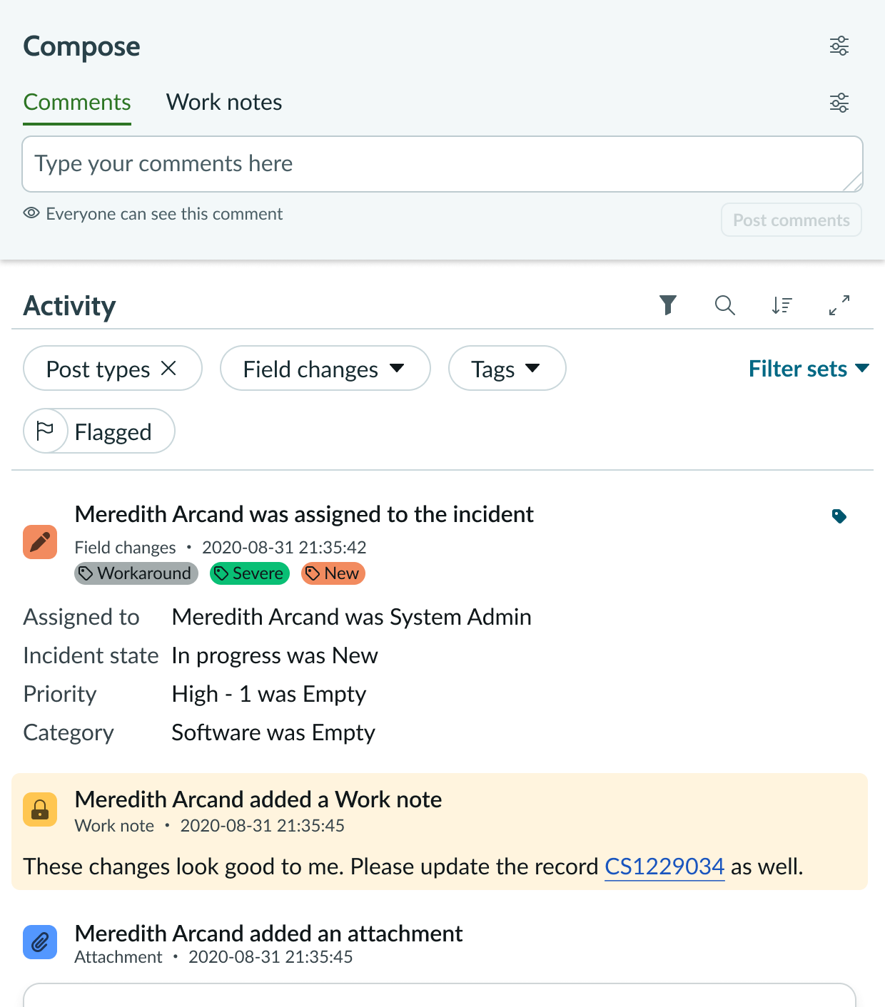
Filters anatomy
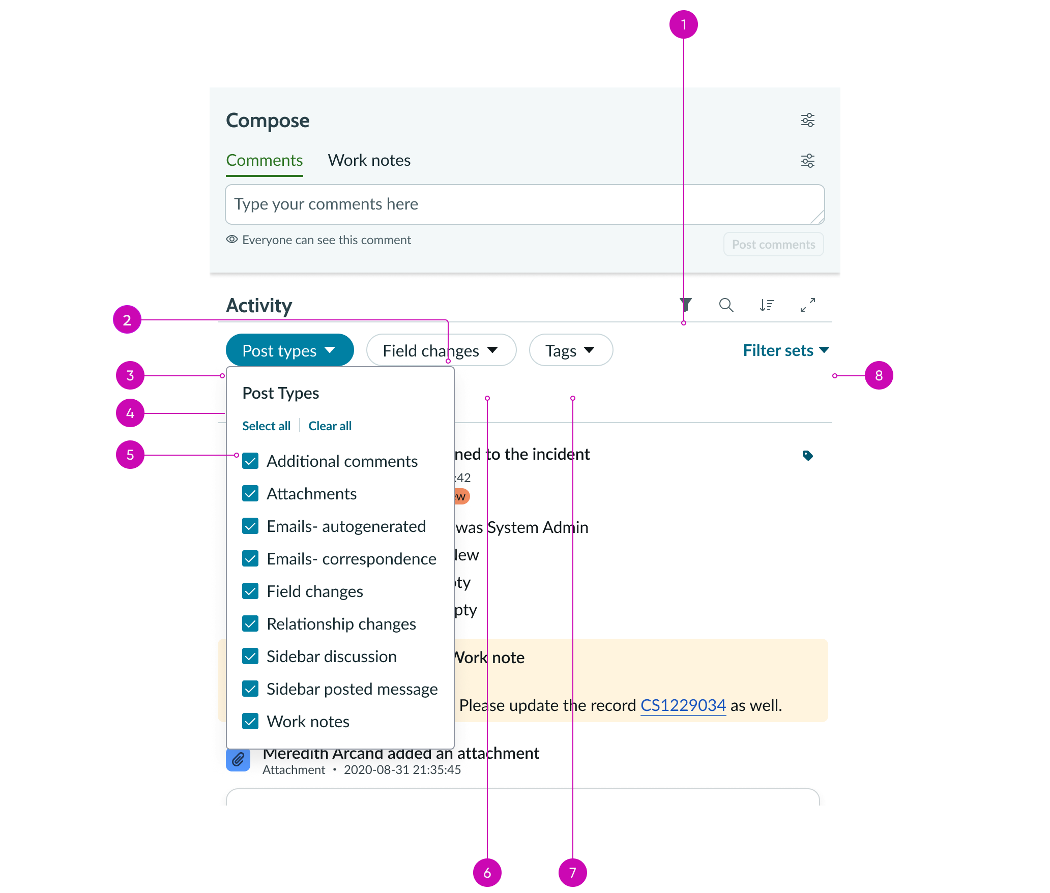
- Filter panel: Actionable icon; selecting this icon opens a panel menu with available filter categories
- Filter panel pill: A filter selection displayed in a pill
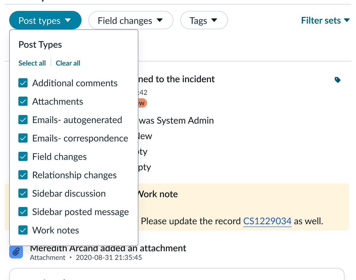
- Post type filter: A type of filter panel pill; filters the activity feed based on the type of activity
- Flagged filter (hidden in image): A type of filter panel pill available only when at least one activity is flagged; filters based on flagged activity
- “Select all” / “clear all buttons”: 2 separate bare buttons that enable the user to select all post types and clear all selections
- Field changes filter: A type of filter panel pill; filters the activity feed based on the type of field change in the record
- Tags filter: A type of filter panel pill available only when at least one activity has been tagged; filters based on tagged activity
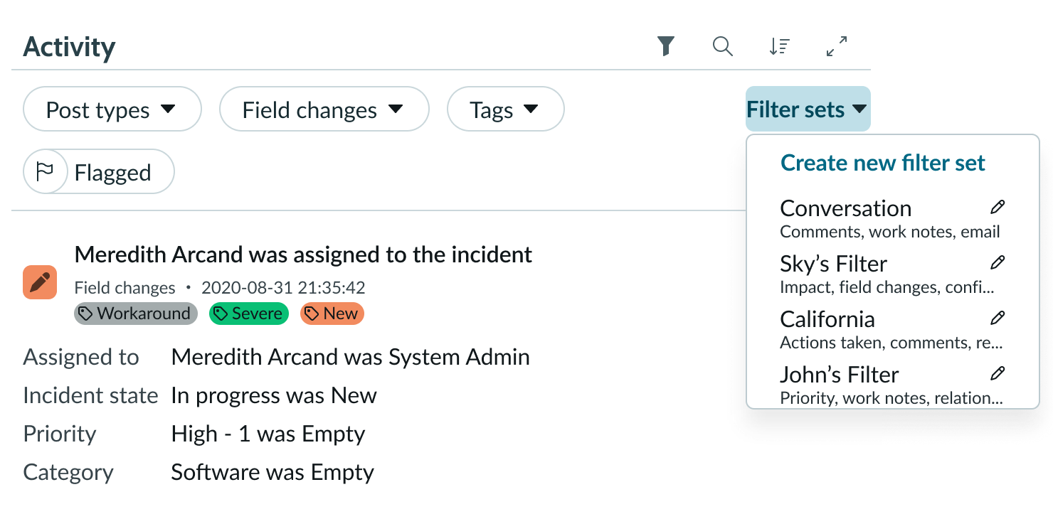
- Filter sets menu: Actionable icon
Subcomponents
See usage guidelines for activity stream compose
Usage
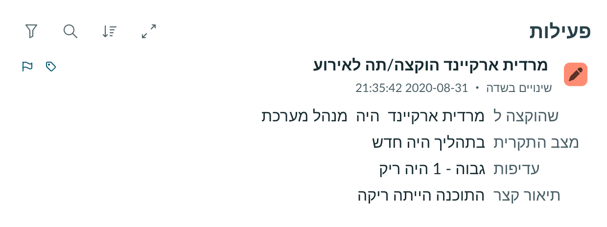
The activity stream gives users context about the record it’s associated with. It shows some activity that has occurred on the record. The activity can be record field changes, journal entries, attachments, and attached knowledge articles.
Configurations
Learn how to customize activity stream by configuring the available properties.
Presets and controllers
This component has a preset configuration that sets properties and event handlers, making it ready for use. You can override preset values with a custom configuration if needed. Preset values won’t upgrade with updates. To avoid using presets, configure manually. One preset can apply to a single component instance. See presets for more info.
A preset is linked to a controller, which serves as a data resource. Controllers provide configuration data and event bindings for the component. Selecting a preset adds the required controller to the page, allowing new components to use its preset. For more on controllers, see controllers. For default presets, see view properties and events in the controller API.
Table
Configure this property to specify the table name of the record you’re displaying the activity stream for.
Sys ID
Configure this property to specify the Sys ID of the record you are using activity stream for.
Title
You can configure this property to assign a title to the activity events section.
To configure the activity stream component in UI Builder, view the activity stream UIB setup documentation.
Post button
By default, the post button is unavailable to users when the work notes field is marked as mandatory. However, you can configure this property to show the post button even when the work notes field is mandatory for users.
Translation
Dynamic translation is available for emails in Activity Stream. When dynamic translation is enabled, the email tile displays the Translate button. Selecting this button translates the email, the header items, and the email notification content. The original email collapses and the translated content expands. If the email is a thread with inline replies, the original text remains collapsed and only the latest reply is translated.
Design recommendations
Learn how to apply activity stream in your design.
Do place the Activity Stream in context of a record.
Don’t place the Activity Stream outside the context of a record.
Alignment and positioning
Activity stream doesn’t have any guidance on alignment or positioning.
UI text guidelines
- Use sentence case for all titles, labels, and column headers
- Keep all text labels informative and short to increase readability and scanning
- Keep content concise and purposeful to help a user understand options and actions
- Capitalize only the first letter and any proper nouns in a string of text
- Ensure content is contextual and specific to offer guidance and support to the user
- If a component performs or supports an action, label it with a verb (like “Submit”)
Behavior
The activity stream comes with filters, sorting and the ability to expand or collapse all posts.
Responsive behaviors
Activity stream automatically resizes to fit the container.
Interactions
Learn how activity stream responds when a user interacts with it.
Filtering content
Selecting the filter icon slides open a panel menu revealing the available filter categories. The filter icon remains in the active state with the panel open until user selects it again, closing the panel.
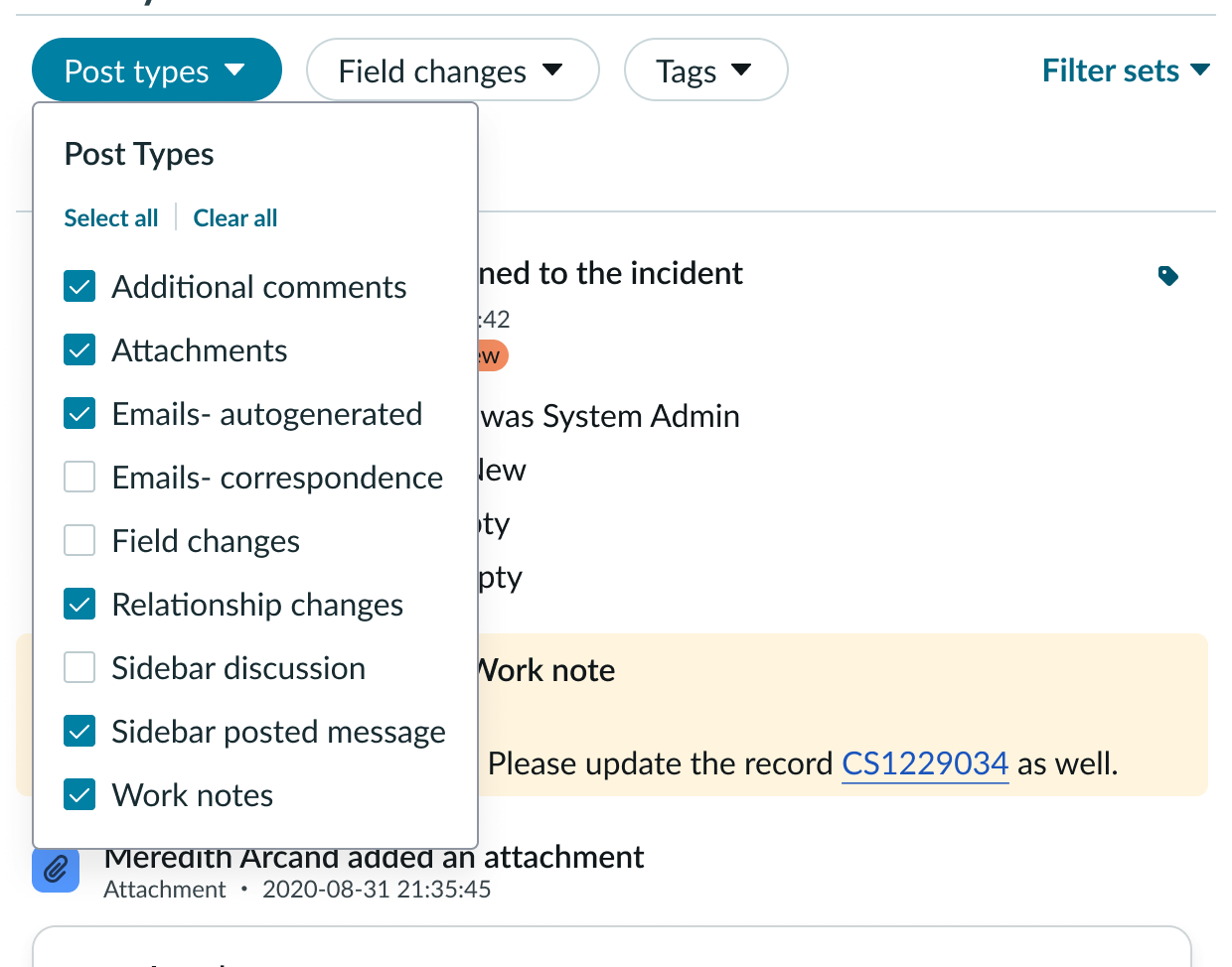
The “Post types” filter lets the user filter out any post types they don’t want to see. The pill button UI element opens a multiselect popover menu and by default all available post types are selected, thereby showing a full activity stream. Turning off the checkmarks removes those posts from the stream.
Users can use the Select All/ Clear All buttons to quickly narrow in on only the field changes they want to view. When the user closes the popover, the pill remains in the active state showing that there are filters applied.
The “Field changes” filter retains the previous releases functionality with an updated UI. All fields are defaulted to active/applied.
Unchecking an item removes that field from the activity stream feed view within the available posts. Users can use the newly added Select All/ Clear all buttons to more quickly narrow in on only the field changes they want to view.
When a user flags a post, they can filter the stream by those posts using the flagged toggle. The flagged toggle updates to reflect its active state.
The “Filter sets” menu shows the first pre-defined group of filters. It can be configured to be present or not present on the UI.
Sorting content
By default, the stream of posts appears in the order of newest to oldest. The sort toggle button is not active by default, and when toggled on, the stream of posts flips to display in the order of oldest to newest.
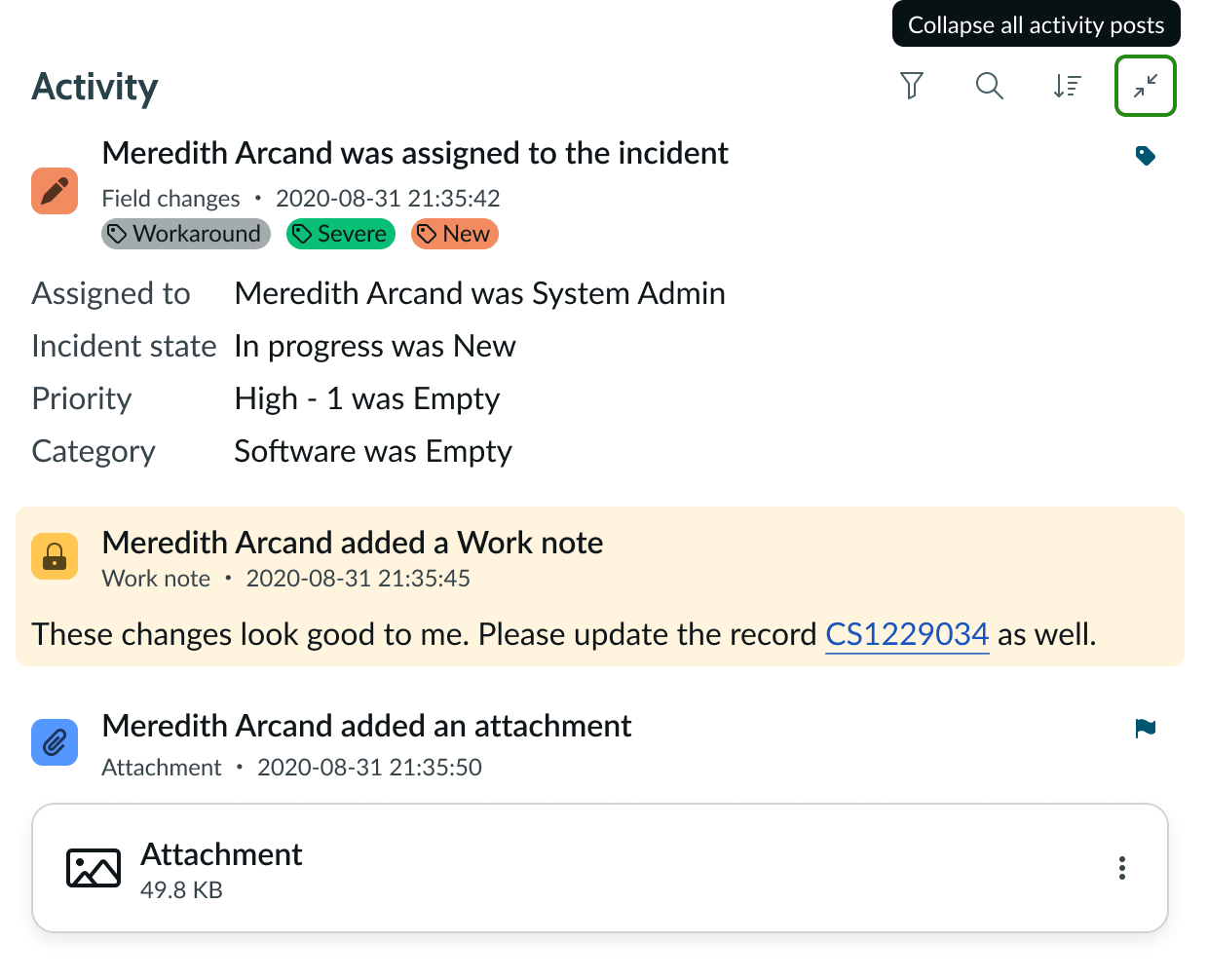
Expand/collapse menu
This menu toggles between Expand all posts and Collapse all posts. The activity stream defaults to collapsing the content within each event post. Selecting the Expand all button opens all the event posts in the stream.
Truncation
When text in activity stream exceeds the width of the container or content area, the text truncates with an ellipsis, and a tooltip shows the full content on hover.
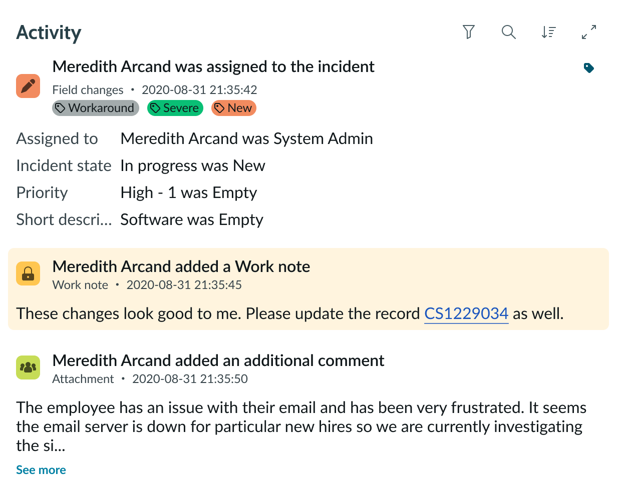
When text in the activity stream event posts exceeds the default width and height of the container or content area, the text area truncates with a “Show More” button. Selecting the “Show More” button, expands the remaining content and the “Show less” button replaces the “Show More” button.
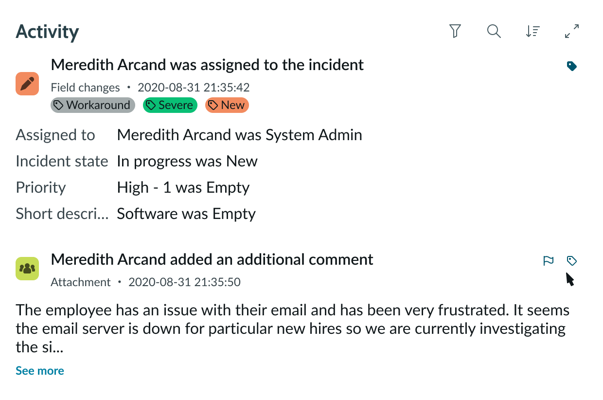
Flagging & Tagging
Users can hover over or use assistive technologies to focus on a post to reveal any available action buttons. By default, flagging displays. The tagging feature can be activated and configured with a set of tags available for tagging posts.
If the post has any other available actions, such as “Reply to Email,” those actions also display. When the user flags a post, the Active flag always displays on the post (not just on hover state). The same behavior applies for tags.
Usability
Activity stream complies with all internationalization and accessibility requirements.
Internationalization
When the display translates to a right-to-left (RTL) language, the ordering stays the same but the content moves from left to right.
Accessibility
Learn how to access the actionable elements activity stream through keyboard interactions.
Keyboard interactions
You can access the actionable elements of the activity stream component with these keyboard keys:
- Tab: Moves through activity stream in the prescribed tab order
- Shift + Tab: Moves through activity stream in reverse tab order
- Space/Enter: Opens a menu or activates a button
When the focus is in a menu:
- Up and down arrow keys: Moves within the menu
- Tab: Closes the menu