

Anatomy
Learn about the individual parts of activity stream compose.
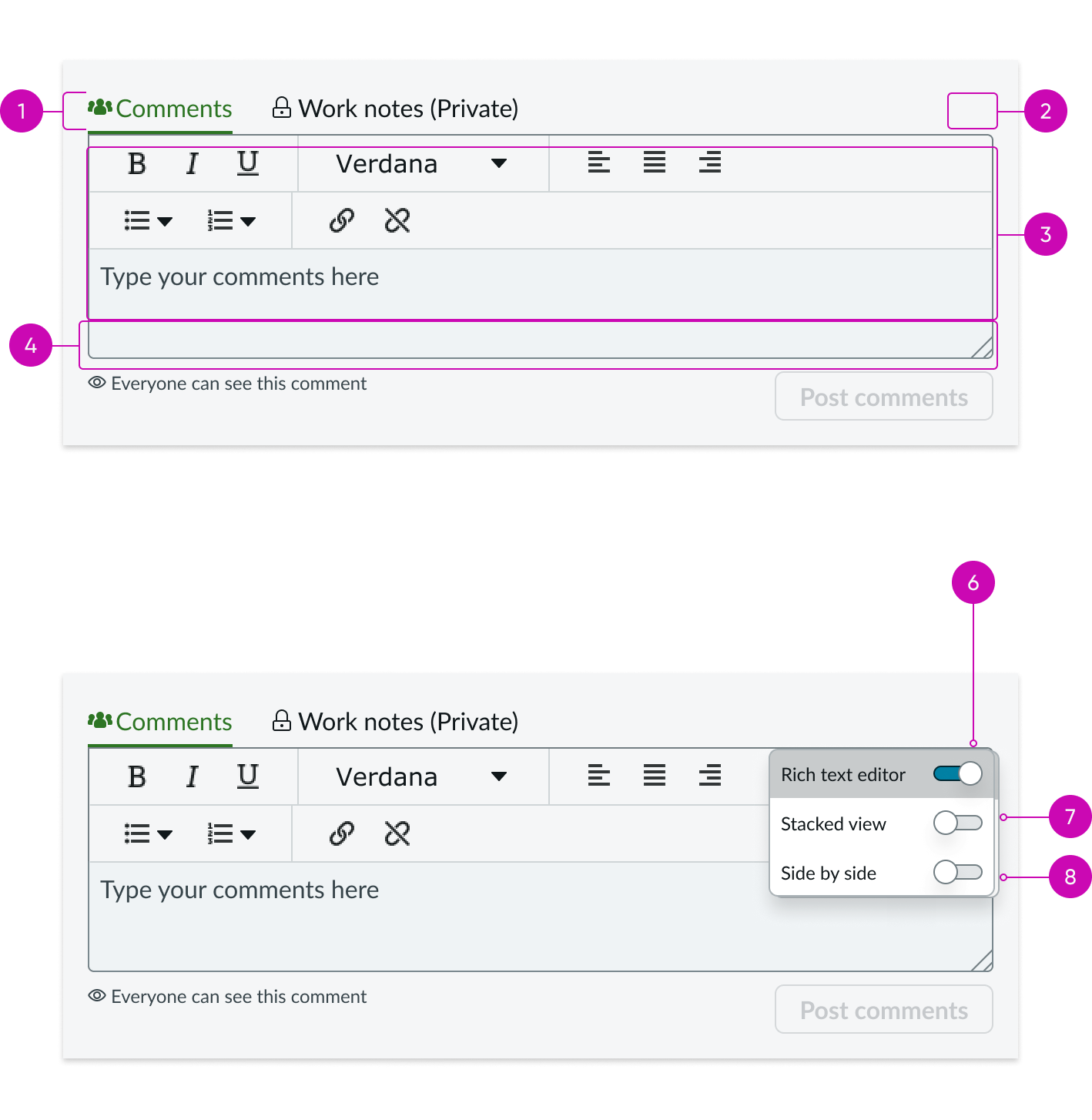
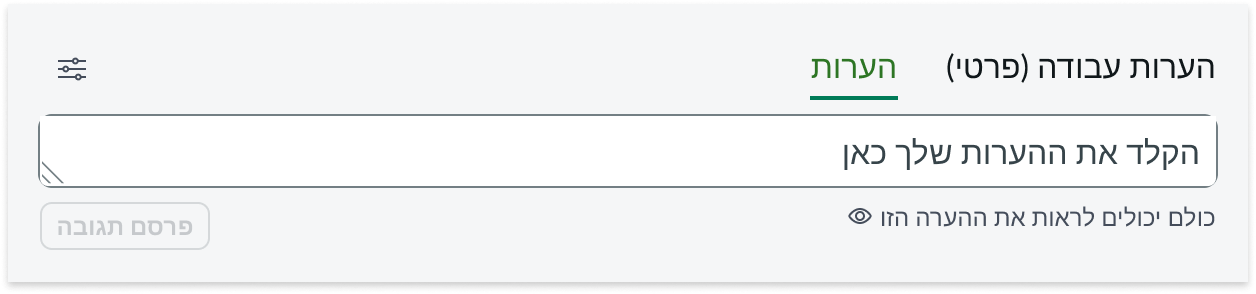
- Tabs: Default view of the available journal fields.
- Settings menu: Menu holding permission managed features.
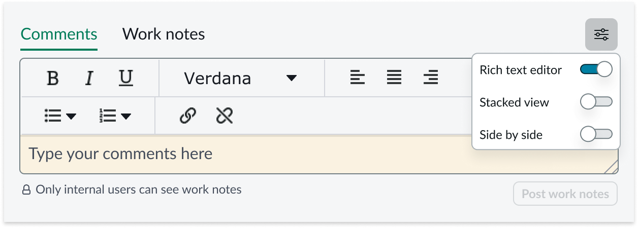
- **Rich text editor: ** Text editor for the text box, available when configured.
- Footer: Area of the component holding optional hint text and action buttons associated with the journal field.
- Hint text (optional): Hint text is shown in the footer for a particular journal field.
- Rich text editor toggle (optional): Allows a user to turn the rich text editor on or off; must be configured to display.
- Stacked view toggle: Allows a user to view journal fields in stacked or tabbed views.
- Side-by-side editing toggle: Side-by-side mode lets the user to change the view.
Usage
The Activity Stream Compose component displays journal fields as text boxes, allowing users to post text to the record by selecting the post action button.
Configurations
Learn how to customize activity stream by configuring the available properties.
Presets and controllers
This component has a preset configuration that sets properties and event handlers, making it ready for use. You can override preset values with a custom configuration if needed. Preset values won’t upgrade with updates. To avoid using presets, configure manually. One preset can apply to a single component instance. See presets for more info.
A preset is linked to a controller, which serves as a data resource. Controllers provide configuration data and event bindings for the component. Selecting a preset adds the required controller to the page, allowing new components to use its preset. For more on controllers, see controllers. For default presets, see view properties and events in the controller API.
Title
The title is hidden by default to save space and reduce scroll time for agents. You can choose to display the title and to change the title text as desired. If you choose to display the title (toggle on the “Show compose title” option), the default title is "Compose."
Post button
By default, the post button is styled as a tertiary button. However, you can configure this property to style the button as primary, secondary, or tertiary as needed.
Modeless dialog
Activity Stream Compose can also be used with modeless dialog functionality. To add this functionality, admin users must replace this Activity Stream Compose component with the Activity stream compose with modeless dialog bundle. See the usage guidelines to learn more about using the Activity Stream Compose with modeless dialog bundle.
Design recommendations
Learn how to apply the activity stream compose component in your design.
Make sure you place the activity stream compose component inside the context of a record.
Don't place the activity stream compose component outside the context of a record.
UI text guidelines
These are some recommendations for using text within the activity stream compose component.
- Use sentence case for all titles, labels, and column headers
- Keep all text labels informative and short to increase readability and scanning
- Keep content concise and purposeful to help a user understand options and actions
- Capitalize only the first letter and any proper nouns in a string of text
- Ensure content is contextual and specific to offer guidance and support to the user
Behavior
Learn how the activity stream compose component behaves when the display changes or a user interacts with the component.
Responsive behaviors
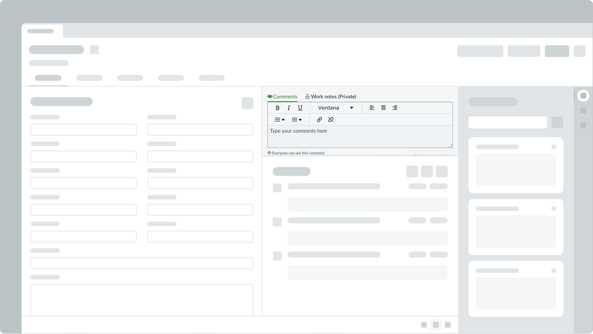
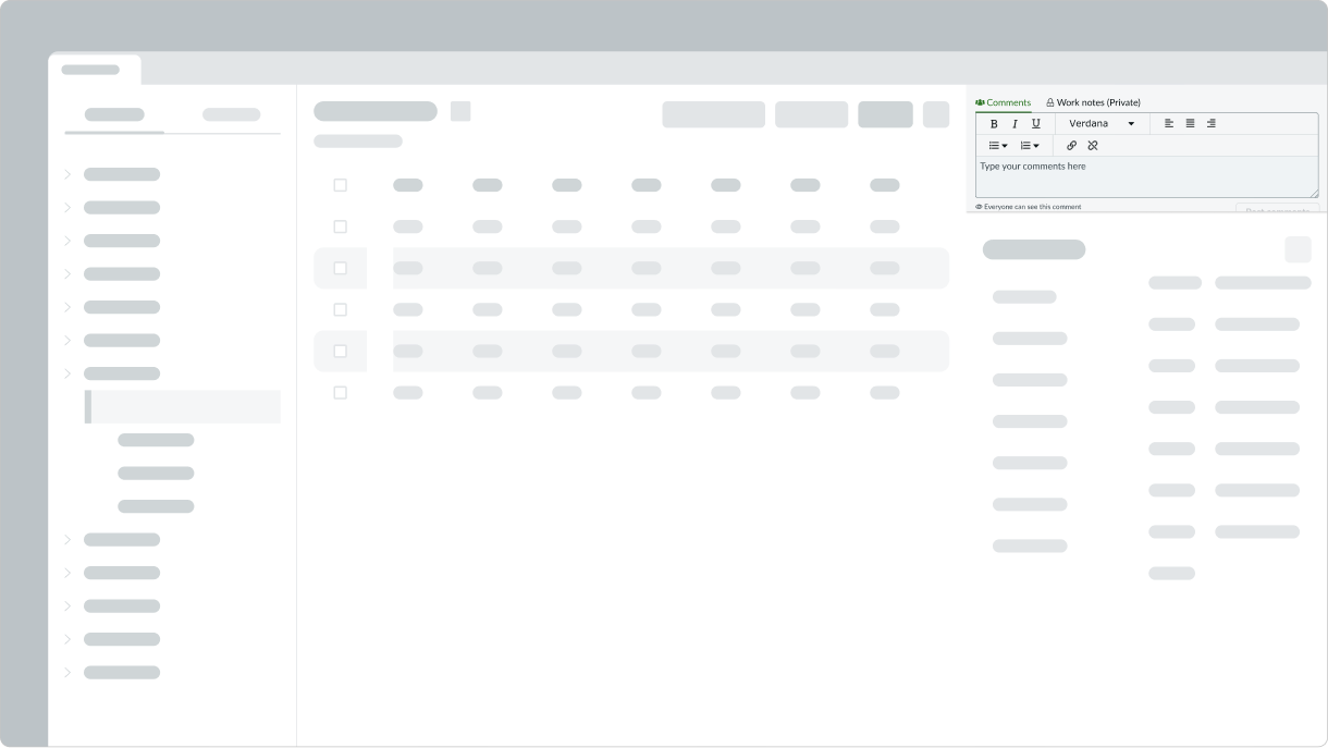
The activity stream compose component automatically resizes to fit a container.
Interactions
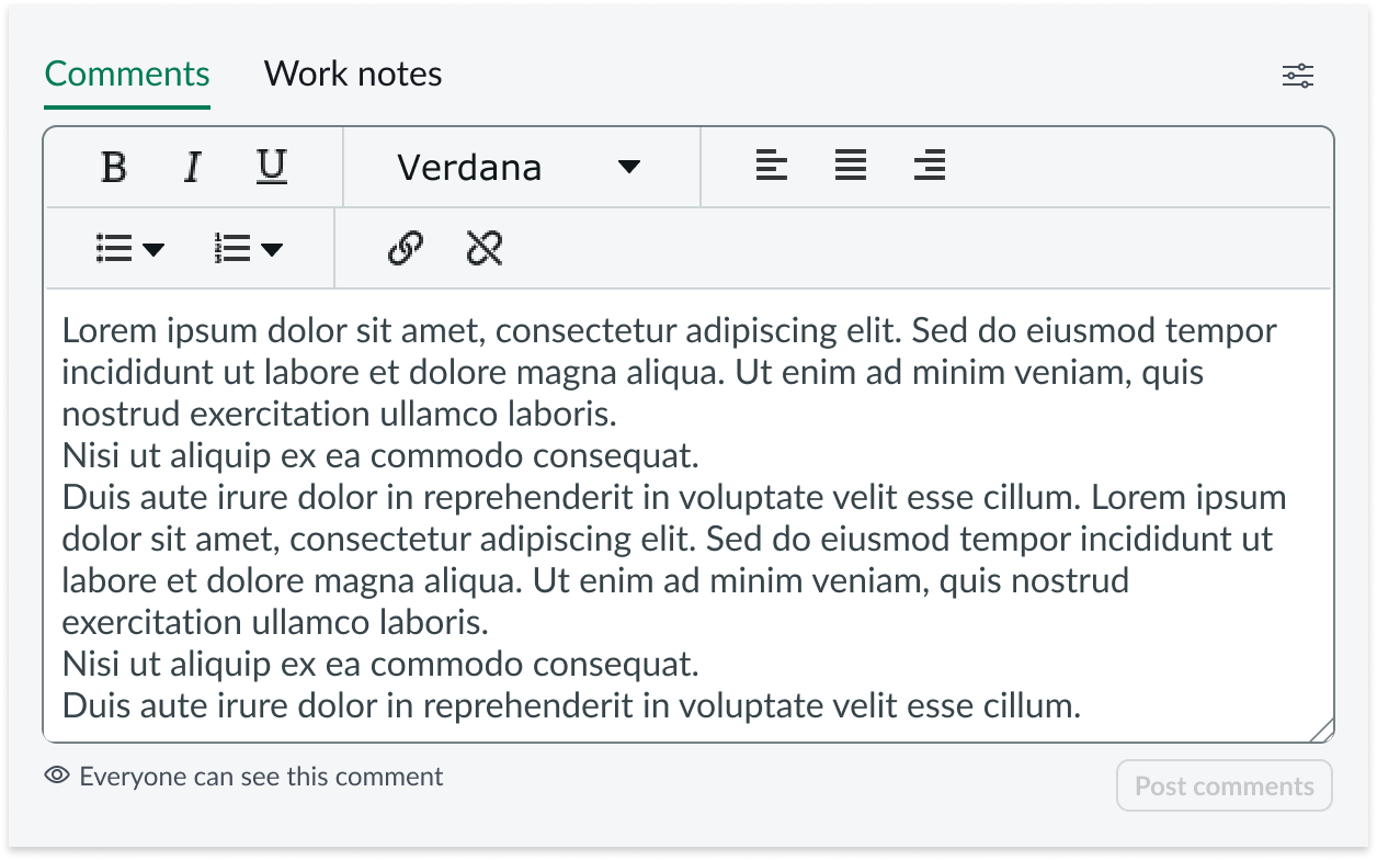
When the user focuses on the input field and begins typing, the text box height expands from 38px to 54px.
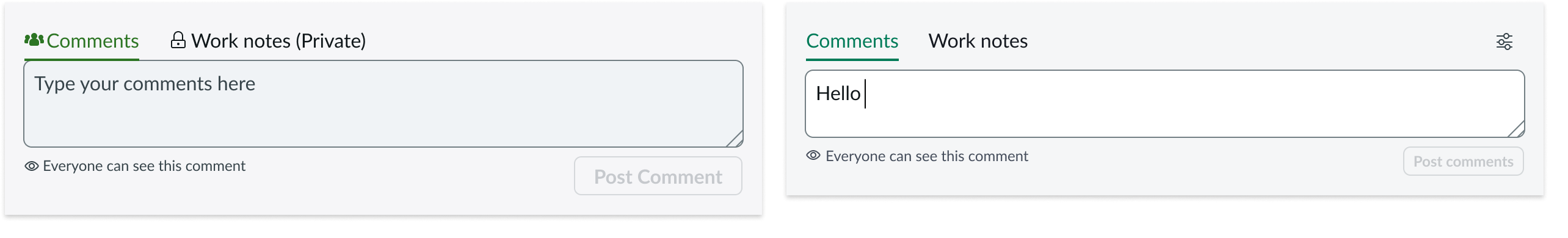
Clicking the settings icon opens a menu of viewing options. By default, only the stacked view option displays, which toggles between the stacked and tabbed journal entry views.
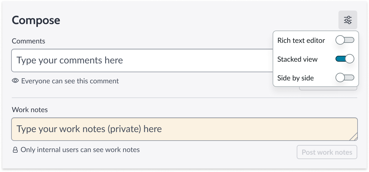
If the rich text editor is configured on, then the option is shown in the menu. When available, this toggle shows or hides the rich text editor bar.
Live presence
When multiple users are viewing the same record and one or more users begins to type in the journal editors (Comments or Work Notes), a message displays below the editor to notify the other user(s) in the record. For example, 'Abel Tuter is typing' or 'Beth Anglin is typing and Abel Tuter is typing.'
The message identifies up to two users by name. When there are more than two users typing in the record, the message displays the number of users. For example, 'Abel Tutor and 2 others are typing.' Users can hover over this message to see a tooltip that lists all of the users currently typing.
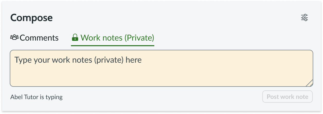
Example of one user typing in the work notes
Resizing
When text in the activity stream compose text box exceeds the default width and height of the content area, the text box size increases. Once it reaches its maximum height, a scroll bar appears.
Usability
The activity stream compose component complies with all internationalization and accessibility requirements.
Internationalization
When the display translates to a right-to-left (RTL) language, the fields and button sets align on the right. Any proper nouns that can't be translated appear left-to-right (LTR).
Accessibility
Learn how to access the actionable elements of the activity stream compose component through keyboard interactions.
Keyboard interactions
You can access the actionable elements of the activity stream compose component with these keyboard keys:
- Tab: Moves through activity stream compose in the prescribed tab order
- Shift + Tab: Moves through activity stream compose in reverse tab order
- Space/Enter: Opens a menu or activates a button
When the focus is in a menu:
- Up and down arrow keys: Moves within the menu
- Tab: Closes the menu