

Anatomy
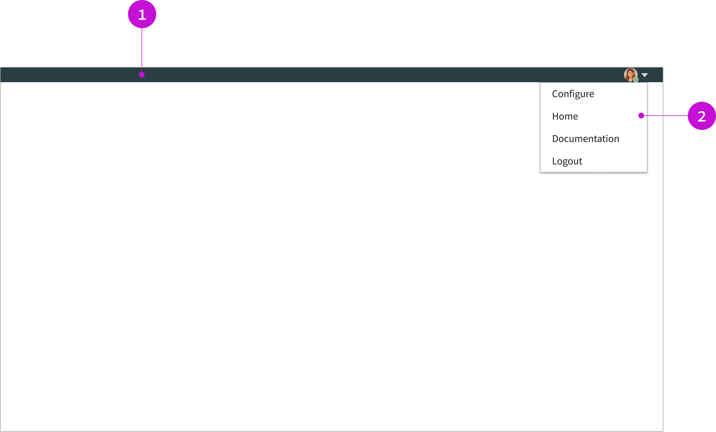
- Header: The visual element of the header app shell; contains the user menu
- User menu: Avatar icon; when selected, it opens a popover with a user’s display preferences and an option to log out
Usage
The header app shell should be used for experiences that require minimal navigation and few actionable items in the header. It can work well for guided builder experiences, where there isn’t a lot of user interaction outside of the instructional content in the main container.
Configurations
The header app shell does not have any configurable properties within UI Builder.
Behavior
The header app shell does not have any configurable properties within UI Builder.
Responsive behaviors
The header app shell doesn’t have any specific responsive behaviors.
Interactions
Users can only interact with the user menu. To open the user menu, users select the avatar in the heading.
Truncation
When content in the user menu exceeds the width of its container, the text truncates with an ellipsis.
Usability
Header app shell navigation complies with all internationalization and accessibility requirements.
Internationalization
When this app shell is used in a platform configured for a right-to-left (RTL) language, the content in the user menu aligns to the right.
Accessibility
Learn how to access the actionable elements of header app shell navigation through keyboard interactions and screen readers.
Keyboard interactions
You can access the actionable elements of app shell with breadcrumb navigation with these keyboard keys.
When the focus is in the popover menu:
- Enter: Opens the overflow menu
- Arrow up and arrow down: Moves focus up and down through the links in the overflow menu
- Enter: Opens the link for an item in the menu
For accessibility behaviors of specific components, see the usage guidelines for those components.
Screen readers
When you apply ARIA labels to the header app shell, screen readers announce the controls and content of the component in the prescribed tab order.