

Anatomy
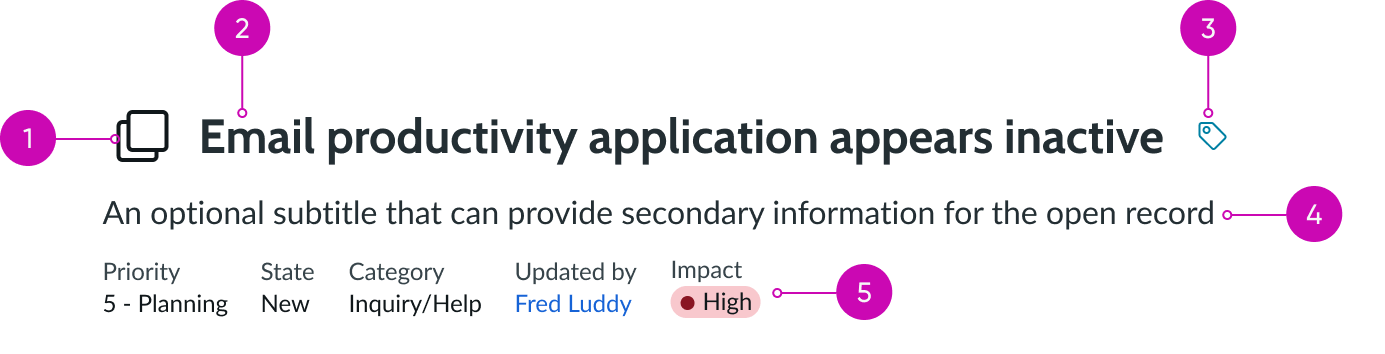
- Image (optional): A visual asset displayed next to the record's short description
- Primary field: Record title; summarizes the purpose of the record
- Record tags (optional): An option to assign tags to the record; provides a method of organizing and identifying records
- Subheading (optional): An additional description that can help clarify any information not included in the primary field
- Secondary values (optional): Additional information from the record that can be included in the record header to allow for scannability
Usage
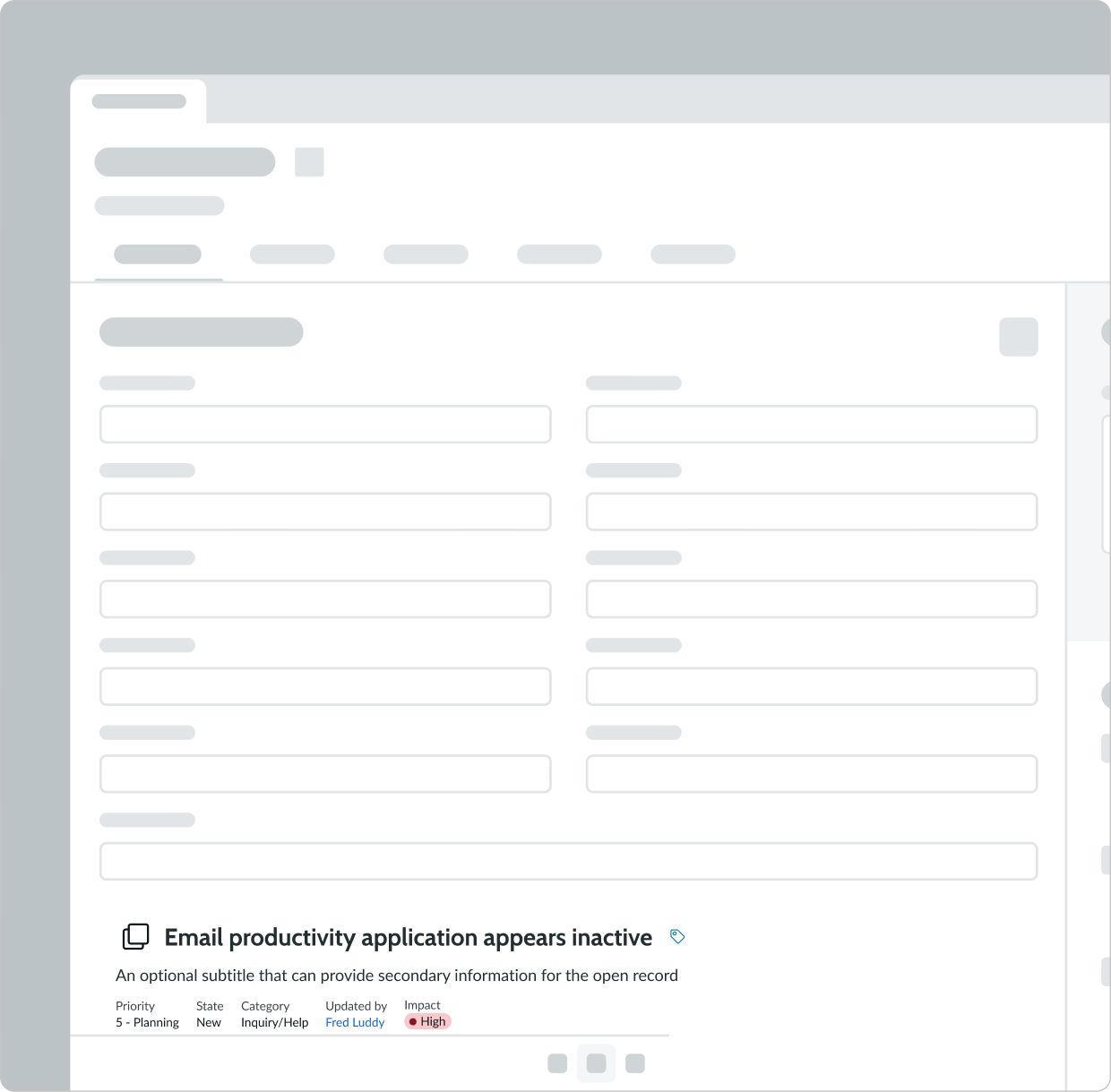
Learn about the record header component and find out how to use it in your design.
Configurations
Learn how to customize the record header component by configuring the available properties.
Primary field
It is necessary to configure the primary field to assign a title to the record. The primary field is the field that appears on the top of the record header and it helps the agent understand what the record is about. A primary field should be descriptive and concise and can often read like a short description.

Subheading
The subheading is positioned below the primary field and provides additional descriptive information if configured.

Secondary values
You can configure secondary values to be displayed to make additional information from the record easily scannable for the user. A secondary value is record information that is pre-configured and read-only, and it appears in a name-value pair format. Up to the first seven, non-null secondary fields can be displayed in the record header.

Header image
You can configure the header image to be displayed to help visually distinguish records. The header image can be an icon, an image, or an avatar. For example, an avatar can be used for a profile record and an image of a computer can be used for a record created to request a new computer.


Hide tags
Record tags are available by default and should be positioned next to the primary field. However, you can configure the record header to hide the tags if there is no need for them.
Design recommendations
Learn how to apply the record header in your design.

Record header should only be placed at the top of a record.
Don't place record header in locations other than the top of the record.
Behavior
The record header component doesn't respond to external changes or to user interactions.
States
The record header component doesn't have any states. However, the record tags component is a subcomponent of record header and its appearance will change based on its state.
Responsive behaviors
The record header component automatically resizes to fit its container.
Interactions
The record header component itself has no interactions; however, you can interact with elements of the record tags.
Truncation
When text in record header exceeds the width of the container or content area, the text truncates with an ellipsis, and a tooltip shows the full content on hover.
Usability
The record header component complies with all internationalization and accessibility requirements.
Internationalization
When the display translates to a right-to-left (RTL) language, the elements in record header maintain their hierarchy and are ordered from right-to-left.

Accessibility
Learn how to access the actionable elements of record header through keyboard interactions and screen readers.
Keyboard interactions
- Tab or Shift + Tab: Moves focus to the record tag element
Screen readers
When you apply ARIA labels to a component, screen readers announce the controls and content of record header in the prescribed tab order.