

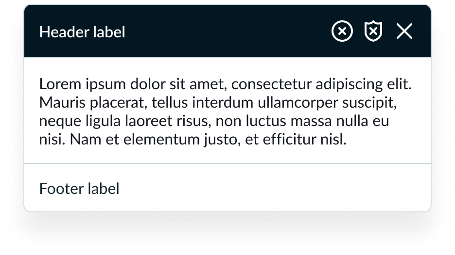
Anatomy
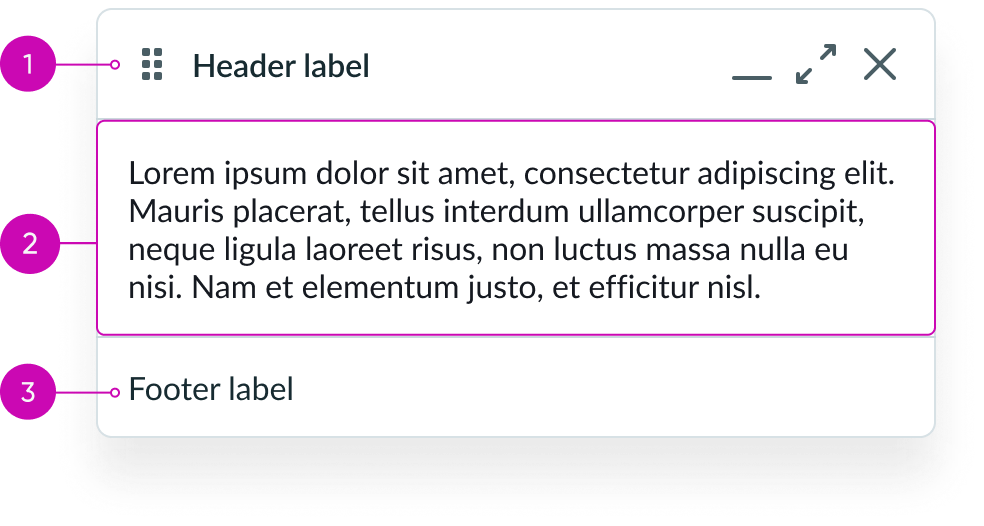
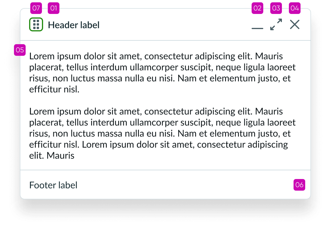
- Header panel: Area for adding the title and actions that are independent of the rest of the component (for example, window controls)
- Content slot: Space for subcomponents and custom content
- Footer panel: Areas for adding text and buttons related to the content in the content area
Header
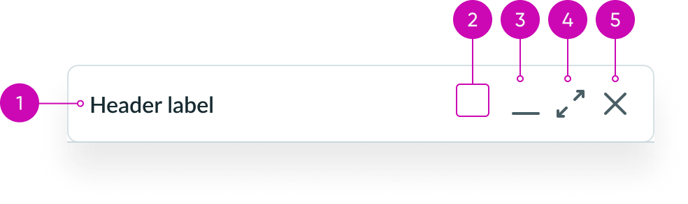
- Title area: Header area where the customizable dialog title appears
- Action slot (optional): An empty slot where you can add a button iconic to trigger an additional action
- Minimize button (optional): You can display the minimize button in the header panel; it’s hidden by default
- Maximize button (optional): You can display the maximize button in the header panel; it’s hidden by default
- Close button (optional): You can display the close button in the header panel; it’s hidden by default
Subcomponents
See usage guidelines for icon gallery
See usage guidance for iconic button
Usage
Use the modeless dialog to show components and content after the user selects an element to open it. Use a modeless dialog when you want the user to be able to interact with the current page and the dialog. Examples of when you can use the modeless dialog are: for chat functions, help information, or other types of content.
Not to be confused with similar components such as:
- Modal dialog: A container that appears above the the application content to provide information or ask for a decision. While the modal is active, the app content behind is disabled.
- Popover: A temporary panel that floats over other content to provide contextual help and information when a user selects a triggering element.
For more information, see the usage guidelines for these components: Modal dialog and custom popover.

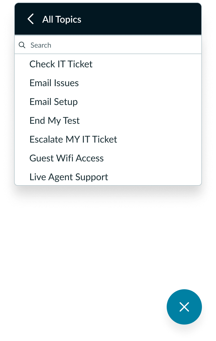
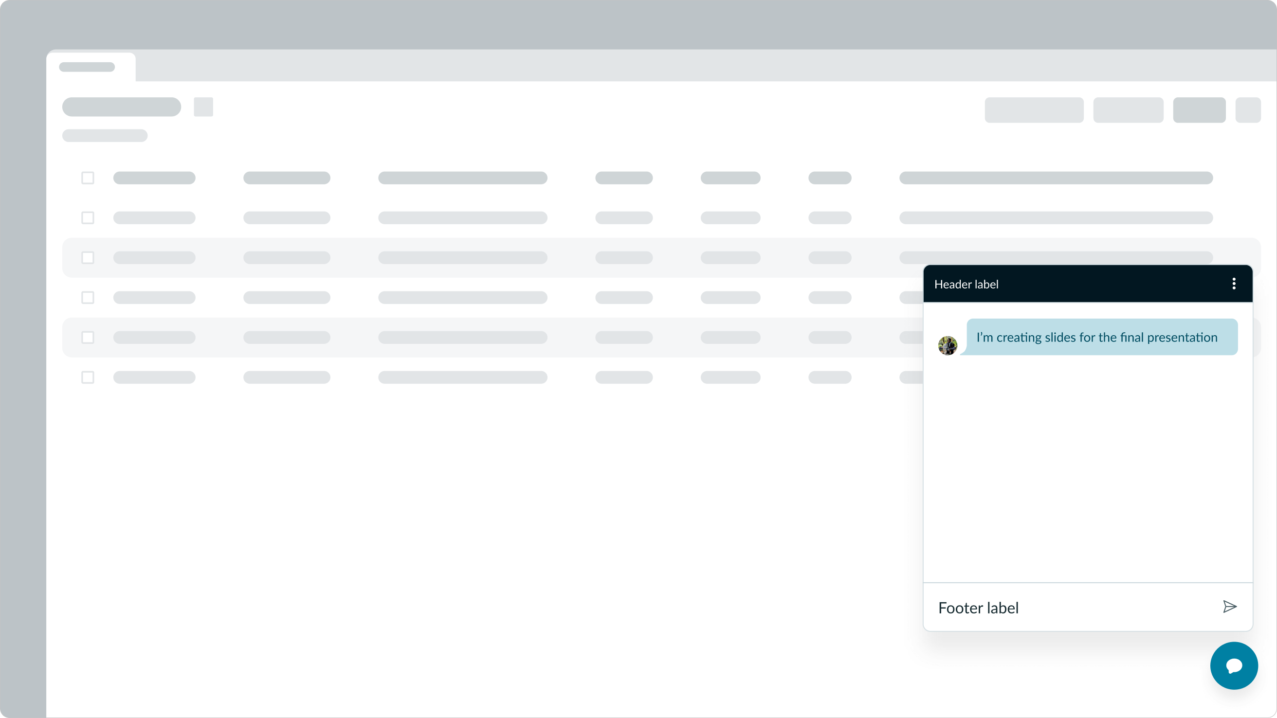
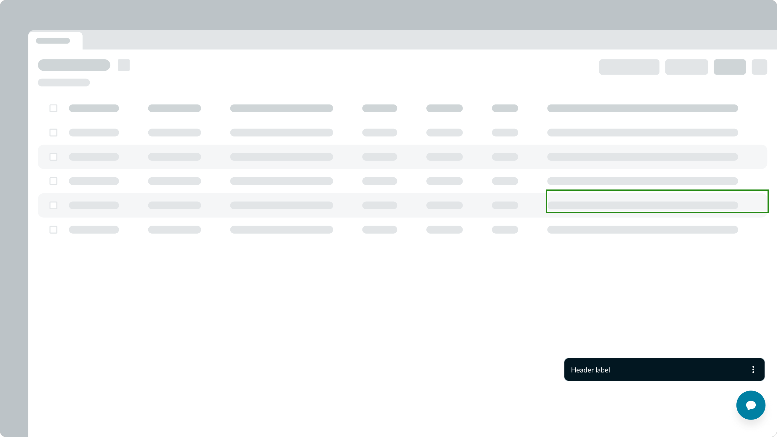
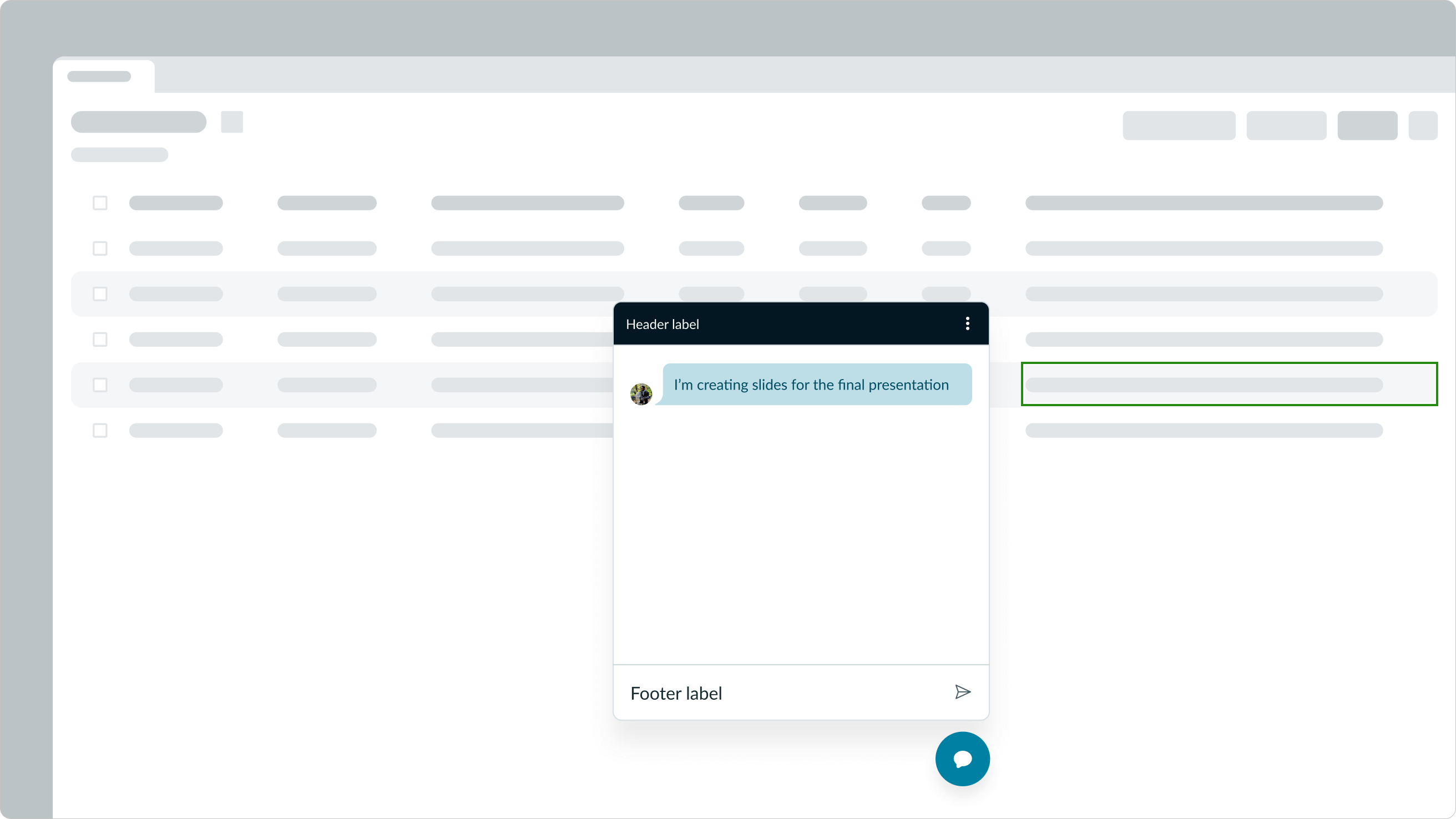
In this example, the modeless dialog is used for a chat function.
Variants
Learn about the attributes of modeless dialog.
Colors
Modeless dialog has the following header color variants: initial, primary, and secondary. This only affects the header background color.
Initial
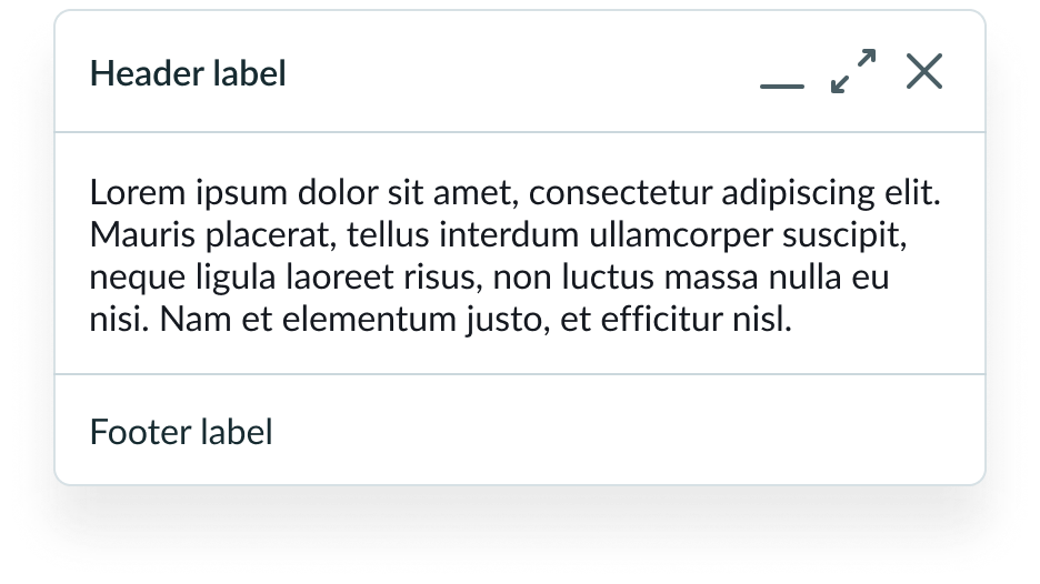
The initial color variant shows a white background for the entire dialog. This is the default.
Primary
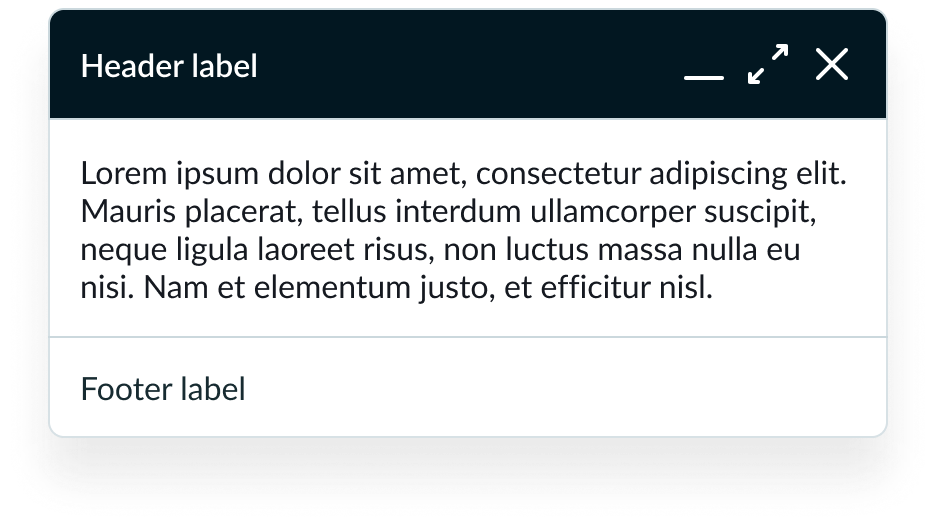
The header background color is more emphasized and best when you want a stronger, more visible header that draws the user’s attention.
Secondary
The header background color is less emphasized than the primary, but it’s also good for when you want a stronger presence than the default initial type.

Sizes
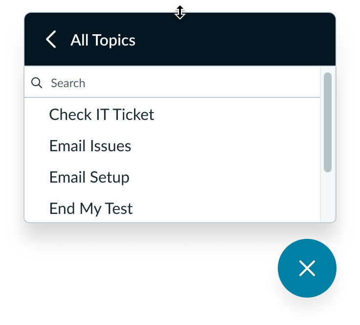
Although there is a default size, you can configure the modeless dialog width and height based on your individual use case. When determining the size, consider the component's intent and the type of content it displays. For example, a modeless dialog used for a chat feature may need to be larger in order to comfortably fit conversations, while a smaller size can be used for simpler content like a list.
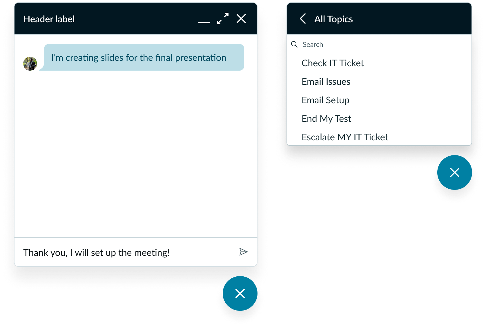
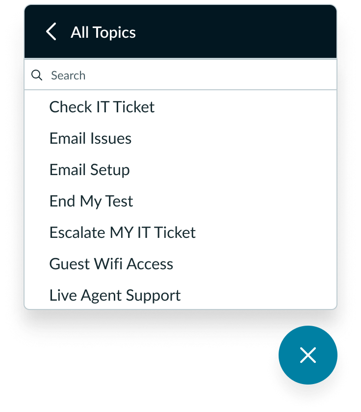
In this example, there are two different sizes for the modeless dialog. On the left, the modeless dialog is being used for a chat feature. On the right, the modeless dialog is being used to filter through knowledge base topics.
Configurations
Learn how to customize modeless dialog by configuring the available properties.
Presets and controllers
This component has a preset configuration that sets properties and event handlers, making it ready for use. You can override preset values with a custom configuration if needed. Preset values won’t upgrade with updates. To avoid using presets, configure manually. One preset can apply to a single component instance. See presets for more info.
A preset is linked to a controller, which serves as a data resource. Controllers provide configuration data and event bindings for the component. Selecting a preset adds the required controller to the page, allowing new components to use its preset. For more on controllers, see controllers. For default presets, see view properties and events in the controller API.
Size (header)
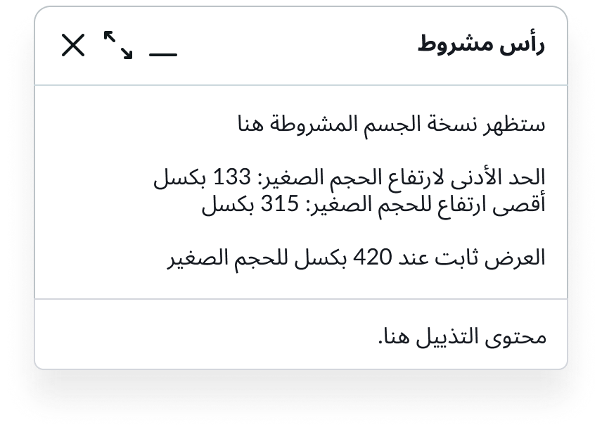
You can configure the modeless dialog header size. The default is medium, but a small size is also available which reduces the size of the text and icons.
Width
By default, the initial width of the modeless dialog is 380 pixels, but you can change that value or make the dialog dynamically resize based on the size of the content. See Fit content below.
Height
By default, the initial height of the modeless dialog is 600 pixels, but you can change that value or make the dialog dynamically resize based on the size of the content. See Fit content below.
Position
By default, the position of the modeless dialog in the container is “unset” - the dialog is placed in the position that fits best. You can set the position to top-left or right, centered, or bottom left or right.
Opened
By default, the modeless dialog is closed and opens when triggered. To have the dialog always appear on the screen providing the user with readily accessible info, select the Opened setting.
Fit content
By default, modeless dialog is static and doesn’t resize. You can choose to make the dialog dynamic and resize to fit the content automatically.
Drag
You can enable drag for the dialog so the user can drag it by clicking on the header or footer (if slots are given).
Close
You can add a button that provides users with the ability to close the modeless dialog. By default, this button does not appear.
Minimize and maximize
You can display minimize and maximize buttons that are hidden by default. When the user maximizes the dialog, it expands 100 percent to the viewport (excluding the navigation bar) or container.
Heading
You can provide a heading for the modeless dialog that overwrites the heading slot. If the heading exceeds the width of the header container, the text wraps.
Heading icon
You can provide an icon that appears next to the heading in the modeless dialog.
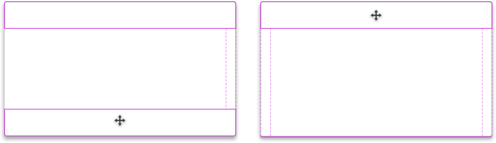
In this example, the header and footer panels are hidden.
You can include the header panel at the top of the modeless dialog when it needs a title to help explain its intent or purpose and action items.
In this example, the header panel has a title that describes the contents in the modeless dialog.
You can include a footer panel on the bottom of the modeless dialog to provide context or additional elements. For example, a chat window can provide a space for user input in the footer panel.
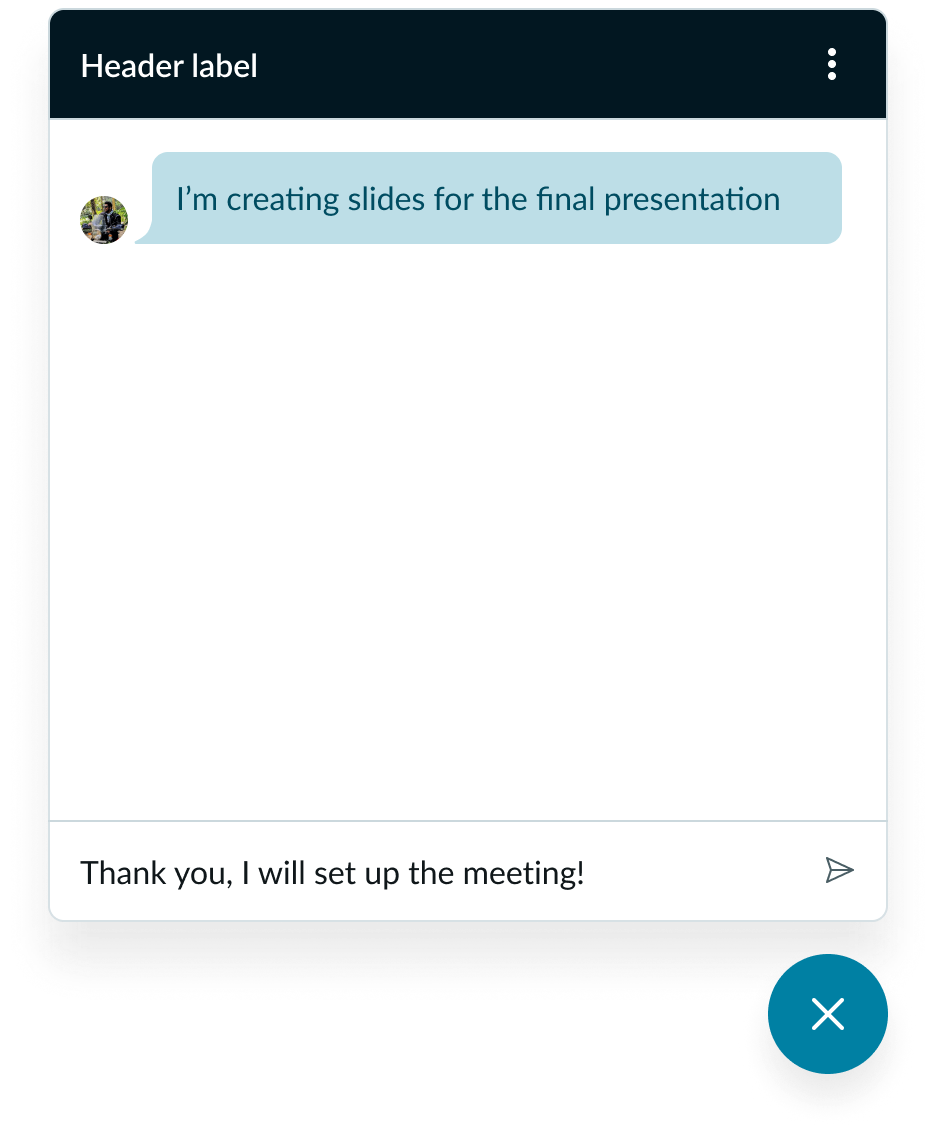
In this example, the header panel displays the company name with additional actions, and the footer panel allows them to enter text to chat with their team members.
Design recommendations
Learn how to apply modeless dialog in your design.

Place the modeless dialog near the component that opened it to show a clear relationship.
Avoid placing the modeless dialog too far away from the component that opens it. When the distance between the two is too far, their relationship can be unclear.

Each icon you use should have a clear meaning and associated action.
Avoid using similar icons (or the same icon) for different actions.
Alignment and positioning
When the user triggers a modeless dialog, by default the dialog position is “unset” - it hovers in the position that fits best. You can have it appear on the top left or right, or bottom left or right in the experience. Always position it close to the element that opens it. Users can interact with both the modeless dialog and the content in view.
Each area where you can have the modeless dialog appear
Behavior
Learn how modeless dialog behaves when the display changes or a user interacts with the component.
Responsive behaviors
Learn how modeless dialog responds to changes in a container or display.
Fixed panels
If you include a header or footer panel, each remains fixed when the user scrolls the content.
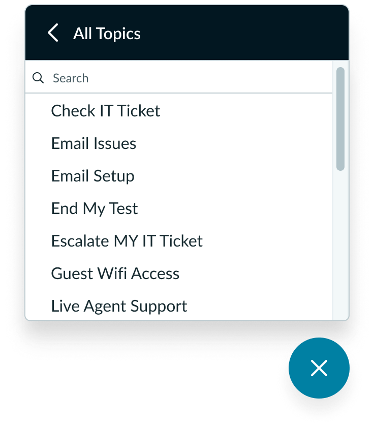
In this example, controls for the modeless window appear even as the user scrolls down to view more content.
Interactions
Learn how modeless dialog responds when a user interacts with it.
Dragging and dropping
You can enable drag and drop functionality for modeless dialog.
When enabled, the user can move the position of the modeless dialog by selecting the header or footer work panel and using the drag and drop pointer to move the dialog to a new location.
This interaction is only available if the modeless dialog includes a header or footer panel.
Note: Users can also move the modeless dialog using keyboard keys. For more information, see the Usability section, Keyboard interactions below.
In this example, the user can place their cursor on either the footer or header panel, then select it to enable the dragging functionality. They can then drop the modeless dialog anywhere in the experience.
Manual resize
You can choose to enable the resize functionality for the modeless dialog.
When enabled, the user can resize the component by selecting the edge of the window and dragging their cursor horizontally, vertically, or at an angle.
You can also restrict the resize ability to minimum width, minimum height, max width, and max height.
Note: Users can also resize the modeless dialog using keyboard keys. For more information, see the Usability section, Keyboard interactions below.
In this example, the user's cursor appears over the edge of the modeless dialog to show that they can resize it.
Auto-resize
By default, when a user enters text that extends beyond the height of a modeless dialog, the dialog automatically resizes. The dialog stops resizing when it reaches either the maximum height value - if set - or the height of the page. If the user keeps typing a vertical scroll bar appears.
How the dialog resizes is based on it’s position on the page. When the modeless dialog is positioned in the center, it resizes at the top and the bottom. If the dialog is anywhere along the top, it resizes from the bottom. When the modeless dialog is anywhere along the bottom, it resizes from the top.
As the user deletes lines of text, the dialog height dynamically reduces.
Note: If a user manually resizes the modeless dialog, auto-resize is disabled.
Truncation
The modeless dialog is a container for content and components. The text within the content area and footer should follow content best practices and avoid truncation when possible.
The header title text wraps to a second line.
Usability
Modeless dialog complies with all internationalization and accessibility requirements.
Internationalization
The modeless window is a container for content and components. Therefore, it is important that any content or components within it adhere to internationalization standards.
When the display translates to a right-to-left (RTL) language, the modeless dialog flips in its orientation. The order of importance changes to right-to-left in the dialog but remains top to bottom. The sort order configuration for LTR and RTL versions remains the same.
Accessibility
Focus Not Obscured Considerations
- To comply with 2.4.11 Focus Not Obscured (Minimum), Modeless Dialog must not fully obscure any interactive element that can receive keyboard focus. because modeless dialogs live on top of other page content, consider scrolling around and/or moving the dialog so that focused elements are visible.
Default (Content Obscured)
Minimize Dialog
Shift Dialog
Move or minimize the dialog to reveal focused content beneath.
Modeless dialog tab order
Note: Truncated text becomes focusable if you have the “Enable keyboard focus on truncated text” option on. Go to your OS Preferences > Accessibility panel and set this option to True. In modeless dialog, a truncated title becomes focusable and displays the full text in a tooltip.
Keyboard interactions
When using the modeless dialog, it’s important to manage focus either to the header or first interactive element. Every modeless dialog component should have at least one focusable control.
You can access the actionable elements of modeless dialog with these keyboard keys:
- Tab: Moves focus to the next element inside the modeless dialog; if focus is on the last element, closes the modeless dialog
- Shift + Tab: Moves focus to the previous element inside the modeless dialog
- Enter/return: Triggers element action
- Escape or Spacebar (with focus on x): Closes the modeless dialog
When the focus is on the resize icon in the bottom right corner:
- Up or down arrow: Resizes window larger vertically
- Left or right arrow: Resizes window larger horizontally
- Shift + up or shift + down arrow: Resizes window smaller vertically
- Shift + left or shift + right arrow: Resizes window smaller horizontally
Focus on the drag and drop button:
- Spacebar or Enter/return: Enables drag and focus moves to dialog
Focus on dialog from drag and drop:
- Tab or Enter/return: Exits dragging and returns focus to drag and drop button
- Up or down arrow: Moves dialog up or down in small increments
- Left or right arrow: Moves dialog left or right in small increments
- Shift + left or right arrow: Moves dialog left or right by 10 pixels
- Shift + up or down arrow: Moves dialog up or down by 10 pixels
- Page Up or Page Down: Moves dialog to top or bottom of viewport
- Home or End: Moves dialog to left or right of viewport
Screen readers
The modeless dialog requires an accessible name. To configure the name, use the ‘aria-label’ attribute. The accessible name should match the modeless dialog heading. If no heading is visible, the accessible name should convey the purpose of the dialog.