

Anatomy
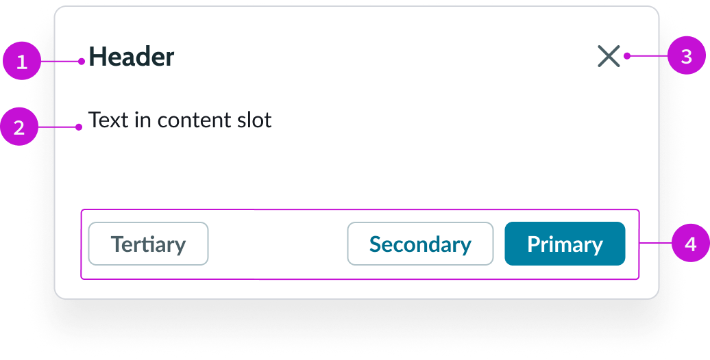
- Header: Text title accompanied by a close button
- Content slot: Container for the main content of the modal; the content can be text, forms, lists, cards, or other elements
- "Close" action: Iconic button for exiting the modal
- Footer: Container for buttons related to the content of the modal
Subcomponents
See usage guidance for tooltip
See usage guidance for popover
Usage
You can use a modal in different contexts and to display a variety of information.
Ask for user input
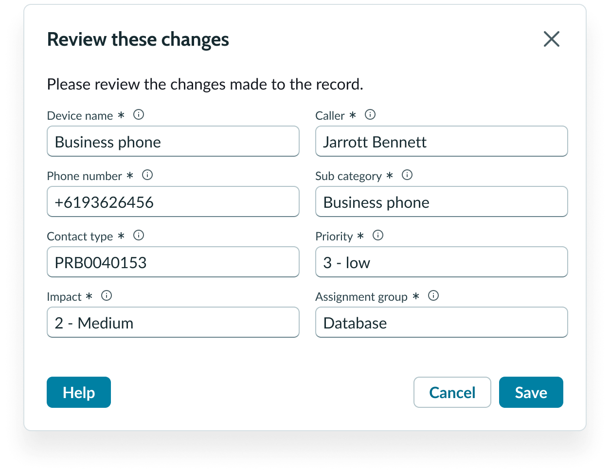
Use a modal to collect user entries and then produce an output. User input modals require a footer for the primary and secondary buttons.
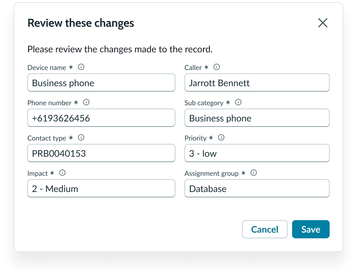
In this example, the user needs to save their changes before moving on.
This can be an individual task or a task that is part of a larger workflow.
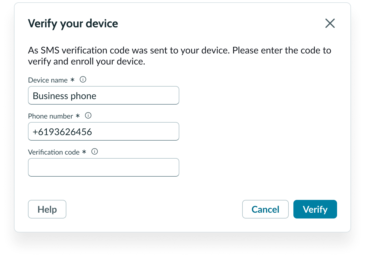
In this example, the user needs to verify their device before they can go to the next step in the process.
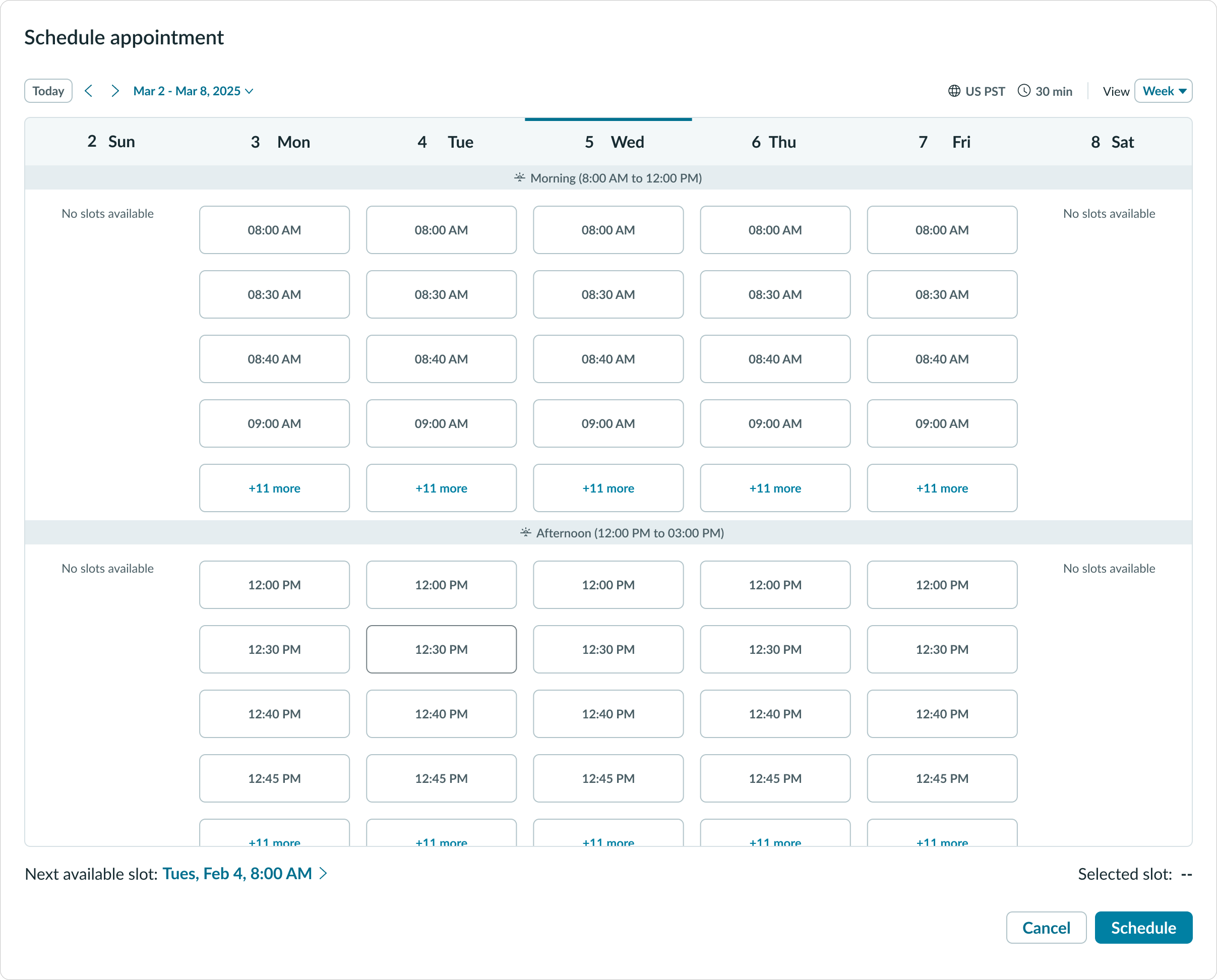
Some user input tasks (like filling out a form) may include multiple subcomponents and elements, which occupy more space than a large modal. For these experiences, use a full-screen modal. These experiences may be more time-consuming or in-depth, and a full-screen modal can help the user see everything within a self-contained process.
If the process within the full-screen modal is time-consuming, consider providing a save state so that the user has a way to exit and not lose any progress.
In this example, a full-screen modal takes up the entire experience to focus the user's attention on the content.
Show critical information
You can use a modal to provide the user with critical information that requires their immediate attention.
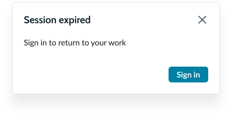
In this example, the user's session timed out and they need to log back in to resume working.
This is only if it’s necessary to interrupt the user's flow with an action. For critical information that doesn't impact the user's workflow, you can use an alert component.
Request confirmation
Additionally, you can use a modal to verify a user’s action. This modal appears when a user takes an action or makes a choice that is typically irreversible. The modal helps prevent any damages if the user made the choice by mistake. Use confirmation modals only for user-initiated actions that are irreversible or have a big impact on their workflow.
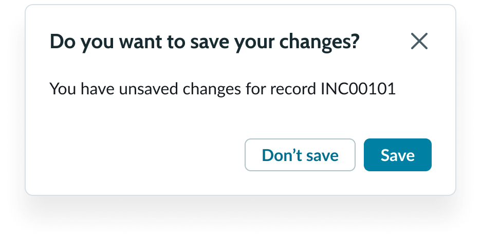
In this example, the modal confirms that the user is about to leave a record form without saving their changes
Use a primary positive or negative button depending on the action the user made. Pair this button with a secondary button that provides a way to dismiss the action.

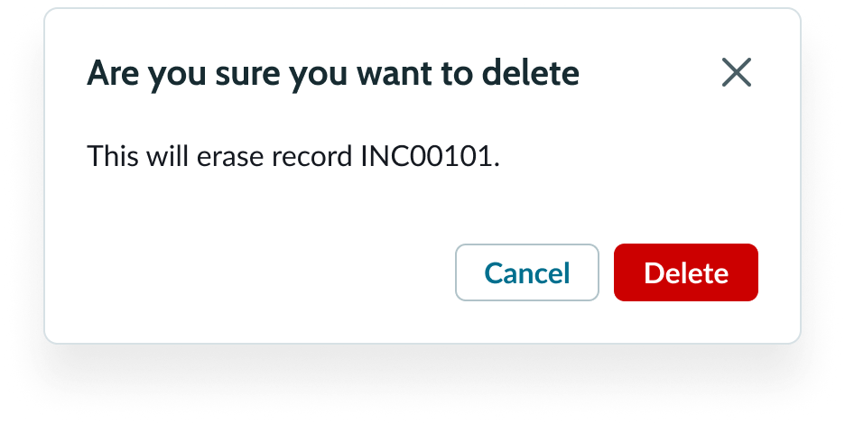
In this example, the modal confirms that the user wants to delete the record, a negative action that the user can't undo.
Modal vs. other components use cases
Sometimes a modal isn't the best component for showing information to the user. If you're unsure whether a modal is right for your use case, consider these other components or design elements.
New page
When the content disrupts the user’s current task and doesn’t require them to return to it, use a new page instead of a modal. Also, consider using a new page if the content would be too difficult to interact with in a modal.
Alert
Use the alert component instead of the alert modal when you need to provide the user with information, but the information isn't critical enough to interrupt their workflow.
In this example, the notification uses the alert component because it doesn't need to interrupt the user's workflow.
Popover
Use a popover instead of a modal when you want to provide the user with additional content that can help them within a workflow. A popover is different from a modal because the popover doesn't interrupt the user's workflow like a modal.
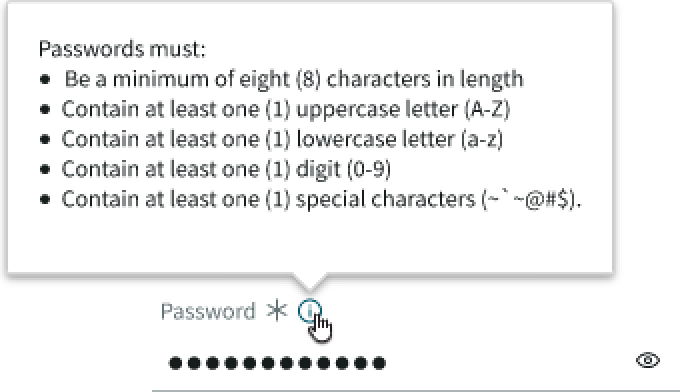
In this example, a popover shows the requirements for creating a password.
Tooltip
Use a tooltip instead of a modal when you need to provide clarifying information for icons, interactive components, or truncated text.
In this example, the tooltip shows the truncated heading text.
Variants
Learn about the attributes of modal.
Modal buttons
For information about each type of button variant, review the button component usage guidelines.
Sizes
A modal is available in the following sizes: small (sm), medium (md), large (lg), full-screen, and custom. The small, medium, and large sizes have fixed widths as well as defined maximum and minimum heights. However, the full-screen modal size is relative to the size of the browser window. Custom size requires both the width and height to be specific.
Choose a size based on the layout of your display and the type of content you want to show.
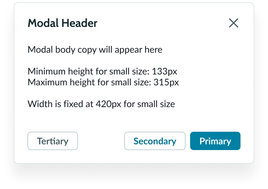
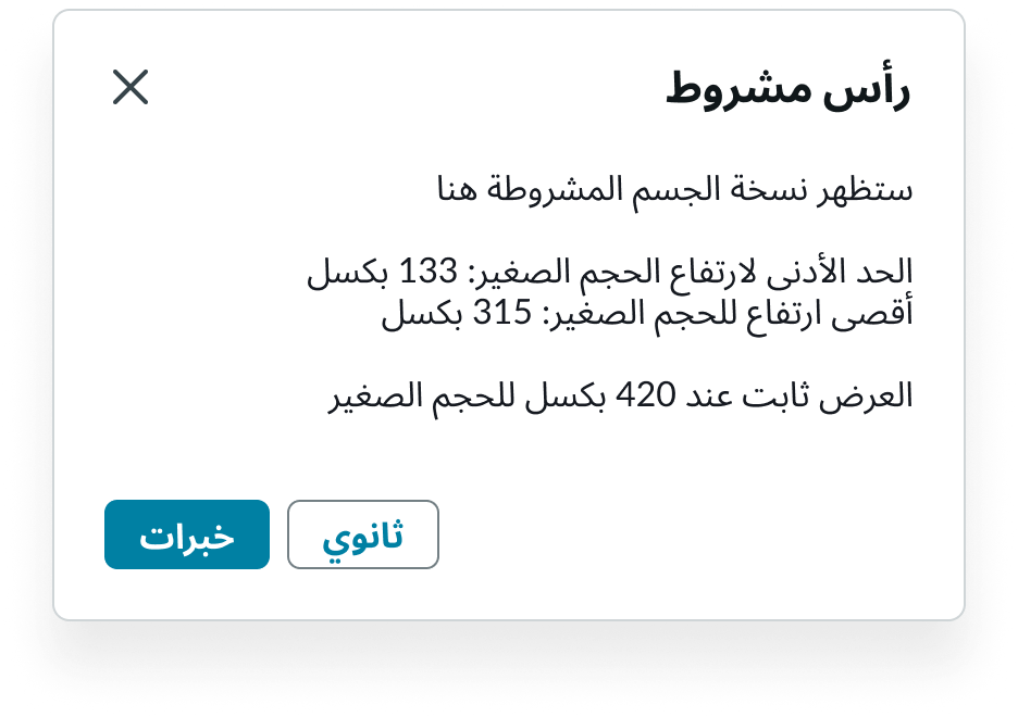
Small
For the small size modal, the minimum height is 133px, maximum height is 315px, and width is fixed at 420px.
In this example, the notification uses the alert component because it doesn't need to interrupt the user's workflow.
Medium
For the medium size modal, the minimum height is 190px, maximum height is 450px, and width is fixed at 600px.
Large
For the large size modal, the minimum height is 254px, maximum height is 600px, and width is fixed at 800px.
Full-screen
In the full-screen size, the modal occupies the entire screen (except for the navigation bar).
Configurations
You can configure the content and buttons depending on your use case.
Design recommendations
Learn how to apply modal in your design.

Use only 1 primary button. For any additional buttons in the footer, use the secondary or tertiary button variants.
Don't use more than one primary button. This creates confusion as to which action is the most important.

Only display 1 modal at a time.
Avoid displaying a modal on top of a modal because it creates confusion around which actions relate to which content.
Alignment and positioning
A modal is always centered horizontally and vertically in the display.
Modal content slot
The modal body has optional left and right padding. You can disable this padding when modal content (like a list or certain media formats) needs to flush with the edges of the container.
Modal footer
Buttons you add to the modal footer are right aligned. The first 2 buttons appear on the right side of the modal footer. These buttons should only be used for primary and secondary actions that are directly related to the purpose of the modal. Position any tertiary action button on the left side of the footer.
The secondary and primary button appear to the right of the footer. The tertiary is the third button added and appears to the left.
UI text guidelines
These are some recommendations for using text within modal.
- The title and body text should be brief, and clearly describe the purpose and intent of the modal
- The button text should be concise, actionable, and clearly state what happens when a user selects the button
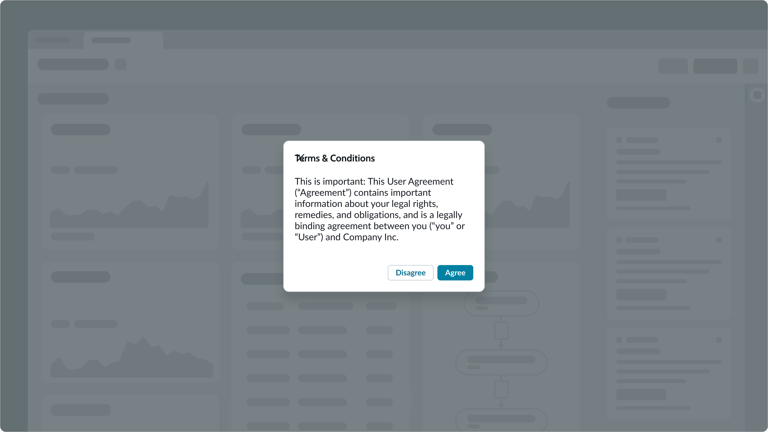
Critical information modal guidance
These are some recommendations for critical information modal text.
Header
- Can be a statement announcing a critical update or change in status
- Avoid using sentence fragments like "Your X" or "About X."
Body copy
- Simple and straight to the point
- Don't repeat the header text
Button text
- Can be an acknowledgement, such as "OK"
- Can also feature navigation choices, such as “Go to home page"

An example of a critical information modal.
Confirmation modal guidance
These are some recommendations for confirmation modal information text.
Header
- It should ask the user if they're sure they want to complete the action they chose; simply displaying "Are you sure?" is a straightforward way to do this
Body copy
- Don't repeat "Are you sure"
- Describe the consequences in direct terms, usually in the future tense
- For example: "Deleting this comment will delete all its replies."
Buttons
- Always use a pair of buttons that reinforce the action by labeling them "Yes, [do this action]" and "No."
An example of a confirmation modal.
Special use case
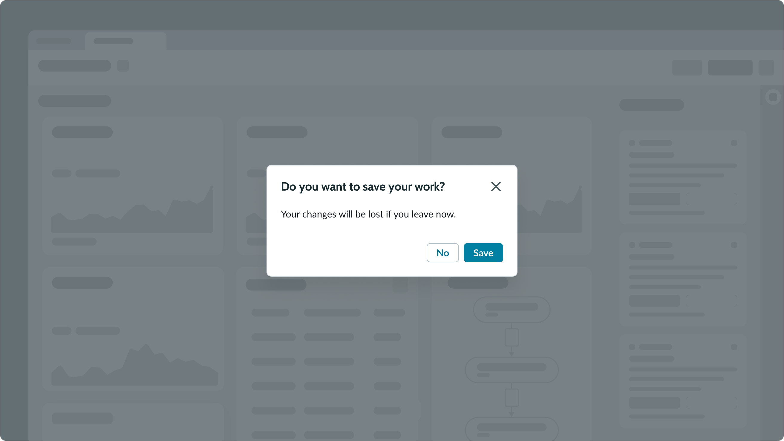
There is a special version of a confirmation modal when a user decides to leave a page without saving.
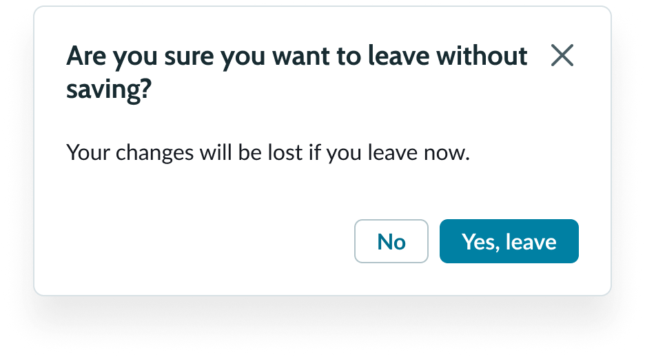
An example of a modal that appears when the user tries to leave without saving their changes.
Input modal guidance
These are some recommendations for input modal information text.
Header
- Use a command or statement
- Avoid sentence fragments like "Your X" or "About X"
- The text should be consistent with (or related to) the CTA or
- intended action
- For example, "Upload a file."
Body copy
- Feature the main step(s), and keep to 5 steps or fewer
- Steps could include dropdowns, checkboxes, or a numbered list
Buttons
- Use the primary button to reinforce the main action or something more generic
- Consider having a secondary button labeled "Cancel" for accessibility purposes
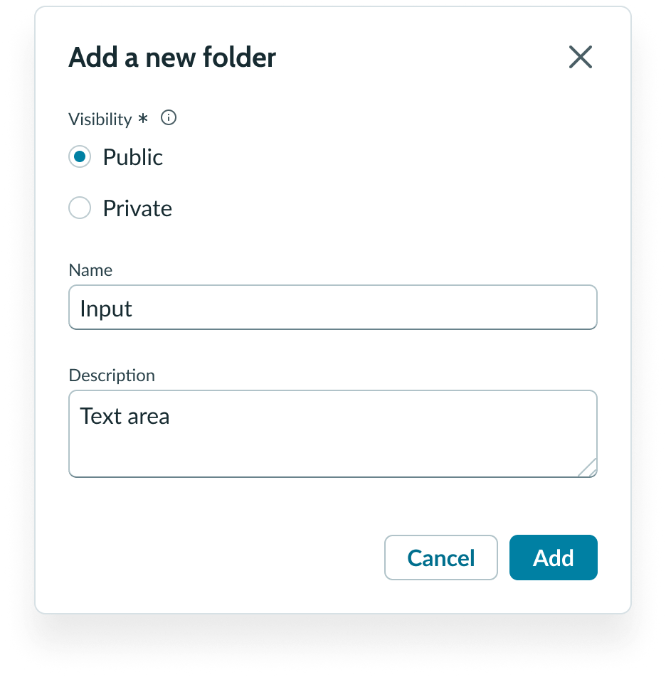
An example of an input modal.
Special use case
A version of the input modal may ask the user for an explanation behind the chosen action. For this version, an alternative header can be "Enter a reason for this choice" or "Share your feedback on [object]."
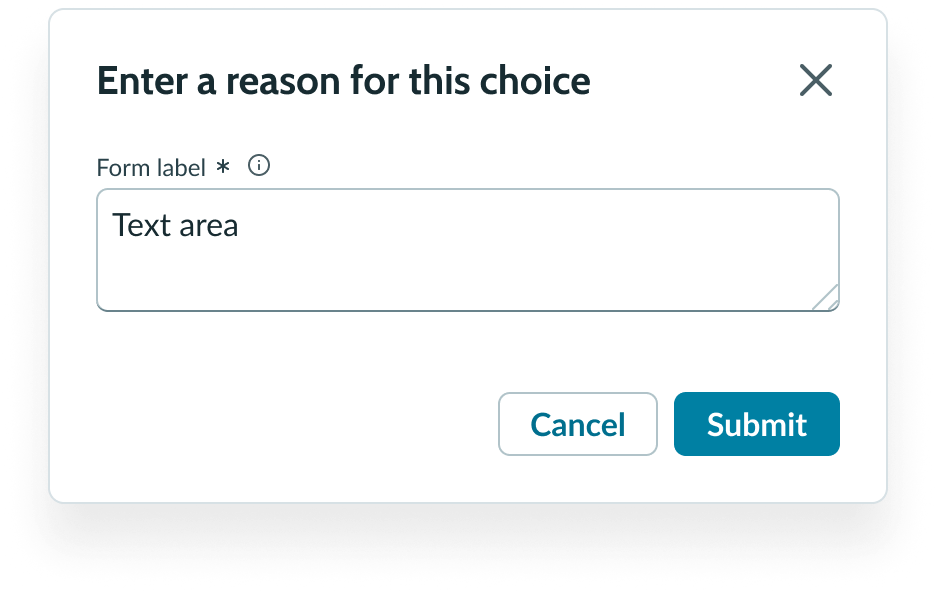
In this example, the buttons can be generic (like 'Submit') or reinforce the action that launched the modal (like 'Flag article').
Another version of the input modal asks a user for feedback, with specific reasons and a promise to improve.
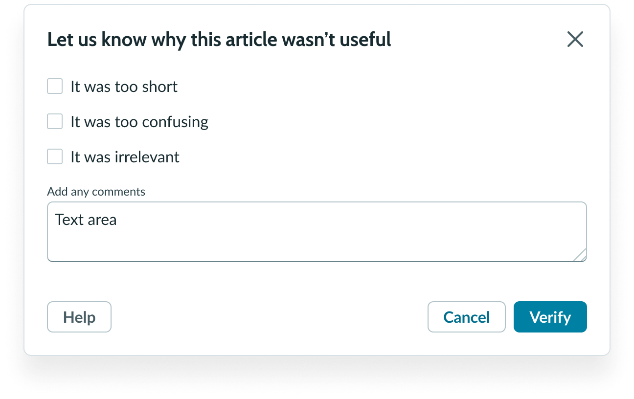
In this example, the modal is asking for specific reasons and user-generated feedback.
Behavior
Learn how modal behaves when the display changes or a user interacts with the component.
Responsive behaviors
Learn how modal responds to changes in a container or display.
Content focus
When the user opens a modal, a semi-transparent shade appears over the existing content to indicate that it's no longer interactive or accessible.
Overflow
If the modal content extends beyond the maximum height, a vertical scrollbar appears so that the user can scroll to see all the content.
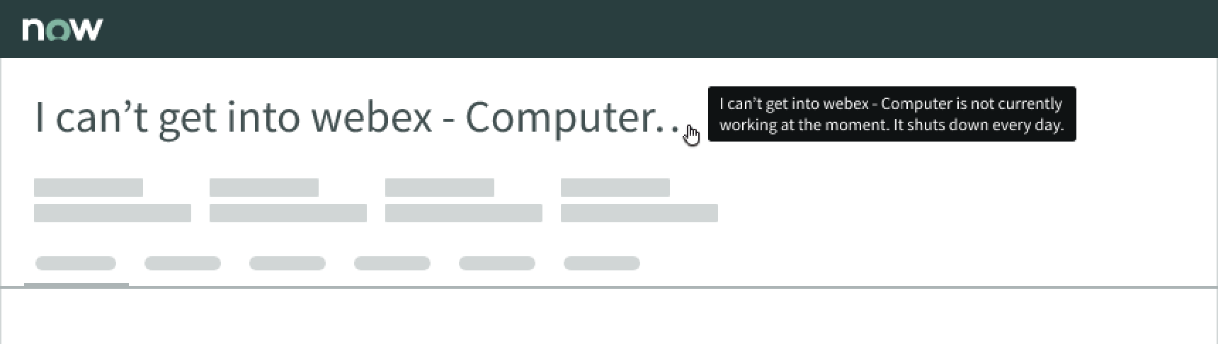
Truncation
If the modal title is longer than the container, the text truncates with an ellipsis. A tooltip appears when hovering over the title so that the user can read the full title.
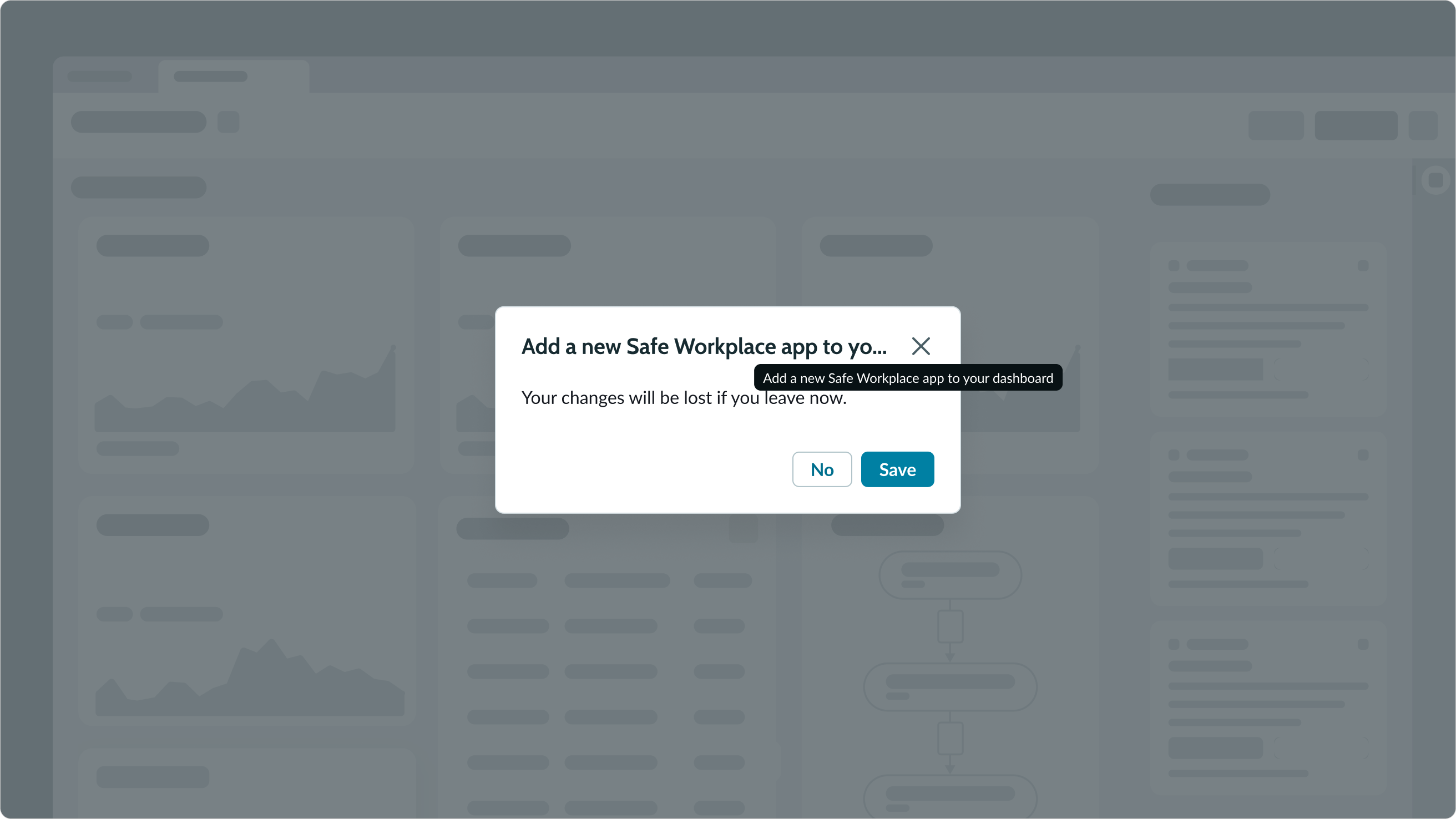
An example of how a truncated modal title appears.
Usability
Modal complies with all internationalization and accessibility requirements.
Internationalization
When the display translates to a right-to-left (RTL) language, the modal content will flip. The close icon appears on the left, and the modal title and content aligns on the right.
Buttons also flip their positioning. The primary button appears on the left and the secondary button is on the right. This group of buttons moves to the bottom left of the container. If there is a third secondary action, it will now be in the bottom-right of the container.
This is an example of how a modal appears for a RTL language.
Accessibility
Learn how to access the actionable elements of modal through keyboard interactions and screen readers.
Keyboard interactions
The default focus is the modal.
You can access the actionable elements of modal with these keyboard keys:
- Tab: Moves focus to the first actionable element within the modal
- Shift + Tab: Moves focus to the element that was previously in focus
- Escape: Closes the modal
Note: An option in the user Preferences menu on the OS sets a tab stop on non-interactive text that truncates in this component, such as a title or label, and makes that text a tooltip trigger. The user presses Enter or the spacebar to open the tooltip and view the entire content. To enable this feature, set the Enable keyboard focus on truncated text option to true in the Accessibility panel of the Preferences menu.
Screen readers
It is recommended that all dialogs should include a visible element with role button that closes the dialog. Therefore, a close icon always remains whether the header is required or optional.