

Anatomy
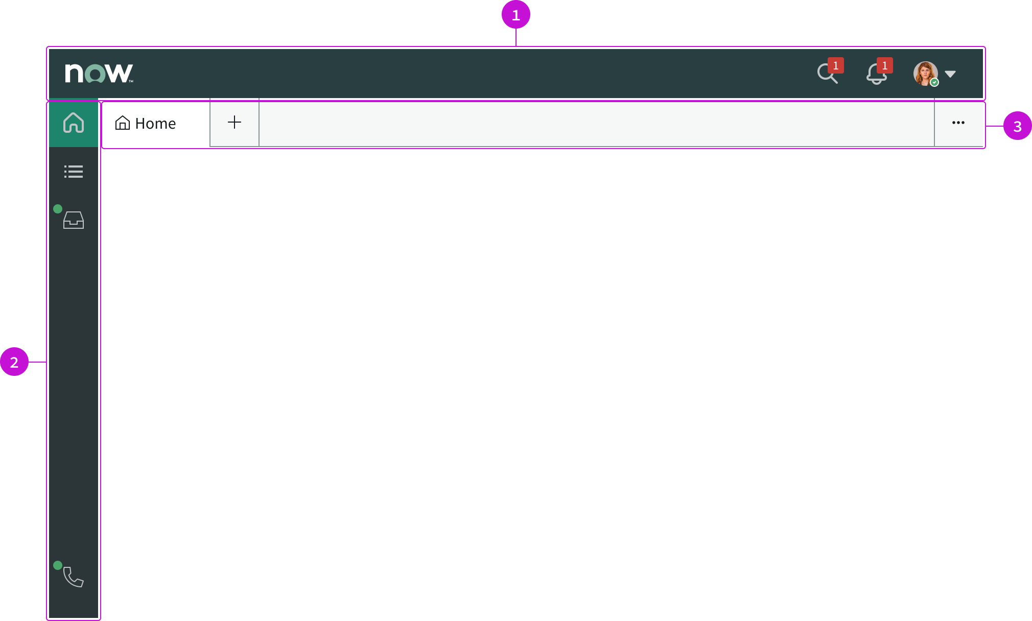
- Experience header: The app shell header; contains the app shell title
- Primary navigation bar: Holds a curated collection of pages, such as a “Landing page” and “Lists”; when selected, the icons open their corresponding pages
- Tab navigation: Parent and child tabs used to gather related items under a single tab for each session
Usage
The Workspace app shell can be used to support multi-tasking, for example, working on multiple records at the same time. You can use this app shell instead of the breadcrumbs app shell to utilize the collapsible menu and tabs.
Components
The Workspace app shell is built with Horizon Design System components that have their own attributes and interactions.
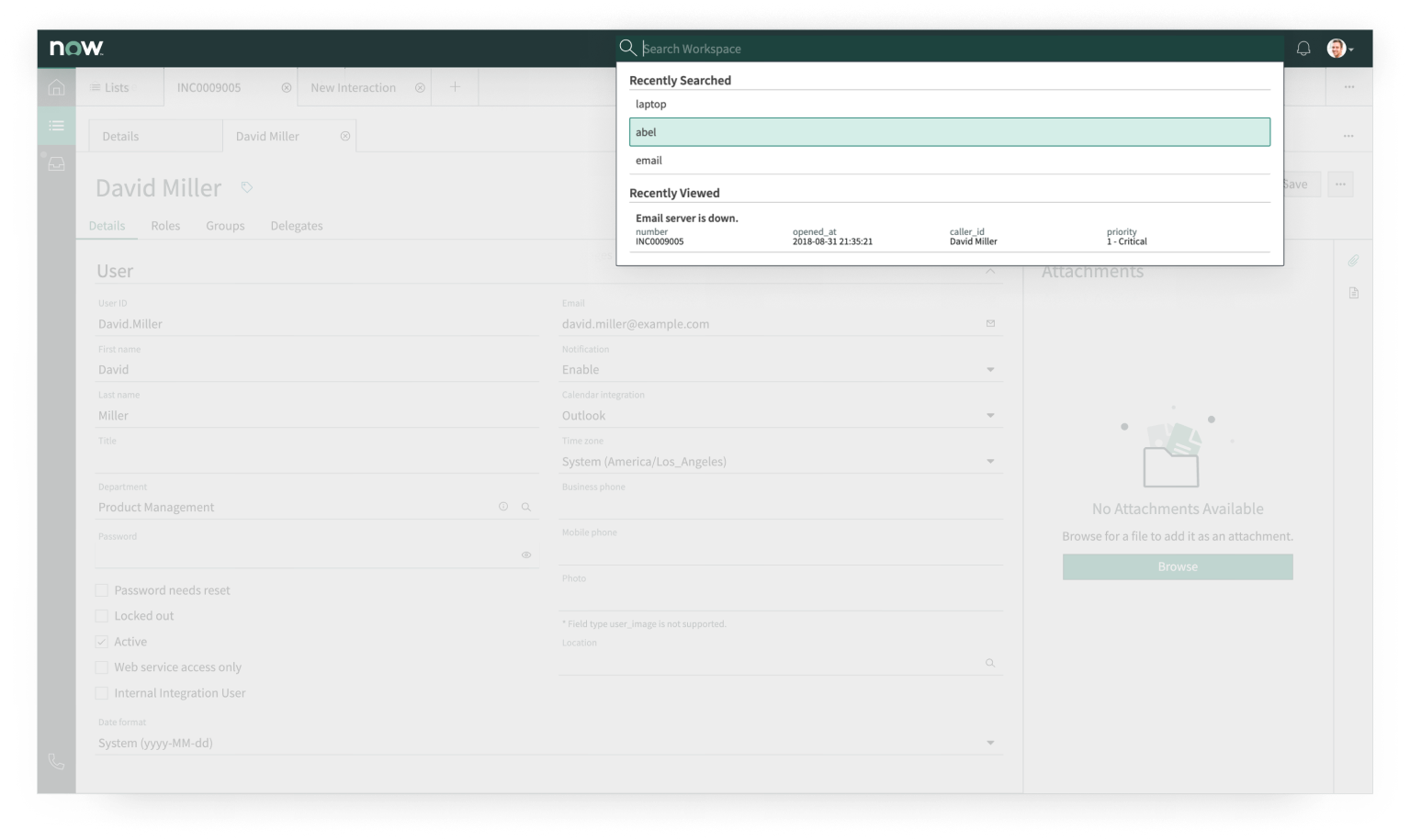
Global search
The global search component enables a user to search across all record types in Workspace.
Interactions and behaviors
- On click, search input expands and search popover is displayed with a “Search All Records” link.
- After the first character is entered, the search popver will display any recently searched terms or recently viewed records (up to 5 each).
- Search popover will display an “exact match” result when searching for a record that matches exactly.
- Selecting the “Search All Records” link in the search popover or using the Enter key will launch the Search Results page in a drilldown breadcrumb, and the search input will remain open. If nothing was typed in the search input and focus moves off the input, the search input will automatically collapse back to just the global search icon.
Defaults
By default the global search component displays these attributes:
- Global search results include Cases, Customers or Users, Now Community Questions, Incidents, Change Requests, Problems, and Knowledge Articles.
- Recent items are stored for 30 days.
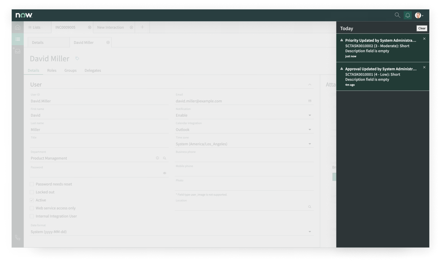
Notifications
This component displays notifications to users when there are updates to important records.
Interactions and behaviors
- Displays a badge with count of unread notifications.
- The badge is removed when the button is clicked and the “notification tray” is opened.
- The notification tray slides out from the right and overlays the page content.
- The tray can contain only 1 notification per record.
- If the same record is updated twice in one day, the first notification is removed with the arrival of the second notification.
- The “notification toast” is a small card that appears over the page content when a new notification is triggered.
Defaults
By default the notifications component displays these attributes:
- Notification toasts are enabled.
- Badge count is enabled.
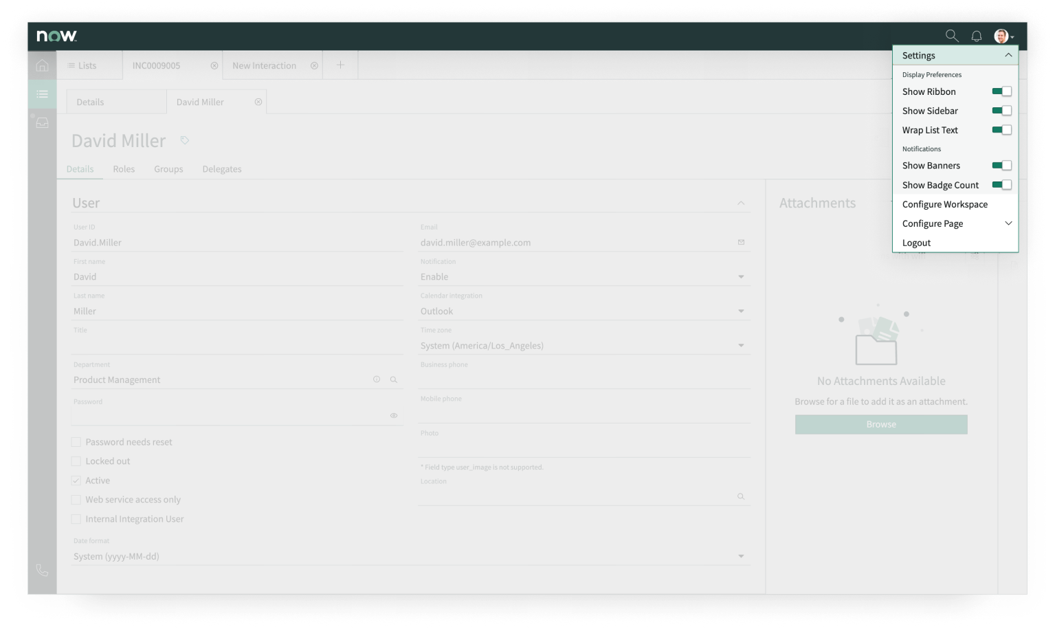
User menu
The user menu provides access to a user’s display preference, notification preferences, and the option to log out.
Interactions and behaviors
- When the user menu icon is selected, the user menu popover appears.
- The settings section of the user menu contains a list of toggleable component display and notification preferences, such as “Show Ribbon,” “Wrap List Text,” and “Show Badge Count.”
- For users with rights to configure Workspace or pages, clicking “Configure Workspace” provides access to UI Builder.
Defaults
By default, all setting preferences in the user menu are set to “on” (toggle pushed to the right and displaying a green fill) except for “Wrap List Text.”
Primary navigation bar
The primary navigation bar holds primary workflows. Workflows are curated collections of pages that correspond to a sequence of activities. Pages that can be added to your primary navigation bar include:
- Landing Page
- Lists
- Channels and Queues
- Schedule
- Teams
- Coaching
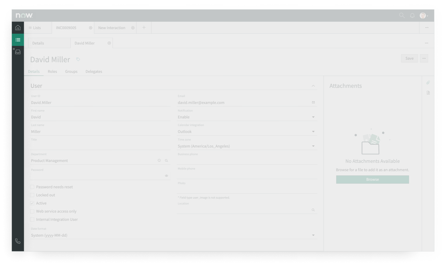
In the image above, the “List” page icon from the primary navigation bar is selected.
Interactions and behaviors
- Selecting any individual page icon in the primary navigation bar launches that page.
Defaults
By default, when the Lists page is opened, the first filtered list is automatically selected.
Inbox
The Inbox panel can be added to the primary navigation bar. When selected, it opens a panel that displays incoming work items, such as chats, cases, and incidents.
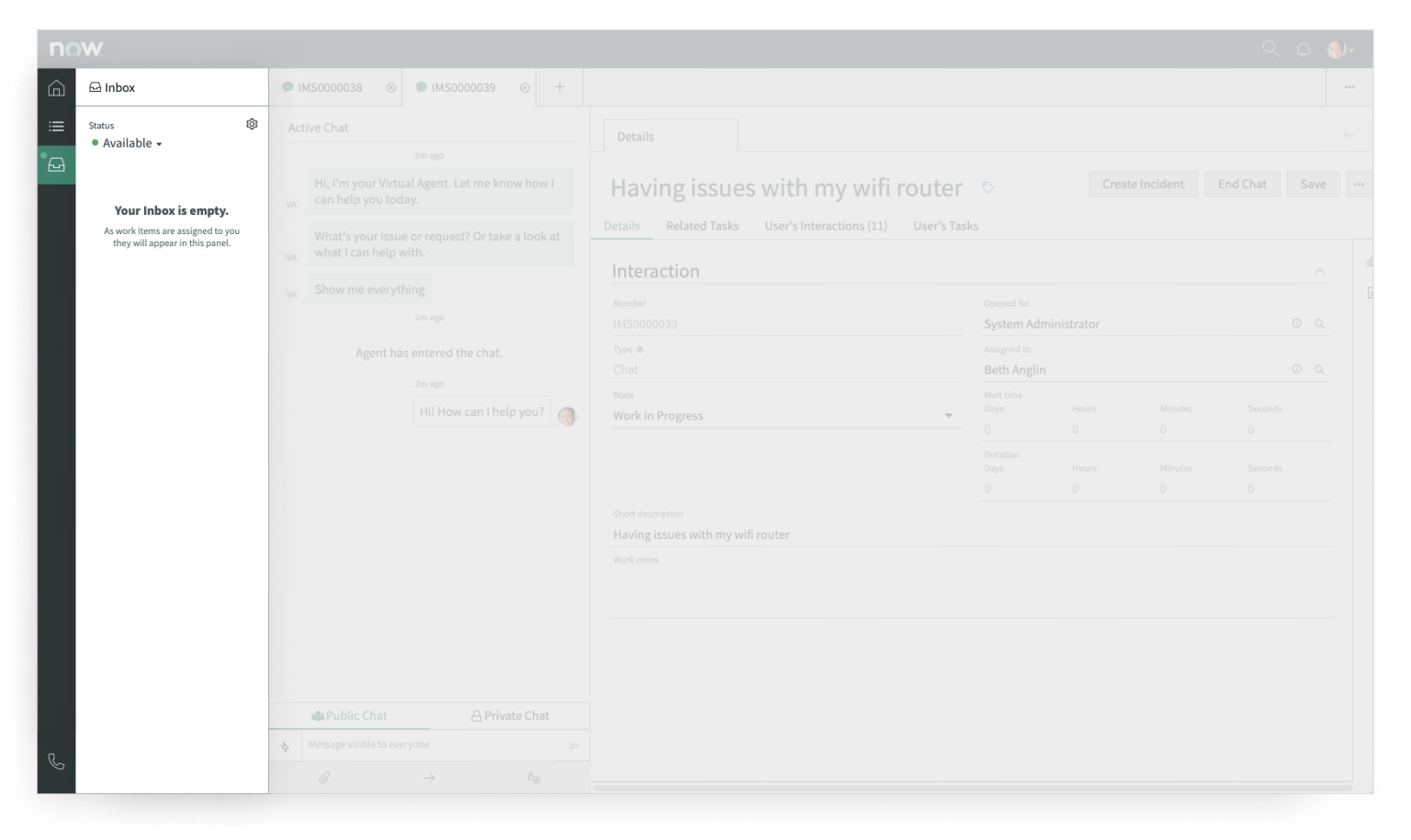
In the image above, the “Inbox” panel icon from the primary navigation bar is selected.
Interactions and behaviors
- The settings icon in the inbox panel enables users to manage their inbox alert preferences.
- Users can indicate their availability using the “Status” field.
- If a user’s status is not set to available, no new chats will appear in the inbox panel.
Defaults
By default, status options include: available, away, and offline.
Call Telephony Integration (CTI)
The CTI utility can be added to the primary navigation bar to enable third party communication. When selected, it opens a popover with call options.
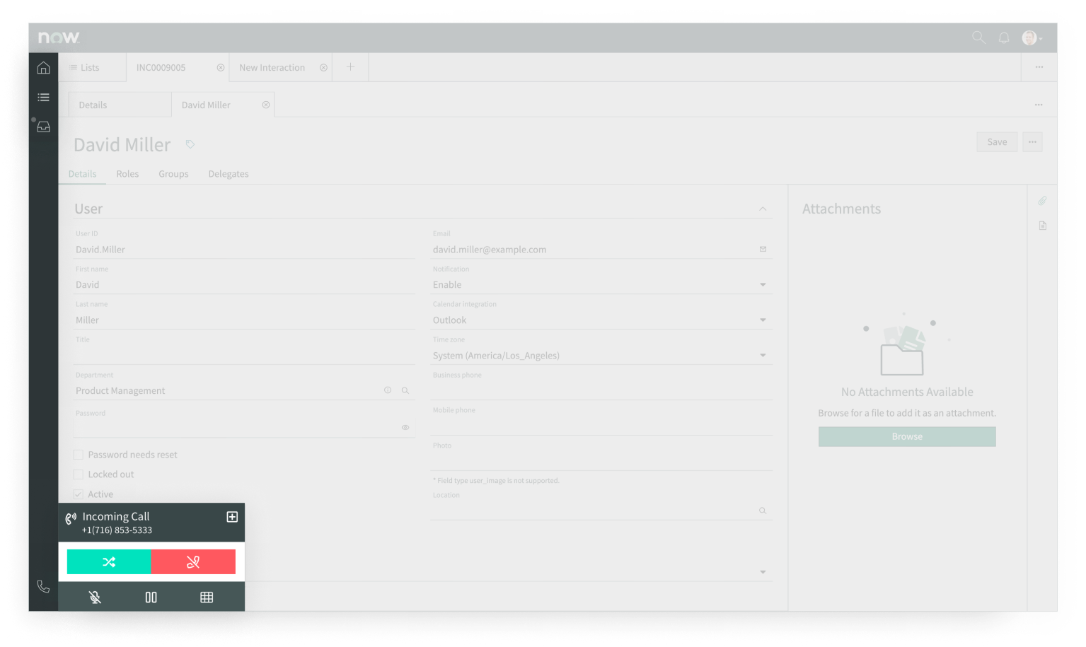
In the image above, the “CTI” panel icon from the primary navigation bar is selected to display a popover with call options.
Interactions and behaviors
- When the user selects the CTI icon, the CTI displays in a popover.
- Selecting the (+) control in the upper right corner will expand the popover. Once expanded, the (-) control will collapse the popover to its smaller state.
- If a user’s status is not set to available, no new chats will appear in the inbox panel.
Defaults
By default the CTI utility displays these attributes:
- Call states include: available, unavailable, busy, and wrap-up.
- The CTI utility is positioned at the bottom of the primary navigation bar.
Tabs
Tabs enable the user to keep multiple pages open at the same time and they appear below the experience header. There are three kinds of tabs: primary tabs, session tabs, and child tabs.
In the image below, “Lists” is a primary tab, “INC0009005” is a session tab, and both “Details” and “David Miller” are child tabs.
Interactions and behaviors
When a page icon from the primary navigation bar is selected, it will open in a tab.
Session tabs are initiated when the user does any of the following:
- Opens a record from a list
- Creates a new record using the (+) tab control
- Accepts a phone call or chat session
- Begins a global search
Child tabs are initiated when the user does any of the following:
- Opens a record from a related list
- Creates a new record from a UI action
- Opens a component in full view, such as Agent Assist
Defaults
By default, the “Details” child tab is always displayed first and cannot be closed.
Configurations
You can toggle the user menu settings to configure your app shell display preferences. You can also add workflows to your primary navigation bar. For more information on creating workflows, see the Create a workflow documentation.
When constructing your pages in UI Builder, consider using page layouts to arrange your components on the page.
Behaviors
App shells don’t have any specific behaviors. However, their subcomponents can have their own behaviors.
For more information on the tab component’s states, responsive behaviors, interactions and truncation behavior:
Usability
The breadcrumb app shell complies with all internationalization and accessibility requirements.
Internationalization
When the Workspace app shell is used in a platform configured for a right-to-left (RTL) language, the subpage links and the separators flip to align to the right.
Accessibility
Learn how to access the actionable elements of the Workspace app shell through keyboard interactions and screen readers.
Keyboard interactions
You can access the actionable elements of Workspace app shell with these keyboard keys:
- Tab: Moves focus to the next element
- Shift + Tab: Moves focus to the previous element
- Enter: Makes a selection on an element
- Shift + control + left arrow/right arrow: Reorders open tabs
When the focus is on the control for the overflow menu:
- Enter: Opens the overflow menu
- Arrow up and Arrow down: Moves focus up and down through the links in the overflow menu
- Enter: Opens the link for an item in the menu
For accessibility behaviors of specific components, see the usage guidelines for those components.