

Anatomy
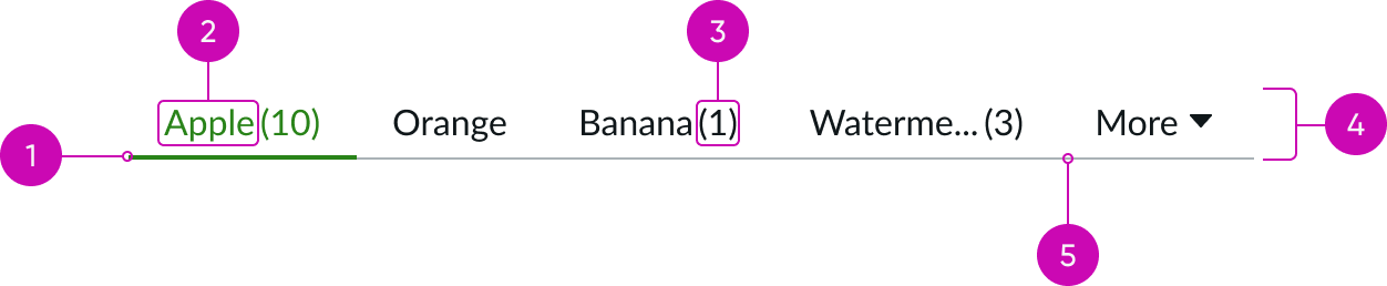
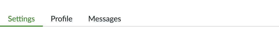
- Selected indicator: Underline that identifies which tab is currently selected; the underline appears under the label
- Label: Text used to identify the associated content; the label can be text, an icon, or both
- Data: Value displayed next to the label; the value is always contained within parentheses
- Container: The designated area for tabs; the width determines when to trigger the overflow ("More" tab)
- Tab base: Visual distinction between the content and tab container
Vertical tabs
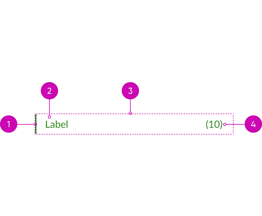
- Selected indicator: Vertical line that identifies which tab is currently selected; it appears to the at the beginning of the label
- Label: Text used to identify the associated content; the label can be text, an icon, or both
- Container: Container that holds all tab content
- Data: Value displayed opposite the label; the value is always contained within parentheses
Subcomponents
See usage guidance for presence icon
Usage
Use tab sets in the main navigation of a product or site to help users identify sections of content at a glance.
Layouts
For in-page layouts, use tabs to help users switch between different groupings of content on the same page. Tabs should always appear on the top of a view layout and not on the side or the bottom of a view layout. Tabs may be oriented flush left or justified to take up the available space, see the responsive section for more details. To indicate user’s current location, the active tab must be highlighted.
Variants
Learn about the variants of tab set.
Sizes
Tab set has two sizes: small (sm) and medium (md).
Small
Use the small size for experiences that have a dense UI and use small variants of texts, icons, and components.

Medium
Medium is the default size for the tab sets component. It is recommended that you use the medium size tabs in Workspace and Portal experiences or for experiences that are not constrained by dense UI and have more space available.

Configurations
Learn how to customize tab sets by configuring the available properties.
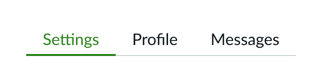
Text
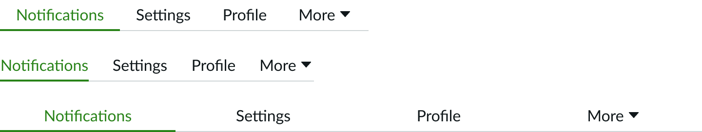
You can label tabs with only text.
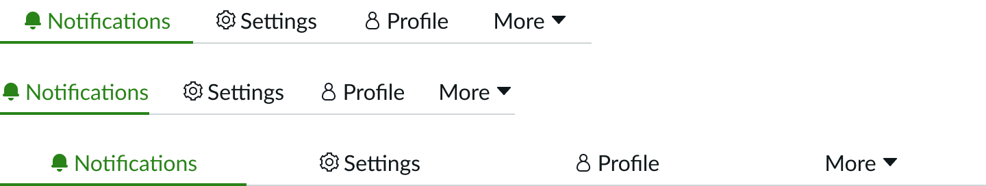
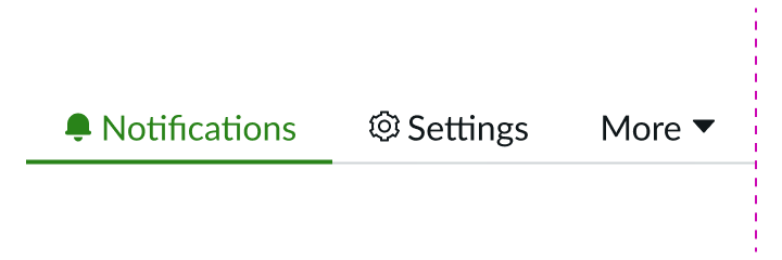
Text with an icon
You can also label tabs with text and an icon to make the tabs more scannable. The one exception is the "More" tab, which won't contain an icon. See the "Responsive behaviors" section for additional clarification.
The presence icon is treated as an icon.
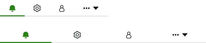
Iconic
You can also label tabs with only an icon. Use this tab type when space is limited in your design. Icons require less translation than text, but different cultures may misinterpret their meaning. Consider the internationalization guidelines before choosing an icon for a tab.
Horizontal tabs
You can configure the maximum width and enable the tabs to be spaced evenly (fixed width) or adjust dynamically. You can also choose to hide the tab base to allow for more white space in your design.

Vertical tabs
You can configure the tab collapsing behaviors and add inline padding to vertical tab buttons.
Design recommendations
Learn how to use tab sets in your design.
All tabs are labeled with text only. Using consistent tab types creates a clean look with equal visual weight.

This design uses all three tab types. This inconsistency creates visual noise and an inaccurate hierarchy.
Ensure there is enough padding around the tab labels to accomodate the longest tab label.
This design doesn’t contain enough padding, so the longest tab label is cut off.

Keep the tab label short and concise.

Don't be over-descriptive with tab labels.
Use dynamic tabs when the parent container is very wide. This visually groups tabs for easy scanning.

Don't use tabs with a fixed width when the parent container is very wide. This creates large tabs and too much space between the labels.
Alignment and positioning
Always position tab sets at the top of the display, and never position them on either the side or the bottom.
UI text guidelines
Consider these recommendations for labeling tab sets:
- Keep text labels short and use fewer than 15 characters (including spaces)
- Use plain language
- Don't add punctuation at the end
- Use sentence case for labels
- Only capitalize the first letter in a string of text; the exception is when you use proper nouns
- Accommodate for text expansion during translation; see the internationalization guidelines
Note: Many existing tabs use title case. The new style is sentence case, so please adjust text labels accordingly.
Behavior
Learn how tab sets behaves when the display changes or a user interacts with the component.
States
Tabs has the following states: default, hover, active, focus, selected, and disabled.
| State | Horizontal | Vertical |
|---|---|---|
| Default |  |
 |
| Hover |  |
 |
| Active |  |
 |
| Focus |  |
 |
| Selected |  |
 |
| Disabled |  |
 |
Responsive behavior
Learn how tab sets responds to changes in a container or display.
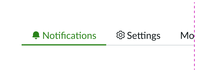
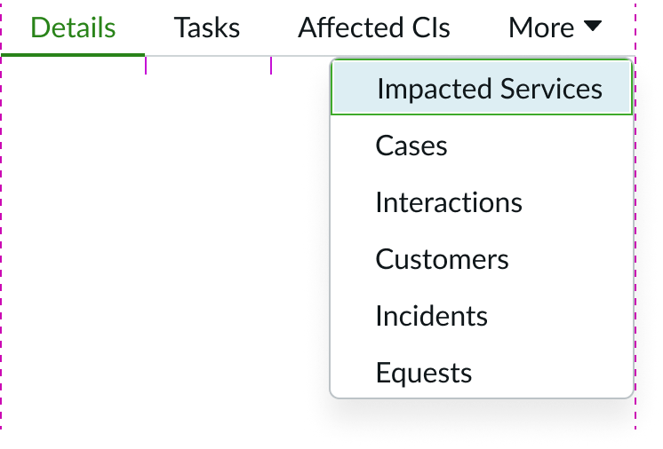
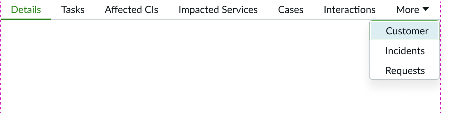
Horizontal tab overflow
In certain circumstances, all available tabs might not fit in the tab container. When this happens, an overflow tab (the "More" option) appears and contains all additional tabs. The overflow menu format mirrors the tab type except for icon-only tabs. The overflow items for icon-only tabs will display the icon with a text label (and not just the icon).
Note: The overflow tab is labeled with text or an icon, but never both.
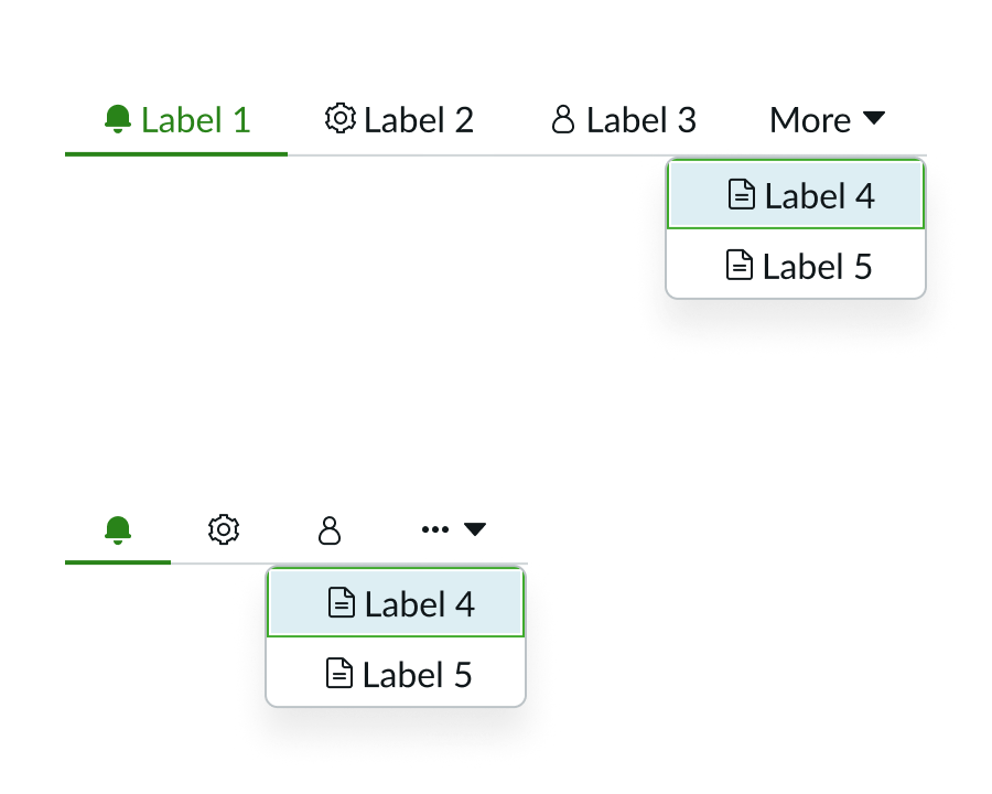
Remember to leave enough space next to the overflow tab so that the longest text label can still appear.
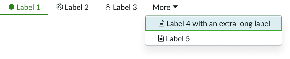
Allow enough space in your design so that the longest list item in the dropdown panel can replace the overflow tab label (the “More” label)
Dynamic overflow alignment
Tabs relocate to the “More” overflow menu as the tab container shrinks in size.

Justified overflow alignment
Starting from the right, tabs relocate one by one to the "More" tab if they don't meet the minimum width requirement.

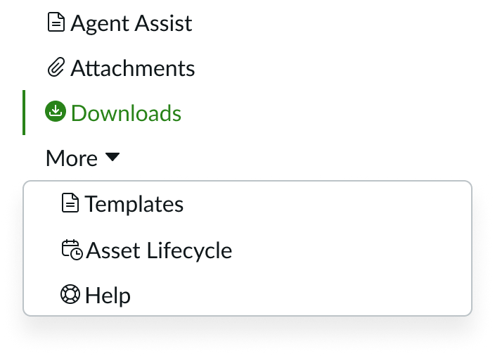
Vertical tabs overflow
When the user selects a tab from the overflow menu, the overflow menu will close and the selected tab will take over the position of the last tab in the tab set.
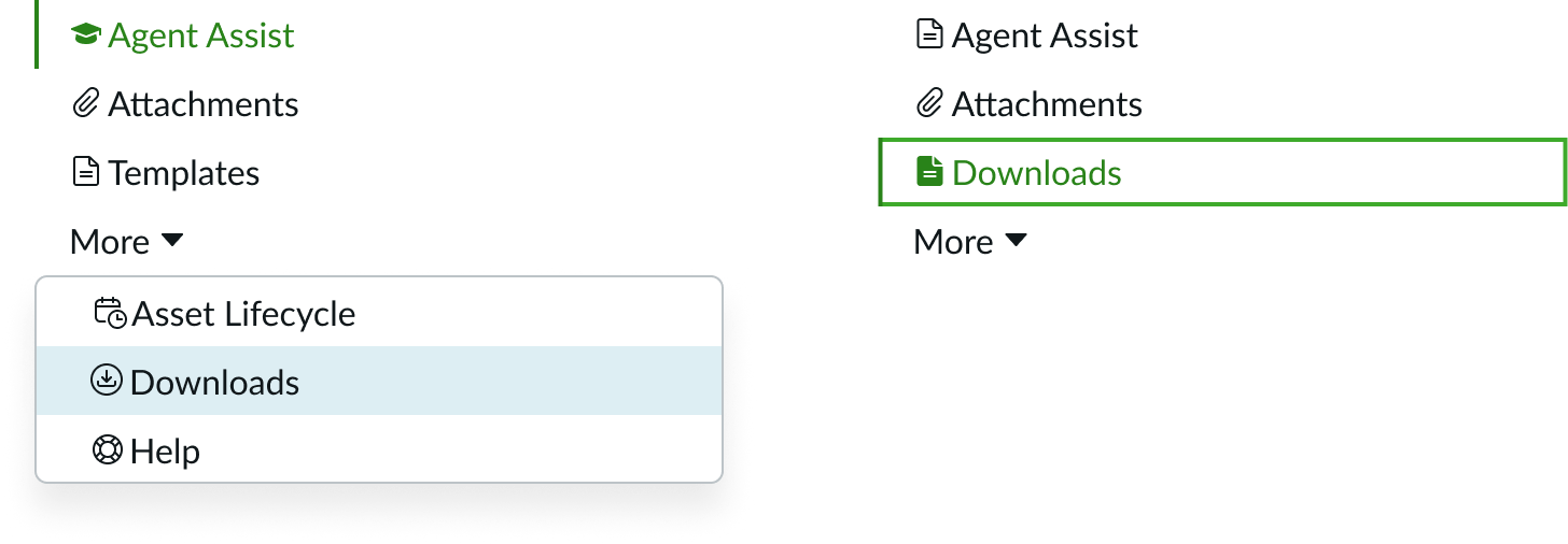
The order of the tabs is maintained within the adjusted overflow menu.
Overflow menu
In certain circumstances, all available tabs might not fit in the tab container. When this happens, an overflow tab (the "More" option) appears and contains all additional tabs. The overflow menu format mirrors the tab type except for iconic tabs. The overflow items for iconic tabs will display the icon with a text label (and not just the icon). The overflow tab is labeled with text or an icon, but never both.

Truncation
If the text label and count are displayed, both are truncated at the same time when the container size shrinks. Once the minimum width is reached for the text label and count, any tab that does not fit within the container width begins moving into the overflow menu. To denote the presence of a count, truncation is not inclusive of the parentheses.
Minimum width of the text label for both md and sm size tabs is 8px (sm).
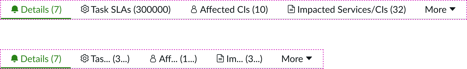
The same truncation behavior occurs when only the count is displayed and the text label is hidden.

Usability
Tabs complies with all internationalization and accessibility requirements.
Internationalization
When the display translates to a right-to-left (RTL) language, the labels and caret flip and align on the right.
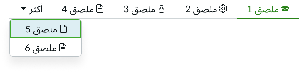
An example of how tabs display in a right-to-left (RTL) language.
Accessibility
Keyboard interactions
- Arrow Keys: The keyboard arrows skip over disabled tabs, but they can still be reached via VoiceOver cursor (which announces them as "dimmed")
- Left Arrow: Moves focus to the previous tab and automatically activates it; if focus is on the first tab, the left arrow moves focus to the last tab (this key cycles through tabs regardless of whether they are in the regular tab list or in the overflow dropdown menu)
- Right Arrow: Moves focus to the next tab and automatically activates it; if focus is on the last tab, the right arrow moves focus to the first tab (this key cycles through the tabs regardless of whether they are in the regular tab list or in the overflow dropdown menu)
- Home: Moves focus to the first non-disabled tab and automatically activates the newly focused tab
- End: Moves focus to the last non-disabled tab and automatically activates the newly focused tab
- Escape: Dismisses the tooltip; focus stays on the triggering element while the tooltip is displayed
- If the tooltip is invoked when the trigger element receives focus, then it is dismissed when it no longer has focus ("onBlur")
- If the tooltip is invoked with "mouseIn," then it is dismissed with "mouseOut"
| Keys | Action |
|---|---|
| Tab | Moves focus to the next interactive element within the list |
| Shift + Tab | Moves focus to the previous interactive element |
| Down arrow key | Moves focus to another playbook |
| Up arrow key | Moves focus to the previous playbook |
| Enter or space | Moves focus to previous interactive element |
ARIA Markup
The element that serves as the container for the set of tabs has the role tab list.
- Each element that serves as a tab has role tab and is contained within the element with role tab list; each element that contains the content panel for a tab has role tab panel
- If the tab list has a visible label, the element with role tab list has
aria-labelledbyset to a value that refers to the labeling element; otherwise, the tab list element has a label provided byaria-label - Each element with role tab has the property
aria-controlsreferring to its associated tab panel element - The active tab element has the state
aria-selectedset to true and all other tab elements have it set to false - Each element with role tab panel has the property
aria-labelledbyreferring to its associated tab element - If a tab element has a pop-up menu, it has the property
aria-haspopupset to either menu or true - The default value of
aria-orientationfor a tab list element is horizontal