

Anatomy
- Container: Area within the card that contains the card actions
- Button: Action or set of actions related to the contents of the card
Subcomponents
See usage guidance for card (header)
See usage guidance for card (footer)
Usage
Use card base actions for any actions associated with a card.
Variants
Learn about the attributes of card base actions.
Types
Card base actions is a subcomponent of the card component.
Variants
Card base actions contain buttons. For further guidance on each type of button variant, review the usage guidance for the button component.
Primary
Use a primary action for the most important action in the card. Only use one primary action per card so that you don't overwhelm the user with choices.

This “Start” button is an example of primary action.
Secondary
Use a secondary action for actions that supplement the primary action. The secondary variant is the default for button.
Additionally, if a primary variant already exists in the action area, use the secondary variant for any other buttons. You can also add secondary actions to the card header or card footer subcomponents.
Tertiary
Use a tertiary action for optional actions. The tertiary action complements the primary and secondary buttons but doesn't visually compete with them.
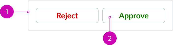
Positive and negative buttons
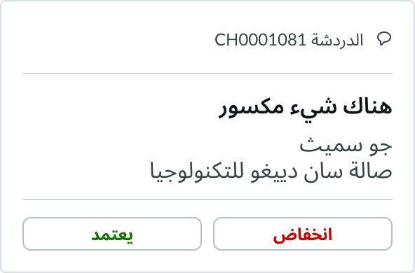
Positive and negative buttons allow a user to accept or confirm an action. Provide a strong contrast between the two decisions to reinforce what action the user is about to take. You can use positive and negative buttons as either primary or secondary actions.
In this example, the buttons use the secondary positive and negative variants in a card.
Configurations
You can either use the predefined layout of the card base actions component or create your own custom layout. For additional configurations on buttons, see button usage guidelines.
Multiple buttons
You can include up to three buttons in the card base actions component. If you have multiple buttons within the card base actions container, the buttons should fill the full width.
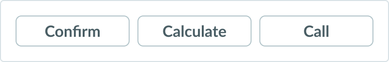
If you need different types of buttons to represent hierarchy, add another card base actions component.
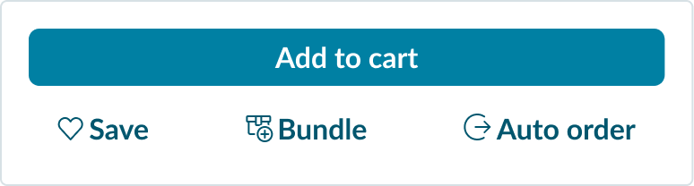
The “Add to Cart” button is the primary action for this card and is in its own container. The additional bare buttons are contained within their own card base actions component.
Design recommendations
Learn how to apply card base actions in your design.
If you want to position a button in the center of the container, it should span the width of the container.

Don't center align a fixed-width button within the action bar.
Alignment and positioning
Learn how to place card base actions and any elements in your design.
Buttons
Position buttons relative to the flow of the content.
UI text guidelines
These are some recommendations for using text within card base actions:
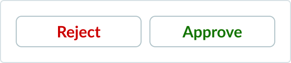
- If you’re including positive and negative actions, the verbs should be opposites
- For example, the buttons could be “Accept” and “Reject”
Behavior
Learn how card base actions behaves when the display changes or a user interacts with the component.
Responsive behavior
If you position a button or toggle to the right or left of the card base actions container, these elements remain in the same position as the display gets smaller.
Usability
Card base actions complies with all internationalization and accessibility requirements.
Internationalization
When the display translates to a right-to-left (RTL) language, the text flips direction. Icons flip only if they indicate direction.
Accessibility
Learn how to access the actionable elements of card base actions through keyboard interactions and screen readers.
Keyboard interactions
To activate a button, select Space or Enter.
After activating the button, focus is set depending on the type of action the button performs:
- If activating the button opens a dialog, the focus moves inside the dialog.
- If activating the button closes a dialog, focus returns to the button that opened the dialog unless the function performed in the dialog context logically leads to a different element; for example, activating a "Cancel" button in a dialog returns focus to the button that opened it.
- If activating the button doesn't dismiss the current context, then focus remains on the button after activation.
- If the button action indicates a context change (such as moving to the next step in a wizard or adding search criteria), then move focus to the starting point for that action.
- If the user activates the button with a shortcut key, the focus remains in the context from which the shortcut key was activated.
Screen readers
The ARIA role for the card base actions component is button, and the button has an accessible label.
- By default, the accessible name is computed from any text content inside the button element; however, it can also be provided the
aria-labelproperty. - If the button is a toggle button, it has an
aria-pressedstate.