

Anatomy
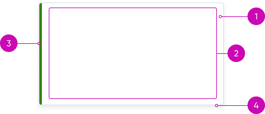
- Card container: Wrapper for the content slot
- Content slot: Space for card subcomponents, other subcomponents, and custom content
- Sidebar (optional): Colored bar that helps categorize or emphasize the card status or importance
- Shadow (optional): Drop shadow is displayed by default to increase attention but can be hidden
Subcomponents
You can add card subcomponents to the card. For information on how to use these subcomponents, see their individual usage guidance.
Usage
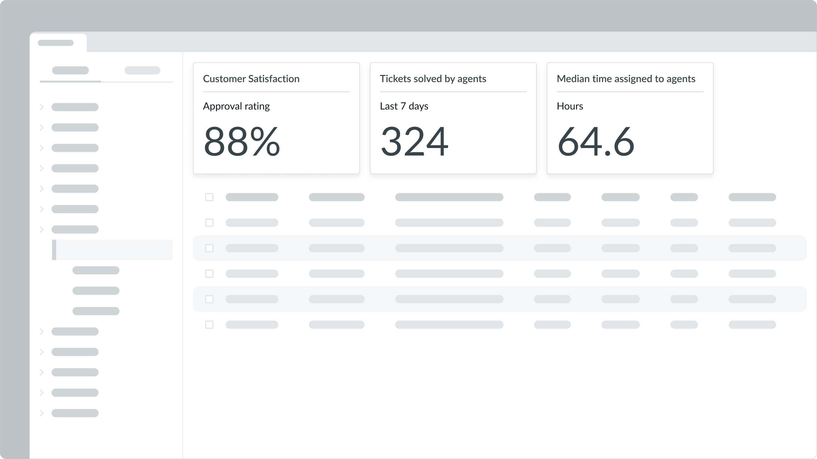
Use a card to help the user make a decision or quickly view information. You can use a card container on a dashboard to display widgets and components to provide a user with information and access to content.
Complete a task
You can also use a card to summarize information and provide the user with access to navigation options or actions.
Compare information
Use cards to help the user compare content. This is especially helpful when they're organized in a grid format.
Emphasize specific content
Use a card when you want to differentiate a piece of content from the rest of the display.
Increase scannability
Use cards to help users see information at a glance. When cards are formatted the same way, the user knows what type of information to expect.
Identify similar content
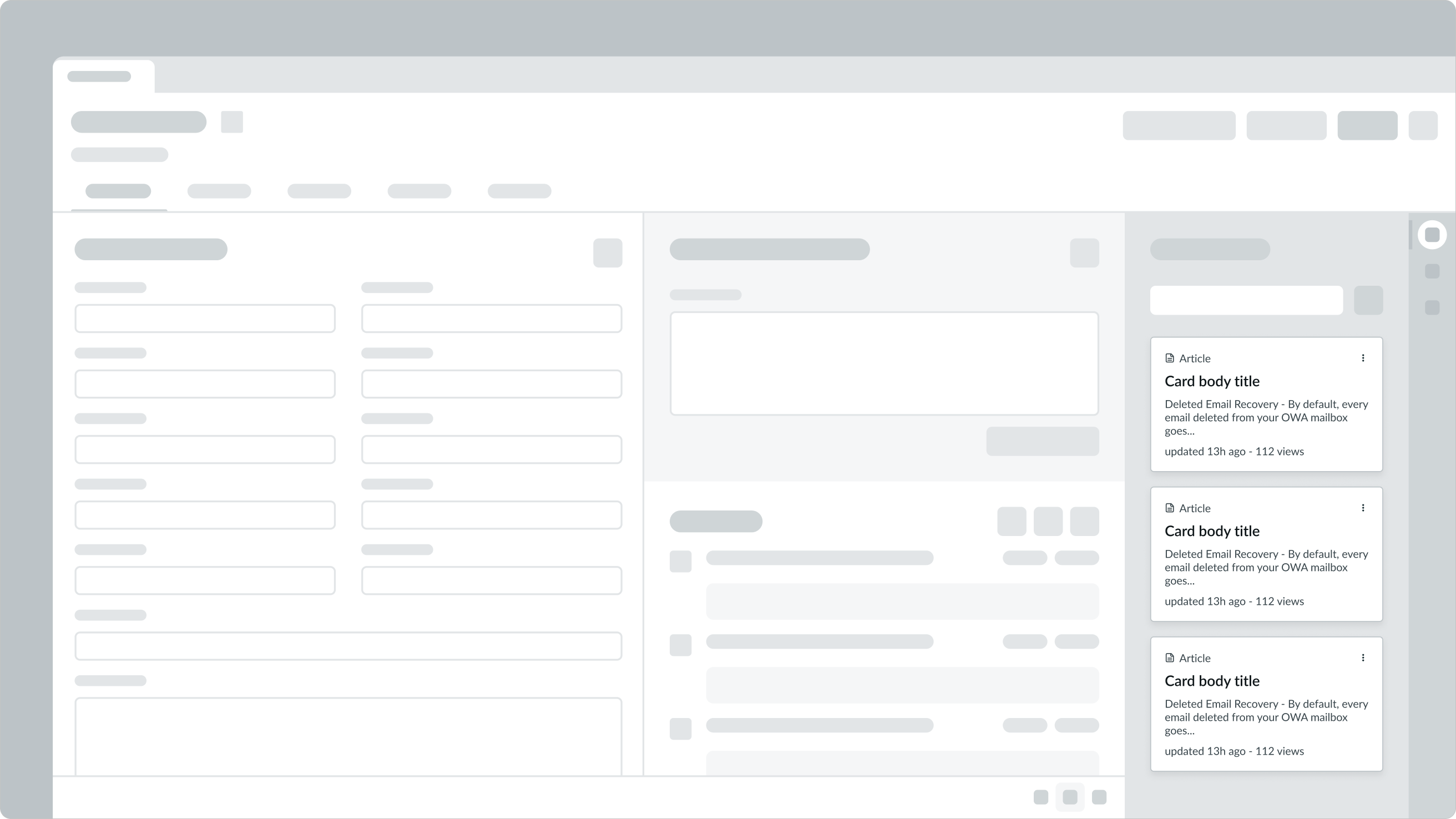
Use a colored sidebar on a card to visually categorize cards. This can help a user identify similar cards more quickly.
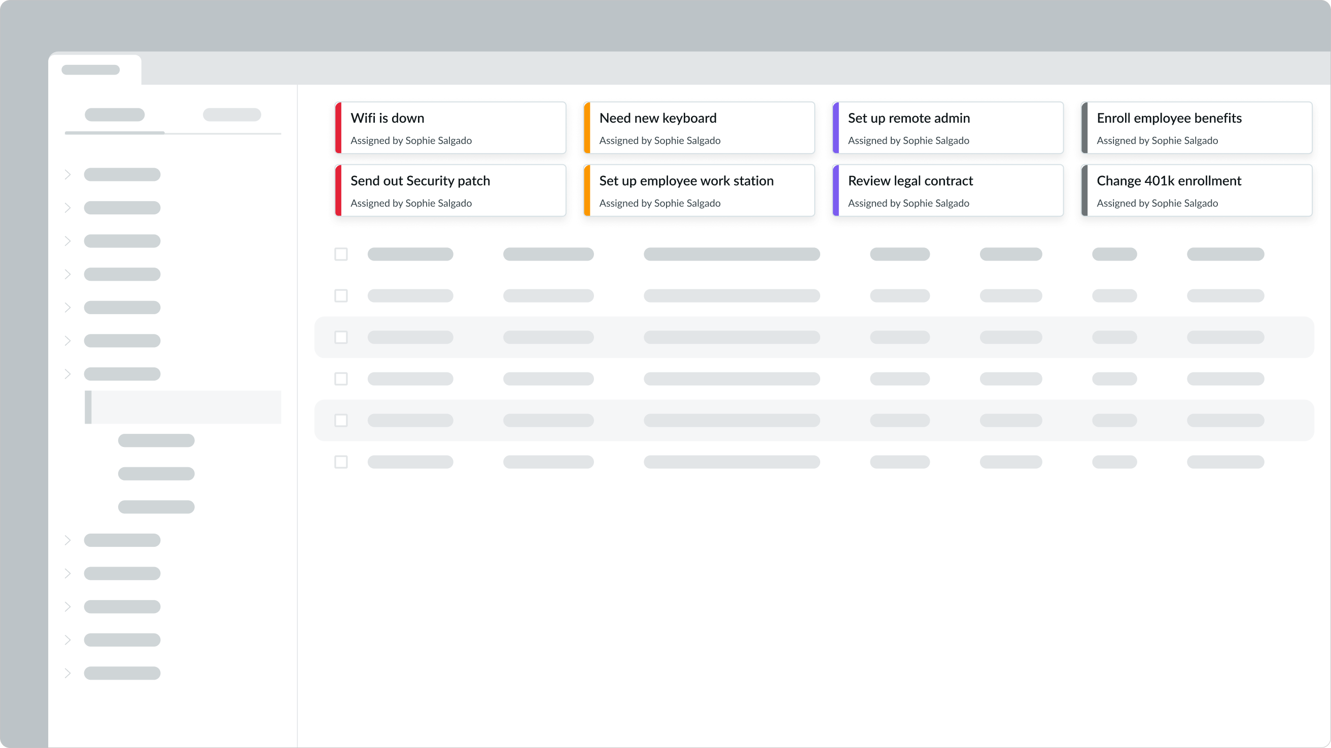
In this example, the sidebar colors help the user identify which cards are a priority.
Variants
Learn about the variants of card.
Initial
Use the initial variant as the default, neutral style for the card container.
Initial variant applied to the card container.
AI
Use the AI variant with updated color palettes for AI-driven workflows. The AI variant can be applied to the card container, the sidebar, or both.

AI variant applied to the card container and sidebar.
Sidebar variants
Pair the primary, secondary, or tertiary styles with any supported sidebar color to visually group and differentiate cards.
Primary
Use the primary variant on the sidebar to provide the strongest visual emphasis when the card contains the most important information on the page.

Primary variant applied to a Warning type of card.
Secondary
Use the secondary variant on the sidebar to provide moderate emphasis for cards that support the primary content, but are not the main focus.

Secondary variant applied to a Warning type of card.
Tertiary
Use the tertiary variant on the sidebar for low-emphasis content that remains visible but does not compete with higher-priority elements on the page.

Tertiary variant applied to a Warning type of card.
Configurations
Learn how to customize card by configuring the available properties.
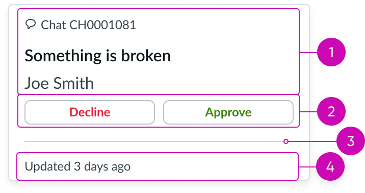
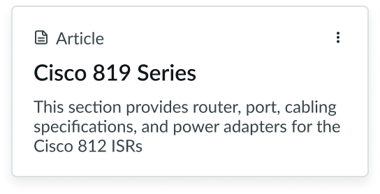
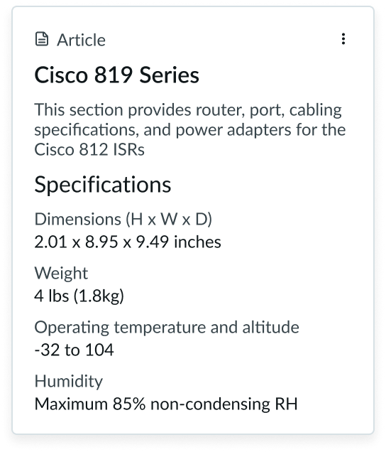
Content slot
The card component has a content slot to organize the card subcomponents and additional content not included within the card header, card action, and card footer subcomponents.
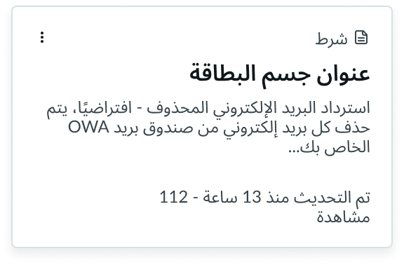
In this example, a series of label-value pairs appear in the content slot under the card header subcomponent.
You can configure these subcomponents within the content slot based on your individual use case.
Sidebar
The sidebar provides a way to visually identify a card, especially when the card appears alongside other cards.
In this example, the blue sidebar indicates that the card is an incident.
The available sidebar colors are the same status and category colors used for the highlighted value component. See the highlighted value usage for guidance on color and variants.
To provide additional context to the user, use a highlighted value with the same color as the sidebar. For example, you can add highlighted value that includes article types (like troubleshooting, information security, or travel policy) to a card categorized as an "article."
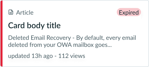
In this example, the red sidebar color matches the same color as the highlighted value with the 'Expired' label to emphasize the status of the card.
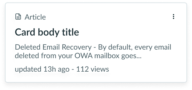
Shadow
The card component displays a dropshadow by default. You can configure the card to hide the dropshadow.
The dropshadow appears on a card by default.
In this example, the drop shadow is hidden in the card.
Design recommendations
Learn how to apply card in your design.
Cards should only show concise snippets of information.
Don’t display too much content in a card. This makes it challenging for users to find information.

Card actions should be simple and direct.
Don't provide the user with too many actions within a card.
Alignment and positioning
When positioning content in the card, use padding to group the different types of content. Adding padding can also help determine content hierarchy in a card. There are 3 sizes for padding: small (sm), medium (md), and large (lg). You can apply the vertical padding in different areas within the content slot.
Small
Use the small padding size with a small font size or to keep the card content compact.
Medium
Use the medium padding size with a medium font size, to visually group content, or to help improve the content's readability.
Large
Use the large size with a large font size or to provide more whitespace within a card. Additional whitespace can help users better identify content in a card, especially when cards are positioned next to each other. Large is the default size for padding.
Behavior
Learn how card behaves when the display changes or a user interacts with the component.
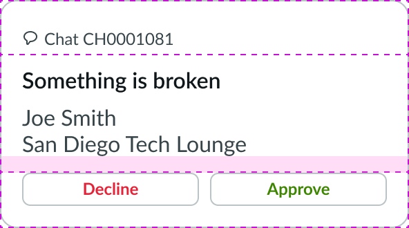
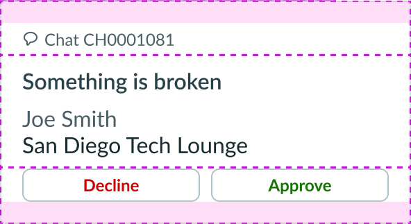
States
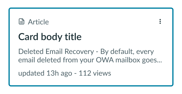
The card component has the following states: default, hover, pressed, and selected.
| State | Dropshadow ON | Dropshadow OFF |
|---|---|---|
| Default | 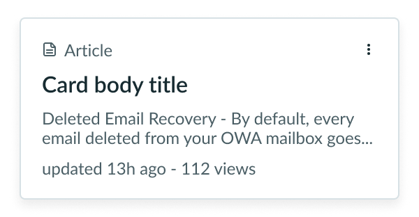 |
 |
| Hover |  |
 |
| Pressed |  |
 |
| Selected | 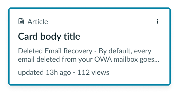 |
 |
Interactions
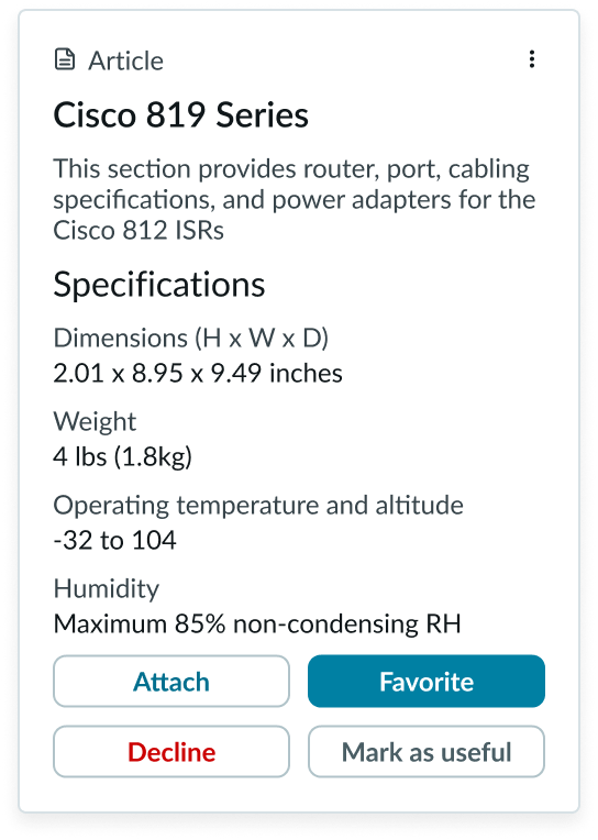
Many interactive and actionable elements can be located within the subcomponents of a card. However, you can also apply specific interactions to the card container.
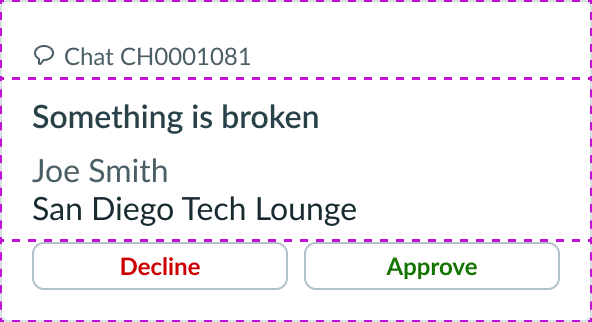
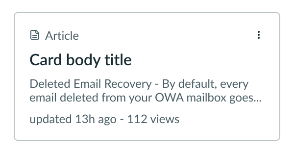
None
The user can't interact with the card container but can still interact with the card actions.

In this example, the card container has no interactions, but the user can still interact with the card actions.
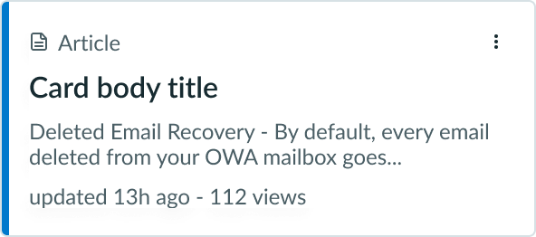
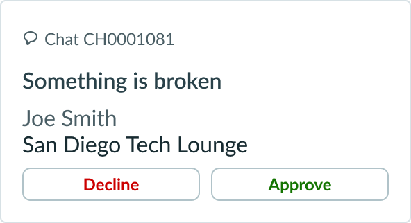
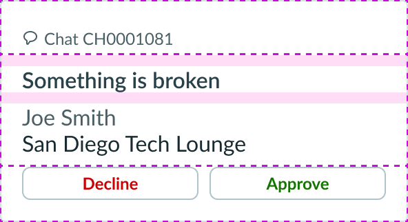
Click
The user can click the card to initiate an event. The event performs an action you have configured.
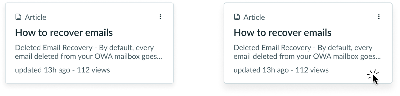
In this example, clicking the card triggers a configured action, such as opening an article.
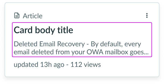
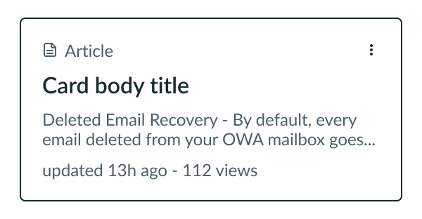
Select
The user can select the card to initiate an event. The event performs an action you have configured and the card changes to the selected state.
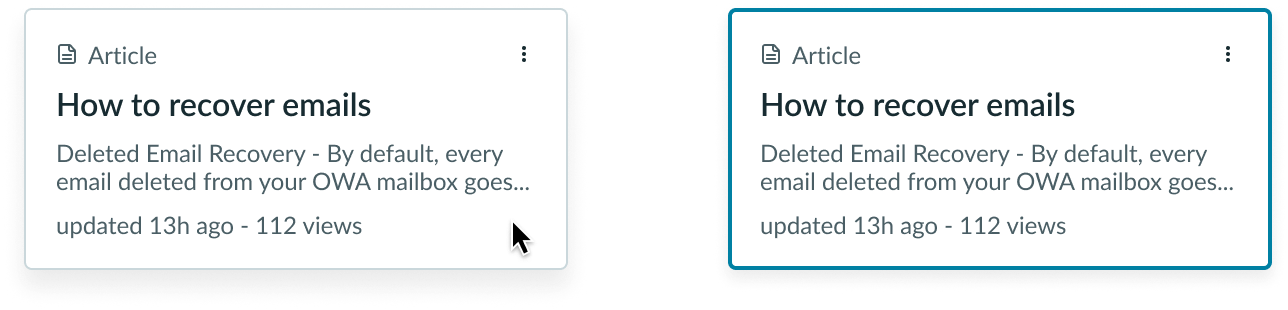
In this example, the card on the left has not been selected. The card on the right has been selected and has a selection interaction applied to it.
Truncation
When text in a card exceeds the width of the container or content area, the text truncates with an ellipsis, and a tooltip shows the full content on hover.
Usability
Card complies with all internationalization and accessibility requirements.
Internationalization
When the display translates to a right-to-left (RTL) language, the content flips and aligns to the right side of the card.
Accessibility
Learn how to access the actionable elements of card through keyboard interactions and screen readers.
Forced colors
Only the card border and face can be styled with forced colors for each state. The contents of the card can’t be styled to match the state.
Keyboard interactions
You can access the actionable elements of card with these keyboard keys:
- Tab: Moves focus to a card only when the card has a click or select interaction applied to it
- Enter or Space: Launches the click or select state on a card