

Anatomy
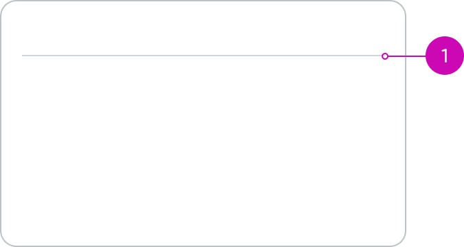
- Divider: Horizontal line that separates content or card subcomponents
Subcomponents
Usage
Use a card divider to separate information so that the user can easily scan a card component.
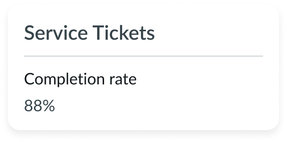
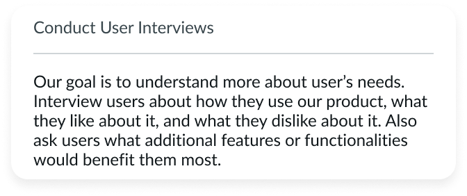
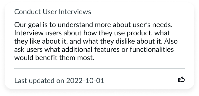
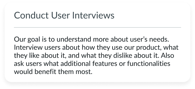
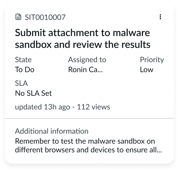
In this example, the card divider separates the title and main content of a widget.
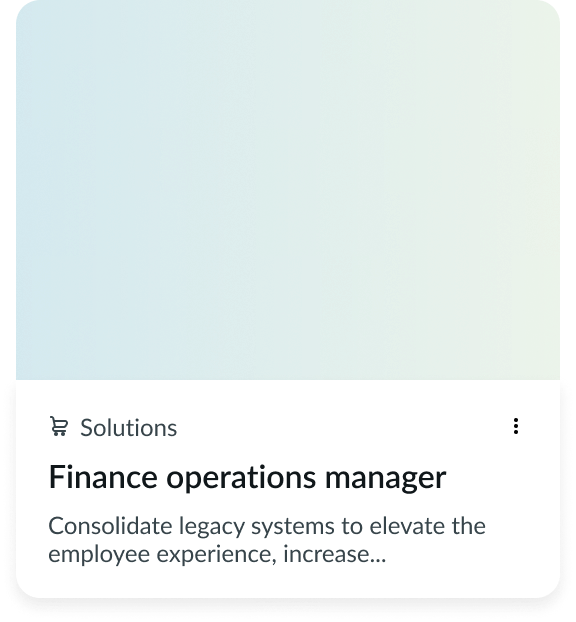
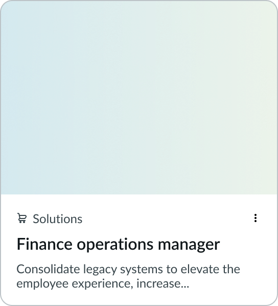
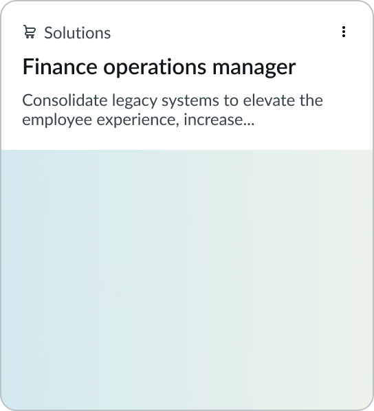
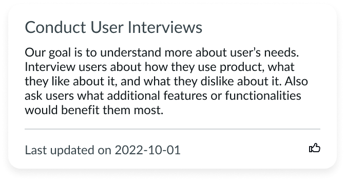
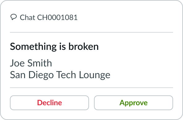
In this example, the card divider separates text and visual imagery.
Configurations
Learn how to customize card divider by configuring the available properties.
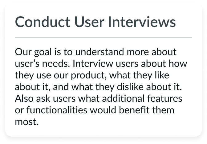
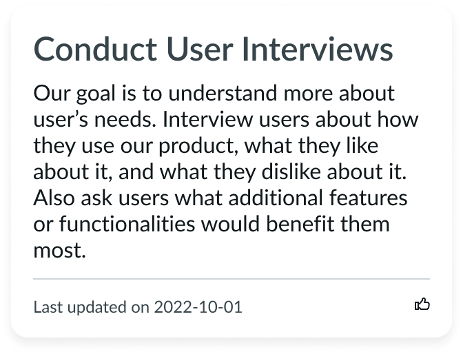
Full width
You can configure whether the card divider extends to the full width of the card.
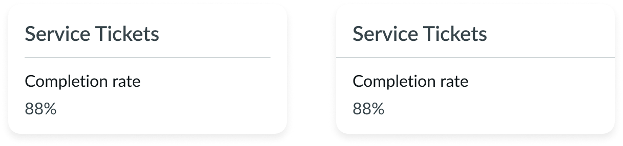
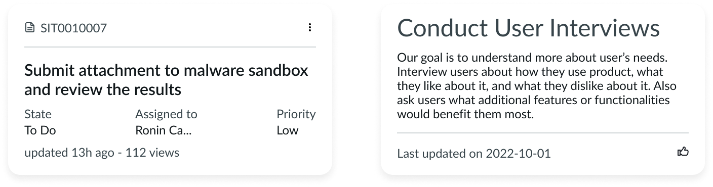
The example on the left shows a divider that is not full width, while the example on the right shows a full-width divider.
Spacing
You can configure the amount of spacing between the divider and other content. The size you choose depends on your use case and the font size you use. The card divider has the following spacing options: none, small (sm), medium (md), and large (lg).
None
Use no spacing when you're including a card divider above or underneath an image.
Small
Use the small spacing with a small font size or when you want to keep the card compact.
Medium
Use the medium spacing with a medium font size or when the content requires more visual separation for better readability.
Large
Use the large spacing with a large font size or to provide the card component with more whitespace. This can help improve readability if there is a lot of content on the card. The large size is the default spacing for card divider.
Design recommendations
Learn how to apply the card divider correctly in your design.
Use a single divider per card to separate visually similar items with different content.
Don't use multiple dividers to visually separate a card when unnecessary. This can create visual noise.
Alignment and positioning
You can position the card divider anywhere within the card.
The divider appears in different positions in each example. The divider helps to visually separate the contents in the card in both examples.
Behavior
Card divider doesn’t respond to external changes or to user interactions.
Usability
Card divider doesn’t have any specific accessibility or internationalization requirements.