

Anatomy
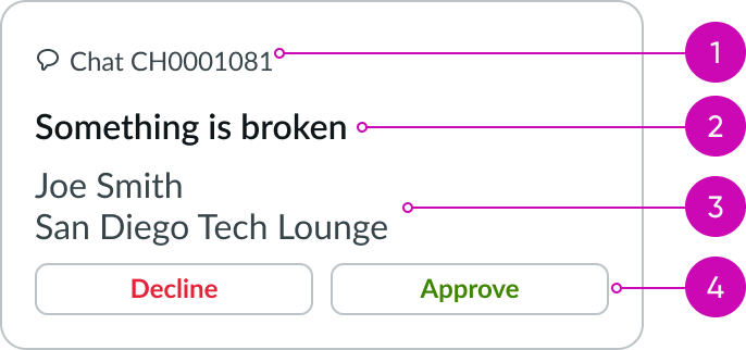
- Tagline: String that identifies the card type; includes an optional icon
- Heading label: Text label with a fixed style
- Content slot (optional): Container for label-value pairs (stacked)
- Actions: Area that contains buttons to let users engage with the card
Subcomponents
See usage guidance for label-value pair (stacked)
Usage
Learn about omnichannel template card and find out how to use it in your design.
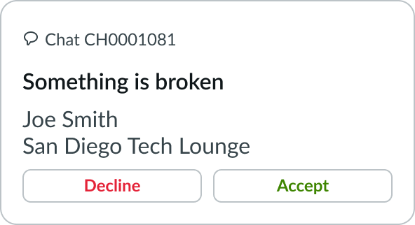
Use the omnichannel template card when you want the user to take an action on an object, like accepting or declining an event.
Configurations
The omnichannel template card is a predefined set of assembled card subcomponents with set styles. The content slot has label-value pairs (stacked) within it. Use these pairs to provide the user with additional context.
The action area has buttons within it. Use these buttons to provide the user with yes and no options. You can change the variant of the buttons to fit your use case.
If the default configuration doesn't meet your needs, you can build a custom card using the card component and its subcomponents.
Design recommendations
Learn how to apply omnichannel template card in your design.
UI text guidelines
These are some recommendations for using text within omnichannel template card:
- Keep the tagline short and simple to categorize different card types
- For example, a tagline could be, “Request” to categorize different tasks
- If you’re using an identifier with the tagline, the icon should make sense with label
- Keep the heading label and caption short so that it fits in the allotted space and so that persons can scan it
- The button labels should be clear and distinct from each other. Start each label with a verb to describe an action and to set an expectation of what happens if the person selects it
- Because the component is flexible and can contain different types of content in the content slot, follow the writing tips for creating UI text
Behavior
Learn how omnichannel template card behaves when the display changes or a user interacts with the component.
Interactions
The user can't select the omnichannel template card. The component only offers the user a polar question, where the options are to either accept or decline an object.
Usability
Omnichannel template card complies with all internationalization and accessibility requirements.
Internationalization
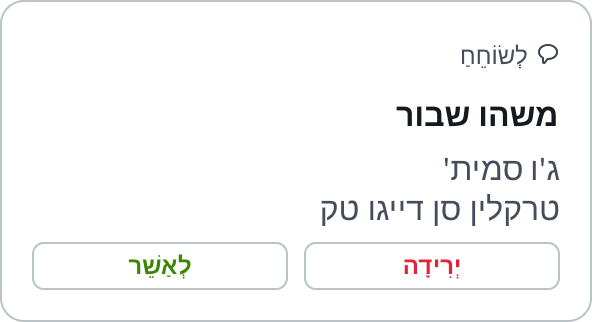
When the display translates to a right-to-left (RTL) language, the labels and values display from right-to-left and align from the right.
Accessibility
Learn how to access the actionable elements of omnichannel template card through keyboard interactions.
Keyboard interactions
- Tab: Shifts focus to the buttons
- Enter or Space: Launches the button action
Screen readers
Use of headings in omnichannel template cards structures content and aids screen readers with navigation.