

Anatomy
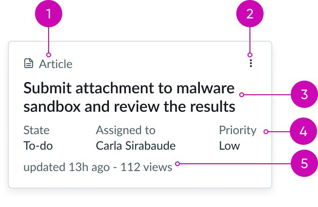
- Tagline: String that identifies the record type; includes an optional icon
- Action: Dropdown menu that contains the record actions
- Heading label: Text that explains the card
- Content slot (optional): Container for label-value pair (stacked) components
- Card footer: Container for a label-value pair (inline) component
Subcomponents
See usage guidance for label-value pair (inline)
See usage guidance for label-value pair (stacked)
Usage
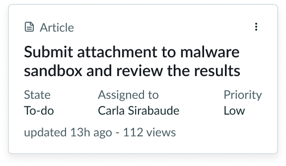
Use the assist template card to summarize an assist record. The assist template card also uses a label-value pair (inline) component in the card footer to display either secondary or tertiary information.
Configurations
The assist template card uses label-value pairs (stacked) in the content slot. You can add as many label-value pairs as you need and customize them based on your data set. If the default configuration doesn't meet your needs, you can build a custom card using the card component and its subcomponents.
Behavior
Learn how assist template card behaves when the display changes or a user interacts with the component.
Responsive behaviors
You can manually set the minimum width of the content area to define when the label-value pairs will wrap to a new line.
Interactions
Card selection
Unlike the card component, the assist template card only has a select interaction that can't be removed. The select interaction allows the user to select the card but doesn't trigger an action.
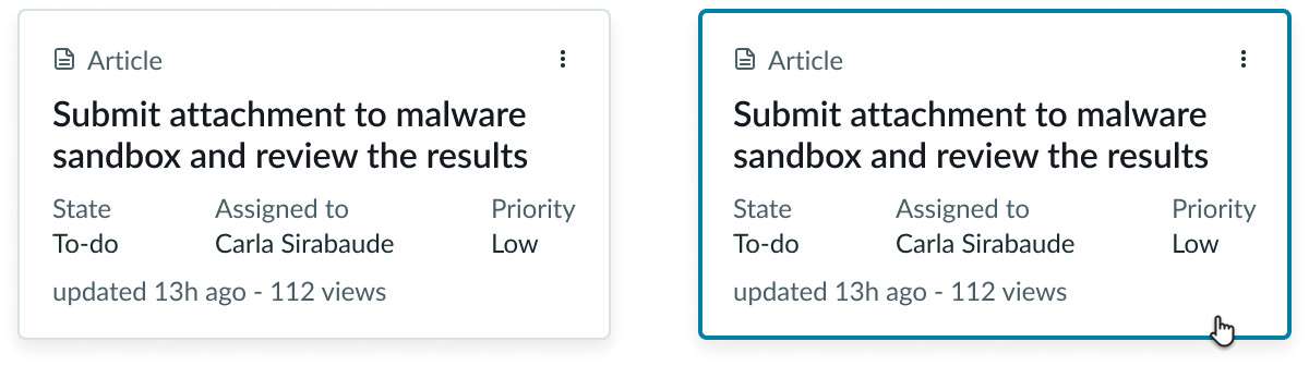
This example shows the assist template card in the default state and the selected state.
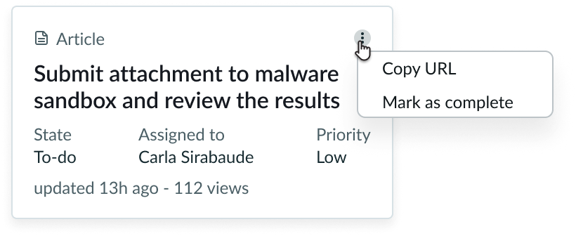
Card header action
Clicking on the card header action opens a dropdown menu with overflow actions.
Usability
Assist template card complies with all internationalization and accessibility requirements.
Internationalization
When the display translates to a right-to-left (RTL) language, the content aligns from the right.

Accessibility
Learn how to access the actionable elements of assist template card through keyboard interactions.
Keyboard interactions
- Tab: Shifts focus to the assist template card; when the card is in focus, it shifts the focus to the overflow menu
- Enter or Space: If the focus is on the overflow menu, it opens that menu; if the focus is on an action in the overflow menu, it launches that action
Screen readers
Header tags create structure for your content and provide screen readers with in-page navigation. For assist template card, remember to assign a header tag to the heading label. This helps define the component's importance in your display.