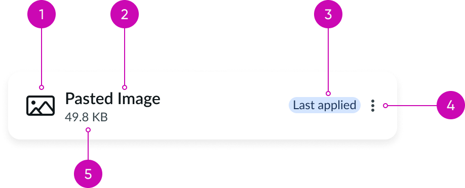
Anatomy

- Identifier (optional): An icon or image that visually represents the attachment
- Heading label: Text that describes the attachment
- Metadata slot (optional): Container for metadata such as a badge, highlighted-value, or string. Displayed after the heading and before the actions.
- Action (optional): Actions related to the attachment that appear in the dropdown menu
- Caption: A customizable text label that provides context for the attachment (like file size)
Usage
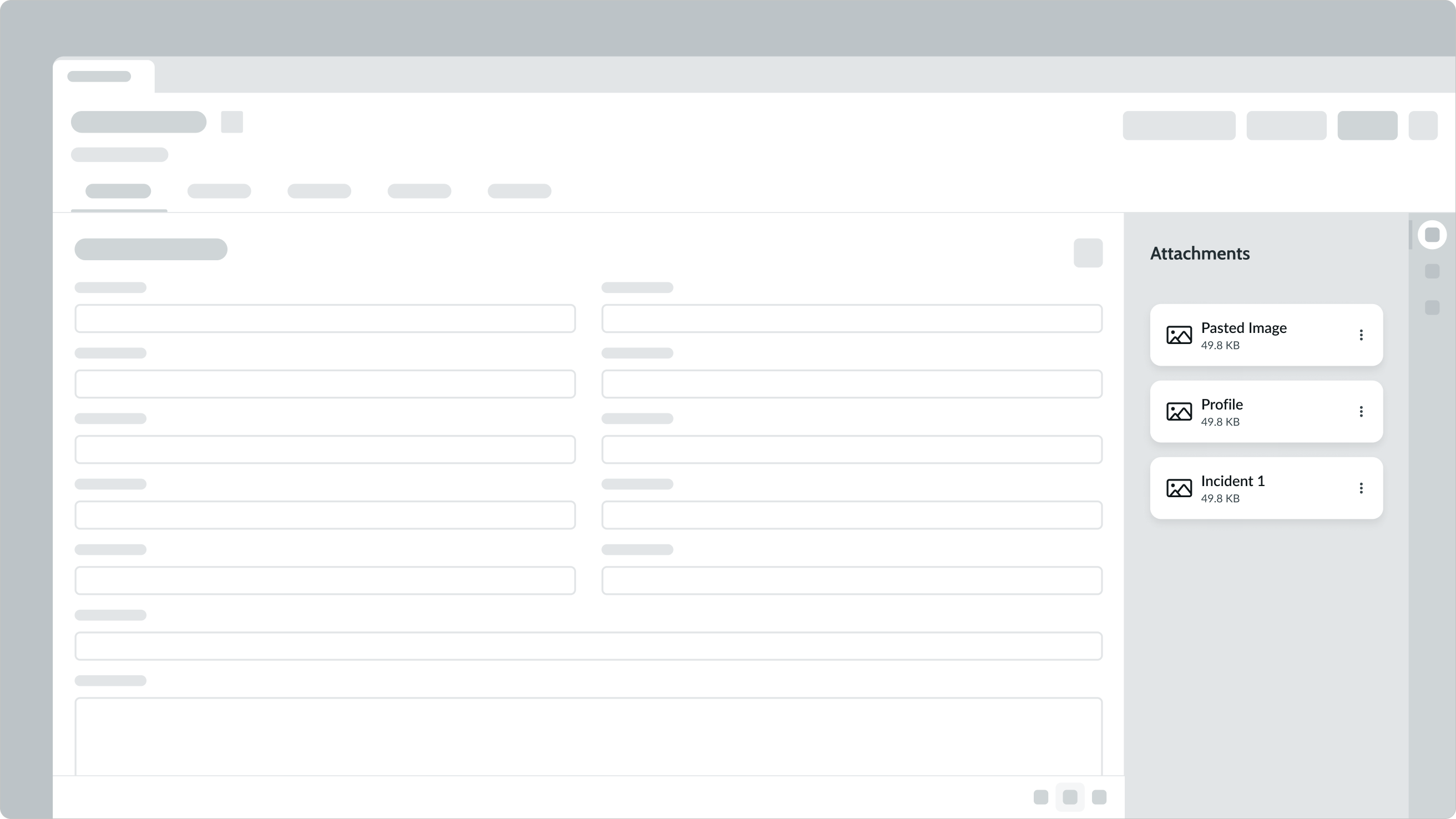
Use template card attachments to show that a file either is or can be added to a record.

Configurations
The template card attachment is a predefined set of assembled card subcomponents with set styles. If the default configuration doesn't meet your needs, you can build a custom card using the card component and its subcomponents.
Design recommendations
Learn how to apply template card attachment in your design.

Display single actions on the card itself, but use the overflow menu for multiple actions. If you have a single action, build a custom attachment card.

Don't place a single action in the dropdown menu.
UI text guidelines
These are some recommendations for using text within template card attachment:
- Keep the heading label and caption short so that they fit in the allotted space and so that people can scan them
Behavior
Learn how template card attachment behaves when the display changes or a user interacts with the component.
Interactions
Template card attachment contains the same interactions as card: none, click, or select. By default the interaction for template card attachment is set to none. For more details on interaction types,
Truncation
If the heading label or caption extends beyond the container width, the text truncates with an ellipsis and a tooltip displays the full text.
Usability
Template card attachment complies with all internationalization and accessibility requirements.
Internationalization
When the display translates to a right-to-left (RTL) language, the labels and values display from right-to-left and align on the right, and any actions will appear on the left.

Accessibility
Learn how to access the actionable elements of template card attachment through keyboard interactions and screen readers.
Keyboard interactions
- Tab: Shifts focus to the template card attachment; if the template card attachment is in focus, it shifts the focus to the action area
- Enter or Space: If the focus is on the action area, it opens that menu; if the focus is on an action, it launches that action
Screen readers
Header tags create structure for your content and provide screen readers with in-page navigation. This helps define the component's location and importance in your display.

