

Anatomy
Learn about the parts of the activity picker and display options.
Dropdown activity list anatomy
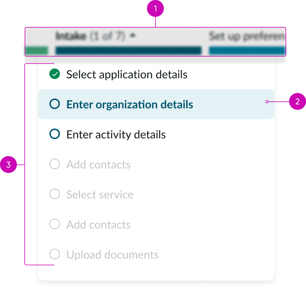
By default, the activity picker (the list of activities in a stage) is accessed by selecting the stage caret that expands the dropdown list.
- Horizontal stage picker: Users select the caret for a stage to expand and collapse the activity picker list of activities; the vertical stage picker also shows activities that correspond with each stage but in a vertical orientation
- Selected activity: Users can select an activity to view its details in the playbook activity viewer
- Activities: All activities in a selected stage display in a vertical list and are selectable
Persistent activity picker anatomy
You can configure the activity picker to always display in a panel on the left instead of in a dropdown from a stage in the stage picker.
Note: This configuration uses valuable space and the users may experience a disconnect between the selected stage and the list of activities.
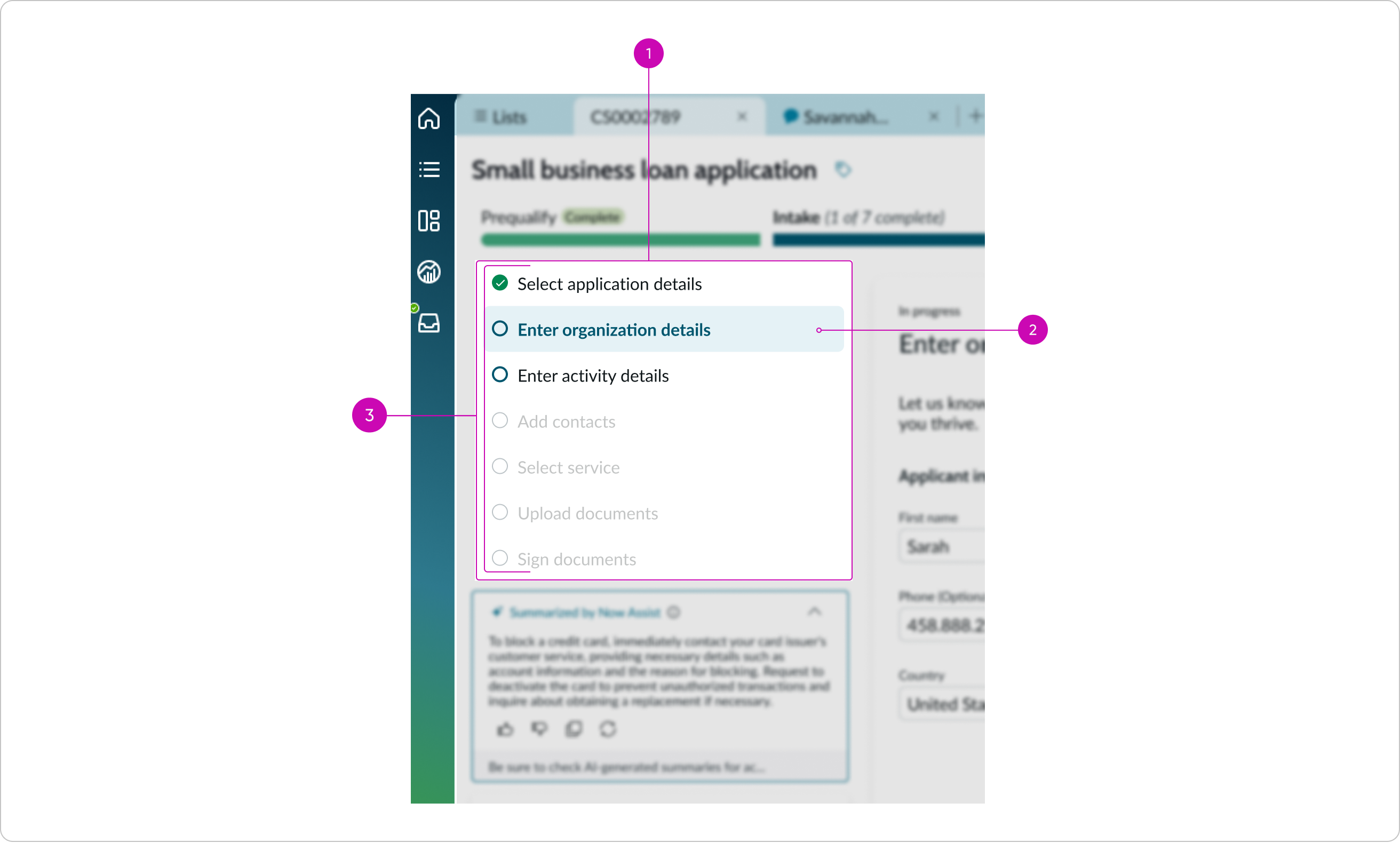
- Activity picker: Persistent activity picker showing list of activities for the selected stage
- Selected activity: Users can select an activity to view its details in the playbook activity viewer
- Activities: All activities in a selected stage display in a vertical list and are selectable
Subcomponents
See the usage guidelines for icon.
Usage
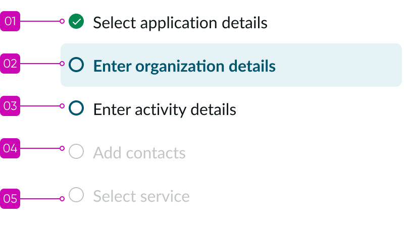
Playbook activity picker lists the names of all activities for a stage that the user selects in stage picker. This component displays the progression of work through the activities in a playbook stage.
Use activity picker to quickly understand the steps required to complete each stage of the playbook. Manually navigate between steps by selecting each activity in the picker.
Configurations
Learn how to customize playbook activity picker by configuring the available properties.
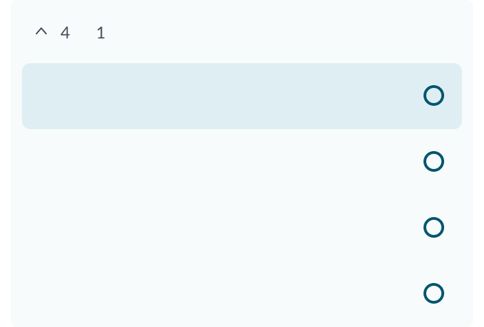
Show activities
In vertical playbooks in focused mode, to show the activities under a stage, the user clicks to expand the stage. Multiple stages can be expanded at the same time.
The ability to expand pending stages depends on whether the playbook is configured to show pending activities. For more information, see Configure playbook stage and activity visibility in the product documentation.
Number of filters
By default, filter info is not displayed in the activity picker, but you can display the number of filtered results at the top. If filters are applied and there are no results, then “No filtered results” appears. When no filters are applied, nothing is displayed. By default, the filter number and text are hidden.
Design recommendations
Learn how to apply playbook activity picker in your design.
UI text guidelines
These are some recommendations for using text within playbook:
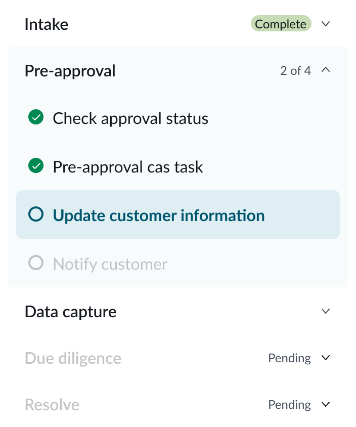
- Headers, stage, and activity titles should be short and precise, or they might truncate
- Use actionable activity titles that start with verbs, such as "Check approval status"
- Keep all text labels informative and short to increase readability and scanning
- Ensure content is contextual and specific to offer guidance and support to the user
- If a component performs or supports an action, label it with a verb (like “Submit”)
- Button text should be concise, actionable, and clearly state what happens when a user makes the selection
Behavior
Learn how playbook activity picker behaves when the display changes or a user interacts with the component.
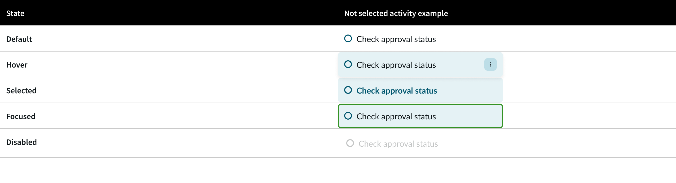
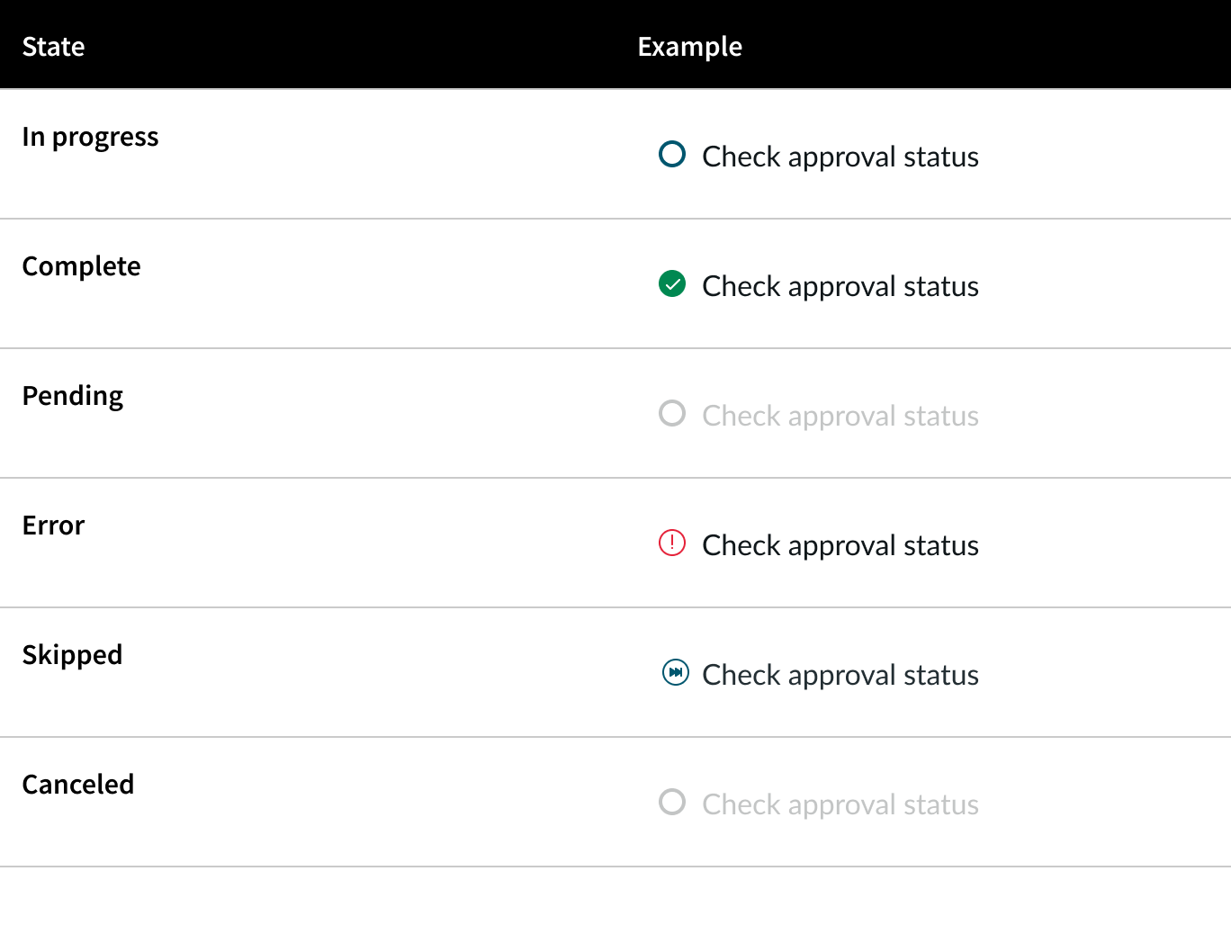
States
Activities in playbook activity picker have the following states.
Activity icons
The following icons appear at the start of each activity name. They indicate the current state of the activity.
Interactions
Learn how playbook activity picker responds when a user interacts with it.
Activity selection
When a user selects an activity in the Playbook activities picker, the focused view of the activity appears in the Playbook activity viewer. There the user can see the activity details and complete it.
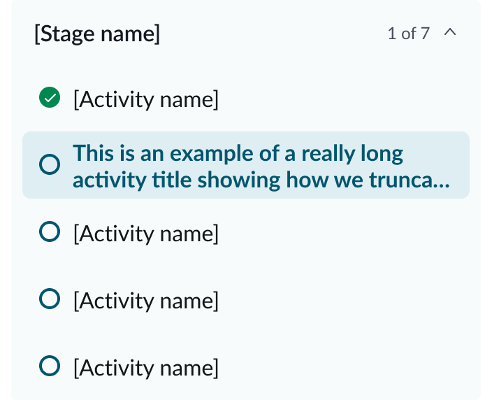
Truncation
The activity names can extend to a second line. If the text exceeds the text area width, then the activity name text truncates with an ellipsis at the end of the second line. When a user places the pointer on the ellipsis, a tooltip shows the full name.
Note: The activity name text area has a small buffer on each side.
Usability
Playbook activity picker complies with all internationalization and accessibility requirements.
Internationalization
When the display translates to a right-to-left (RTL) language, the order of importance changes to right-to-left in the playbook activity picker, but remains the same from top to bottom.
Accessibility
Learn how to access the actionable elements of playbook activity picker through keyboard interactions and screen readers.
Playbook activity picker tab order
Keyboard interactions
Users can interact with the playbook activity picker using the keyboard.
- Tab: Moves focus to the next interactive element in the UI
- Shift + Tab: Moves focus backward through the interactive elements in the UI
- Esc: Dismisses displayed tooltip
- Enter/return or space bar: Triggers an action associated with an interactive element when in focus, such as expanding and collapsing the activities dropdown
- Arrow up: Moves focus from an activity to the one above it
- Arrow down: Moves focus from an activity to the one below it
Screen readers
When you apply ARIA labels to a component, screen readers announce the controls and content of playbook activity picker in the prescribed tab order.