

Anatomy
Learn about the individual parts of playbook activity viewer.
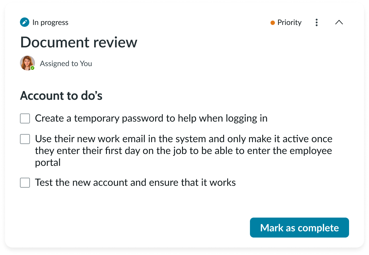
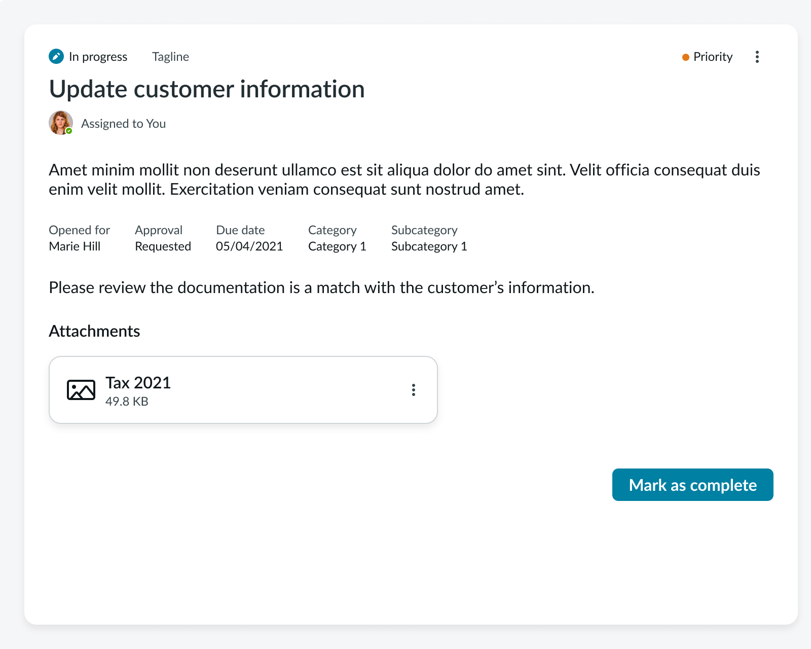
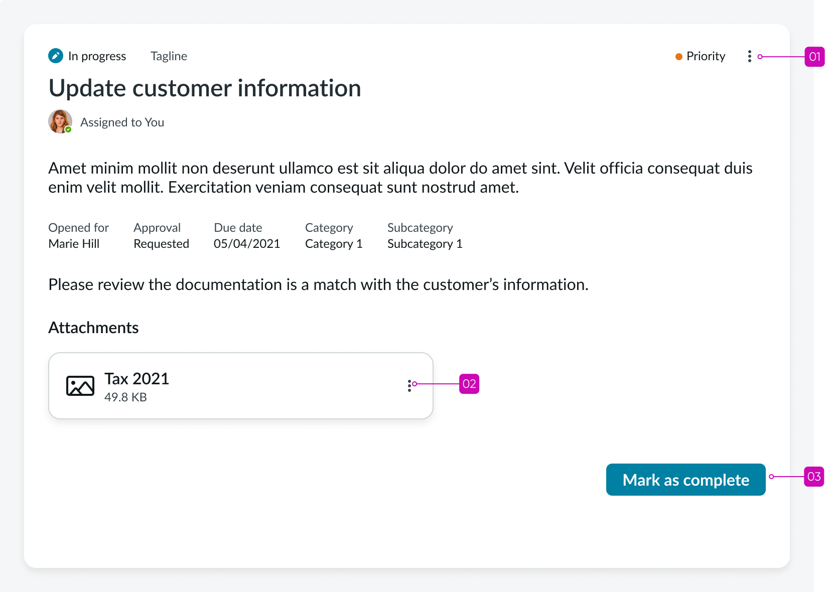
Activity viewer (focused view)
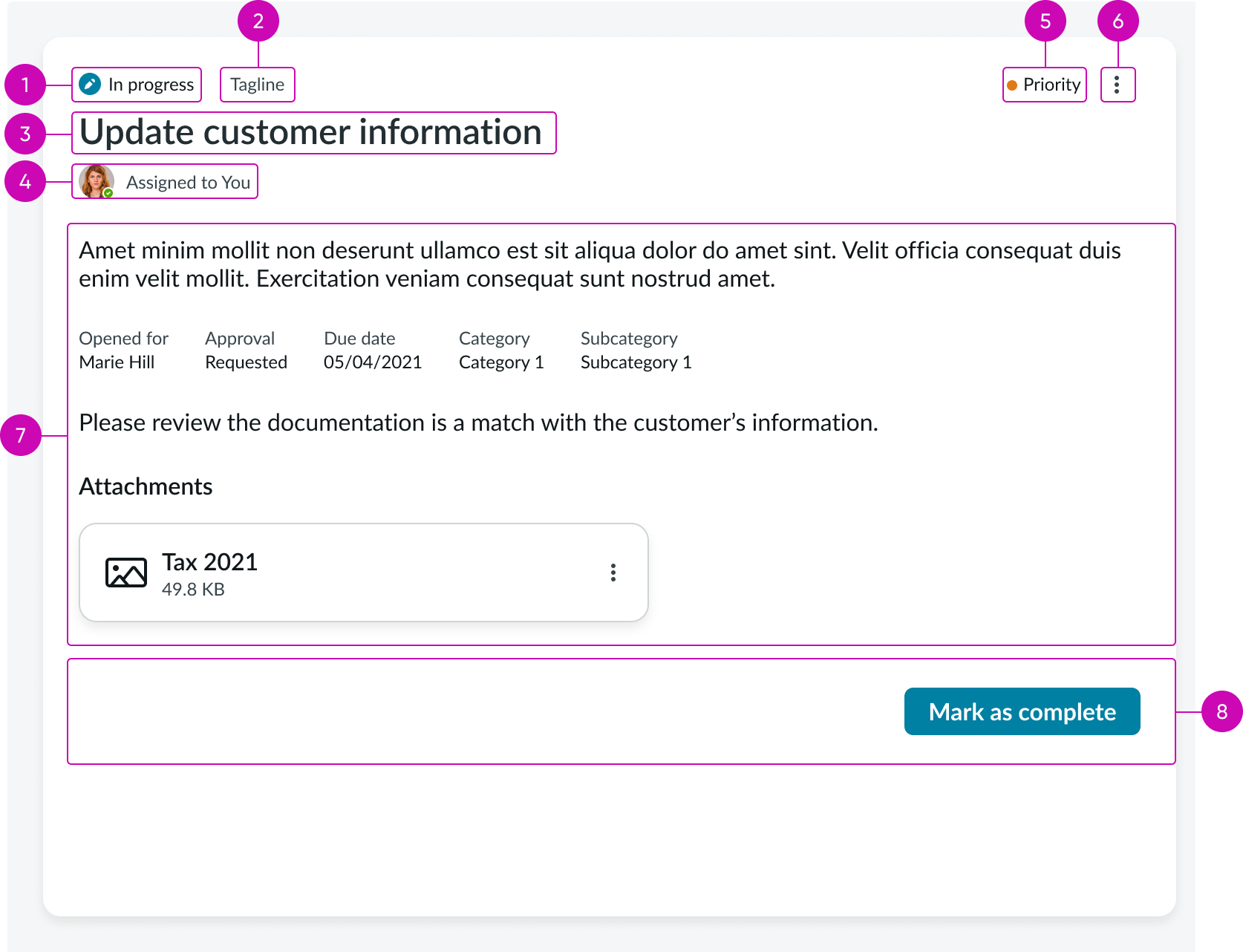
- Activity state: status of activity progress
- Tagline (optional): Any text you want to use to provide context to the user; by default, it doesn’t display
- Activity title: Name assigned to the activity when created
- Assignment slot: Identifies who is currently assigned the activity
- Priority indicator: Indicates a primary activity; based on prioritization you define
- Overflow action menu: Configurable actions in addition to the 3 available buttons
- Activity card content area: Contains information associated with the activity
- Declarative actions (optional): Up to 3 configurable buttons that enable the user to carry out actions associated with the activity card; all actions in addition to the 3 assigned to the available buttons appear in the overflow action menu; declarative action buttons may not be available for every activity card
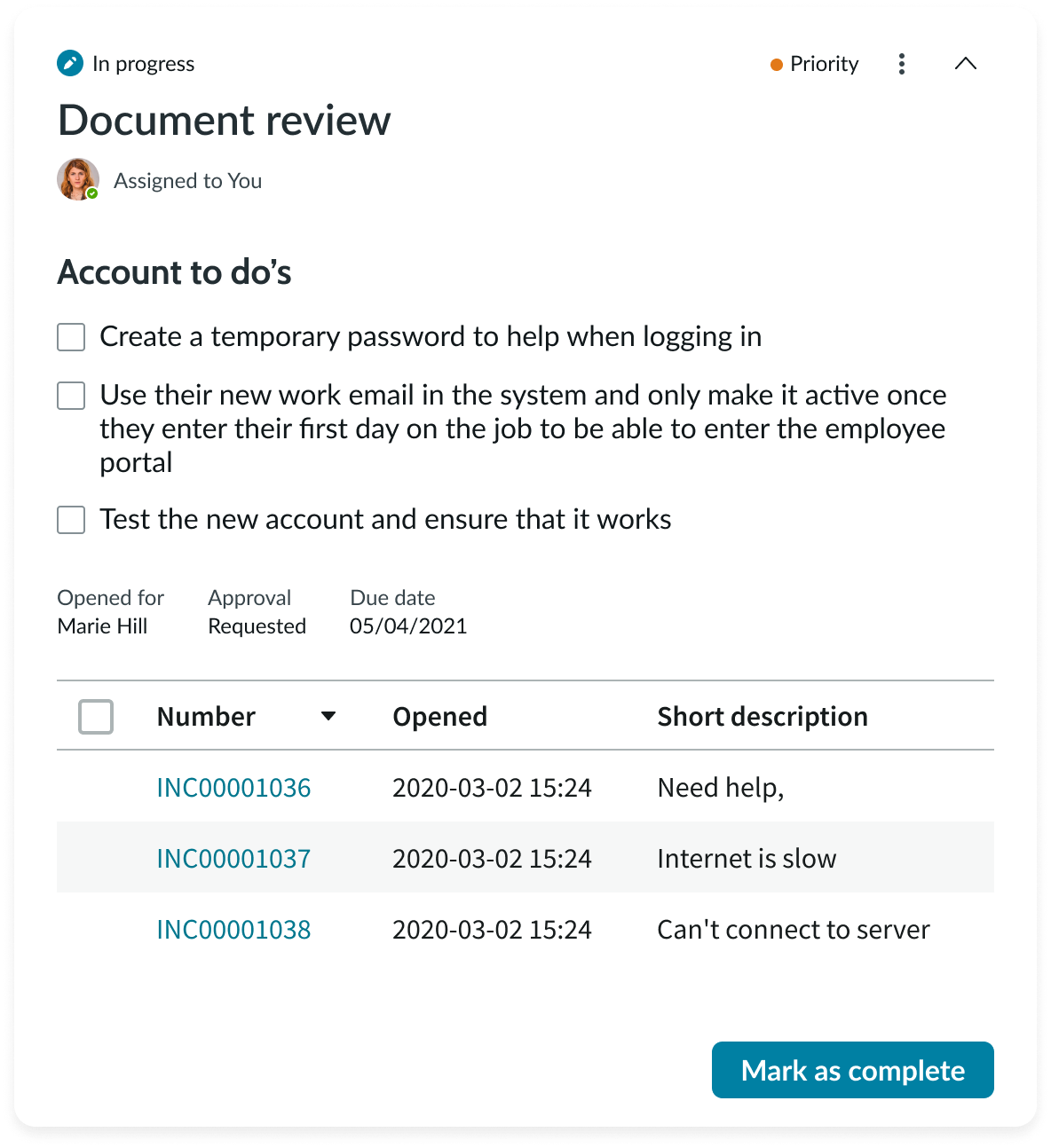
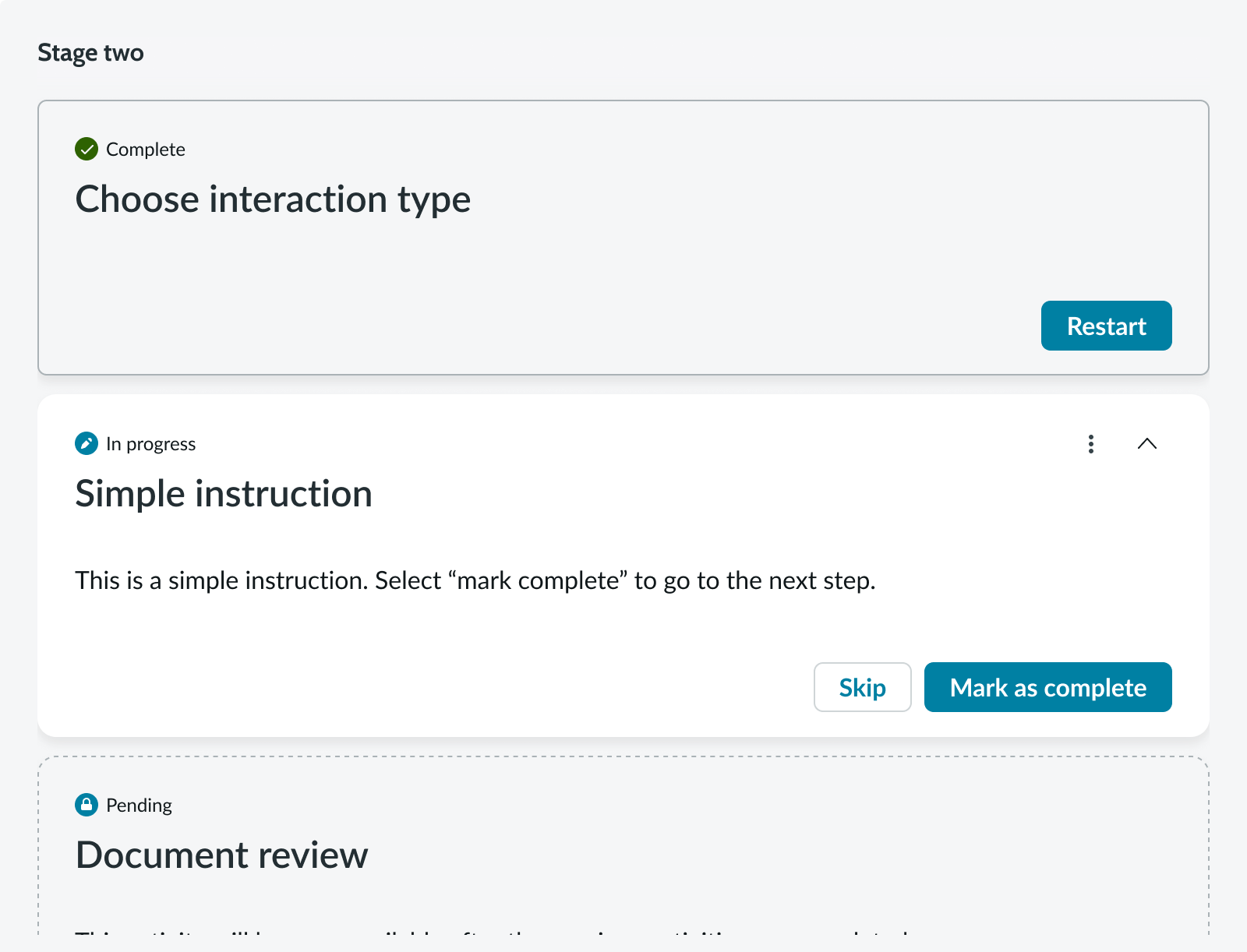
Activity viewer (stacked view)
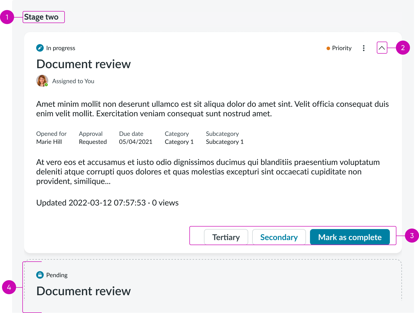
- Stage title (stacked view only): Name given to the activity stage the user is viewing the activity cards for
- Collapse/expand caret icon (stacked view only): Actionable icon; collapses and expands an activity card to show activity details; by default, activities are collapsed except for the initial activity already in progress
- Declarative actions (Optional): Maximum number of action buttons per activity card is 3; additional actions appear in the overflow action menu
- Next activity in stage (stacked view only): All activities in a stage are listed in order from top to bottom and are all collapsed except the initial activity
Subcomponents
See the usage guidelines for button.
See the usage guidelines for button icon.
See the usage guidelines for heading.
Usage
Activity viewer provides the user with process-aware activities, and guides them through their preconfigured sequence to complete work. Use the activity viewer to reduce clutter and keep focus on the activities associated with each stage in a process.
Variants
Playbook activity viewer has the following variants.
Types
The playbook activity viewer component has the following types.
Stacked view
The default view for activity viewer is the stacked view. It displays a navigable list of activity cards for the stage the user selects in the playbook stage picker component.
Focused view
The activity viewer focused view displays one activity at a time.

Configurations
Learn how to customize playbook activity viewer by configuring the available properties.
View
You can specify either the stacked view of all cards in a selected stage, or the focus view of a single card.
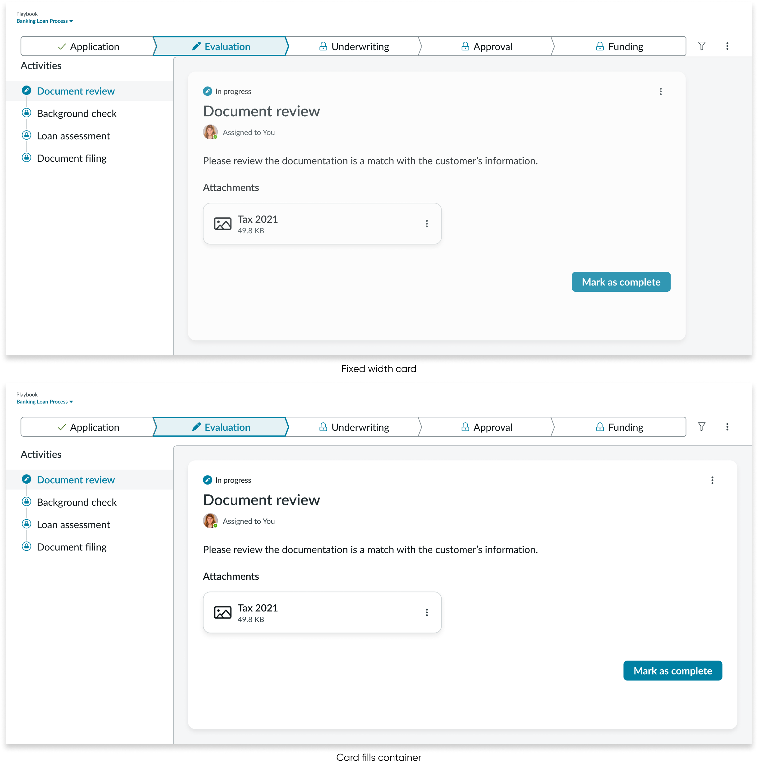
Card width
By default, the activity viewer card width is set at 800px. You can enable the cards to fill the container if you prefer.
Filter count
For the stacked view only, you can display the number of filters applied in the upper-left corner of the activity viewer. By default, the filter count message doesn’t appear.
Design recommendations
Learn how to apply playbook activity viewer in your design.
Card information should be clear and concise, so a user can easily understand a task and act on it. Alternatively you can use focused view to better support complex content.
When using stacked view, avoid overloading content in a card or combining interactive components like simple lists and form fields.
Use only 1 highlighted value, like SLA (Service Level Agreement), especially if card actions are exposed outside an overflow.
Avoid cluttering the activity header with multiple highlighted values and exposed card actions that can confuse users.
UI text guidelines
These are some recommendations for using text within playbook activity viewer:
- Headers and stage and activity titles should be short and precise, or they might truncate
- Use actionable activity titles that start with verbs, such as "Check approval status"
- Keep all text labels informative and short to increase readability and scanning
- Ensure content is contextual and specific to offer guidance and support to the user
- If a component performs or supports an action, label it with a verb (like “Submit”)
- Button text should be concise, actionable, and clearly state what happens when a user makes the selection
Behavior
Learn how playbook activity viewer behaves when the display changes or a user interacts with the component.
States
Playbook activity viewer has the following states.
Default (focus view)
Default (stacked view)
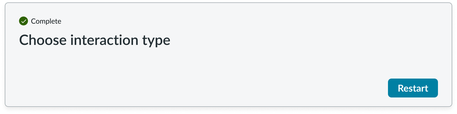
Completed activity
In activity viewer, when an activity is completed the data displays as text - not in a form. The user can select the restart button and change the activity back to the c state. If so, the data is presented in a form again.
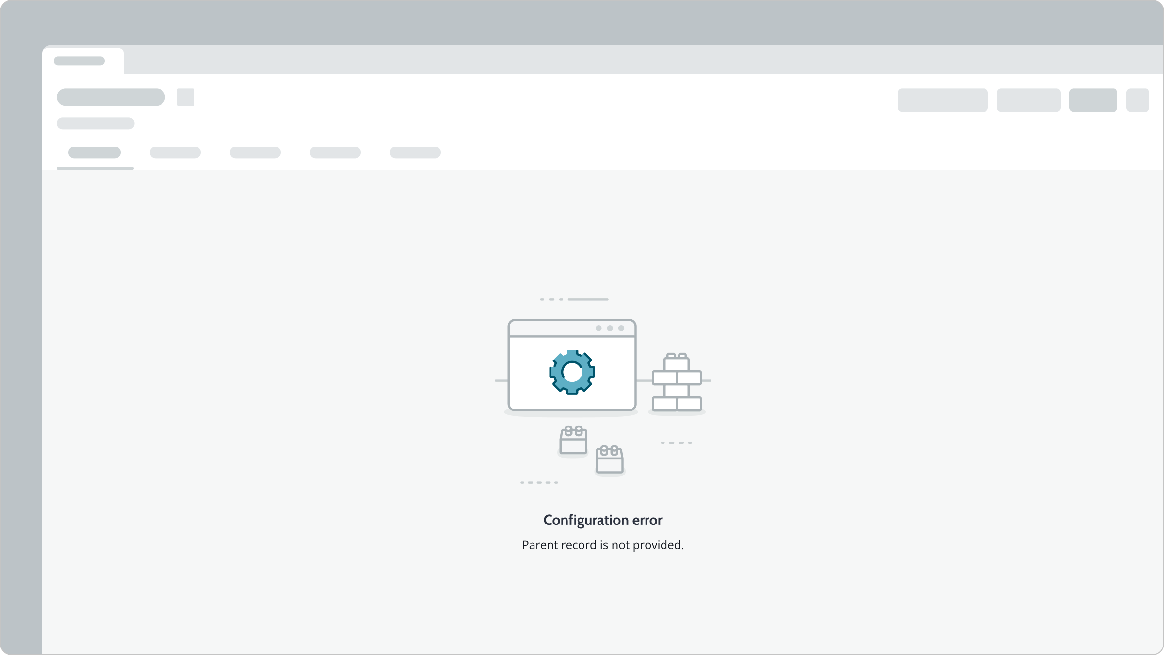
Configuration error
If there’s a configuration error, playbook activity viewer is not activated, and an empty state message appears in a full-page view.
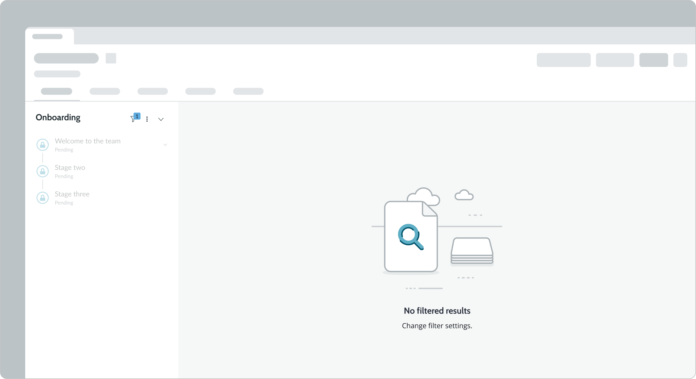
No filtered results
For a playbook with no filtered results, the activity viewer displays an empty state message to change the filter settings.
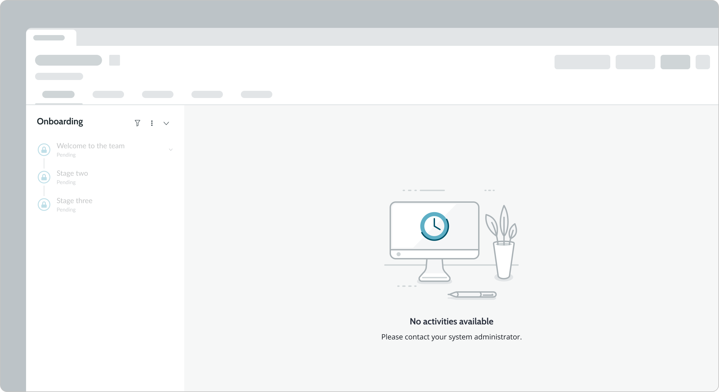
No activities available
Any stage launched without activities available is disabled. If a playbook has only a single stage without activities, the activity viewer displays an empty state message.
Interactions
Learn how playbook activity viewer responds when a user interacts with it.
Actions menu
Users can select the actions icon (vertical ellipses) in the top-right corner of the activity viewer which opens the actions menu.
Action buttons
You can include up to 3 action buttons on an activity card that users can interact with. When you configure more than 3 actions, they appear on the activity viewer actions menu.
Collapse/expand cards (stacked view)
In stacked view, users can expand and collapse an activity card by selecting the caret in the top-right corner of the card. By default, activities are collapsed accept for the initial activity already in progress.
Usability
Playbook activity viewer complies with all internationalization and accessibility requirements.
Internationalization
When the display translates to a right-to-left (RTL) language, the order of importance changes to right-to-left in the activity viewer, but remains the same from top to bottom.
Accessibility
Learn how to access the actionable elements of playbook activity viewer through keyboard interactions and screen readers.
Playbook activity viewer tab order
This is the tab order for playbook activity viewer.
Keyboard interactions
Users can interact with the playbook activity viewer using the keyboard.
- Tab: Moves focus to the next interactive element in the UI
- Shift + Tab: Moves focus to the previous interactive element in the UI
- Esc: Dismisses displayed tooltip
- Enter/return: Triggers an action associated with an interactive element when in focus, such as opening an actions menu or selecting a button
- Arrow up, down, right, left: Moves focus through menu options when opened
Screen readers
When you apply ARIA labels to a component, screen readers announce the controls and content of playbook in the prescribed tab order.